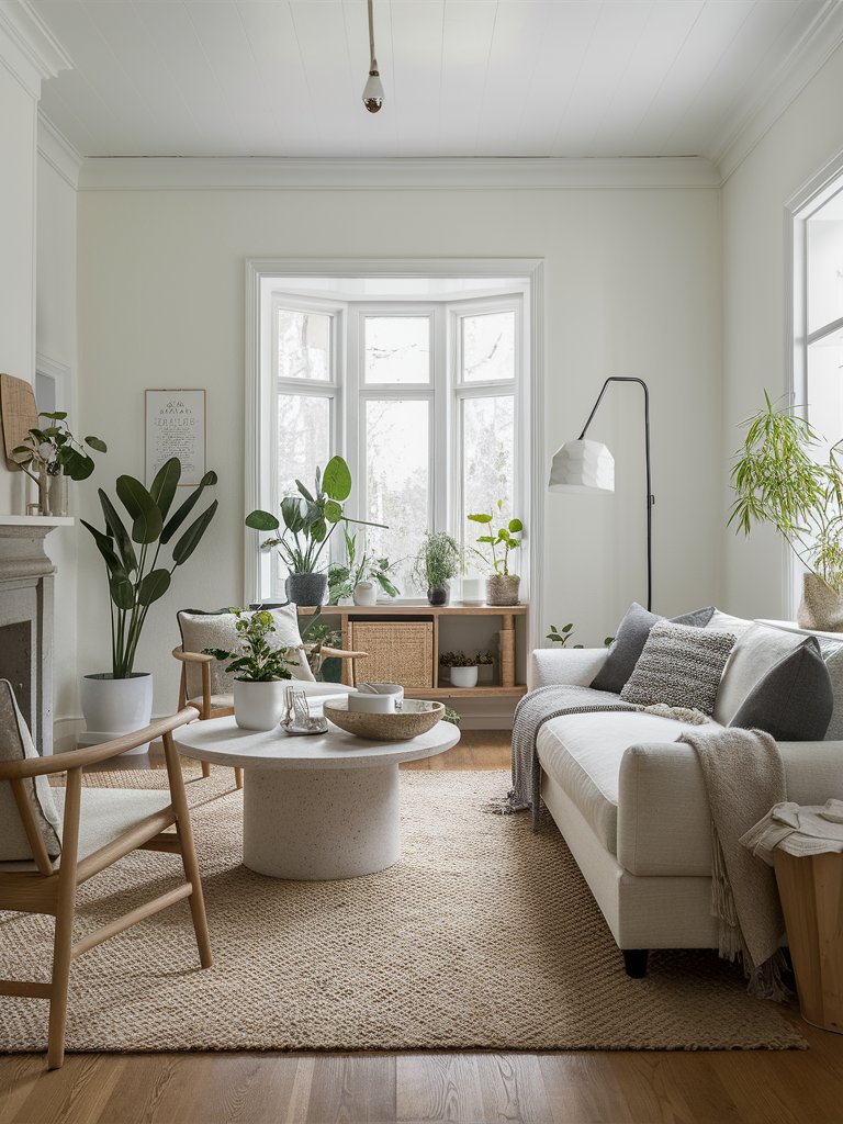
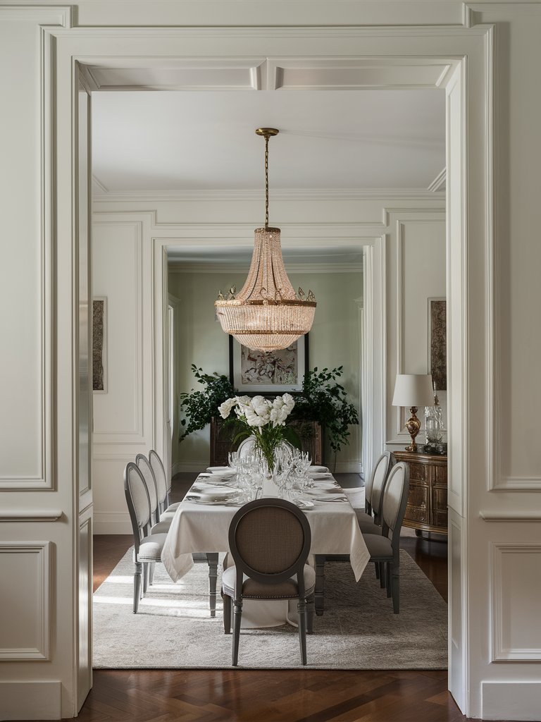
Unless you’re a fan of minimalist interiors, white paint isn’t usually the first color you think of when picking paint for the inside of your home. Nonetheless, having a good white paint color at your disposal is always handy, especially for ceilings, trim, and baseboards.
Before we begin, let’s discuss Light Reflectance Value (LRV). A paint’s LRV measures how light or dark a color is on a scale of 0 to 100, with zero being very dark and 100 very light. It’s also an indicator of how much light a paint color reflects. Now, let’s get back to it!
Only a few white paint colors are considered true white—less than five. That means all other white paint colors have an undertone. Each white paint color has a subtle nuance that may serve one interior better than the other. This is one of the reasons why white paint colors are very complicated.
But worry no more! We’ve selected some of the best white paint colors, along with some tips, to transform your home into a haven of airiness.
Take a look!
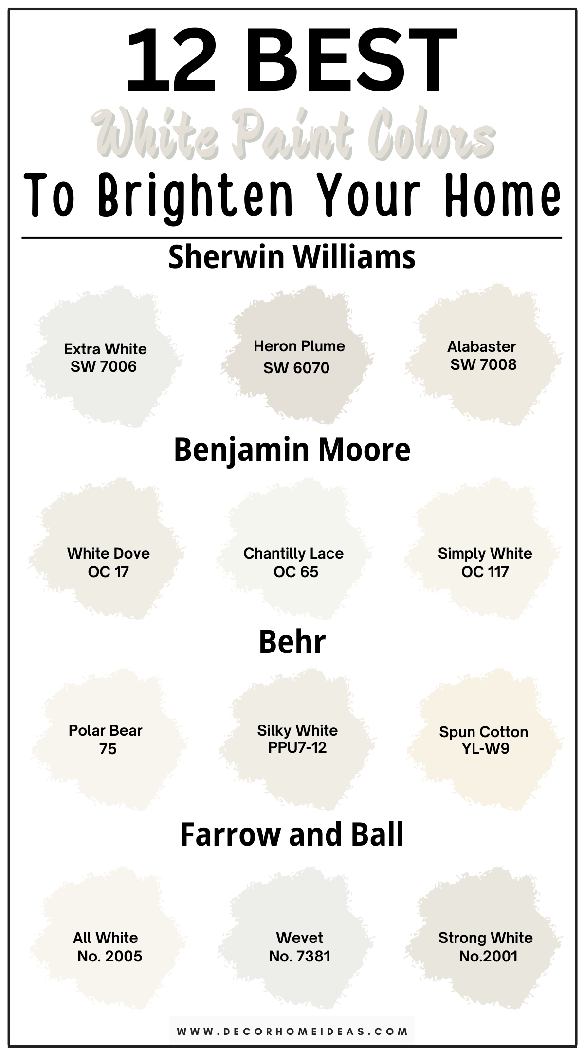
1. Sherwin Williams
Sherwin Williams Extra White
Sherwin Williams Extra White (7006) is a very bright white—the name says it all—with an LRV of 86. However, it’s not exactly the brightest; more legit whites start at the 90 LRV mark. Although the color may not be a pure white, it still does read as a white, especially against darker colors.
SW Extra White has a touch of softening from hints of gray undertones, and its RGB (R:238 G:239 B:234) suggests a touch of yellow warmth. However, in practical use, Extra White has slightly cool blue casts coming through against bright daylight or cool interior lighting.
The color is right on the cusp of neutrality and is highly susceptible to going one way or the other temperature-wise, usually being on the cooler side.
The blue undertone gets neutralized when you put the paint color against other cooler-leaning colors, such as greens, purples, and blues, but it can pop up prominently next to overly warm ones or when used on the exterior.
If you have a north-facing light, SW Extra White will look cooler. On the other hand, if you have a south-facing or afternoon western light, the paint color will get a bit of warmth without looking cream. This color is an excellent choice for the trim, whether inside or outside, as part of a cooler color palette.
Sherwin Williams Heron Plume
Sherwin Williams Heron Plume (6070) was featured as one of the 2024 Colormix Forecast Colors by Sherwin Williams, which means it’s one of the trendy colors that Sherwin Williams is pushing for in the market.
With an LRV of 75, some people consider this color an off-white, with Sherwin Williams describing it as “a cool-leaning off-white” on their website. Nonetheless, Heron Plume is pretty light and bright enough to bring a feeling of airiness and openness, so it won’t feel dark.
You might notice some warmth to the color when you put it on your walls, like a beige-gray quality, but its undertones lean slightly cooler. Depending on the actual lighting in your space, Heron Plume can exhibit an almost violet undertone—a slight purple tinge.
Still, the undertone is very subtle since the paint color is very light and has a nice level of desaturation. It has a combination of a brown base with a touch of gray, hence leaning toward the taupe side, albeit to a lighter degree.
The paint color’s neutrality lends it a lot of versatility and adaptability, so if you love experimenting with different design styles in your home from room to room, this is a color you can use as your primary color without disrupting things too much; it’s an excellent neutral canvas color.
If you have a south-facing room with a lot of natural light and the correct elements to pull it off, Heron Plume will look like a warm white-gray with a hint of tan. However, if you use the color in a north-facing room, it will look slightly greener and might even exhibit a hint of blue undertone.
Even though SW Heron Plume is kind of transitionary, it works best with cooler colors in practical use.
Sherwin Williams Alabaster
Sherwin Williams Alabaster (7008) is one of the company’s most versatile colors. It’s a white with an LRV of 82, but not a true or pure white; rather, it’s more of an off-white. The paint color is very popular because of its strong sense of balance between cool and warm undertones.
Alabaster is a bit creamy and beigey, but doesn’t feel overly yellow. It has a touch of gray that helps soften and desaturate it, allowing it to blend in seamlessly with many different spaces—this is integral when using a neutral paint color on your walls. It’s one of those magnificent neutral canvas colors that allow your accessories to take center stage.
Since it’s on the lighter side of wall colors (those that are 80 and above on the LRV scale), you do run the risk of your paint color feeling a bit washed and almost bland during periods of peak lighting.
Very bright whites also tend to look a bit dingy and unattractive in corners of rooms precisely because of how shadows can behave. However, this paint color shouldn’t cause you too much trouble since it isn’t a true white, like SW High Reflective White—it’s soft and subtle, bright but not too bright.
You can use Alabaster for kitchen cabinets, ceilings, trims, and main interior walls. When used correctly, it pairs well with warm and cool fixed elements. If your fixed elements lean on the cool side, Alabaster will look a bit creamier, with its yellow undertones becoming more pronounced.
If the fixed elements are on the warmer side, the color will be softer, like a warm off-white, with the yellow undertones becoming less pronounced.
SW Alabaster is also an incredible choice as an exterior paint color when used as a secondary or trim color on your home. You can use it as a primary body color, but it’ll appear pretty bright.
NB: If you plan on painting your interior walls with Alabaster and your home is surrounded by trees and has many windows, you might notice a green undertone on your walls.
2. Benjamin Moore
Benjamin Moore White Dove
Benjamin Moore White Dove (OC-17) is one of the best-selling colors in Benjamin Moore’s entire catalog, mainly because of its timeless appeal, flexibility, and versatility. It’s a beautiful, clean, sophisticated, soft white that doesn’t feel cold and frigid.
White Dove has an LRV of 83, which is very high for colors generally but not quite the brightest in terms of white paint colors. Still, it’s in that tier of white-looking colors, so don’t worry; it’s going to look white!
Although it does have some yellow undertones, White Dove also has some greige undertones that make it really grounded and creamy, but not overly creamy like SW Alabaster.
The paint color compromises between feeling warm but not overly soft while still being clean. This is one reason it works excellently with kitchen cabinets: It helps your kitchen feel light and approachable instead of sterile and lifeless. It also makes it a great soft trim color in or outside your home.
BM White Dove also works well with walls because it has some color to it, so it won’t feel like a plain old dull white. It coordinates beautifully with warmer-leaning things, such as natural materials like wood, wicker, rattan, jute, etc.
Benjamin Moore Chantilly Lace
Benjamin Moore Chantilly Lace (OC-65) has an LRV of 90.04, making it a unique paint color because it’s definitively the brightest white paint color that Benjamin Moore makes. This has made it gain a lot of notoriety in the design world, especially within Scandinavian and minimalist designs, as everyone tries to evoke the feeling of an art gallery in their homes.
BM Chantilly Lace has no undertones; that’s right—there’s no blue, gray, or yellow in it. It’s more susceptible to the environment than other soft whites since it has a higher LRV, reflecting more of its surroundings. Chantilly Lace will do the job if you want a light, crisp, and clean white paint color.
Chantilly Lace is a favorite on white baseboards, doors, ceilings, and even walls. However, unless you’re decorating with a lot of stark or true whites in your space, this paint color might be a little too bright for your walls.
For example, if you have pink floor tiles and Chantilly Lace on your walls, don’t be surprised to see pink on your walls—the paint color will reflect the pink undertones in the floor tiles. Similarly, if there are a lot of trees outside your home and you have a lot of windows, you might notice some green on your walls.
If you plan on using Chantilly Lace on your kitchen cabinets, first get a sample of the paint color and compare it with your countertops. If you have off-white, gray, blue, green, or black countertops, chances are BM Chantilly Lace will pair well with them. However, be mindful of other fixed elements in your kitchen and the type of lightning.
Earthier countertops that are creamy or beigey aren’t an ideal pairing for Chantilly Lace. The paint color will be too stark and white, making the countertops look old and outdated.
Chantilly Lace leans slightly cooler in north-facing light, picking that gray-blue cast. It might warm a bit in south-facing or afternoon western light, but it won’t be overly creamy.
NB: Please don’t be persuaded by the popularity of this paint color in magazines or online. Benjamin Moore Chantilly Lace doesn’t work in every home. The most common mistakes people make are failing to compare the color with their fixed elements and not being mindful of their lighting.
Benjamin Moore Simply White
Benjamin Moore Simply White (OC-117) is a bright, clean white that doesn’t feel too stark. It has an LRV of 89.52, and its yellow undertone keeps it positive and uplifting, offering an inviting gallery aesthetic.
If you want or your space demands a softer white but don’t want to see too much cream or greige, BM Simply White is your go-to color!
Simply White is often used on trims and millwork, but its warm yellow undertone makes it an excellent choice as an inviting wall color. The paint color also works well on doors, cabinets, and ceilings, with its happy, warm feel turning any room into an inviting and airy space.
Pro Tip: If you plan on using BM Simply White on your walls, we recommend continuing with the color on your trim and doors. There’ll almost certainly be a difference in sheen, separating the flatter walls from the shinier baseboards, which is pretty much the contrast you need. This is much safer than using a slightly different white on the baseboards that could potentially clash with your walls.
3. Behr
Behr Polar Bear
Behr Polar Bear (75) is a crisp, bright white paint color that brings life and freshness to a space. With an LRV of 90, it’s one of the brightest whites available, reflecting a significant amount of light. This makes it perfect for modern and traditional spaces alike.
The paint color has a warm undertone, but the yellow isn’t too much, only tinges. These undertones are barely visible, so you’re guaranteed a sense of warmth, crispiness, and refreshing vibe in your home.
Polar Bear works well on walls, furniture, trim, and ceilings. The paint color is bound to make your space look brighter, airier, and larger, making it a perfect choice for small rooms. It’s good to note that large areas covered by Behr Polar Bear can reflect other colors near them, so be mindful of the fixed elements in your space.
In north-facing rooms, Behr Polar Bear will lean cool and exhibit a gray undertone, but the undertone will not be prominent. On the other hand, in south—or west-facing rooms, the paint color will feel slightly warmer, but not to the extent of going to the creamy range.
NB: If you are using Behr Polar Bear on your walls and you plan on introducing material and metallic accents through furniture frames, floating shelves, chandeliers, and artwork frames, it would be best to add hints of rustic wood, brushed brass and matte black.
Behr Silky White
Much like its name, Behr Silky White (PPU7-12) is an off-white paint color that feels like silk threads—soft, warm, calm, and poised. Even though the color feels warm, it doesn’t have a prominent yellow or creamy undertone, making it an excellent neutral for your home.
Silky White has an LRV of 83, so it can be used as a neutral or a base. It also has a slight greige undertone, so it’s guaranteed to feel extra warm, cozy, and welcoming when used in space, fostering positivity and liveliness.
So, if you love creamy and warm whites dominating your palette, Behr Silky White is a color to keep an eye on.
Whether used on cabinets, trims, furniture frames, moldings, or interior or exterior walls, Silky White will make a subtle and cozy statement in your home.
Natural light revives the paint color’s undertones and can further brighten a room. In north-facing rooms, Behr Silky White will look slightly cool and show a grayish undertone, while in south—or west-facing rooms, it’ll look creamy and yellow.
Silky White’s undertones are also likely to be washed if natural light hits the walls directly, making it look like a pure white color.
Behr Spun Cotton
Behr Spun Cotton (YL-W9) is one of Behr’s top colors and a favorite among designers. It’s a warm white paint color that feels very soft and a bit old-worldly. Spun Cotton works well with other bright colors and doesn’t feel too stark like other white colors.
Behr Spun Cotton has an LRV of 89, bordering on the bright white range and the edge of soft white. It has a relative amount of yellow undertones, lending it warmth and creamy feel. You can combine the paint color with many other colors without overwhelming your space, so it’s pretty versatile.
Spun Cotton is an excellent option for cabinets, furniture, trim, walls, or any other room in the house.
4. Farrow and Ball
Farrow and Ball All White
Farrow & Ball All White is as pure white as you can get with Farrow & Ball white paint colors. It’s a bright white paint color with no noticeable cool undertones—no cream, yellow, or blue. All White is a fresh, pure, perfect paint color for a clean white space.
The beauty of this bright white is that, when used correctly, it makes rooms feel more spacious and brighter. The best way to achieve this airiness is to avoid pairing it with another contrasting color, but instead, color-drench your walls and carry the color up and onto the ceiling.
FB All White has an LRV of almost 92 and is a great all-around neutral that can be used on modern kitchen cabinets, walls, ceilings, and trim.
The paint color is primarily a good option if you have a cool palette in your space, working well with cool grays, greens, and blues. You still have to be careful because the color can feel quite crisp and cool.
Natural light will enhance the lightness and airiness of FB All White, with the paint color exuding a cool and cozy vibe in north-facing rooms. In south and west-facing rooms, All White will feel slightly warmer.
Farrow and Ball Wevet
Farrow & Ball Wevet is a sophisticated off-white with a hint of gray that gives it a contemporary and serene feel. The paint color feels like a very light taupe because it adds a touch of brown to its gray undertone.
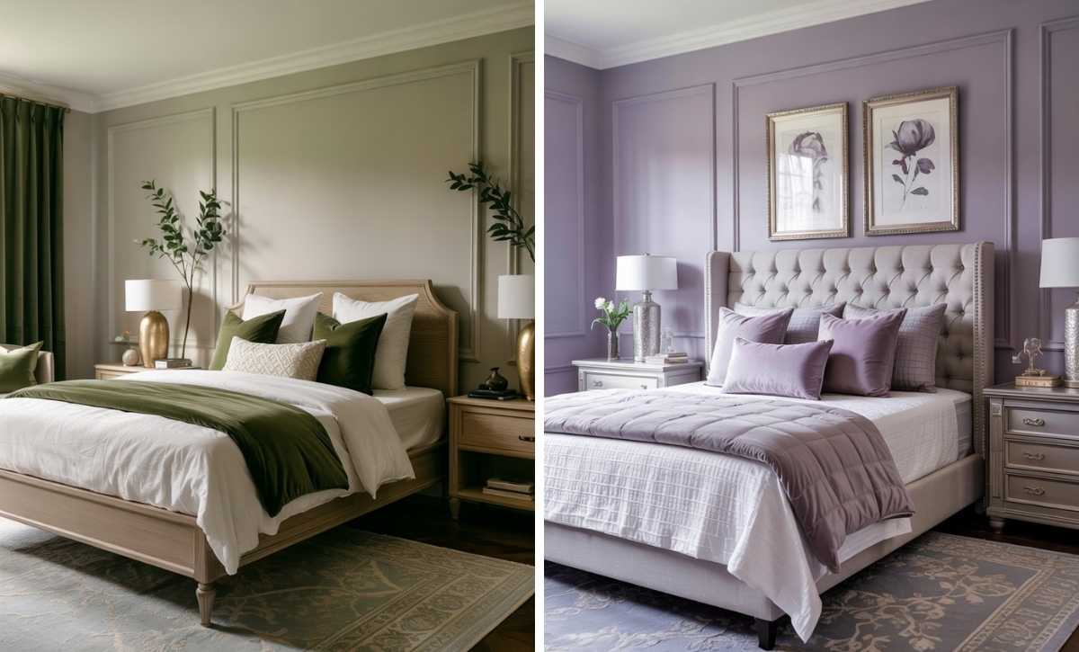
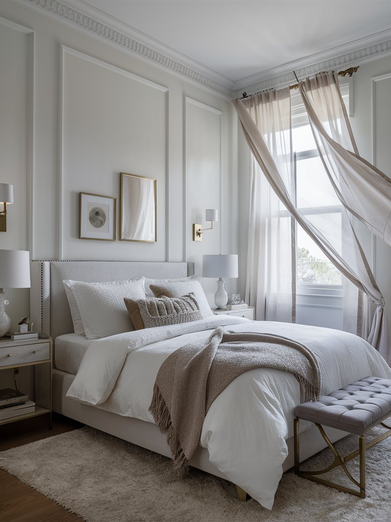
FB Wevet has an LRV of almost 85, and its gray undertone adds to its depth and character. The color is perfect for creating a calm, peaceful atmosphere, ideal for bedrooms and living areas. It complements other colors beautifully, allowing for versatile design options.
Wevet’s subtleness lends itself to a really soft and laid-back look. Natural light balances the color’s intensity, making it feel calm, something you don’t get with most bright whites.
NB: There are cases where Wevet loses its color hue and feels like a very light gray, especially in spaces with cool lighting. We recommend testing the paint color in different conditions before committing to it.
Farrow and Ball Strong White
Farrow & Ball Strong White is notably one of its contemporary neutrals, which is usually paired with more up-to-date color schemes and palettes. It’s a somewhat muted paint color, meaning there isn’t a ton of visible color to it.
However, this doesn’t mean there’s no color at all. Strong White has an LRV of about 75, so it’s more off-white and incorporates a decent dose of gray and maybe a slight touch of brown, giving it the slightest of taupey feel.
FB Strong White is geared towards the contemporary vibe that we all seem to love with neutral paint colors. It suits the modern aesthetic of neutral canvas homes, allowing you to decorate in a number of different ways outside of a much brighter and more fun paint color.
Strong White is an excellent primary wall color to build an entire palette off of. It reflects a good amount of light, meaning your rooms will feel more open and airy. Even though the name is very imposing, Strong White isn’t the best white to use on ceilings or even trim.
It is, however, a good choice for an exterior paint color since it’ll seem a lot brighter outside but not too bright where it’ll be overpowering.
FB Strong White is a subtle color that can manifest in different ways. Mostly, you’ll notice that light warm gray peeking through, but in some cases, you can see the slightest green poking through as well. It depends on your home’s fixed elements and lighting, so you must test your color first.
What Color Compliments White Paint Colors?
- Charcoal Gray
- Soft Blue
- Warm Beige
- Blush Pink
Charcoal Gray
Charcoal gray is a deep, sophisticated shade that pairs beautifully with white. The contrast between these two colors creates a modern and sleek look, adding depth and elegance to any space.
Use charcoal gray in furniture, accent walls, or decorative items to create a striking, contemporary aesthetic that enhances the brightness of white walls.
Soft Blue
Soft blue is a calming, serene color that complements the crispness of white. This combination creates a fresh and airy atmosphere, perfect for bedrooms, bathrooms, or any space where you want to evoke a sense of tranquility.
Incorporate soft blue through textiles, such as throw pillows or curtains, to add a touch of peacefulness and harmony to a white room.
Warm Beige
Warm beige is a neutral, earthy color that adds warmth and coziness to the coolness of white. This pairing creates a balanced and inviting environment, ideal for living rooms or dining areas.
Consider using warm beige for larger elements like rugs, furniture, or accent walls to create a comfortable and welcoming space.
Blush Pink
Blush pink is a soft, muted shade of pink that adds a gentle warmth and romance to white. This combination creates a delicate and refined look, perfect for creating a cozy and inviting atmosphere.
Use blush pink in accessories like throw blankets, wall art, or small decorative items to introduce a subtle hint of color and charm to a white room.

Color Disclaimer
Please note that all paint colors displayed on this page are for illustrative purposes only. Due to variations in screen settings, lighting, and other factors, the colors you see on your screen may differ from the actual paint colors. We recommend viewing a physical color sample or swatch for the most accurate representation. Some images might be generated by AI to represent paint colors in different interiors