Painting your home a white or off-white paint color isn’t as easy as you may think, with most homes being unable to pull off these colors. So why not go for a warm cream paint color instead?
Before we go any further, you need to know about Light Reflectance Value (LRV). A paint color’s LRV is the percentage of light it reflects on a scale of 0 to 100. The more a paint color’s LRV is closer to 100, the lighter and brighter it is, and they become darker as you approach zero. So, let’s get into it!
Cream colors are considered classic and timeless since they pair nicely with neutrals and colors. For instance, creams pair very well with beiges, taupes, warm grays, cool grays, blues, pinks, greens, creams—the list goes on.
We’ve picked some of the best warm cream paint colors to transform your home, as well as valuable insights you need to know about the paint colors before you decide to put them in your home.
Take a look!
1. Sherwin Williams
Sherwin Williams Antique White
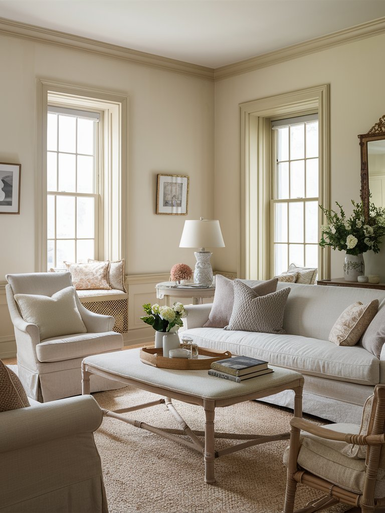
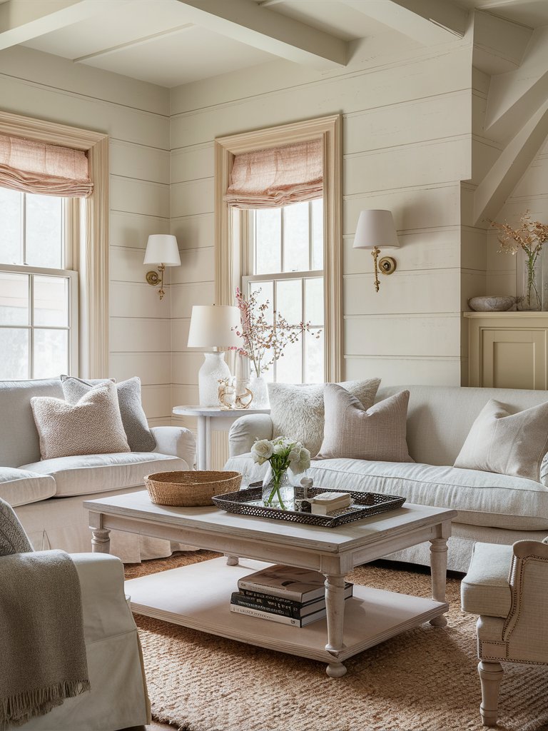
Sherwin Williams Antique White (6119) is a warm cream color with yellow and beige undertones, which contribute to its warm and inviting appearance. It’s not a stark white but rather a creamy off-white.
Antique White has an LRV of 72, making it a light and reflective creamy color. Since it has more body than other well-known cream paint colors, it’s used to add a gorgeous depth to walls. The paint color strikes a balance between a creamy hue with richness without appearing heavy on the walls.
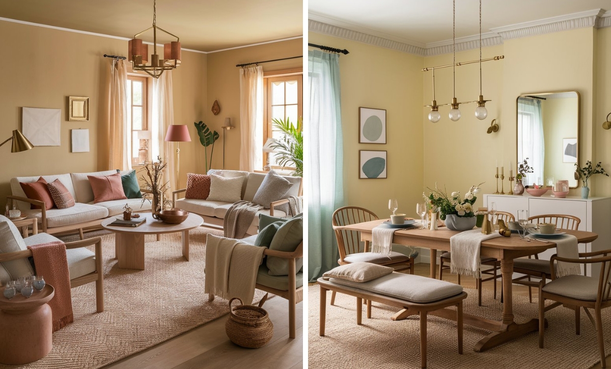
When paired with complementary décor elements, it can create a warm and inviting atmosphere in different rooms. You can see how the off-white furniture blends well with the Antique White on this living room’s walls, while the wood tones and area rug bring out that beige undertone.
SW Antique White works well in rooms where you want to create a soft, elegant atmosphere, such as bedrooms, living rooms, or dining rooms. It blends amazingly with wood tones, other warm neutrals, and various design styles, such as traditional, farmhouse, cottage, and transitional styles.
Antique White is an excellent choice as a wall color, but it might prove troublesome when used on trim work and kitchen cabinets.
The ideal paints for trim are usually located in the 82 LRVs and above domain, and Antique White’s LRV of 72 is too low even when compared with traditional off-white colors.
The paint color’s depth also makes it warmer and richer when used on cabinets or trim, limiting the types of paints you can pair it with, especially since it goes well with colors that are cooler than it.
We also wouldn’t recommend this color in a modern or minimalist space where clean lines or a more monochromatic color palette are preferred.
Sherwin Williams Steamed Milk
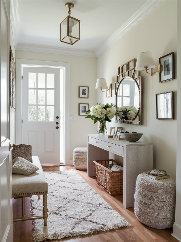
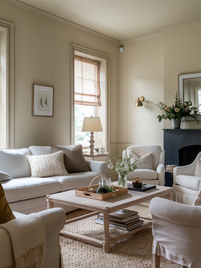
Sherwin Williams Steamed Milk (7554) is a warm white paint color with a yellow base that gives it an inviting warmth, making rooms feel cozy and sunny without appearing too creamy.
SW Steamed Milk has an LRV of 76, so it’s a light light color that can make a room feel airy and open. However, it won’t be overly bright. The charm of Steamed Milk comes from its undertones: Beige, which gives it a soft, creamy feel; yellow, which adds a warm, sunny touch; and gray, which provides the color with a contemporary edge and prevents it from being too yellow or creamy.
Even though Steamed Milk possesses some warmth, it still maintains a level of neutrality and lightness, making it easy to mix with warm and cool color palettes. The above entryway is a perfect example, with the console table, bench, ottomans, the woven basket, and wood floor complementing the walls.
SW Steamed milk is quite versatile and complements various house designs, including farmhouse, traditional, modern farmhouse, coastal, and Scandinavian. Its warm and cozy nature enhances your home’s aesthetic, creating a harmonious and inviting space.
While SW Steamed Milk can be used in various areas of your home, to match the desired look, the fixed elements to be paired with should be considered. For an elegant appearance in a living room, we recommend matching it with deep, luxurious shades like burgundy or navy blue in furniture.
Alternatively, opt for lighter tones in upholstery for a peaceful, harmonious design scheme.
Steamed Milk’s look varies based on the lighting. The paint color will appear slightly neutral and cooler in north-facing rooms as the beige undertones stand out more.
On the other hand, yellow and gray undertones will be more prominent in south-facing rooms, with the color taking on a warmer, creamier feel.
NB: Sherwin Williams Steamed Milk has a high reflective ability, so there’s a high chance it’ll become washed out when placed in a room with extreme light.
Sherwin Williams Casa Blanca
Sherwin Williams Casa Blanca (7571) is a cream paint color with a soft, neutral base that helps tone down its yellow undertones. This gives the paint color a more muted, natural feel instead of a “bright yellow” look.
Casa Blanca has an LRV of 76, which places it in the off-white range. It has a relatively good reflective ability, adding depth and light to rooms.
Casa Blanca’s undertones predominantly carry notes of yellow. Still, they aren’t as prominent as some other cream shades since the paint has a neutral base alongside subtle beige undertones that calm it down nicely.
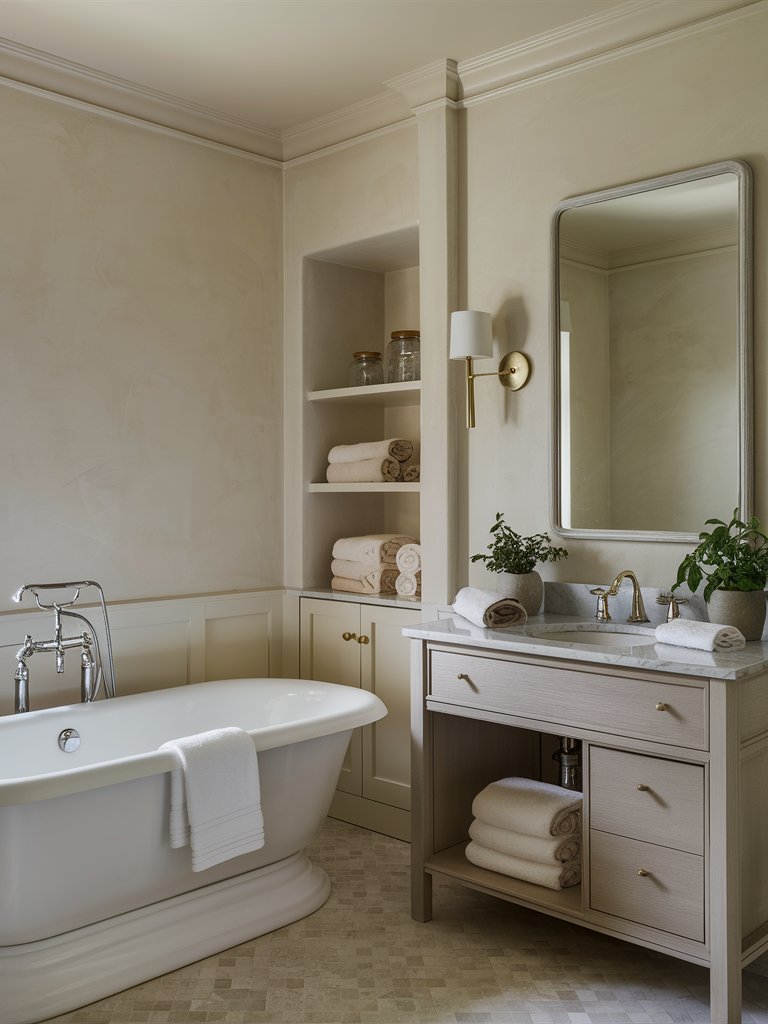
If you want to create a gentle ambiance in your living space or exterior, SW Casa Blanca is a perfect option. It works well with open-plan living spaces but lends itself equally well in tranquil bedrooms or boutique bathrooms, as evident in the above example.
NB: Casa Blanca is a lovely exterior color if you’re going for a warm, creamy look. Nonetheless, keep in mind that the color’s warmth could rise outside, especially if your home’s front is south-facing or has afternoon western sunlight.
To enhance your room’s warmth and brightness, consider pairing SW Casa Blanca with light oak or walnut wood tones and soft fabrics in neutral shades, such as beige. This will beautifully complement the cozy, inviting look.
2. Benjamin Moore
Benjamin Moore Rich Cream
Benjamin Moore Rich Cream (2153-60) is a warm off-white paint color with soft yellow undertones, but not too much to look harsh or glow on your walls.
Rich Cream has an LRV of 76, so it’s in the light color category. BM Rich Cream has yellow undertones, but there’s also a touch of beige in there. The yellow undertones give the paint color warmth, making it perfect for rooms with bright sunlight or even exterior purposes.
Natural light helps bring out the paint color’s warmth, preventing it from looking too stark or washed.
BM Rich Cream is quite versatile, with a lot of possibilities inside and outside of your home. It’s an excellent wall color for living spaces, kitchens, and even bathrooms.
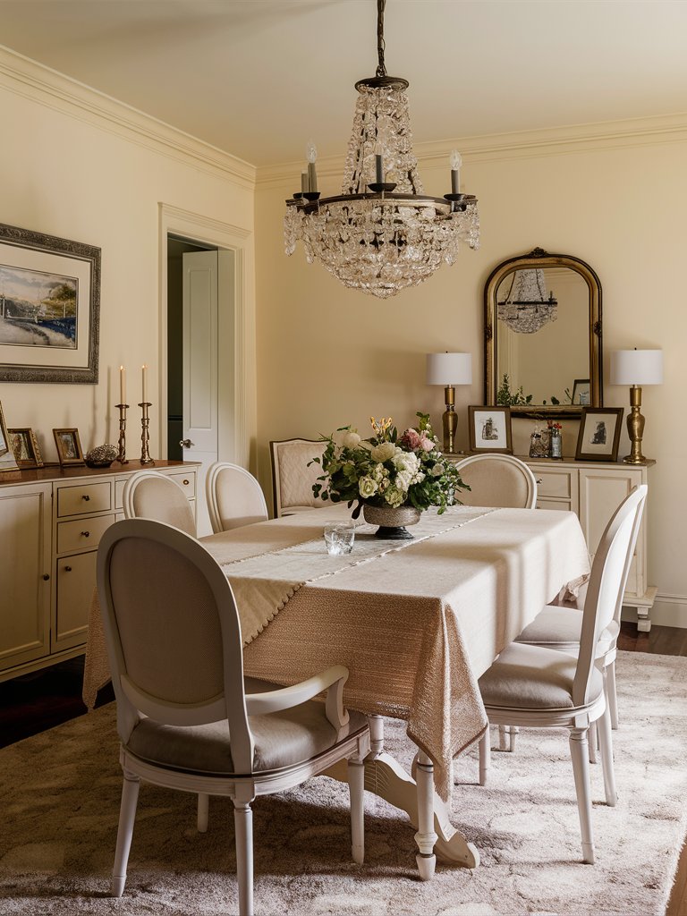
Rich Cream pairs beautifully with a range of color palettes. Mix it with soft grays, warm browns, and a hint of brass for a classic look—the above dining room depicts the timeless elegance brought by Rich Cream when paired with vintage elements.
You can also pair it with navy blues or rich emerald greens for a more modern vibe.
BM Rich Cream works best in south-facing rooms or rooms with a lot of natural light, but you can also pull off the color in north-facing rooms since the yellow undertones will keep the room looking bright and cheery.
Benjamin Moore Gentle Cream
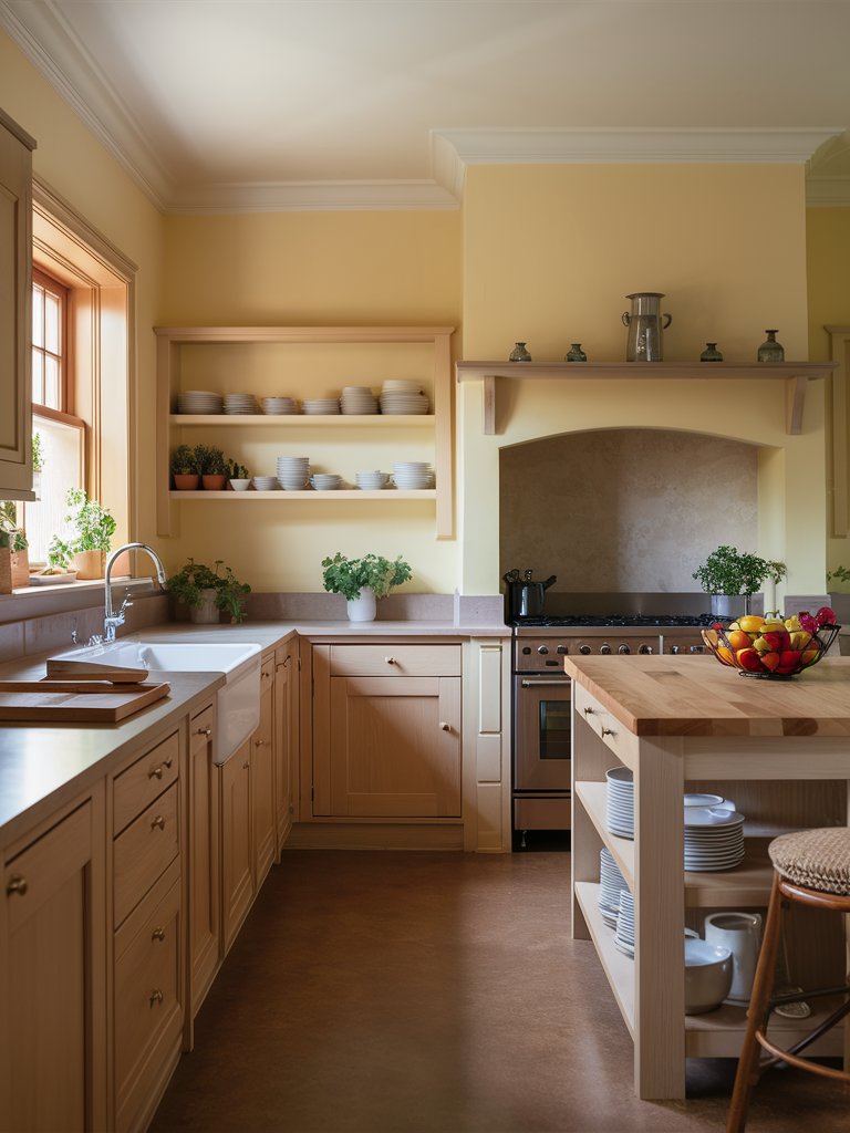
Benjamin Moore Gentle Cream (OC-96) also goes by the name Barely Beige, which the two names perfectly describe the color. It’s a light neutral with a slight orange undertone, making it look darker than most cream colors.
Gentle Cream has an LRV of 71.32, so it’s a light color, but it has enough color to distinguish itself from true off-whites and stark whites.
The paint color has yellow undertones that contribute to its warmth, and a bit of brown is mixed in as well. These brown undertones pacify the creaminess and make the color a bit more tame by toning it down.
Gentle Cream is a solid main color choice for your primary areas in your home. If you’re looking for a lighter neutral, Gentle Cream will add a cozy base or foundation to your color palette. It also caters to several design styles, including Scandi, coastal, and even granny chic.
BM Gentle Cream is also an excellent paint color to dress up with accessories and artwork.
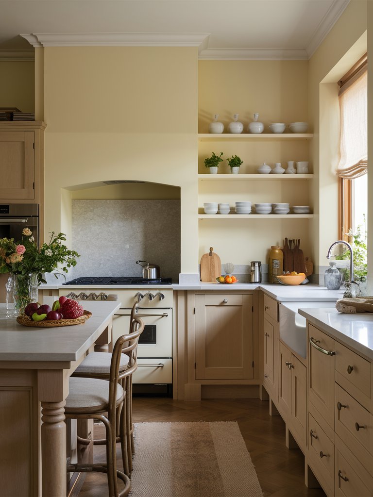
If your kitchen has many Tuscan elements and you plan on painting the kitchen cabinets, Gentle Cream is an excellent choice—the above kitchen cabinets say it all!
However, be mindful of the trim color when using Gentle Cream on your walls.
Benjamin Moore Natural Cream
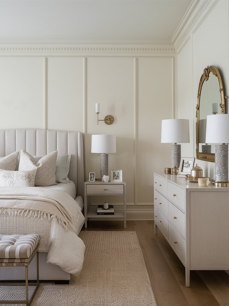
Benjamin Moore Natural Cream (OC-14) is a light and warm cream paint color with a bit of contemporary gray in there as well. The paint color has warm, creamy elements, mainly beige, but it possesses a decent dose of gray that puts it in the greige category.
This means the color is ideal for modern interiors since it combines the cozy elements of warm neutrals, beiges, and creams while having a sophisticated gray look.
Natural Cream has an LRV of 64.78, making it a safe choice for wall colors. Colors in the 60s LRV range are perfect in that they aren’t too light that you won’t notice them or too dark that they’ll bring a gloomy mood.
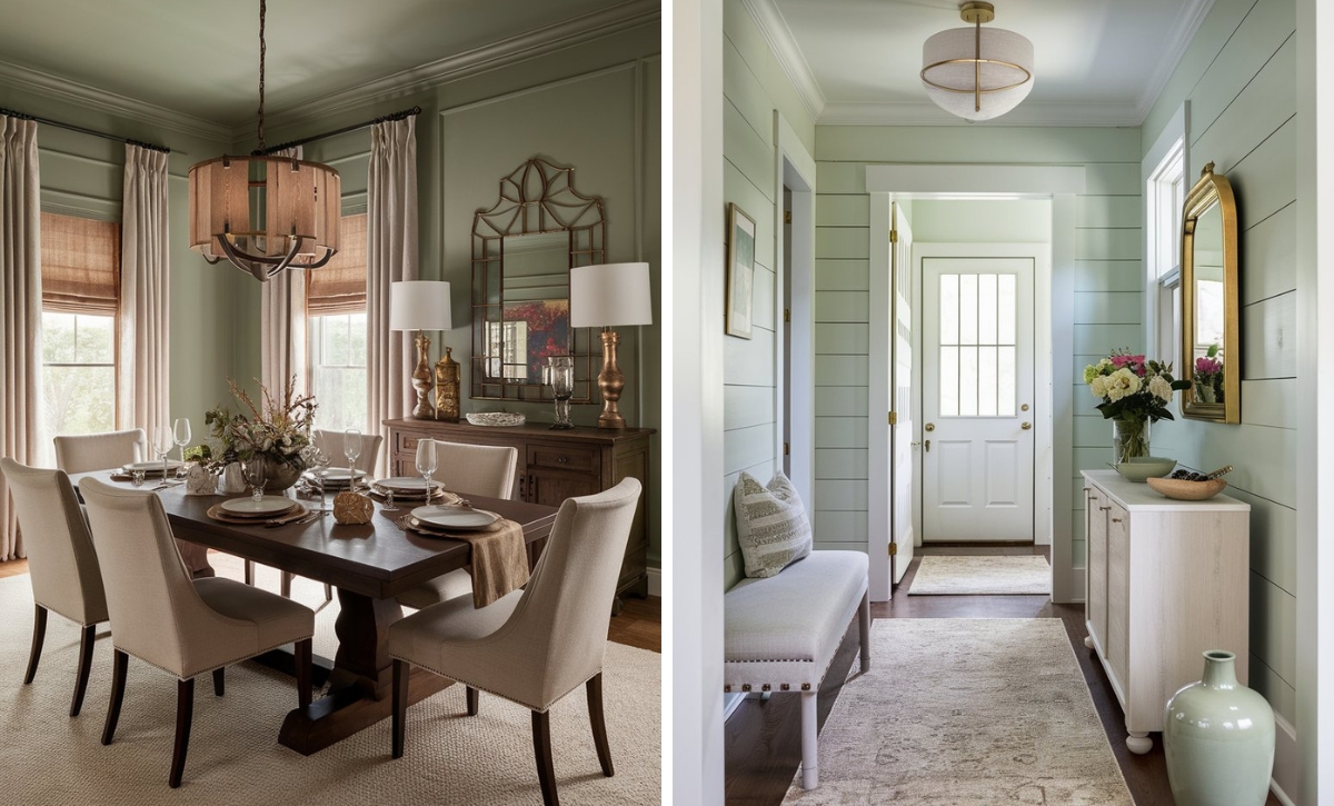
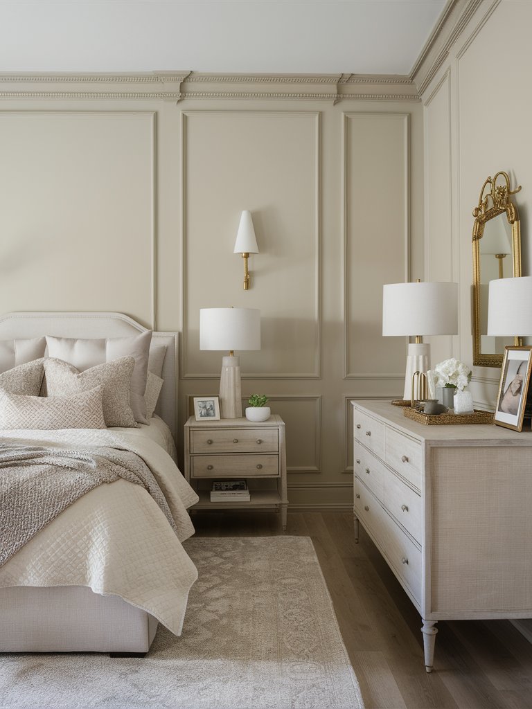
The above bedroom pairs gray bedding and furniture with Natural Cream on the walls to create a cozy, cohesive look. The gray area rug and wooden floor help ground the palette, while white accents provide a subtle contrast.
BM Natural Cream’s undertones lean more towards the yellow side of warmth. Depending on your lighting, the paint color can also exhibit a hint of green.
Natural Cream will pair really well with taupe furniture and fabrics.
Natural Cream will look like a cool tan-beige when used in a south-facing room. If used in a north-facing room or any room that doesn’t receive a lot of natural light, the gray undertones will be more prominent and make the color a lot darker—it’ll look like a cool gray-beige.
3. Behr
Behr Spun Cotton
Behr Spun Cotton(YL-W9) is a warm white paint color, but thanks to its lovely undertones, it appears creamy, which you’ll notice when compared to a stark white background. It’s a favorite among designers and one of Behr’s top colors.
Spun Cotton has an LRV of 89, so it’s right on the edge of soft white but doesn’t necessarily cross over to the bright white spectrum. It’s a nice, bright color for small spaces and works well with other bright colors.
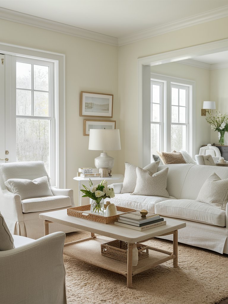
The true white on this living room’s trim is a perfect example of how to pull off a look with Spun Cotton on your walls.
Behr Spun Cotton has a relative amount of yellow undertones, lending it warmth and a creamy feel. It’s a very versatile paint color that pairs well with numerous colors without overwhelming your space.
Spun Cotton is light enough to be used as a trim color paired with other warm or lighter white paint colors—it’ll still offer a subtle contrast. However, it might be too “yellow” for some people’s liking, so we always recommend testing the paint color first to see how it’ll look in your space.
It’s also an excellent option for cabinets, furniture, and walls. If your house has wood siding on the exterior, you can use Spun Cotton to give it a fresh, old-world look.
Behr Cottage White
Behr Cottage White (13) is a creamy, soft paint color with a hint of yellow, which casts a warm glow over the space.
Cottage White has an LRV of 82, so it’s a white with a warm undertone. It’s an excellent paint color for walls, furniture, and exteriors. It’s also an excellent paint color for a bedroom, where its soft undertones bring out the beauty of classic white linens.
Behr Cottage White on this living room’s shiplap walls help evoke a subtle warmth that makes the room airy, but still cozy. The good thing about creams is that when used on walls, you can use a brighter or darker cream color on the trim for a contrasting, yet cohesive look, as evident in the above idea.
Behr Original White
Behr Original White (N290-1) is a relatively warm white paint color with a pale tan hue and a somewhat pink undertone mixed in with yellow, which gives it a soft, peachy look.
Original White has an LRV of 79, meaning it reflects a good amount of light. However, there are no cool tones, so keep that in mind—it’ll work best with warm colors with yellow and red undertones. The warm and cool neutrals in the above bedroom perfectly depict Original White versatility with color palettes.
Behr Original White can be used on walls, kitchen cabinets, and trim, providing a clean and relatively bright foundation with added warmth in the used spaces. It also goes well with various designs, including Scandinavian, farmhouse, and coastal.
4. Farrow and Ball
Farrow and Ball Cream
Farrow & Ball Cream (No.67) is a paint color highly connected to the company’s history. It’s meant to replicate the same sort of colors you might have seen being used centuries ago.
While some might say it’s the most dated color you could possibly go for, Cream’s purity and simplicity make it stand out as a warm cream paint color.
Cream has an LRV of about 71 and no black pigment inside. This is one of the main reasons the paint color is able to maintain its rich, creamy nature. Its yellow undertone evokes a welcoming and cozy atmosphere without being overly vibrant, offering a smooth finish.
FB Cream is an excellent wall color for living rooms, bathrooms, and even the kitchen. Pair it with deep muted colors such as Farrow & Ball Hague Blue (30) for a timeless and aesthetically pleasing space you’ll never get bored of.
Farrow and Ball Double Cream
Just from its name, you can tell that this color is related to the one we discussed previously. Farrow & Ball Double Cream (No. 9907) is a paint color that’s part of the Farrow & Ball Archive Collection and has a warmer base than FB Cream.
FB Double Cream has an LRV of about 59, so it’s right on the edge of mid-tone paint colors. It has a slight brown-beige undertone that tones it down, but not too much that it’s overly dark. The yellow undertones help keep the paint color light and lend it the warmth commonly associated with most cream paint colors.
Double Cream works exceptionally well in kitchens and living spaces, but you can also use it in the bathroom for a cozy, airy feel. You can also use the paint color in your home office for a light paint color that isn’t too ‘invigorating.’ It also looks fantastic with warm whites or lighter neutrals for trim and ceilings.
For a statement-looking space, consider using Double Cream on your walls, trim, and ceiling as well, as depicted in the above living room. This will create a super clean, cohesive look that doesn’t break the visual flow of the design.
FB Double Cream particularly excels in north-facing rooms because the paint color can balance out the cool, natural light. Consider traditional or classic décor styles for a sophisticated and elegant look.
Farrow and Ball School House White
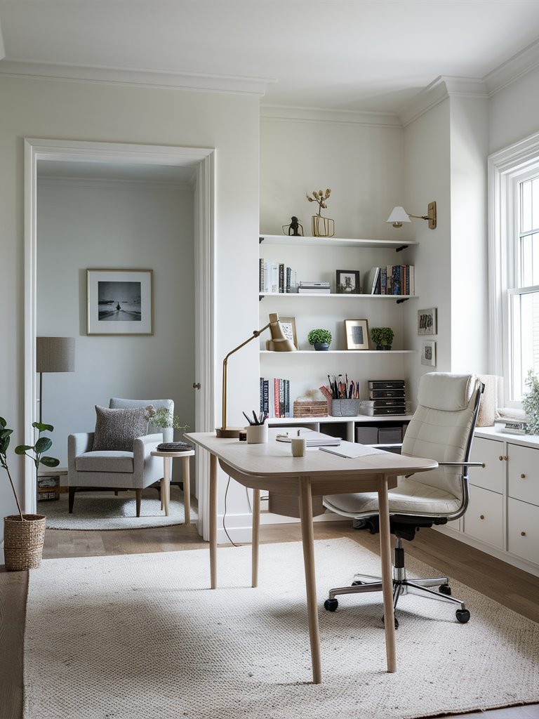
Farrow & Ball School House White (No.291) isn’t the ordinary stark and sterile white that Farrow & Ball usually produces. It’s a paint color that’s fairly soft but not too overpowering, and it gives you a timeless, warm white kind of look.
FB School House White has an LRV of about 72, which places it in the light color category, but the presence of a slight brown-red undertone gives it a noticeable coloration and depth. It also has a touch of yellow—as do all creams—but not a ton of it coming through.
School House White will look clean as a trim color no matter which color you end up with, contrasting particularly nicely with much brighter whites. The paint color could also work as a wall color if you’re going for a modern color scheme.
FB School House White can be applied in various areas, such as living rooms, bedrooms, bathrooms, and powder rooms. When combined with natural elements such as wood and rattan (like in the above home office), it establishes a gentle, neutral base that invokes a soothing ambiance.
What Color Compliments Warm Cream Paint Colors?
- Rich Brown
- Soft Blue
- Olive Green
- Muted Coral
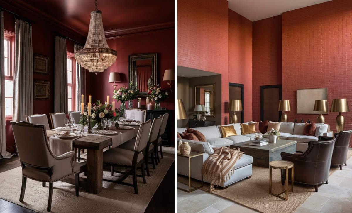
Rich Brown
Rich brown is a deep, earthy color that complements the warm undertones of cream. This combination creates a cozy and inviting atmosphere with a touch of sophistication.
Incorporate rich brown through furniture, accent pieces, or wooden details to add warmth and a classic feel to a warm cream space.
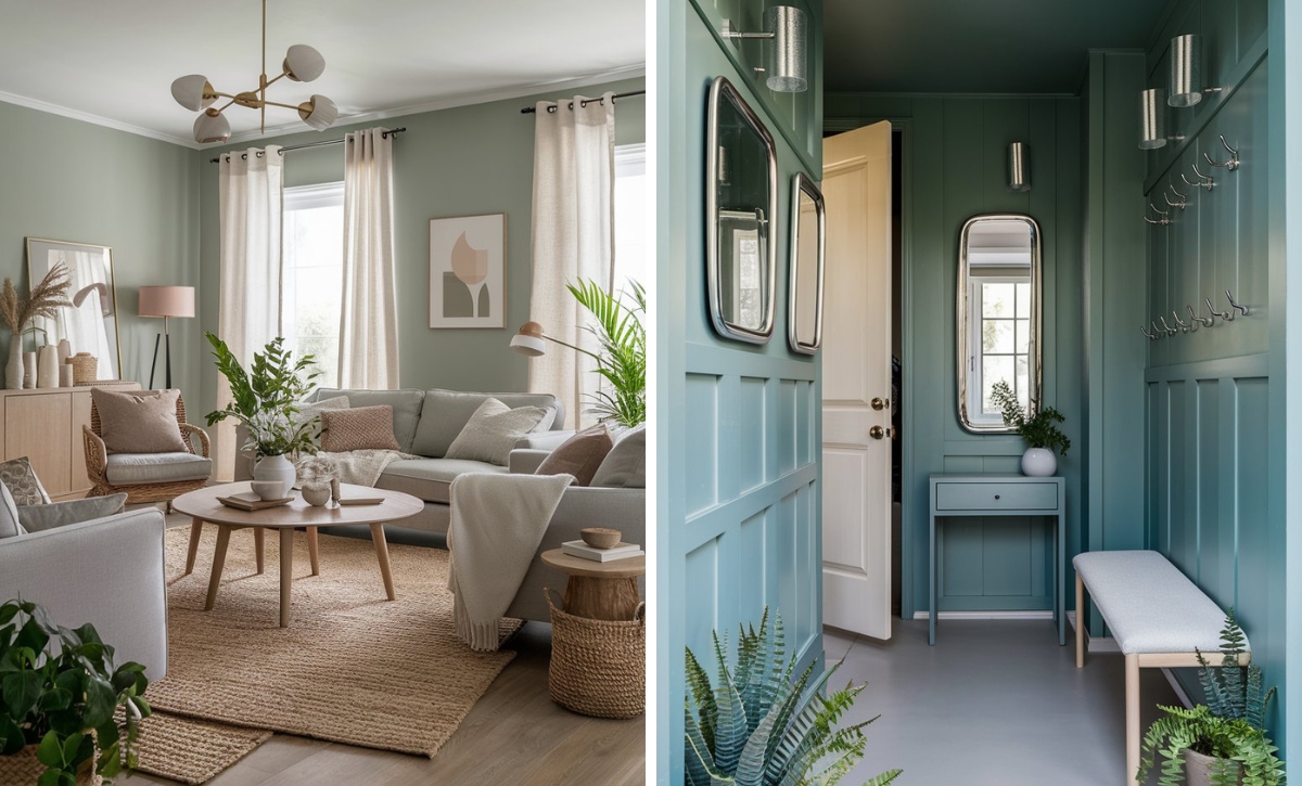
Soft Blue
Soft blue is a serene and calming color that pairs beautifully with warm cream. This combination brings a sense of tranquility and freshness, ideal for creating a relaxed and peaceful environment.
Use soft blue in textiles, such as throw pillows, rugs, or curtains, to introduce a soothing touch and balance the warmth of cream.
Olive Green
Olive green is a muted, natural shade that adds an earthy and organic touch to warm cream. This pairing creates a harmonious and grounded look, perfect for adding a touch of nature to your space.
Consider using olive green in accessories like cushions, throws, or plants to introduce a refreshing and balanced element to a warm cream room.
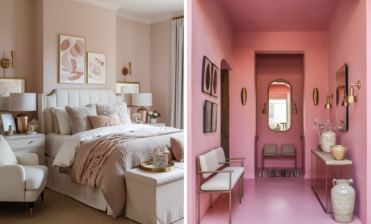
Muted Coral
Muted coral is a soft, warm pink-orange that adds a gentle pop of color while complementing the creamy base. This combination creates a lively yet understated look that feels both inviting and stylish.
Incorporate muted coral through artwork, decorative accessories, or upholstery to add a hint of vibrancy and warmth to a cream-colored space.

Color Disclaimer
Please note that all paint colors displayed on this page are for illustrative purposes only. Due to variations in screen settings, lighting, and other factors, the colors you see on your screen may differ from the actual paint colors. We recommend viewing a physical color sample or swatch for the most accurate representation. Some images might be generated by AI to represent paint colors in different interiors