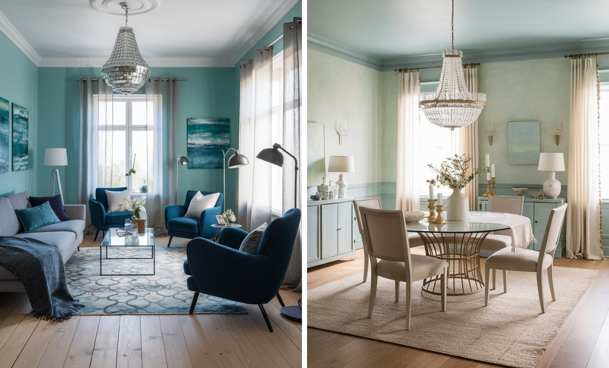
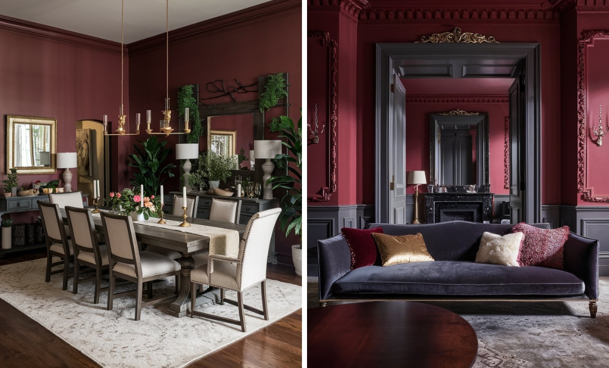
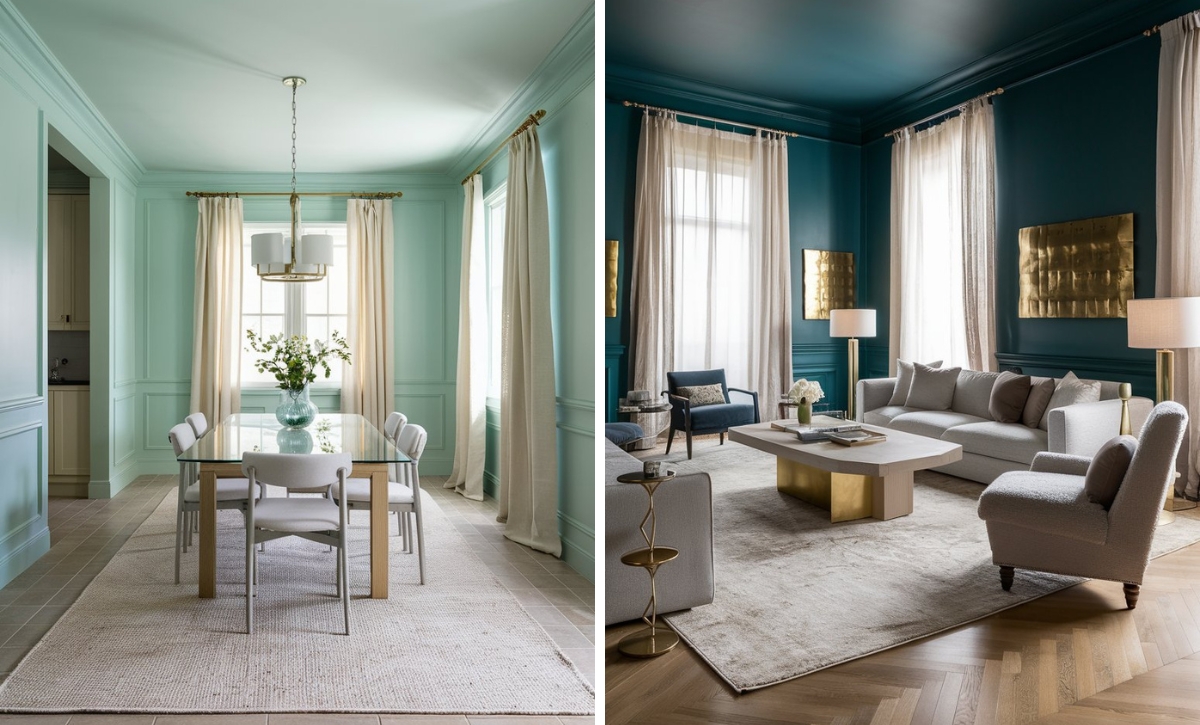
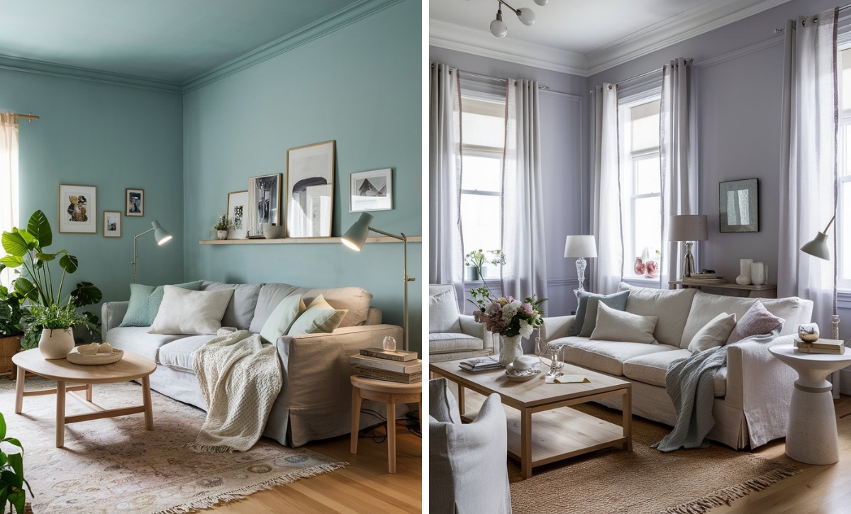
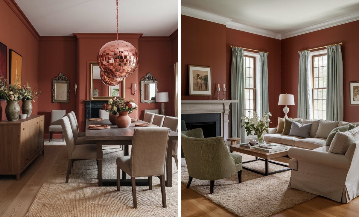
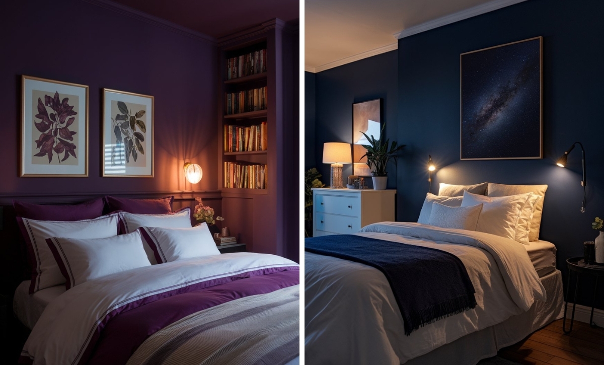
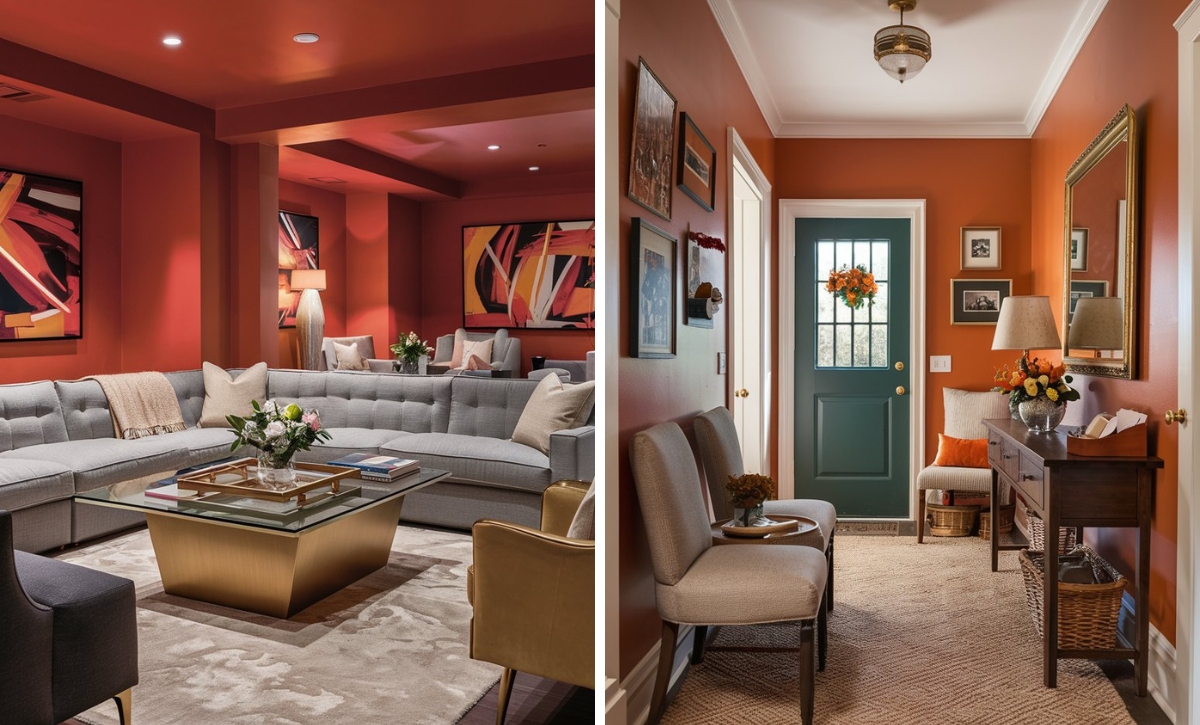
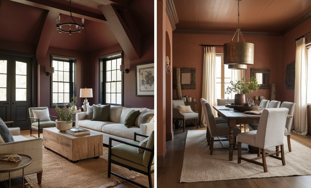
When it comes to neutrals, taupe is one of our favorites. It’s a color that strikes a balance between two neutral hues, i.e., gray and brown, creating an exciting tone with a spectrum of undertones that can be used in various settings.
Many interior designers prefer this color since it provides the ideal backdrop that can work with warm woods, metallic accents, and bright hues.
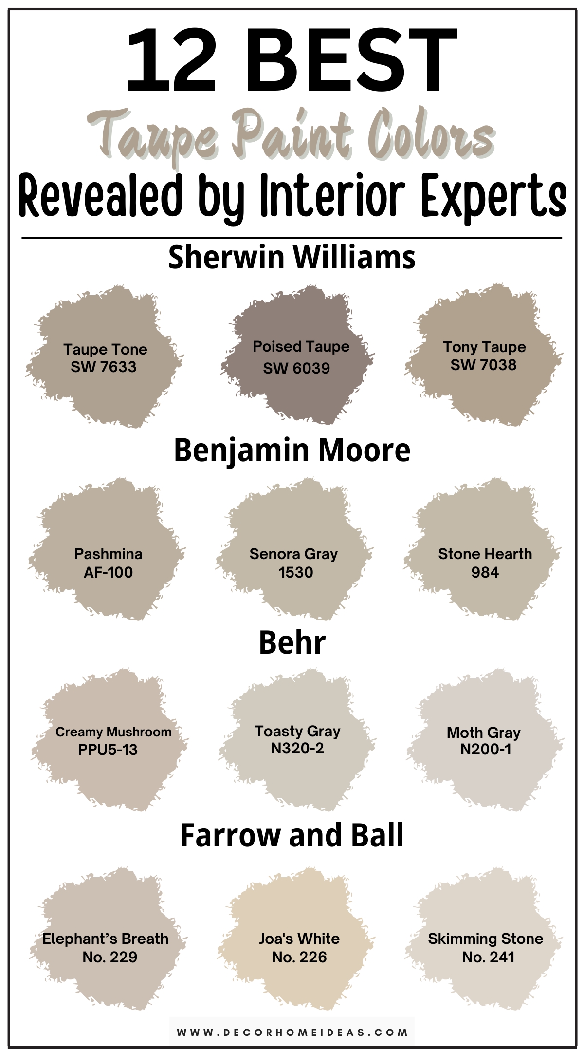
Since taupe has a range of undertones, each hue in the color has its own merits; some work best based on the light exposure in the room (sunnier or darker). To help you understand the different hues of this fantastic color, we have prepared the 12 best taupe paint colors.
Take a look!
1. Sherwin Williams
Sherwin Williams Taupe Tone
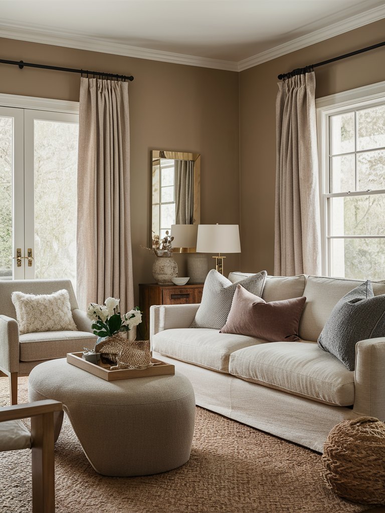
Sherwin Williams Taupe Tone (7633) is a combination of vibrant gray and pink beige. With an LRV of 36, it’s one of the classic taupe colors that’ll combine with neutral, warm, and even cool tones.
Taupe tone has two primary undertones, violet and blue.
Depending on the lighting conditions, the accents in the room, and the side that the room is facing, the color may show different undertones that will become prominent.
In north-facing rooms, the color will read a warm gray without the blue or light undertones becoming too prominent. Taupe Tone will also behave the same in a room with lots of natural light. In south-facing rooms or dimly lit rooms, the color will appear darker.
The pink and violet undertones will also become more prominent. Avoid using green accents or decor in your space if you don’t want Taupe Tone to display pink undertones. The best way to know how this color will look is to experiment with it to know which undertones will be more prominent.
Here, Taupe Tone is used to add an earthy tone to the space. The natural light flowing in the room brings out the color’s warm undertones, creating a perfect complementary contrast for the lighter tones in the space. The natural fibers and wood in the space help extend the room’s earthy theme.
Sherwin Williams Poised Taupe
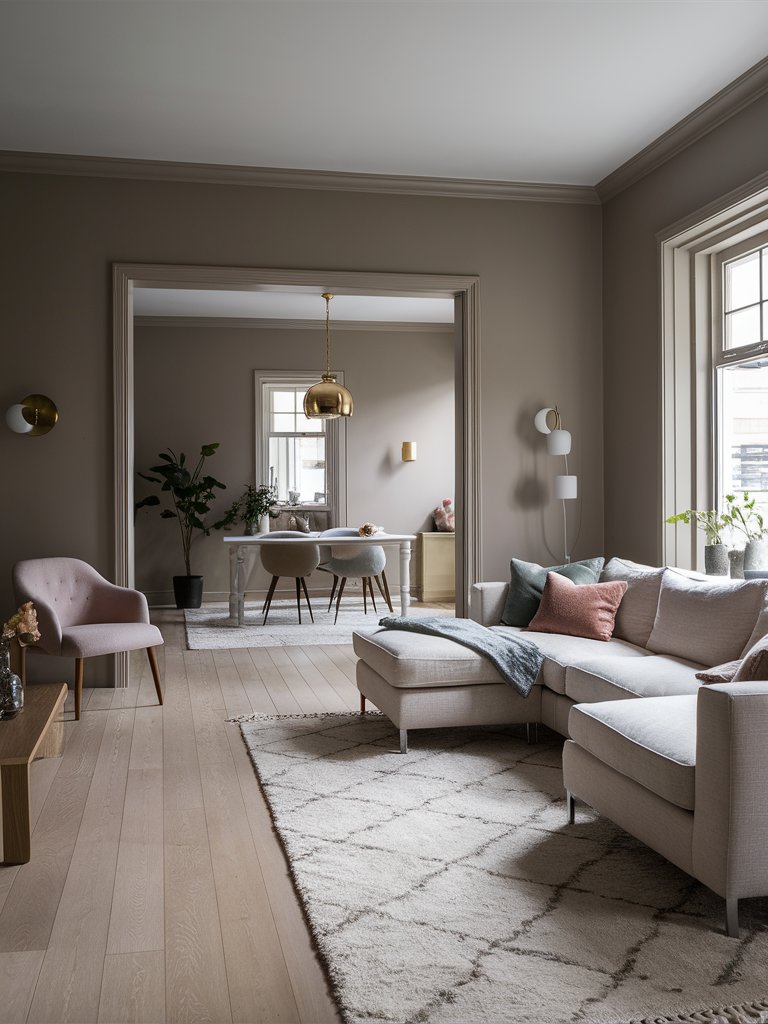
Sherwin Williams Poised Taupe (6039) is a versatile, timeless shade that blends gray and brown tones to balance warm and cool undertones. This makes it a perfect neutral backdrop for any room.
With an LRV of 22, Poised Taupe has a medium darkness that perfectly balances light and dark. It reflects enough light to keep rooms open and airy yet deep enough to provide a sense of intimacy and comfort.
One of the most appealing aspects of Poised Taupe is how it adapts to different lighting conditions. It tends to lean warm in north-facing rooms, bringing out its brown undertones and creating a cozy, inviting atmosphere.
In southern-facing light, the gray tones become more pronounced, lending a sleek, contemporary feel to the space. This chameleon-like quality makes Poised Taupe versatile for various settings, from living rooms to bedrooms.
Poised Taupe’s subtle complexity adds depth and sophistication to spaces without overwhelming them. It offers a serene environment that complements a variety of styles, be they modern, rustic, or classic.
In this space, Poised Taupe creates a calm, airy feel, allowing enough light to bounce off the walls without making the room overly bright or dull. The color combines well with the neutral-colored furniture, metallic accents, and earthy tones to create a cohesive, visually appealing living room.
Sherwin Williams Tony Taupe
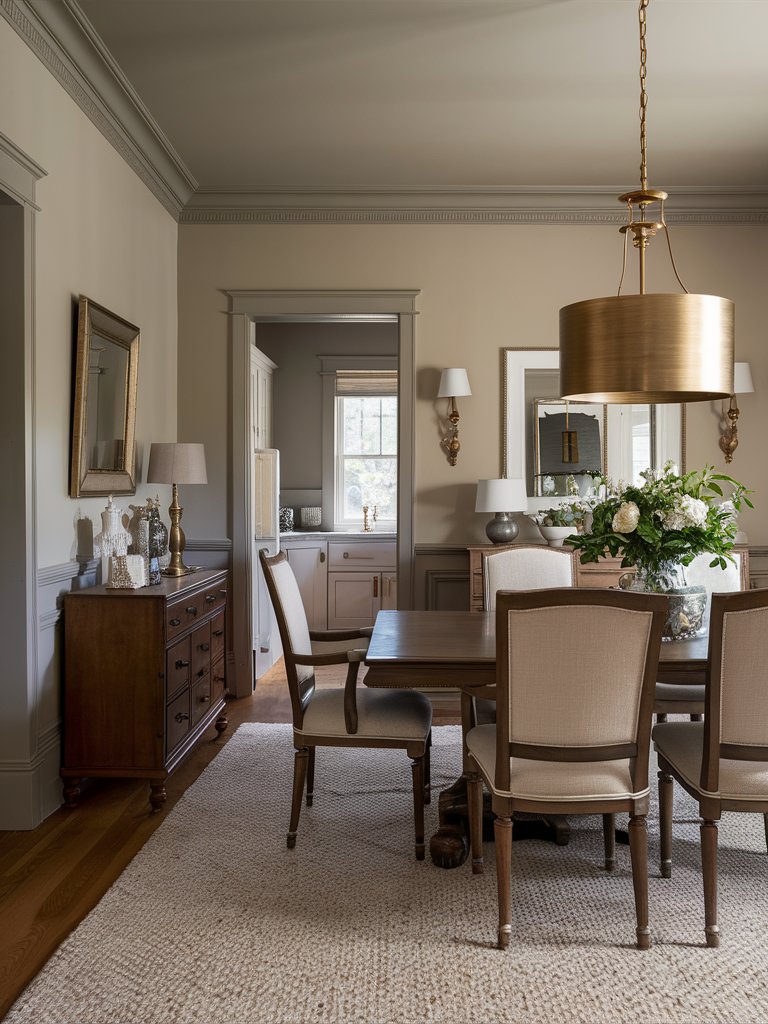
One of the most popular upcoming taupe tones, Sherwin Williams Tony Taupe (7038), exhibits a smooth, warm texture that may be perceived as drawing in some cases. It has a dark and bold character that will alter its looks based on how it’s used.
With an LRV of 37, this color falls on the darker side of the spectrum.
When used in an enclosed space with minimal light, this shade of taupe can make your space feel enclosed, weighted down, and bold. Be cautious when using this color in small spaces since its ability to make spaces feel enclosed may make your room look smaller than it actually is.
Tony Taupe works best in spaces with plenty of natural light, making a good complementary color for wood and metallic accents.
Tony Taupe creates a tranquil, calming atmosphere in this living room design. The metallic accents in the room add a bit of character to the space. With brown woody tones and bright lighter tones, the space strikes a delicate balance, creating an open, inviting space.
2. Benjamin Moore
Benjamin Moore Pashmina
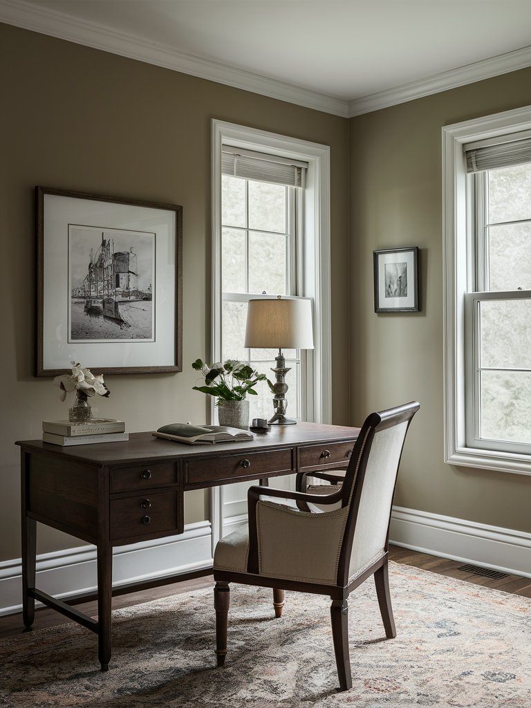
Benjamin Moore Pashmina (AF-100) is a deep, greige-like color that has recently grown in popularity in interior design due to its ability to create naturally toned spaces. Since this color combines gray and beige tones, it can work in a warm and cool setting.
How the color reads in your space depends on the accents you choose to combine it with. The window placement and direction of the light can significantly affect how warm or cool the paint looks.
With an LRV of 44.2, Pashmina is a mid-tone paint color; hence, how the color reads in a room largely depends on external factors.
Pashmina will have more depth in a room with limited natural light, and its green undertones will be more prominent. In a room with plenty of natural light, the color will brighten and not feel as heavy.
Pashmina has been used in this home office to create a chilled and relaxed space. Combining this color with lighter trim colors allows the color to create a calming effect.
Notice how the light reflected in the room shows the two-toned nature of the color; on the side with plenty of natural light, the color looks light, while on the opposite, it reads much darker.
Benjamin Moore Senora Gray
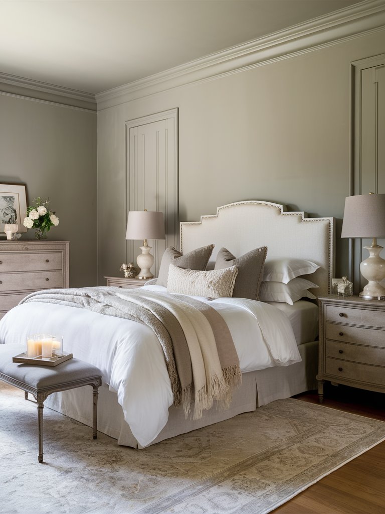
Benjamin Moore Senora Gray (1530) is an elegant, versatile shade within the greige family.
With an LRV of 48.24, this hue is perfect for spaces where you want to create a sophisticated yet inviting atmosphere. Its mid-range LRV allows it to reflect a moderate amount of light, making it suitable for rooms with ample natural light or more intimate, cozy settings.
Senora Gray adapts differently to different spaces. The gray undertones become more pronounced in bright spaces, offering a cool, modern feel. While in dimmer lighting, its warmer, beige notes come to life, lending a softer, more comforting vibe.
This color’s dynamic quality makes it ideal for use in bedrooms, living rooms, and even modern open-concept spaces.
Senora Gray combines well with other earthy tones in this bedroom to create a cozy, well-rounded one. The uniform application of this color creates a perfect backdrop for the lighter and earthy tones to dominate the room. The combination of light and dark tones helps create a cozy, inviting space.
Benjamin Moore Stone Hearth
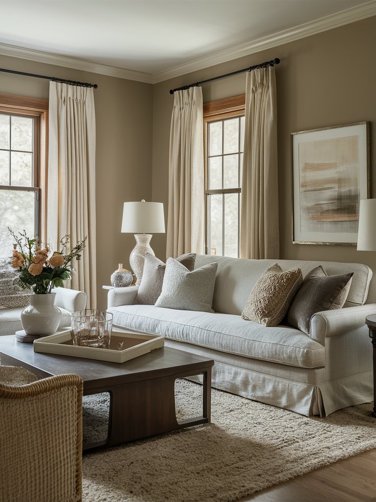
For those looking for a color warmer than gray but cooler than beige, Benjamin Moore Stone Hearth (984) may be the taupe for you.
With an LRV of 48.45, this is one of the best colors for your interiors since it can instantly elevate your room from average to elegant if you know what to pair it with.
This color has light pink undertones that may either become prominent or not, depending on what you pair it with. We recommend that you compare this color to the items and furnishings in your home before painting to know exactly how the paint will look.
When matched with brighter colors like greens and bright blues, pink undertones become more prominent, while darker-toned colors mask the undertones.
Stone Hearth is used to create a warm, cozy, welcoming space in this living room design. The room’s light taupe and wood accents help bring out the warmth in this hue. Light-toned furniture and the glass and metallic accents in the room help create contrast without the space being too stark, creating a uniform, balanced look.
3. Behr
Behr Creamy Mushroom
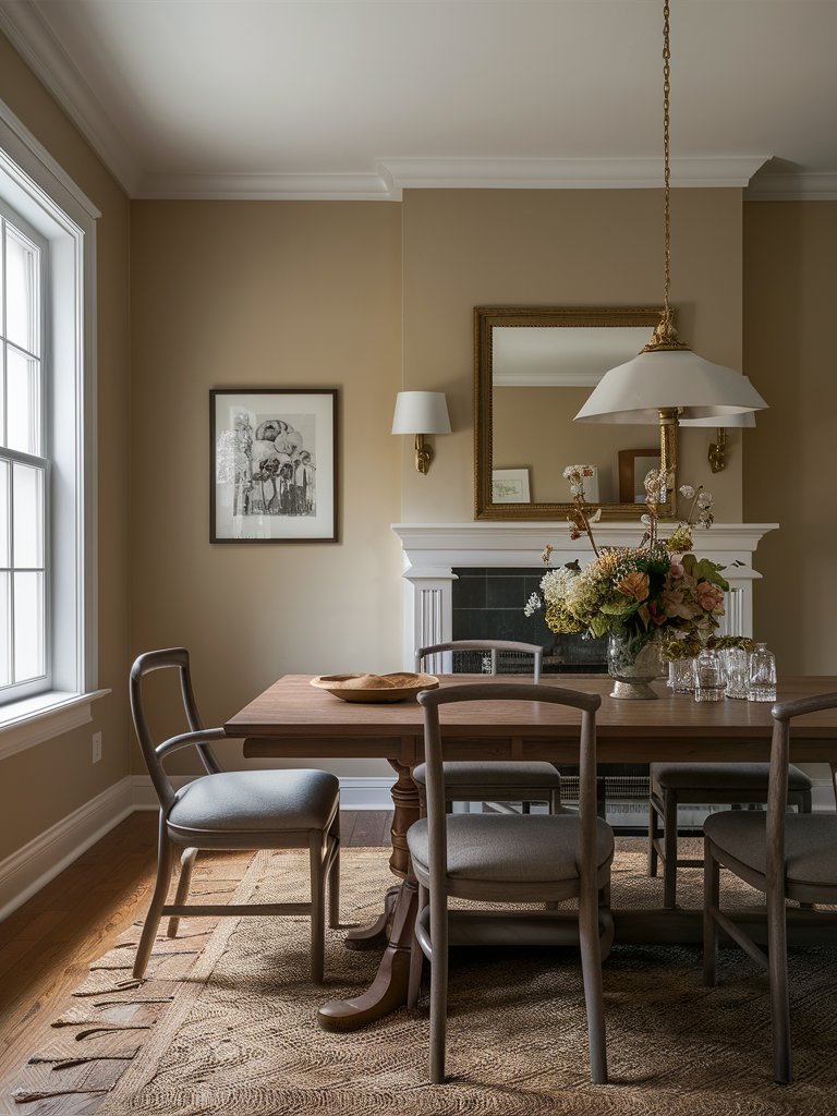
Behr Creamy Mushroom (PPU5-13) is one of the paint colors that is different from beiges, bronze, and taupes. What really sets the color apart is its undertones. It brings a sense of depth and character to a space by adding a soft, cozy, medium-dark look.
With an LRV of 52, Creamy Mushroom is a neutral tone that borders on the reflective side; hence, it’ll reflect a generous amount of light in a space.
When placed around brighter colors, such as white, the paint color appears bolder. This color can be a great statement color in medium and larger rooms, making the space feel expansive and relaxed.
If you live in a colder region, Behr Creamy Mushroom can be a great color to bring a sense of warmth and coziness to your space.
Here, Creamy Mushroom is used to bring a touch of warmth to this dining room. The color combines well with the wood accents and finishes (such as the floor) to create a well-rounded space. Additionally, the color compliments the metallic accents, which add a touch of character to the room.
Behr Toasty Gray
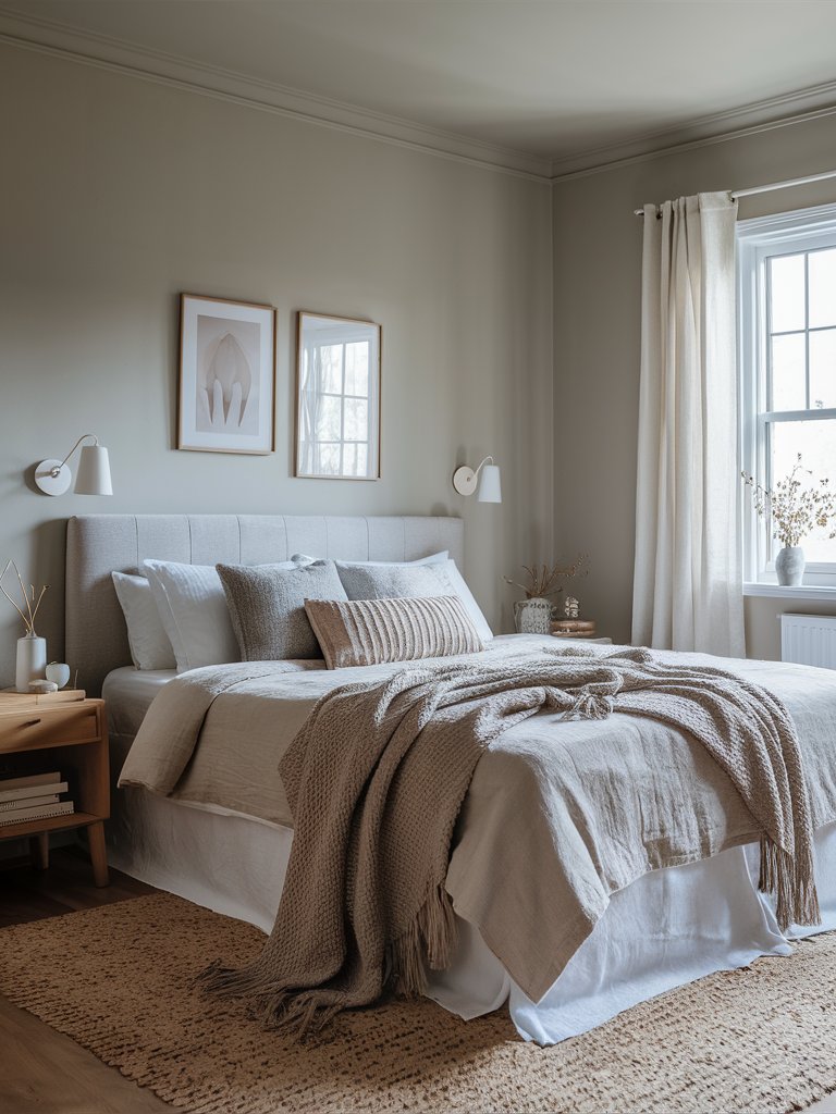
This taupe color is sometimes confused with gray due to its base, which is primarily gray. Behr Toasty Gray (N320-2) has subtle beige undertones, which creates a taupe feeling. Toasty gray is a versatile and timeless color, whether used in traditional, modern, minimalist, or farmhouse-style spaces.
One of the things that makes Toasty Gray a preferred color by many interior designers is its flexibility. You can use this color to define any particular style or palette without worrying whether it will complement your style.
It has an LRV of 61, which makes it one of the most reflective taupes. This slightly reflective ability makes it easy to use in various spaces without the color feeling overwhelming.
Here, Toasty Gray is used to create an inviting, airy bedroom. The earthy tones used for the bedding and other accents help tie the room together. Notice how the color reflects light in the room without being stark—neutral tones like light brown, gray, and white combine to give the space a cozy feel.
Behr Moth Gray
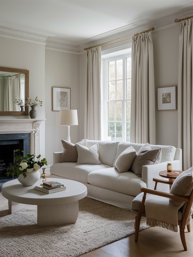
Behr Moth Gray (N200-1) is a refined, understated neutral that balances warmth and coolness harmoniously.
With an LRV of 66, it reflects a good amount of light, making it an excellent option for brightening smaller rooms or enhancing spaces with limited natural light.
What’s particularly impressive about this color is its adaptability. Whether paired with crisp whites for a clean, modern look or rich jewel tones for a more dramatic contrast, Moth Gray is the ideal neutral canvas.
It can anchor a space without dominating it, allowing other elements like textures, fabrics, and furnishings to take center stage. It’s an excellent choice for creating a serene, polished atmosphere without sacrificing character or depth.
Here, Moth Gray is used to create a calm, tranquil space. The color has been paired with light tones to create a clear, semi-modern look.
The use of neutral and earthy tones in the space makes the room airier, giving it a chilled ambiance. This allows even small accents like the houseplants to dominate and contribute to the space’s visual interest.
4. Farrow and Ball
Farrow and Ball Elephant’s Breath
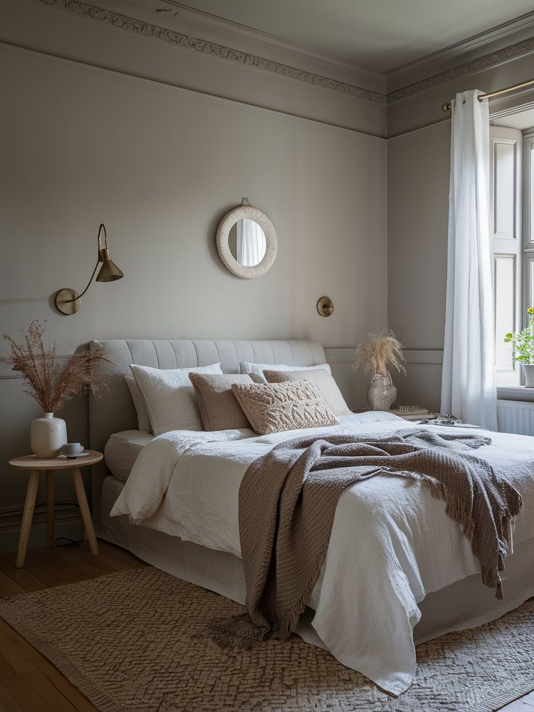
Farrow and Ball Elephant’s Breath (No. 229) is one of the easiest neutral colors for your walls. It has a hint of magenta that makes it far more interesting than other gray, greige, and taupe colors.
This color will combine well with lighter trims and work as a full-wall paint. Its LRV of about 49 means it falls in the middle of the scale, absorbing more light than it reflects yet still maintaining a sophisticated brightness in well-lit spaces.
What really distinguishes Elephant’s Breath is its ability to adapt to different spaces. It leans into its subtle purple undertones in bright, natural light, offering a soft, contemporary feel perfect for modern spaces.
In lower or artificial light, the warmth comes forward, revealing a hint of beige that creates a more comforting, enveloping atmosphere.
In this boho-style bedroom, Elephant’s Breath creates a neutral backdrop, allowing other elements to dominate the room. The space feels well-grounded by matching taupe tones on the bed and other accents. Complimentary brown tones ensure no striking colors will draw attention and interfere with the space’s aesthetics.
Farrow and Ball Joa’s White
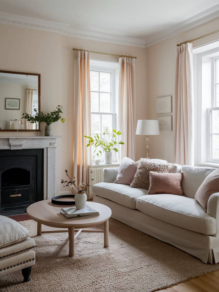
Named after Joa Studholme, a Farrow and Ball color curator, Joa’s White (No. 226) is one of the most unique taupe colors you can use. It has slight black undertones, but what really stands out about this hue is its pink and red undertones.
It looks particularly dashing in rooms with natural materials like wood, leather, and even natural fibers.
Unlike cooler off-whites or stark neutrals, Joa’s White offers a soothing, almost nurturing quality that softens any room it graces. In natural light, it appears as a soft, warm beige, perfect for spaces where you want to create a sense of comfort and relaxation.
In artificial light or darker rooms, its pinkish undertones become more prominent, adding a subtle blush that contributes to the space’s warmth.
This color has created a chic, polished look in this living room. Matching pink-like curtains helps ground the space and makes the color’s pink undertones more prominent. Notice how the color compliments the natural materials in the room, such as the natural fiber rug and the wooden coffee table.
Farrow and Ball Skimming Stone
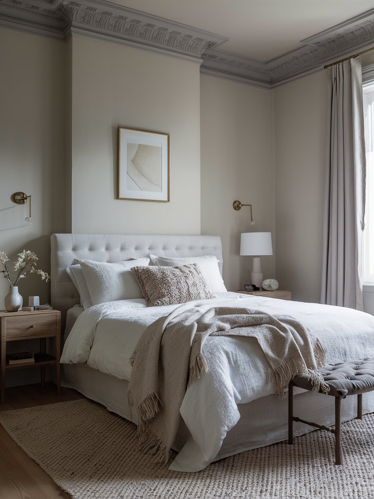
Farrow and Ball Skimming Stone (No. 241) is one of the exquisitely soft taupes with warm undertones that offer a serene backdrop that can work in various settings.
With an LRV of 63, it reflects a good amount of light, making it an excellent choice for bright, open spaces and rooms where you want to maximize natural light.
Skimming Stone is incredibly versatile, pairing beautifully with cooler tones like Ammonite or Cornforth White for a minimalist look and deeper shades like Elephant’s Breath or Purbeck Stone to create a more grounded, layered effect.
Here, Skimming Stone creates a simple yet elegant bedroom perfect for relaxing after a tiring day. Since even with natural light bouncing off it, the color is not stark, it creates a cool, calming space perfect for winding down.
What Color Compliments Taupe Paint Colors?
- Dusty Rose
- Deep Navy
- Warm Ivory
- Olive Green
Dusty Rose
Dusty rose is a soft, muted pink that adds warmth and a touch of romance to taupe. This pairing creates a cozy and inviting atmosphere, making it perfect for bedrooms or living areas.
Incorporate dusty rose through textiles, such as throw pillows, curtains, or rugs, to introduce a subtle pop of color that complements the neutral tones of taupe.
Deep Navy
Deep navy is a rich, bold color that contrasts beautifully with taupe. This combination creates a sophisticated and timeless look, adding depth and elegance to any space.
Use deep navy in furniture, accent walls, or decorative items to enhance the taupe and create a striking, luxurious environment.
Warm Ivory
Warm ivory is a creamy, off-white shade that pairs seamlessly with taupe. This combination creates a soft, cohesive look, adding brightness and warmth to the space without overpowering the taupe.
Use warm ivory in larger elements like trim, ceilings, or furniture to create a light, airy, and elegant environment that enhances the taupe.
Olive Green
Olive green is a natural, earthy shade that pairs beautifully with taupe. This combination creates a serene and balanced atmosphere, adding a touch of nature and tranquility to the space.
Add olive green through plants, textiles, or decorative accessories to introduce an organic element that complements the taupe.
Color Disclaimer
Please note that all paint colors displayed on this page are for illustrative purposes only. Due to variations in screen settings, lighting, and other factors, the colors you see on your screen may differ from the actual paint colors. We recommend viewing a physical color sample or swatch for the most accurate representation. Some images might be generated by AI to represent paint colors in different interiors

