Off-white paint colors come in different shades and can subtly change your home’s look and feel. Some off-whites have warm undertones for a soft, cozy feel, others have cool undertones for a bright and crisp finish, while some stay neutral—there are even ones that mix both cool and warm undertones.
A paint color’s Light Reflectance Value (LRV) will help you gauge how it might look in your space. LRV represents how much light a paint color reflects on a scale of 0 to 100; the higher the LRV, the brighter the paint, and vice versa.
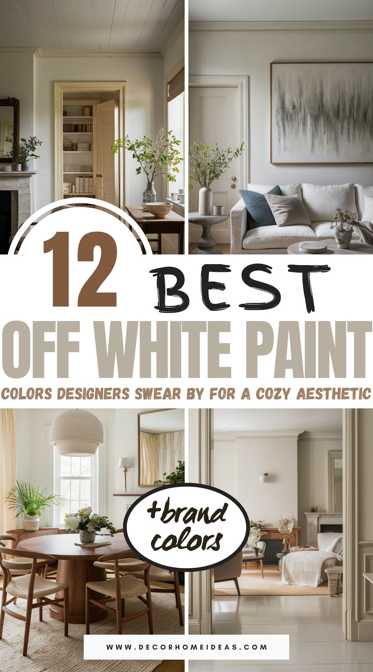
We’ve picked the top 12 off-white paint colors most adored by designers and will do wonders for your next paint project.
Take a look!
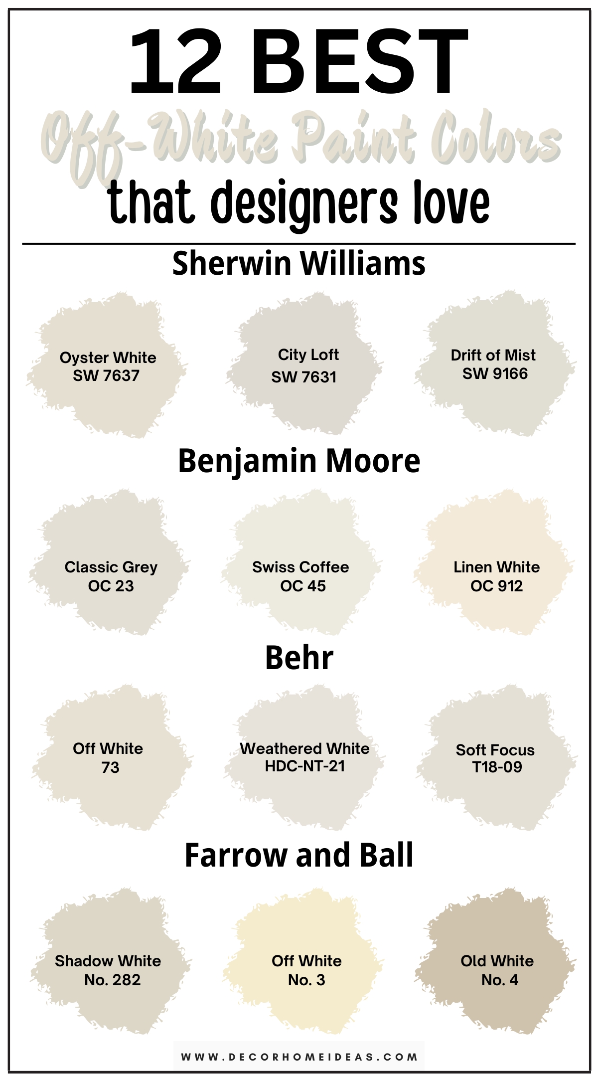
1. Sherwin Williams
Sherwin Williams Oyster White
Sherwin Williams Oyster White (7637) is sort of a light gray color that combines beige and gray to create a really soft, passive greige color. It’s a pretty light color, slightly further from white, and the same can be said for off-white.
The color also seems to have a touch of brown mixed in, but on closer look, its warmth is more yellow-gold rather than red.
Such greige colors—that are more yellow than red—tend to show a slight green undertone, but that depends on personal lighting, flooring, furniture, and other décor in the space; all will influence your interpretation of the color.
SW Oyster White has an LRV of 72, and you can witness its lightness when used in larger areas of your home. However, it isn’t the best substitute for, let’s say, a high-reflective white used in places like baseboards.
Still, you can use it on your trim if you want a purposeful greige color; just don’t expect a bright, beautiful white trim.
The fairly versatile color works in rooms with a lot of natural light, with beige undertones manifesting more in south-facing rooms while gray ones in north-facing rooms. The light flooring above is an excellent example of creating a subtle contrast with Oyster White.
If you want a bolder contrast, a neutral like SW Requisite Gray as an accent would be perfect.
Sherwin Williams City Loft
Sherwin Williams City Loft (7631) is a lighter gray color with an LRV of 70, so it’s objectively light. It has a brightness and airiness that’s not common in most grays; they’re usually heavy, grounded, and have a lot of body.
It’s also a more neutral color, so it tends to be more desaturated, muted, and a bit softer, which is good if you want your paint to be more of a blank canvas in the background.
SW City Loft has a touch of taupe undertone that makes it warm-leaning and gives it that beige quality. This gives it an edge that prevents the color from feeling gray while providing lightness that gives it airiness. The paint color also has a green undertone, but it’s very subtle and difficult to notice at first glance.
City Loft is a versatile color used in many design styles, be it traditional, modern, Scandi, coastal, contemporary, transitional, boho, or farmhouse. It’s best used as a primary color since it works with different flooring styles, lighting exposures, bulb types, etc.
If you want a main color with some depth and more of a grounded earthiness while still being in the light color category, City Loft is your color!
Fixed and furnished elements will also affect how this color works in your space. For example, if your home has dark Tuscan countertops, they will clash with this color on the walls; SW City Loft pairs best with light neutrals or clean colors. The paint color excels in south-facing rooms or rooms with plenty of natural light.
NB: It’s not so common, but if you use City Loft in a very bright room, it might become a little washed out since it doesn’t have the depth of a color that’s in the, let’s say, 60s LRV.
More reflective whites are excellent secondary colors when City Loft is your primary color. The above example shows the subtle contrast created with a clean white on the trim and City Loft on the walls. You can see those taupe undertones being brought out by the browns on the art frame, foliage, flooring, and accents.
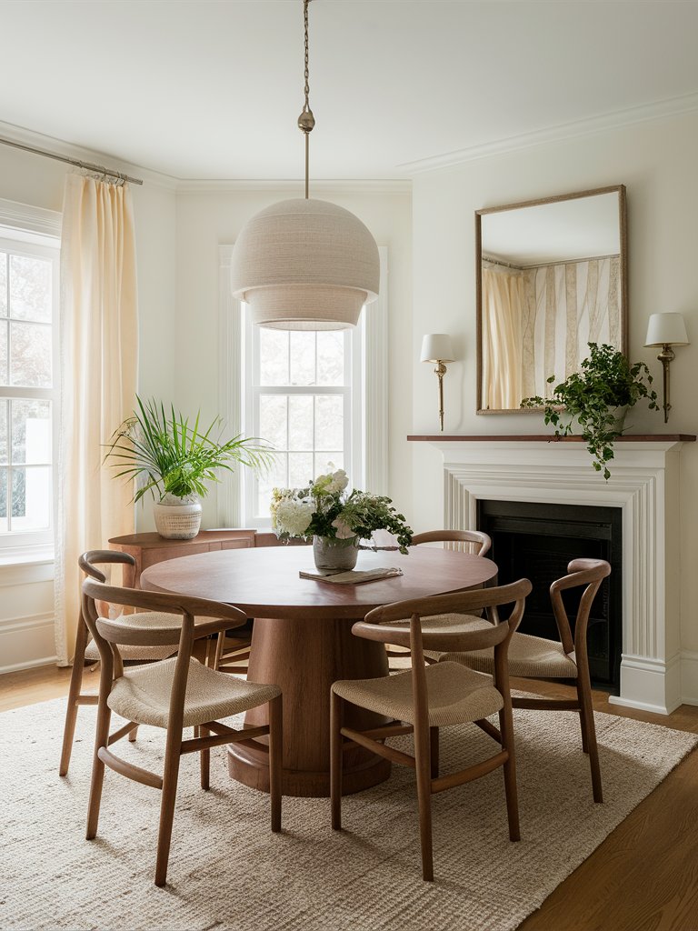
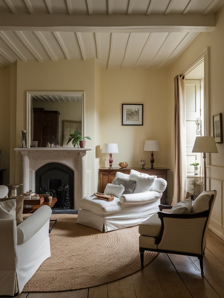
Sherwin Williams Drift of Mist
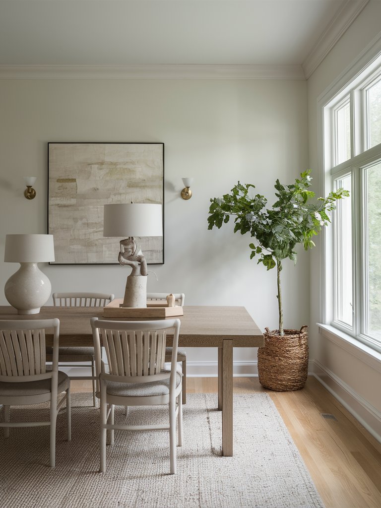
Sherwin Williams Drift of Mist (9166) is a cozy gray-beige color that sometimes has a slight tint of green undertone coming through. The color has been featured in several color collections, including The Top 50 Colors by Sherwin Williams.
Drift of Mist is a warm color with a cool undertone, a dynamic that makes it an extremely versatile color that suits traditional, transitional, coastal, or even modern farmhouse designs.
SW Drift of Mist has an LRV of 69, making it pretty easy to use on the walls since it’s difficult for it to feel that dark; typically, paint colors that are 60+ on the LRV scale are more usable design-wise.
It can also be classified as a light, warm gray, or a darker off-white, and it won’t disappoint you whether you have a cool or warm color palette.
If you use Drift of Mist in a north-facing room or a room that doesn’t receive much natural light, it might turn out as a gray-blue.
On the other hand, in south-facing rooms or rooms with plenty of natural light, it’ll appear as a beautiful greige, and it’s bound to showcase a tinge of green. The plant in this room helps bring out that green undertone, while the wicker planter complements the beige.
SW Drift of Mist is your go-to color if you want a soft, subtle primary color for your home’s hallways, living areas, bathrooms—basically all the common walls. It’s an excellent base (can be used along with whites) or neutral, but it doesn’t work well as an accent since it’s lighter-toned and won’t make much of a big statement in your space.
2. Benjamin Moore
Benjamin Moore Classic Grey
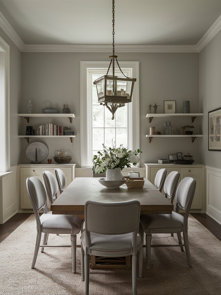
Benjamin Moore Classic Gray (OC-23) is part of Benjamin Moore’s Off White Collection, and it’s an excellent neutral to complement your contemporary décor. Classic Gray has an LRV of 74, and the color has a little bit of beige that keeps it warm and a light brown that prevents it from feeling overly creamy.
The brown also makes it feel like an extremely light version of taupe, and can sometimes give the color the slightest of rosy undertones. However, since it’s so light and delicate, the overall look and feel will turn out pretty subtle.
BM Classic Gray works with numerous different interiors and does a great job of complementing taupes, grays, and slightly warmer floors. It particularly works well with dark wood floors such as amber, oak, maple, or any hardwood flooring.
If you have a floor rug in your living room with earthy undertones like reds, yellows, oranges, chances are Classic Gray isn’t going to be a good match for it. Conversely, if your living room floor rug has white, earthy undertones like off-white or cool undertones like gray or green, it will look really nice with this color. The beige floor rug used in this room is an excellent example.
Be careful with carpets since they have undertones. Dirty and muted carpets will look old and outdated against Classic Gray.
Benjamin Moore Swiss Coffee
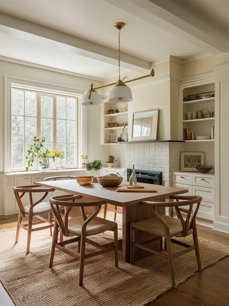
Benjamin Moore Swiss Coffee (OC-45) is one of Benjamin Moore’s best-selling colors and has been very popular for quite some time. It’s a beautiful, light, warm off-white with yellow and gray undertones, with the undertones often leaning yellow.
The color has a lovely sense of balance as an off-white—it doesn’t have too much of a bright feel that can be obnoxious and doesn’t have too much colorant that might take it in a direction you didn’t expect.
Swiss Coffee has an LRV of 82 and the right amount of creamy, yellow-based warmth that feels soft and elegant, making it pleasing to the eye. If you want an off-white that’s soft around the edges and pairs nicely with other warm aspects of your décor while giving your space a holistic feel, this color is definitely for you.
This welcoming white fits perfectly with farmhouse color schemes or aesthetics and can be used all over the house as a primary color to make living areas feel expansive and hallways look immense. The wood tones in the above room look really nice against the off-white. Pair it with light white curtains in your bedroom for a relaxed, serene vibe.
If you want a subtle contrast between your walls and trim, a color like Benjamin Moore Simply White or Chantilly Lace will do the job. For a more pronounced contrast, try a color like Benjamin Moore Tapestry Beige; it’s actually more of a complementary color to Swiss Coffee.
NB: Our recommended design trick is to use BM Swiss Coffee on the walls and trim and even extend it to the ceiling. This creates a seamless, cohesive look that’s more subtle and will be a perfect fit for anyone going for a ‘less is more’ vibe.
One common challenge most homeowners face with Swiss Coffee is having the proper natural or artificial lighting and fixed elements. If your room doesn’t receive much light (natural or artificial), don’t be surprised when this color turns out a little bit more yellow than you expected and even dingy.
Benjamin Moore Linen White
Benjamin Moore Linen White (912) is a warmer off-white with a slightly creamy feel. It’s part of the Benjamin Moore Classics Color Collection. Linen White has an LRV of 81 and is a beautiful choice if you want a white paint color that doesn’t feel too lifeless or plain.
The color does have a noticeable coloration, though, so it’s not necessarily a plain pure white, nor is it a mega bright white; if you were to use it on the trim or ceiling, you probably would notice the creamy aspect of the color, such as in this example.
Being more of an off-white rather than a pure white still has its advantages. One is that the color is a little friendlier to use on walls and other large surfaces.
It’s also a good color choice for cabinets or doors. If you have warm floors and want to lean into them, or much cooler or neutral floors and want to brighten things with the walls, Linen White is a pretty solid choice.
BM Linen White can be used in various design styles, from modern to farmhouse and anything in between. It’s also an excellent contrast for dark floors.
3. Behr
Behr Off White
Behr Off-White (73) has a very intriguing name since it essentially describes what the color is. The color has a bit of gray and a bit of beige in it, and an LRV of 76
It’s an excellent warm color for bringing a modern or contemporary feeling to your space since it has that touch of gray that tones it down.
If you want something more transitional or want to lean into more of those cooler colors without necessarily going for a blue or steely gray, Behr Off-White is your go-to paint color!
Behr Weathered White
Behr Weathered White (HDC-NT-21) has slightly gray undertones that provide a cozy, lived-in vibe. It has an LRV of 77 and is the perfect color if you want to create a comfy and inviting atmosphere in your home.
The beige in the color warms it up, making it especially suitable for living spaces and bedrooms where relaxation is essential. The subtle hints of gray also make it an excellent backdrop color for modern and traditional decor styles.
Weathered White has a more airy, contemporary feel that would suit any Scandi enthusiast. The above example says it all!
Behr Soft Focus
Behr Soft Focus (T18-09) is a light neutral with an elegant and delicate feel. Although it has previously been classified as a gray, it’s right on the very edge between gray and beige; when you look at it in person, you’ll notice a creaminess to it that comes across as very inviting.
Soft Focus has an LRV of 75, which pretty much classifies it as an off-white. It’s a warmer color, but its warmth isn’t too much that it’ll clash with cooler tones. Its tinge of beige adds comfort to the space it’s used in and nicely complements any similar tones in your furniture.
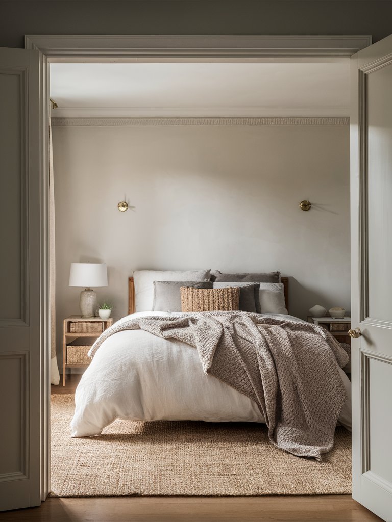
The color is light enough that it could feel washed out a bit in highly bright areas and will seem pretty muted against true white wood and trim work. If you love lighter browns, taupes, sandy, or creamy color palettes, Behr Soft Focus should suit you just fine.
Being a greige, Soft Focus will be impacted by other colors around it. If you use more grays in your space, you’ll notice more beige in the color. On the contrary, if you want your walls to exhibit a bit more gray, your accents should have warmer pops of color. This bedroom uses a bit of both to get the best out of the undertones.
Behr Soft Focus is a great main color that you can use throughout your house for a clean slate look. It works best in cozier rooms like family rooms or bedrooms. It’s also an excellent paint color choice for your kitchen cabinets, giving off a pristine elegance because of its light, velvety look; the warmth keeps it inviting, and the gray aspect makes your cabinets easier to maintain!
4. Farrow and Ball
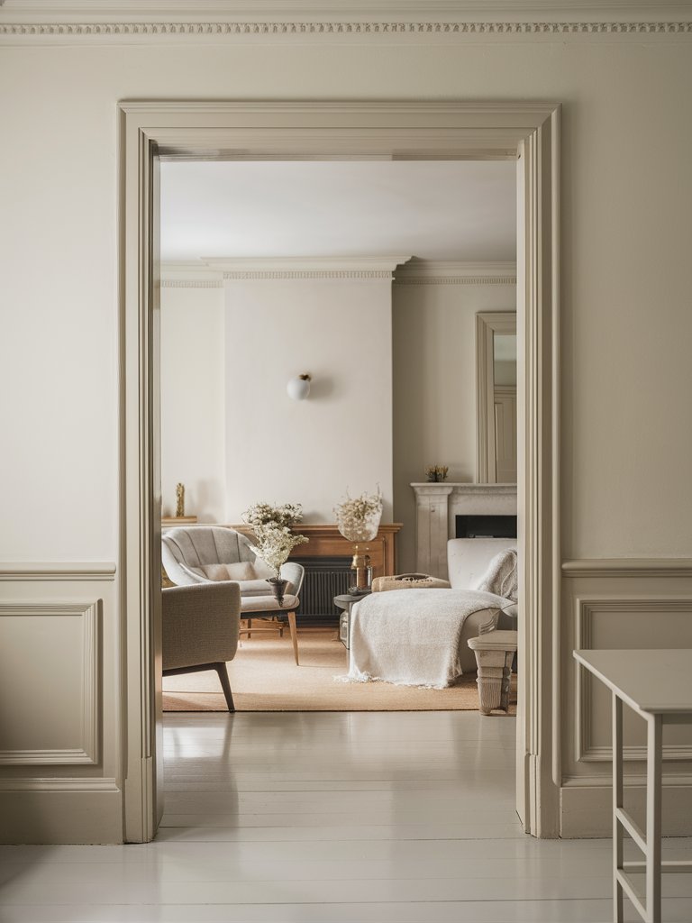
Farrow and Ball Shadow White
Farrow & Ball paint is well-known for its involvement with restoring classical and traditional architecture. Farrow & Ball Shadow White (No. 282) may have been considered a white color maybe 100 years ago, but has weathered with time and is starting to show its age.
FB Shadow White has an LRV of around 68, so it’s a pretty dark color compared to the others we’ve looked at. Picture a shadowy corner in a white room—how this corner will appear a bit darker is similar to this color’s look. This could be considered an honest basis for the color’s naming.
Shadow White has some noticeable warmth to it and a perceived green undertone that helps with its versatility. It’s almost like a taupey off-white; you get an almost warm gray that doesn’t have much yellow showing through it.
Although the color isn’t nearly as white as a pure white, it could be used in similar ways since it works great on walls with its neutral feel; it’s one of those neutral canvas types of colors. FB Shadow White can also be used as a darker trim color or even on doors—mainly because it has that light gray base with a little bit of warmth mixed in as well.
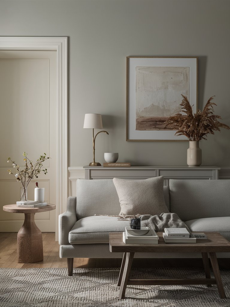
Farrow and Ball Off White
Farrow & Ball Off-White (No. 3) is a chalky mid-tone color with an LRV of around 70, which is pretty light, objectively speaking. Nonetheless, we still see it as more of a light color rather than a true mid-tone.
FB Off-White has a timeless appeal because of its warmer leaning undertone. The color has a grayed-out yellow quality, a combination of colors that has stood the test of time. You can also say it’s a variation of greige.
It’s a trendy color in interior design, primarily because off-white colors act as a safety net for designs.
When paired with lots of natural wood and materials, Farrow & Ball Off-White will look fantastic and create a warm, pleasant feeling in your home, so if you have such, you’re in luck!
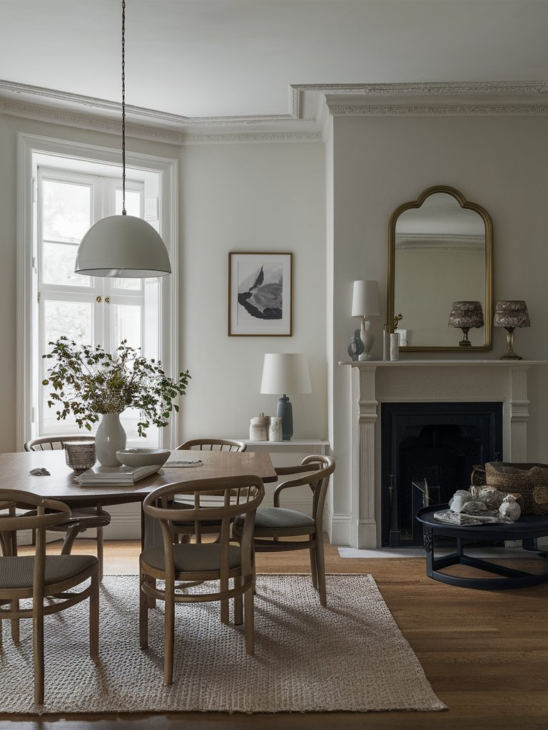
Farrow and Ball Old White
Farrow & Ball Old White (No. 4) is a beautiful mid-tone beige mixed with gray (not too bright, not too dark) with slight green undertones.
The creamy white on the trim and door of this room creates a subtle contrast with FB Old White on the walls. Gray and brown tones in the space play up the paint color’s cozy, serene feel. Old White is one of those more traditional mid-tone warm neutrals that can cool down in north-facing rooms.
NB: Farrow & Ball Old White varies immensely throughout the day, so ensure you test the color to see how it would look on your walls during different times before committing to it.
What Color Compliments Off-White Paint Colors?
- Soft Gray
- Navy Blue
- Dusty Rose
- Forest Green
- Golden Yellow
Soft Gray
Soft gray is a light, neutral shade that pairs beautifully with off-white, creating a calm and sophisticated look. The subtle contrast between these two colors adds depth without overwhelming the space.
Use soft gray in larger elements like furniture or area rugs to complement the off-white walls and create a serene, elegant environment.
Navy Blue
Navy blue is a deep, rich color that provides a striking contrast to off-white. This combination creates a classic, timeless palette that exudes sophistication and elegance.
Incorporate navy blue through decorative items like throw pillows, vases, or artwork to add depth and a touch of luxury to an off-white room.
Dusty Rose
Dusty rose is a soft, muted pink with a hint of warmth. This gentle color adds a touch of romance and elegance to the clean, neutral backdrop of off-white.
Try using dusty rose in textiles, such as curtains or throw blankets, to introduce a subtle pop of color and warmth to an off-white space.
Forest Green
Forest green is a rich, deep shade of green that evokes a sense of nature and tranquility. Its boldness complements the simplicity of off-white, creating a balanced and harmonious look.
Add forest green through plants, cushions, or accent walls to bring a touch of the outdoors and a refreshing feel to an off-white room.
Golden Yellow
Golden yellow is a warm, vibrant color that adds a cheerful and inviting touch to off-white. This combination creates a bright and uplifting atmosphere that feels both cozy and energetic.
Use golden yellow in accessories like lamps, throw pillows, or artwork to infuse a sunny, welcoming vibe into an off-white space.
Color Disclaimer
Please note that all paint colors displayed on this page are for illustrative purposes only. Due to variations in screen settings, lighting, and other factors, the colors you see on your screen may differ from the actual paint colors. We recommend viewing a physical color sample or swatch for the most accurate representation. Some images might be generated by AI to represent paint colors in different interiors