Beige has been under the radar for quite some time now, but the warm color has been making a remarkable comeback in interior design. Most people are being seen adopting it in their quest for the perfect neutral tone.
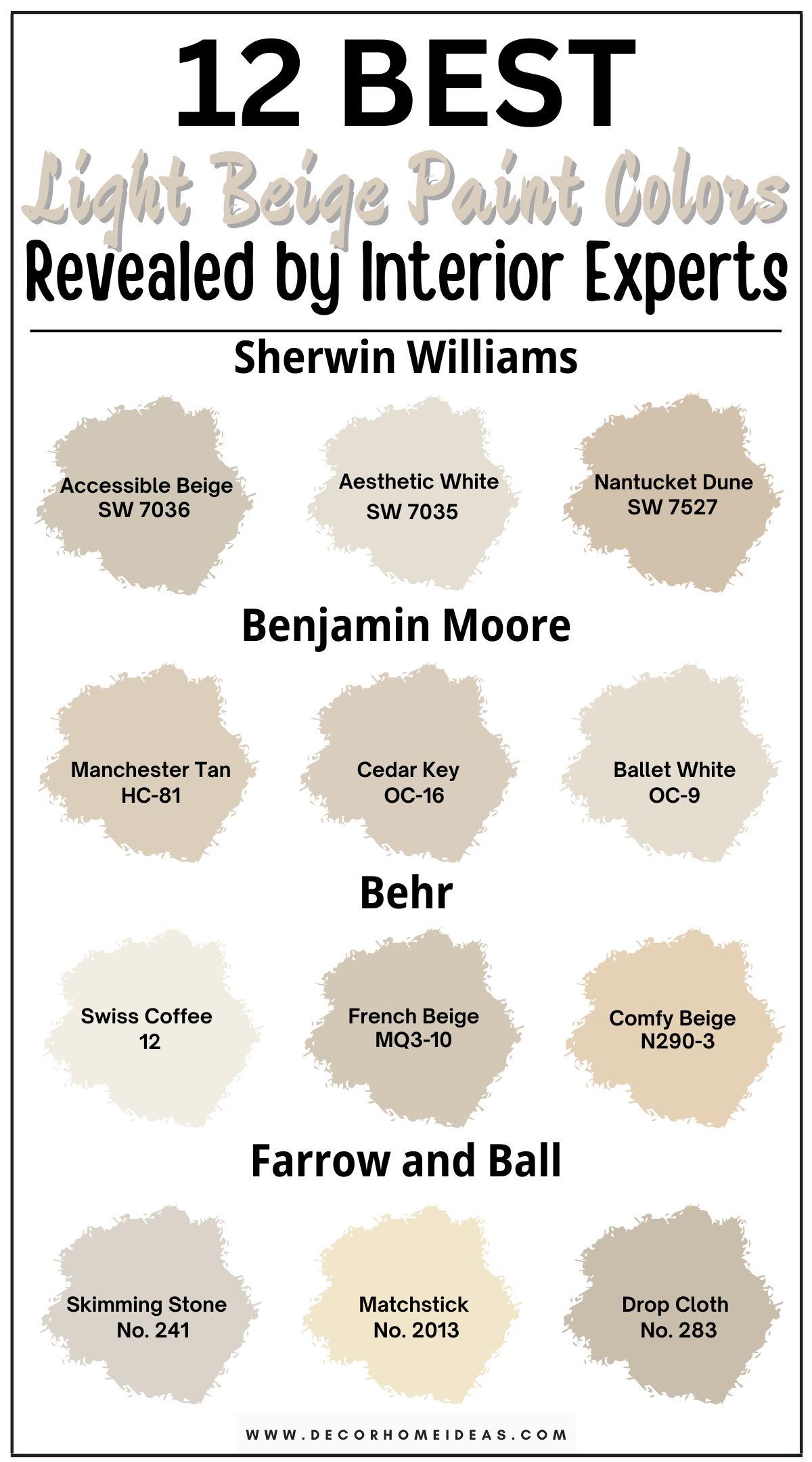
Beige has replaced whites and grays as versatile and timeless neutrals, and it’s part of numerous paint brand’s best sellers. With the ability to be warm or cool, beige can give you a blasé or bold look, depending on your room’s lighting, orientation, and accents.
Beige paint colors vary from one paint company to another, and today, we’ll look at some of the best light beige paint colors that interior designers and color experts swear by.
Take a look!
1. Sherwin Williams
Sherwin Williams Accessible Beige
Sherwin Williams Accessible Beige (7036) is a modern, trendy beige with an LRV of 58. This makes it a light-depth color but not overly bright or airy.
It’s a well-balanced beige paint color, avoiding overly pink or green hues. Its primary tone is gray, which gives it a soft appearance, and a subtle orange undertone that gives it warmth.
SW Accessible Beige is versatile and neutral, making it suitable for various design settings, such as transitional, modern farmhouse, traditional, minimalist, coastal, Scandinavian, and contemporary. It adds a touch of warmth and charm to a space.
This paint color is commonly used in different areas. For example, its warm, soothing tones in living rooms and bedrooms establish a comfortable and inviting ambiance that’s ideal for relaxation.
In open-concept spaces, Accessible Beige seamlessly connects rooms, ensuring a cohesive look. When paired with warm grays or taupe elements, it exudes elegance.
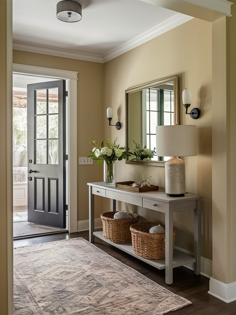
Here, Accessible Beige offers a subtle contrast against the white trim and adds depth to this entryway. The gray console table brings out the gray undertones in the color, while woven baskets cater to its warmth.
Sherwin Williams Aesthetic White
Sherwin-Williams Aesthetic White (7035) is an off-white beige with a hint of gray that balances well with both warm and cool tones. It has an LRV of 73, meaning it’s on the lighter side but has some depth, making it sit between off-white and light tones.
Aesthetic White has greige undertones, slightly favoring warmth in its blend of beige and gray. It gives off a light, open, and inviting vibe in rooms facing south. However, it might seem dull or subdued in north-facing spaces, requiring thoughtful selection based on the room’s natural lighting.
SW Aesthetic White is perfect for minimalist or contemporary houses. It provides a fresh, light-neutral base that complements modern furniture, gentle fabrics, and natural wood shades.
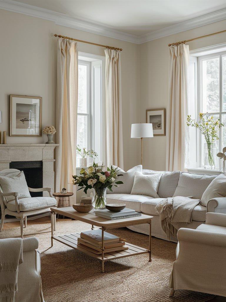
Notice how the creamy curtains, white ceiling, and furniture blend seamlessly with Aesthetic White on the walls in this living space. The brown wall art frames help bring out the color’s warmth, an effect that’s further enforced by natural elements like the woven area rug, wood table, and accents.
Combine Aesthetic White with pure white trim to achieve a sharp, pristine contrast that accentuates architectural features such as baseboards and crown moldings.
When applied outdoors, Aesthetic White takes on a soft white appearance in bright sunlight, making it an excellent option for siding or trim on homes desiring a light, neutral exterior that avoids a stark white look.
Aesthetic White also offers a lighter, neutral alternative as a trim or door color, seamlessly blending with warmer wood floors or earthy tiles.
Sherwin Williams Nantucket Dune
Sherwin Williams Nantucket Dune (7527) is a light, warm beige that exudes a cozy and welcoming ambiance. It has an LRV of 54, and is an ideal paint color for spaces desiring warmth without excessive darkness.
Despite its warm, beige nature, Nantucket Dune maintains a balance with cool yellow, green, and gray undertones.
The yellow undertones infuse a subtle golden hue, especially in well-lit areas, creating a sunny radiance. Additionally, the green undertones provide an earthy quality, perfect for areas incorporating natural elements like wood or plants.
On the other hand, the gray undertones cool down the beige, ensuring a neutral and balanced appearance without feeling overly warm or yellow-toned.
When selecting a main wall color, consider using it as the primary hue to create a warm, inviting, yet neutral backdrop. It’s perfect for living rooms, dining areas, and bedrooms.
It’s also perfect for a tranquil and relaxing bedroom ambiance, especially when paired with soft fabrics and textured bedding.
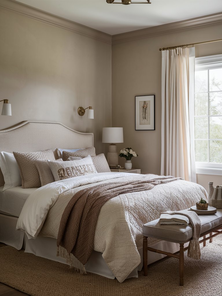
To add depth to the design, pair this color with deeper shades of beige or greige for a contrasting effect within a neutral color scheme. Notice how the browns and beiges on the woven rug, bedding, and headboard in this bedroom pair perfectly with Nantucket Dune on the walls.
2. Benjamin Moore
Benjamin Moore Manchester Tan
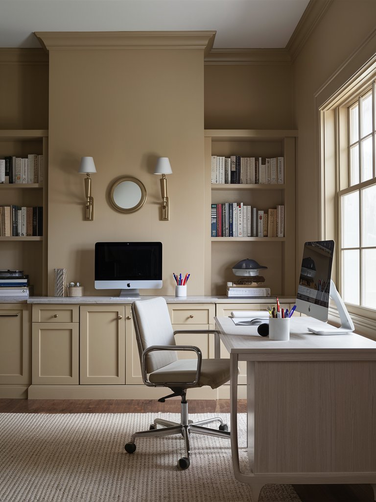
Benjamin Moore Manchester Tan (HC-81) is a neutral beige with passive yellow and green undertones that add warmth to a space without being overpowering.
Manchester Tan has an LRV of 63, making it a fairly light paint color. Its versatility shines in various design styles. Traditional interiors benefit from its warmth and subtle undertones, blending perfectly with classic furnishings and wood tones.
Transitional spaces embrace the paint color’s ability to seamlessly blend modern and classic elements. In coastal designs, Manchester Tan acts as a serene neutral backdrop, harmonizing with coastal hues like blues, greens, and sandy tones to create a tranquil and coastal-inspired atmosphere.
In rooms facing north, Manchester Tan takes on a more neutral appearance in cooler, shadowed light while still retaining its warmth to bring light and softness to the space. On the other hand, in sunnier south-facing rooms, the paint showcases its warm undertones, creating a cozy and inviting ambiance.
Here, Manchester Tan on the walls and cabinets brings a cozy feel to this home office. White and gray on the ceiling, wall pendants, countertop, desk, area rug, and accents provide a subtle contrast without diminishing the color’s warm presence.
Benjamin Moore Cedar Key
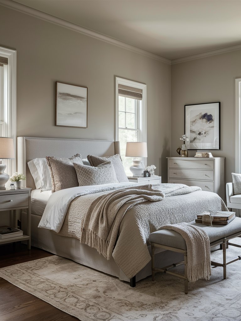
Benjamin Moore Cedar Key (982) is a versatile neutral paint color that combines soft beige and taupe with subtle gray undertones. Cedar Key leans towards a greige with warm beige and gray undertones, striking a balance between the two.
With an LRV of 59, Cedar Key is a light-to-medium shade that reflects a good amount of light while providing ample depth for contrast against lighter trim colors. This ensures that it doesn’t overly brighten or darken a room.
The subtle gray undertone helps neutralize the beige, making it adaptable to different lighting conditions and décor styles.
Cedar Key can be applied effectively in various settings for walls, trim, or accent pieces. Its neutral yet warm characteristics allow it to harmonize well with different design styles, from coastal to contemporary.
Cedar Key offers a warm, inviting, and neutral tone in living rooms that pairs well with modern and traditional furnishings, providing versatility for different styles.
The color’s neutral character in kitchens complements various cabinetry styles and finishes, especially natural stone countertops or stainless steel appliances.
Here, Cedar Key has been used on the walls and ceilings for a continuous, cohesive look. The gray headboard blends seamlessly with the wall, while other gray and beige hues on the bedding, furniture, area rug, and table lamps combine for a relaxed feel in this serene bedroom.
Benjamin Moore Ballet White
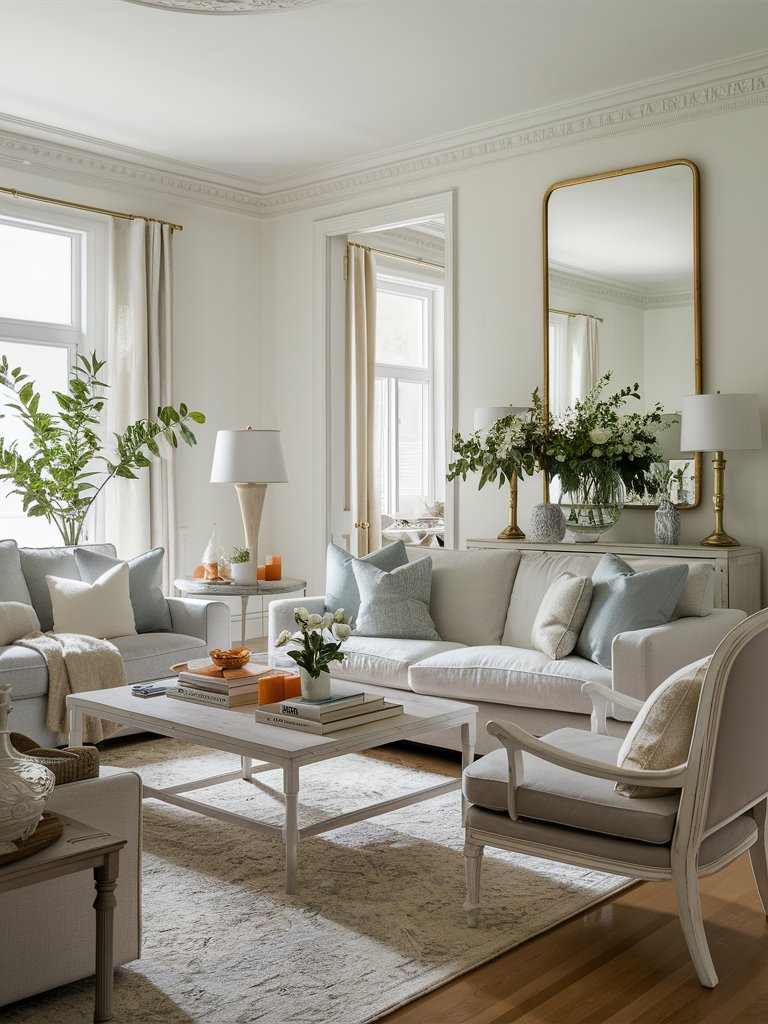
Benjamin Moore Ballet White (OC-9) is a somewhat cream paint color, which means it has a yellow base with neutral tones (such as gray-beige) added. These neutral tones mute the yellow, making it more subdued and earthy.
Ballet White has an LRV of 72 and is a fairly light paint color that creates a muted background, allowing furniture and décor to stand out.
It’s not too creamy or gray, making it a middle-ground choice that works well in spaces with both natural and artificial light. It’s an excellent primary color for a home, especially if you want a subtle, neutral aesthetic.
Ballet White’s versatility shines through as it lacks strong undertones like green or pink, fitting well into various color schemes. However, while it’s adaptable, it’s essential to consider room lighting and furnishings before choosing the color, as its suitability may vary depending on the specific room setup.
Ballet White creates a warm and inviting atmosphere in living rooms, a serene feel in bedrooms, and a neutral backdrop in dining rooms. It offers an elegant transition between rooms in hallways and entryways, making spaces feel open and airy.
Ballet White provides a soft and neutral background for the white and gray décor in this living room. Brass tones on the mirror frame and lamps provide contrast, while greenery adds a pop of color.
3. Behr
Behr Swiss Coffee
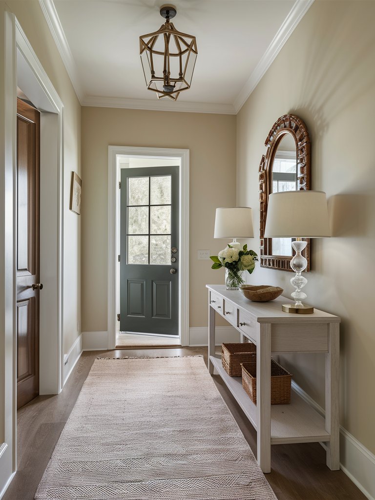
Behr Swiss Coffee (12) is renowned for its warm, creamy appearance and versatility, making it a favorite choice among homeowners and designers.
It embodies a soft white shade with neutral undertones that complement various styles, from traditional to modern, contributing to inviting and airy spaces.
Behr Swiss Coffee has an LRV of 84, making it a warm white that isn’t too stark and reflects enough light to brighten up the space effectively.
Swiss Coffee’s yellow and brown undertones bring a cozy warmth, subtly shifting its hue towards a light beige tone based on lighting conditions.
These undertones soften the white, imparting a creamy, almost beige-like feel to the color. They maintain a neutral warmth that prevents them from appearing overly stark or clinical.
Swiss Coffee can exhibit a gentle beige tint in darker or warmer lighting, adding to its versatile and inviting appeal.
It works wonderfully on walls in living spaces, bedrooms, and dining rooms, giving a light and airy vibe. It serves as a perfect backdrop, allowing your furniture and décor to shine without overpowering the room, as evident in the above entrance hall.
When used for trim and moldings, you can pair it with deeper wall colors for a striking contrast or lighter whites for a softer look. Swiss Coffee is also a top choice for kitchen cabinets—it beautifully complements brass, nickel, or matte black hardware and wood tones.
Behr French Beige
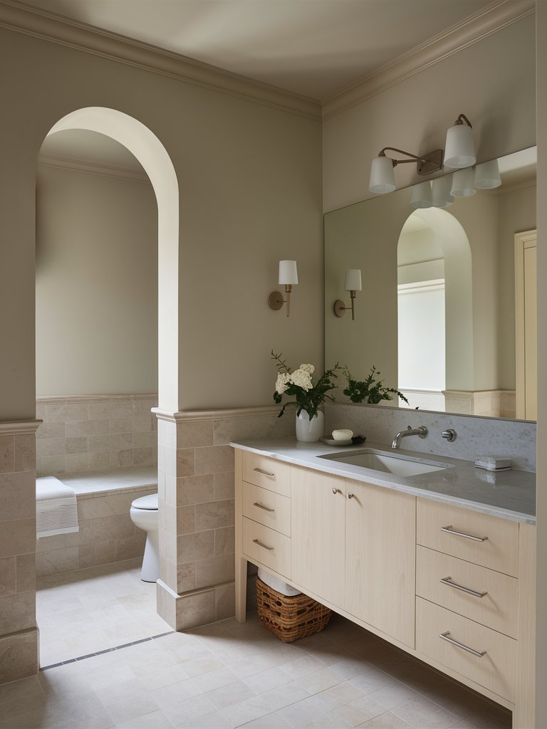
Behr French Beige (MQ3-10) is a versatile and appealing paint color distinguished by its lighter beige shade with tan undertones. Its unique properties make it a popular choice for interior and exterior applications, contributing warmth and depth to spaces.
French Beige has an LRV of 59, placing it on the spectrum of mid-tone paint colors. It’s associated with a light shade of brown, contributing to its earthy feel and versatility in coordinating with other colors and materials in your home.
This warm undertone also allows for compatibility with both warm and cool color palettes, depending on the design scheme.
French Beige is a versatile paint color for walls, trims, and cabinetry. It adds coziness to living rooms, bedrooms, and bathrooms, helping create a relaxing vibe in your space. Mix it with darker or bolder colors to jazz up the design with some visual interest.
Here, French Beige on the walls pairs nicely with the gray-brown tiles and creamy beige cabinets on the vanity. The color continues onto the ceiling for a super cohesive look, while white fixtures provide a bit of contrast.
French Beige is perfect in traditional, cozy, and country-style designs, boosting the comfort factor. It also fits nicely in contemporary and transitional styles, blending smoothly with décor and furniture.
Behr Comfy Beige
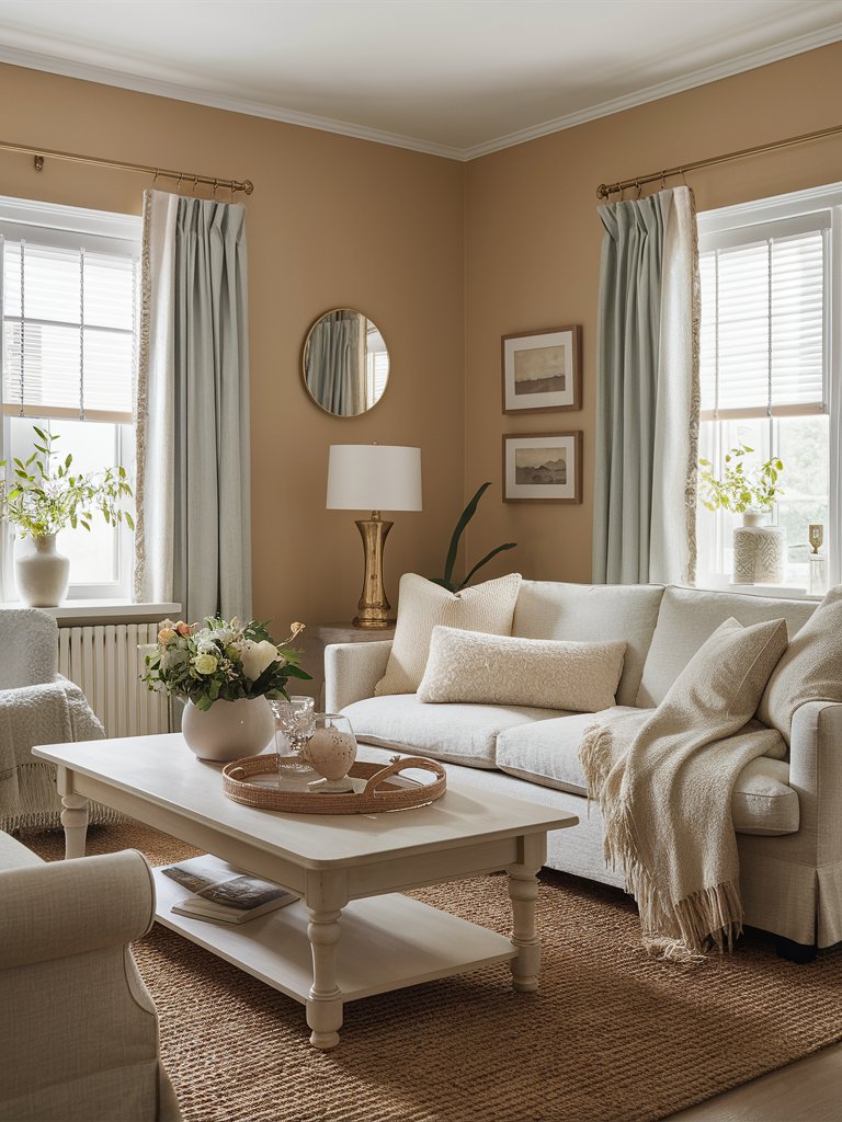
Behr Comfy Beige (N290-3) is a warm, soft, neutral color that gives off a cozy and welcoming vibe, perfect for creating a relaxed atmosphere.
Its warm yellow and brown undertones make it creamy and inviting, striking a balance between cozy and approachable. It’s a reasonably neutral paint color but still versatile enough to match different color schemes and décor styles easily.
Comfy Beige has an LRV of 66, which helps it keep things bright and warm while avoiding that overly stark feel. The paint color suits various design styles, such as traditional, contemporary, and transitional.
Comfy Beige is all about creating warmth and comfort in living rooms, especially when paired with soft textiles and natural materials, as can be seen in the above example. Its softness also benefits bedrooms, perfect for a restful and soothing ambiance.
4. Farrow and Ball
Farrow and Ball Skimming Stone
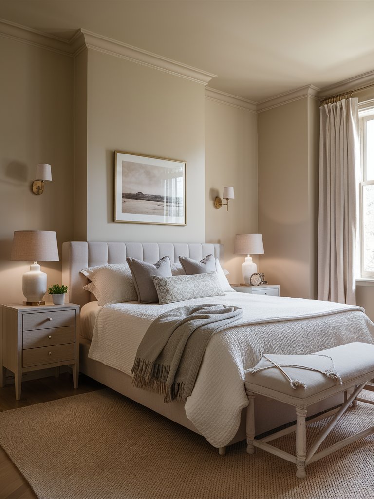
Farrow & Ball Skimming Stone (No. 241) is a soft, warm, neutral shade with a light gray undertone. It offers an elegant and calming backdrop for various spaces and is a popular choice due to its versatility and ability to adapt to lighting conditions.
It tends to lean more toward the warmer side of things, but this highly depends on your room’s orientation, furniture, flooring, and lighting. It has brown-pink undertones that lend it a cheerful look.
Skimming Stone is adaptable across various design styles, such as contemporary, classic, and traditional homes. Its subtle elegance allows it to work in both formal and casual settings.
Here, Skimming Stone on the walls and ceiling makes the space feel expansive, and pairs with grays, browns, and beiges in the space for a sophisticated and cozy ambiance.
Farrow and Ball Matchstick
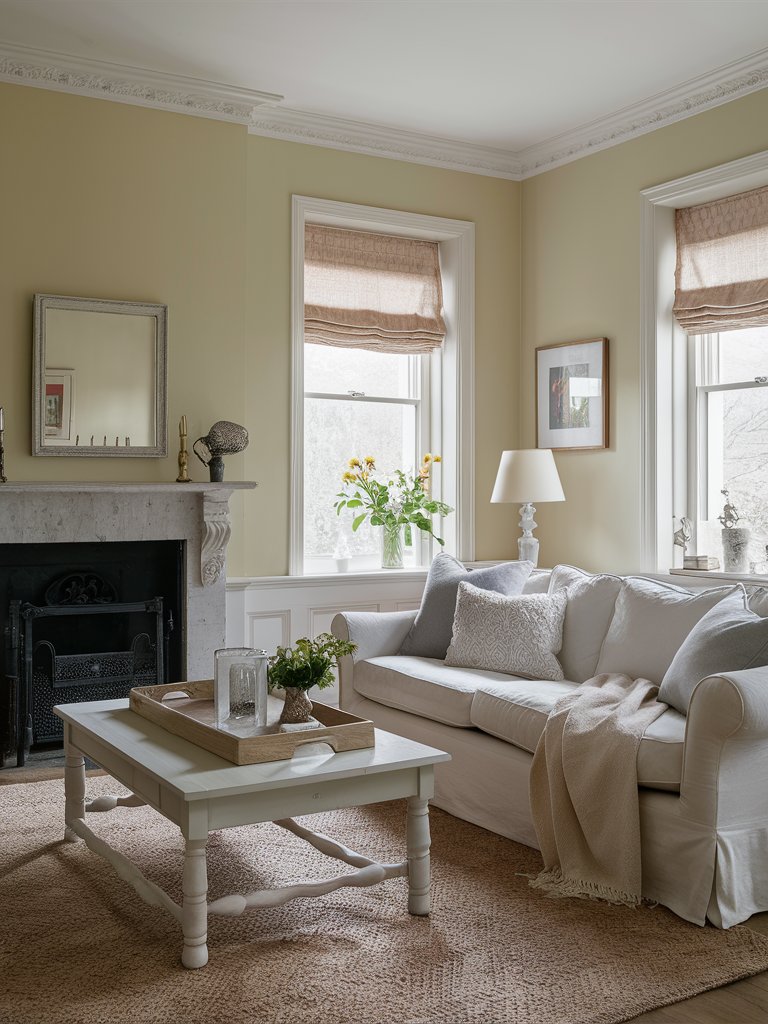
Farrow and Ball Matchstick (No. 2013) is a soft, cozy, neutral shade with creamy yellow undertones. It offers a subtle warmth that doesn’t overpower a room with color.
With warm yellow undertones, Matchstick exudes a pale, creamy tone with a hint of yellow beige. This creates a welcoming and inviting ambiance, especially in spaces with plenty of natural light.
It has an LRV of about 63, providing ample brightness without feeling stark or cold and offering a warm, light-reflective presence.
Its warm undertones contribute to a cozy atmosphere, seamlessly blending into various home styles and adding a touch of comfort and sophistication.
Matchstick is ideal for living rooms and common areas, bringing a warm and inviting feel, especially with soft fabrics and natural tones. The woven area rug and Roman shades in the above living space serve as the perfect example of how to capitalize on Matchstick’s warmth for a cozy ambiance.
Farrow and Ball Drop Cloth
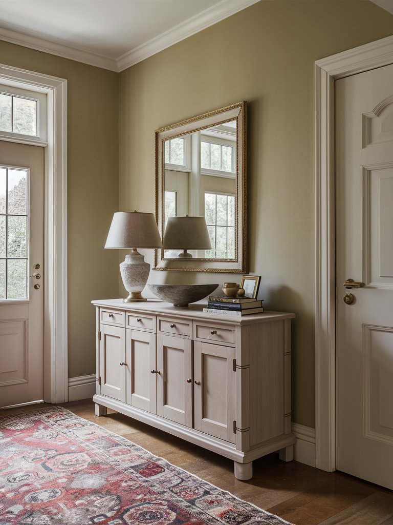
Farrow & Ball Drop Cloth (No. 283) is a gentle mid-grey beige paint color characterized by warm and muted tones. This versatile hue sits comfortably between beige and gray, making it suitable for various interior applications.
Drop Cloth has an LRV of about 51. Due to its neutral qualities, it can be effortlessly integrated into different design schemes, whether contemporary or classic.
It works particularly well for walls and trims, providing a harmonious backdrop that complements a range of furnishings and accents. This color is also ideal for larger spaces, as it helps to create a sense of continuity and flow.
Drop Cloth’s neutral warmth perfectly lends itself to living rooms, creating a cozy yet elegant backdrop suitable for modern and traditional interiors. Its understated quality allows for easy pairing with a variety of furnishings.
It promotes a sense of calm and relaxation in bedrooms, harmonizing well with soft textiles and natural materials like linen and wood.
What Color Compliments Light Beige Paint Colors?
- Rich Brown
- Soft Blue
- Olive Green
- Warm White
Rich Brown
Rich brown is a deep, earthy color that pairs beautifully with light beige. This combination creates a cozy and inviting atmosphere with a touch of sophistication, perfect for living rooms or bedrooms.
Incorporate rich brown through furniture, accent pieces, or wooden details to add warmth and a classic feel to a light beige space.
Soft Blue
Soft blue is a serene and calming color that complements the warm undertones of light beige. This combination brings a sense of tranquility and freshness, ideal for creating a relaxed and peaceful environment.
Use soft blue in textiles, such as throw pillows, rugs, or curtains, to introduce a soothing touch and balance the warmth of beige.
Olive Green
Olive green is a muted, natural shade that adds an earthy and organic touch to light beige. This pairing creates a harmonious and grounded look, perfect for adding a touch of nature to your space.
Consider using olive green in accessories like cushions, throws, or plants to introduce a refreshing and balanced element to a light beige room.
Warm White
Warm white is a creamy, slightly off-white shade that blends seamlessly with light beige. This combination creates a soft and cohesive look, adding brightness while maintaining a warm and inviting feel.
Use warm white in larger elements like trim, ceilings, or furniture to create a cohesive and elegant environment that enhances the light beige.
Color Disclaimer
Please note that all paint colors displayed on this page are for illustrative purposes only. Due to variations in screen settings, lighting, and other factors, the colors you see on your screen may differ from the actual paint colors. We recommend viewing a physical color sample or swatch for the most accurate representation. Some images might be generated by AI to represent paint colors in different interiors

