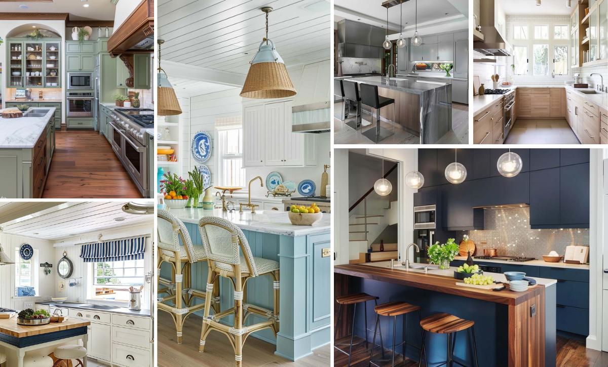
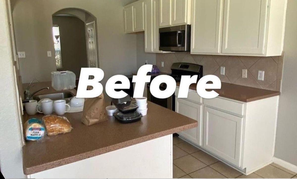
The kitchen is the heart of the home and one of the most commonly used spaces, making it a top priority when it comes to home makeovers.
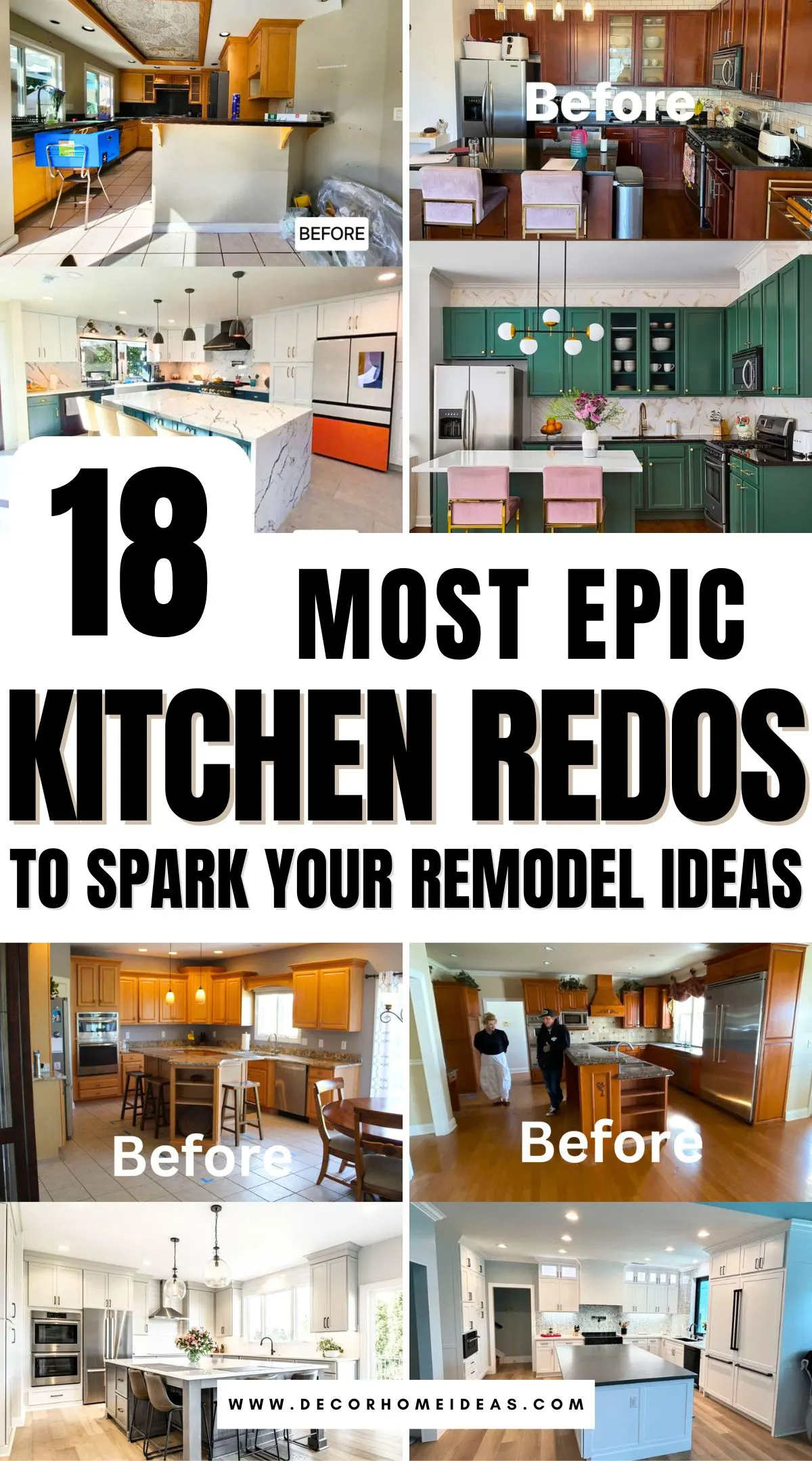
Whether your kitchen is big or small, there are numerous kitchen remodel ideas that can transform your barely functional and closed-off space into an elegant, bright room that efficiently handles daily tasks.
We’ve compiled several before-and-after kitchen redos that will infuse your space with style and relevant amenities while making cooking, dining, and entertaining worthwhile and simple.
Take a look!
1. Closed Off Kitchen
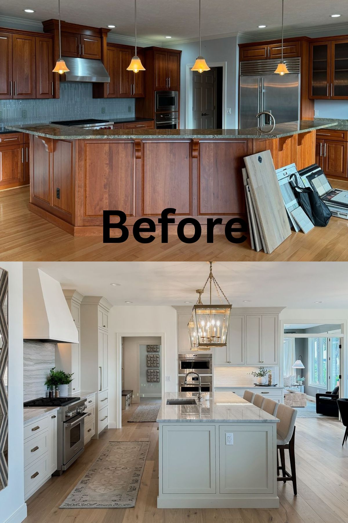
Light blue walls and backsplash, combined with the dark-toned wood cabinets, gave this kitchen a gloomy, dated look. A peninsula separated the kitchen from the rest of the space, disrupting the traffic flow.
The homeowners decided to switch around the floor plan to improve traffic flow and make the kitchen more efficient.
The new layout included tall cabinets and an island with classic overhead ceiling pendants. A fresh coat of white paint on the cabinets, range hood, and walls provided an airy feel while making the silvery finishes stand out more. The light gray wood floor also helped ground the space more.
2. Disruptive Peninsula
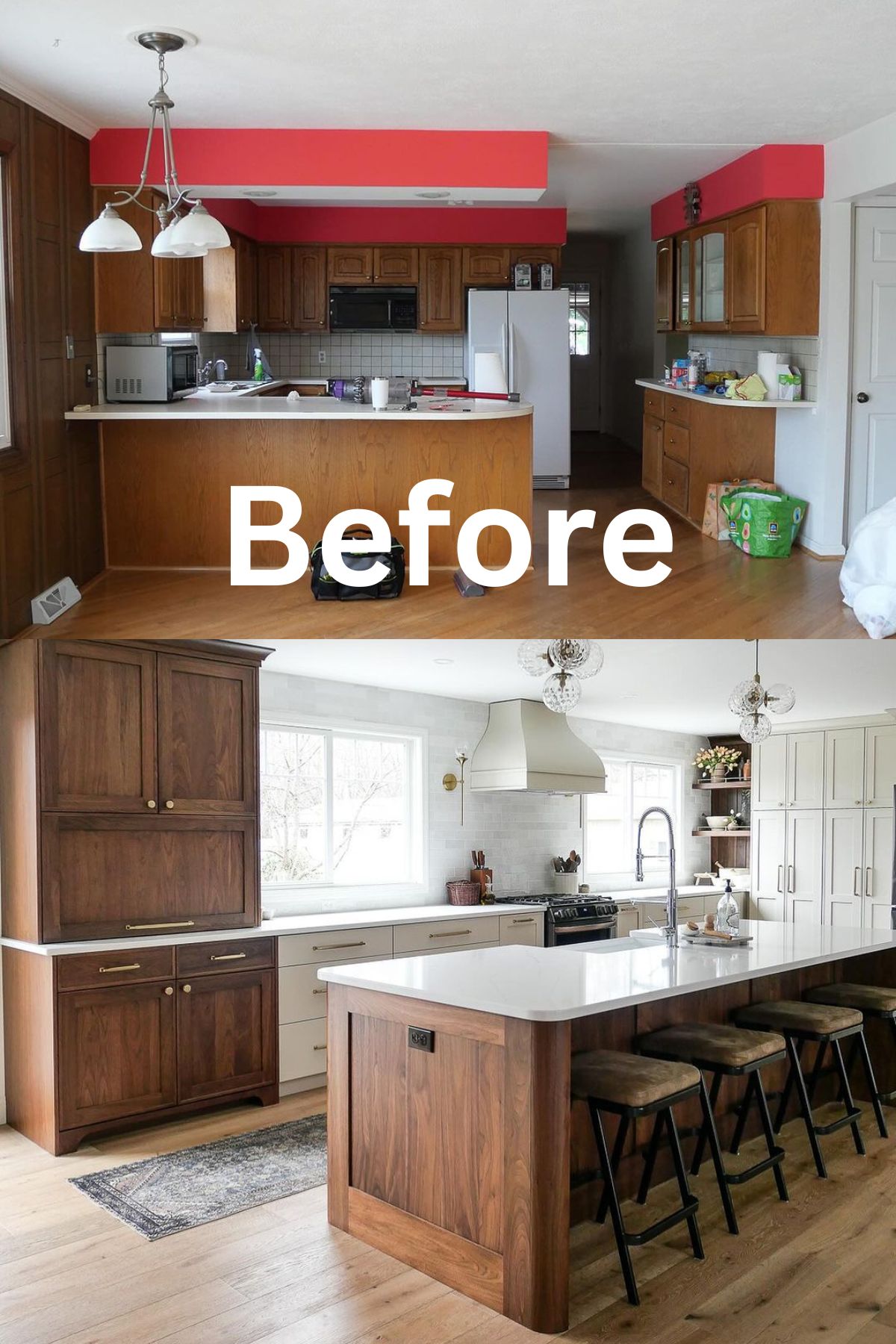
The homeowners didn’t like the bright, red soffits and cramped space of this kitchen. The peninsula made the kitchen lack a logical flow and blocked the path, causing traffic to stop. To create a space large enough for a beautiful and functional kitchen, they had to move one wall.
The kitchen redo involved a merge of traditional and modern elements, including tall shaker style and semi-stock distressed cabinets. The sink and faucet were moved from the window to the newly installed island. This enabled the introduction of big windows that flooded the space with light.
An appliance garage helped declutter the countertop, while open shelves allowed more decorative items to take center stage. Natural hardwood flooring was the perfect way to ground this white and brown palette.
3. Unfounded Layout
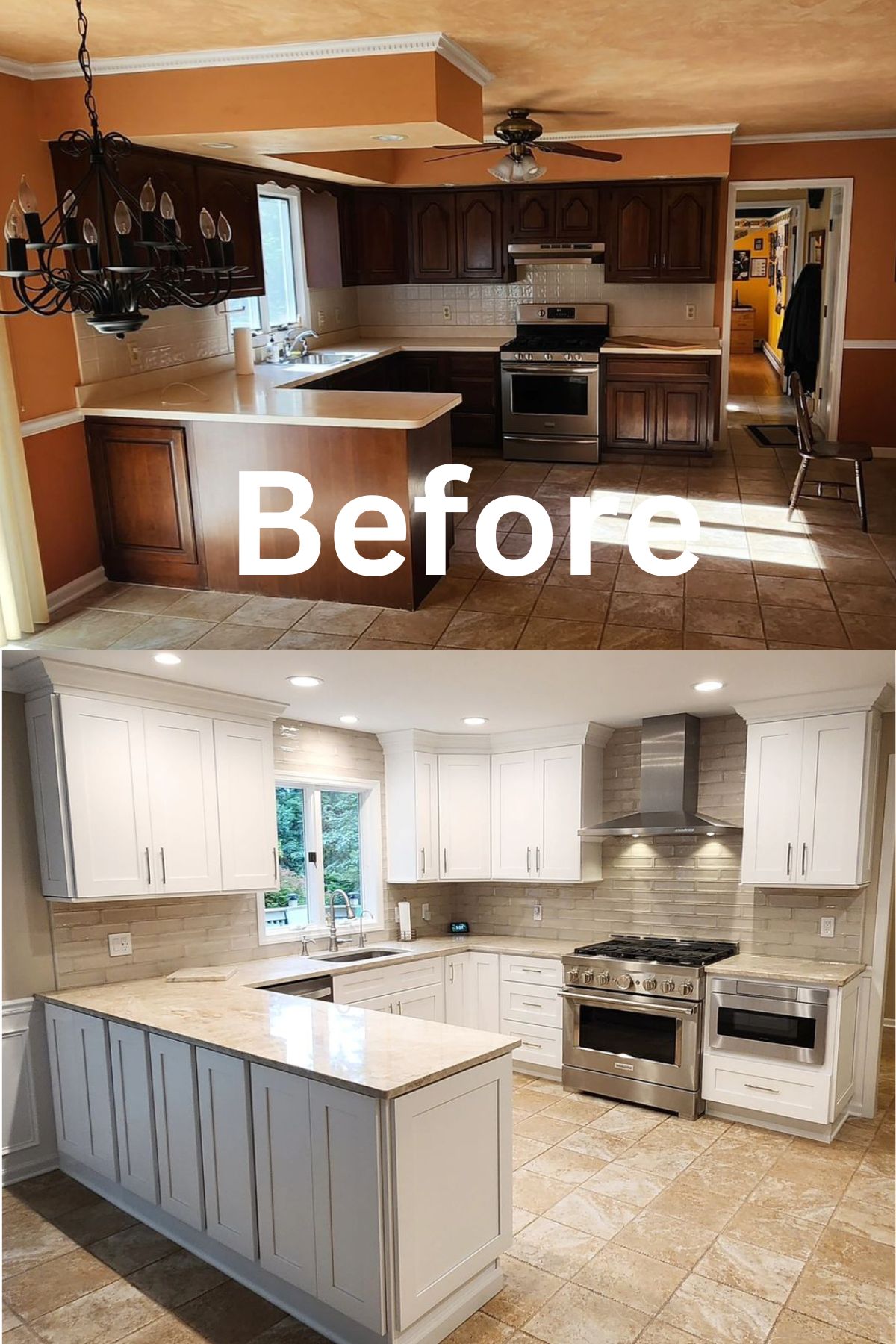
The orange-toned walls, ceiling, and soffits, together with the dark brown cabinets and tile flooring, made this U-shape kitchen boring. The curved peninsula was a bit short, making the kitchen area less defined and not very secluded.
Elongating the peninsula gave the kitchen a more hard-working U-shape layout and extra storage. The crisp white cabinets contrast with beigey quartz countertops and a cool gray subway tile backsplash.
The backsplash tile went up to the ceiling, adding a sense of height, while the socket fan light was replaced by plenty of recessed ceiling lights that made the space bright.
4. Disorganized Kitchen Corner
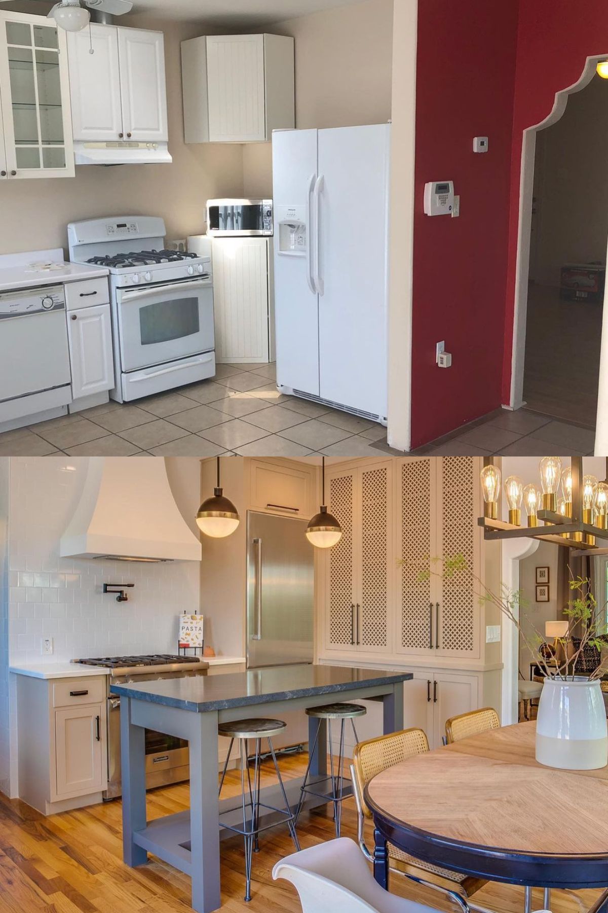
This kitchen corner only had 36 inches of counter space, three different types of cabinets, and all the kitchen appliances in one area. Knocking out the wall partition painted red drastically improved the usage of the space.
The refrigerator was moved to the adjacent wall, allowing for tall cabinets that added storage. The efficient layout also enabled the introduction of a movable island for casual dining and extra counter space. Two ceiling pendants hanging above the island made it feel more defined.
The cane webbing on the cabinet fronts brought character and charm. A white subway backsplash that took to the ceiling combined nicely with the range hood and added a timeless finish.
5. Cramped Countertop
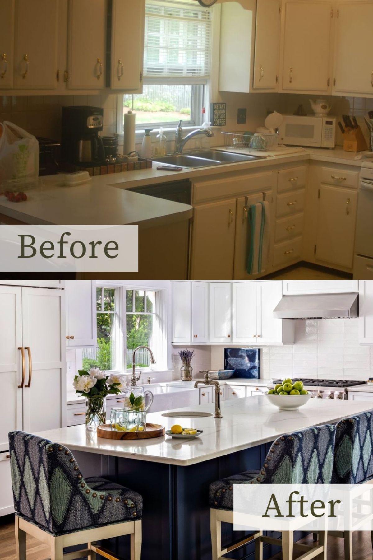
This kitchen’s countertops were filled with clunky appliances that were eyesores and made the space feel cramped. The creamy white cabinets imparted no personality, and the kitchen lacked an island to accommodate seating for guests and casual eating.
A brighter white hue graced the cabinets, walls, backsplash, and countertops, brightening the space. An extra window also helped the kitchen feel airy. Navy blue on the island contrasts with the white palette for a modern feel, while the seats add texture and character.
6. Misplaced Island
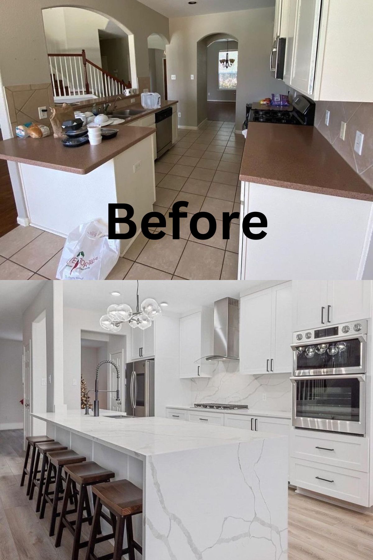
This kitchen’s peninsula took much of the floor space and didn’t have seating, so a proper eat-in kitchen wasn’t an option. As such, it needed an entirely new layout to function at its best. Bright white inset cabinets, marble, and steel finishes revamped the kitchen with a contemporary, clean aesthetic.
The peninsula and wall were replaced by an island with ample seating, opening up better layout possibilities for the kitchen. The kitchen’s large scale also enabled the introduction of other appliances like the refrigerator. Contemporary lighting and hardware uplift the overall look.
7. Limited Space
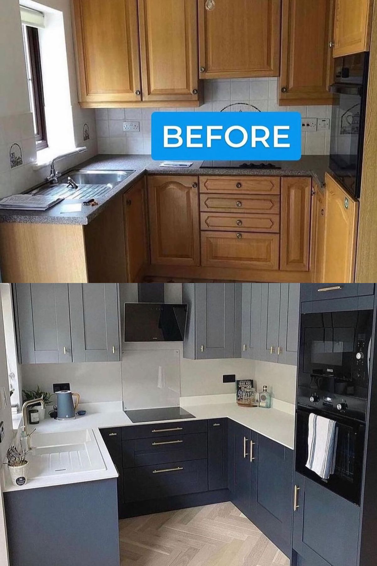
This small, builder-grade kitchen was sufficient but needed a few cosmetic tweaks to take it to the next level. The cool gray shaker-style cabinets and dark gray inset cabinets pair nicely with the white countertops and backsplash for a sophisticated, neutral kitchen.
Innovative kitchen redo ideas such as an electric cooker and a small LED display screen create a kitchen that feels custom and high-end, but the herringbone pattern hardwood floor keeps the space feeling casual and warm.
8. Small Island
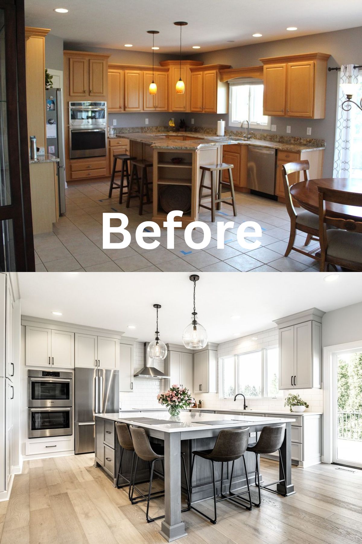
This kitchen didn’t utilize the room’s shape and size efficiently. Dated furniture, ceiling pendants, and lackluster cabinets left the kitchen looking tired and stuck in the past. A much bigger island made better use of the kitchen’s footprint, adding seating and extra prep space.
Some upper cabinets were removed to allow room for more windows that brought in more light, while the white backsplash, countertops, and cabinets made the space feel spacious. The fridge was positioned elsewhere, and floor-to-ceiling cabinets were built to compensate for the removed storage.
9. Distressed Look
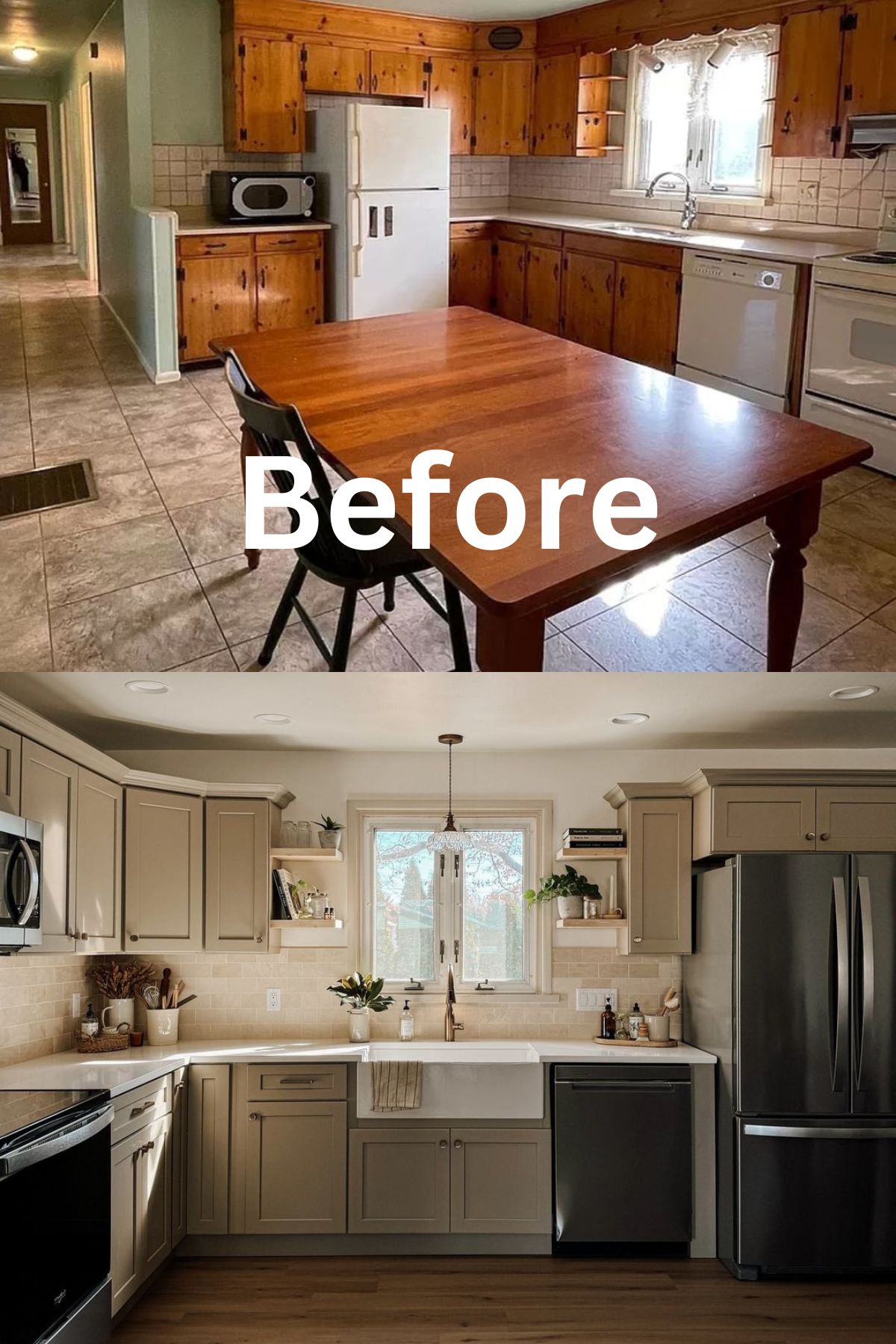
This old dining table didn’t fit in with the rest of the kitchen. The homeowners decided to do away with it and focus on kitchen remodel ideas that would add loads of charm. The builder-grade cabinets were replaced by more stylish, light ivory perimeter cabinets.
Without the table, the kitchen gained better traffic flow. A subtle creamy backsplash, small, sleek shelves with décor items, and a farmhouse kitchen sink add charm and personality to this kitchen remodel.
10. Dark Backsplash
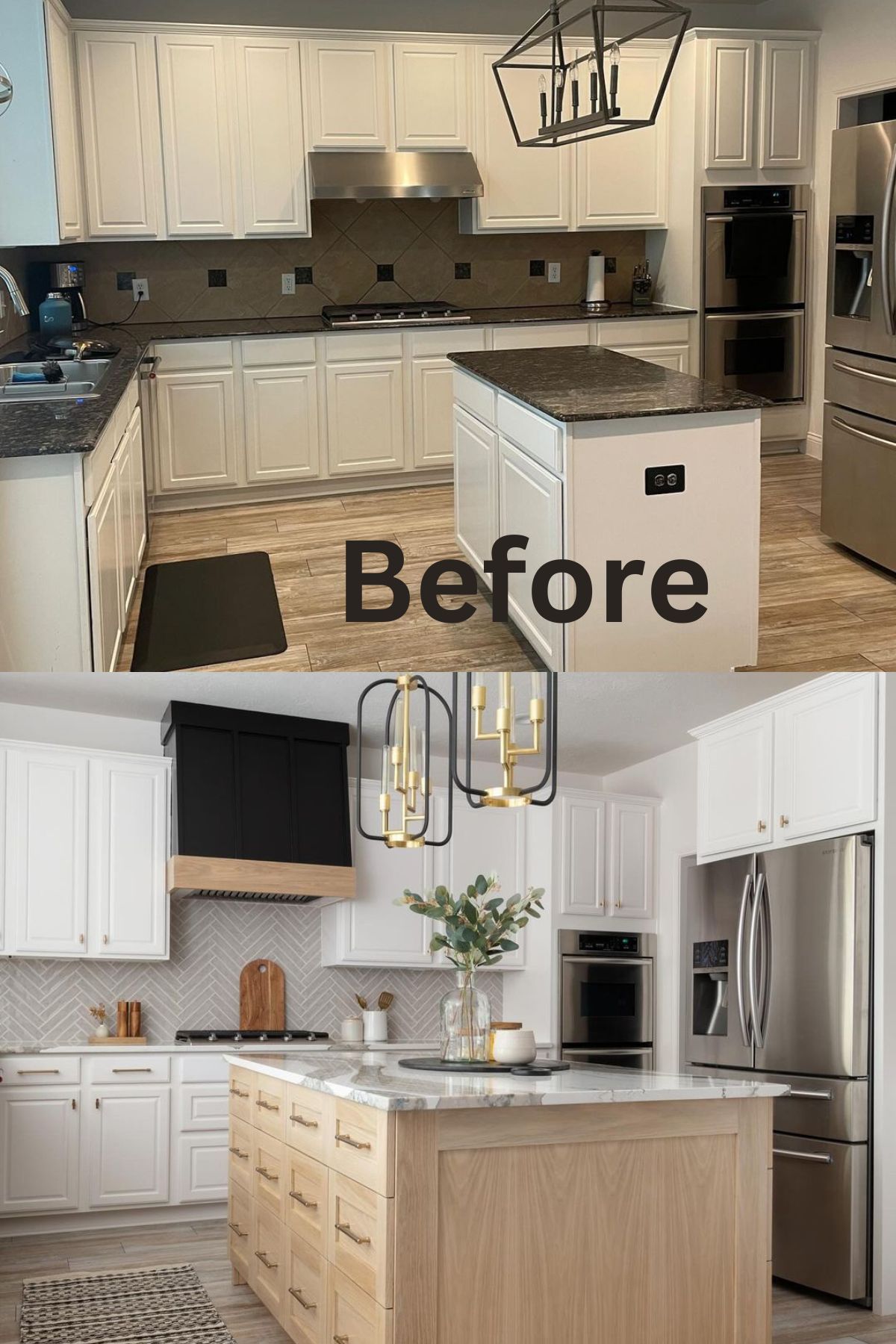
Although this kitchen looked nice, the homeowners thought it had so much potential to become a more functional space with a mature look. Shades of gray and black on the countertops and backsplash created a heavy, dated look. The white raised panel cabinets were also okay but lacked character.
The kitchen remodel idea revolved around mix and matching. A much bigger island provided better storage and freed up counter space. The white cabinets were given new hardware, and a pale light gray backsplash added glamor.
Light wood tones fill the space with warmth and anchor the kitchen’s airy look, while a stunning matte black hue on the range hood creates an eye-catching focal point. The industrial chandelier was replaced by unique statement pendant lights, overhauling the bland, standard builder-grade kitchen look.
11. Switch It Up
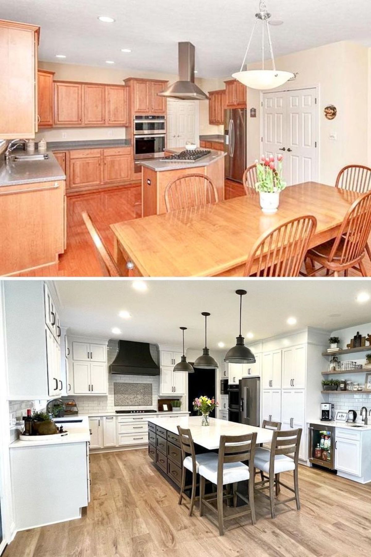
Orange-hued furniture, cabinets, flooring, and an awkward layout made this kitchen look straight out of the ‘80s while limiting its potential. Removing the small peninsula paved the way for an enlarged island with enough dining space for an eat-in kitchen.
A custom-built range hood, new hardware, and a chic white and gray color palette revived this kitchen’s look and purpose. The pantry was replaced by cabinets and open shelves, creating distinct spots like a coffee station.
Ceiling pendants and recessed lighting add an element of symmetry while flooding the space with light.
12. Bring some Vibrancy
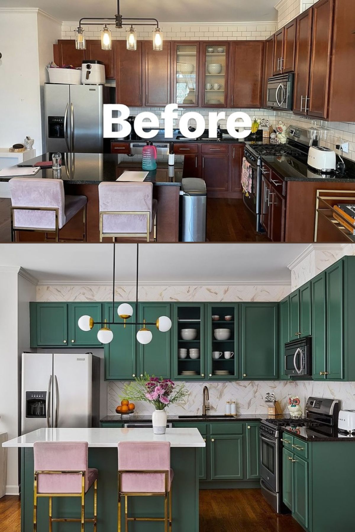
Dark brown cabinets and black countertops stuck out in this dowdy kitchen. Appliances and accessories were also a big eyesore in the kitchen. New vibrant dark green cabinets gave the kitchen a clean, updated look, while a marble backsplash brightened the space.
The chairs were updated with new pink fabric and gilded legs, delivering modish pops of color. The island’s white countertop contrasts nicely with the green tones and black countertops while complementing the backsplash. A modern linear pendant adds to the kitchen’s elegant facelift.
13. Underutilized Space
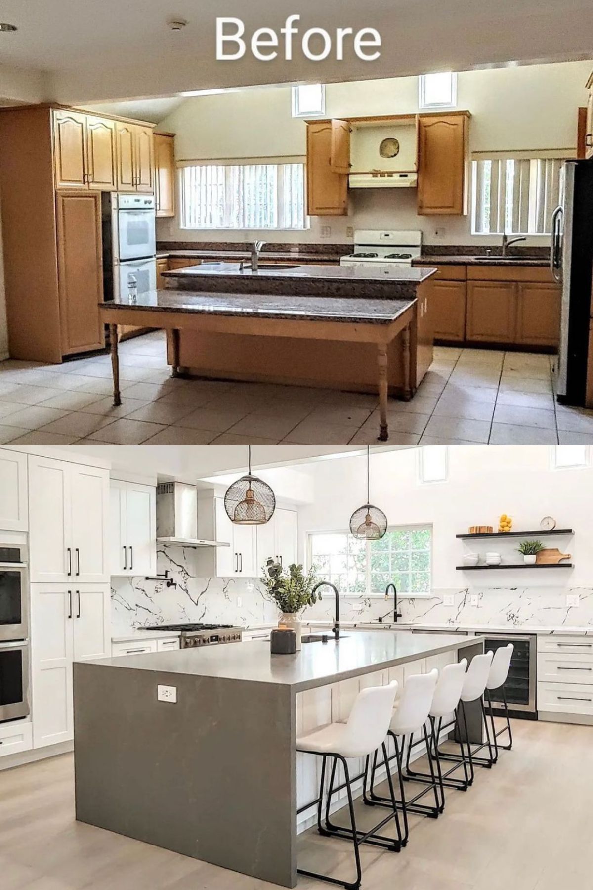
Dated dark gray granite countertops and a matching table aged this kitchen, as did the builder-grade cabinets and creamy white floor tiles. Removing the table for a more encompassing island was a kitchen redo idea that helped create a more functional floor plan.
White perimeter cabinets and a patterned marble backsplash update the space for a clean, airy look. The gray island provides a lovely contrasting color, and the homeowners installed wood flooring to better ground the kitchen’s palette.
14. Awkward and Bland
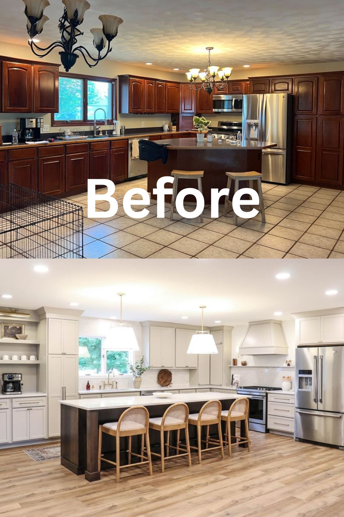
This kitchen had an awkward island that disrupted the flow and created an inefficient work core. During the kitchen redo, the homeowners replaced it with a more slimline island that made better use of the floor space. White cabinetry and abundant lighting gave the kitchen a bright look.
White floor tiles were replaced with light hardwood flooring that complemented the wooden chairs for a stylish, modern farmhouse look. Dark wood on the island contrasts with the white palette, and the fridge is tucked into the wall, allowing for uninterrupted flow around the kitchen.
15. Remove Wallpaper
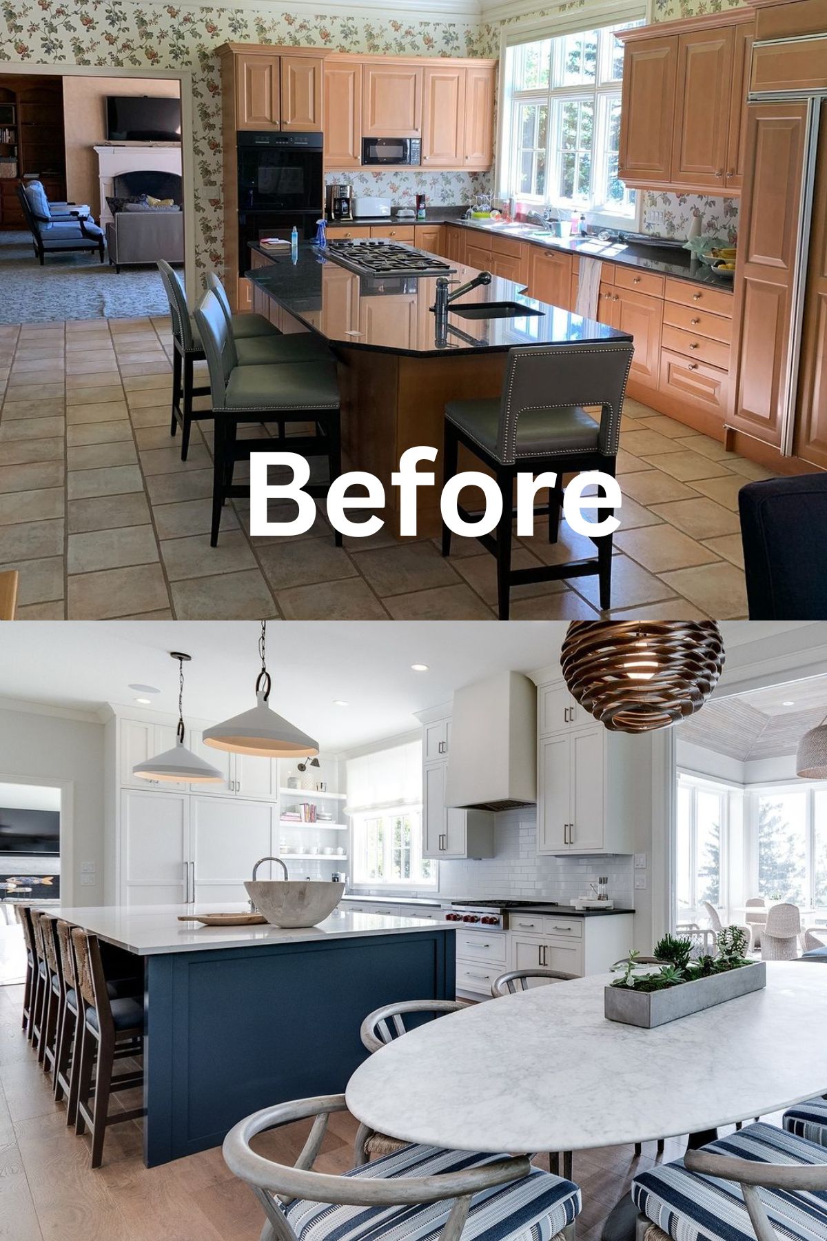
The homeowners of this kitchen didn’t have too many issues with the existing floor plan but felt it needed an update. Floral wallpaper and green ceiling combined with the natural oak cabinets create a heavy, dated look.
Crisp white cabinetry and ceiling were used to brighten the kitchen. Removing the floral wallpaper paved the way for a lustrous subway tile backsplash. A more significant island provided extra seating and counter space, with its blue base complementing the dining chairs’ fabrics to tie the two separate spaces together.
16. Impress with Two-Tone Design
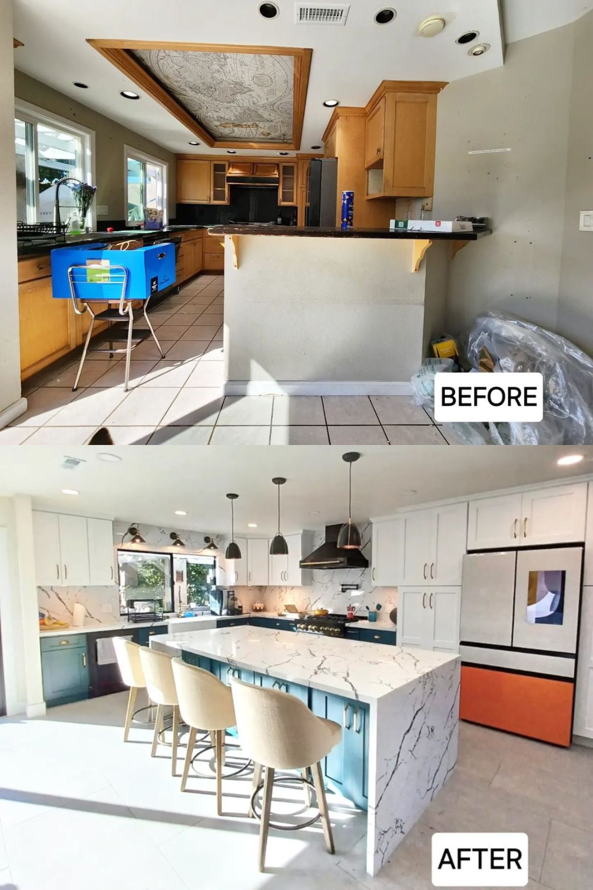
Builder-grade cabinets, dark granite countertops, and a gray palette were the hallmarks of this lackluster kitchen. An angular wall closed off the kitchen, and the old floor tiles made it a bit dreary. Knocking down the angular wall, as well as updating the ceiling, helped incorporate lots of style into the remodeled kitchen.
A two-tone color scheme worked wonders in this kitchen, adding tons of personality. The light blue base cabinets contrast with the bright white upper wall cabinets and marble countertops, giving the kitchen a presence.
Although one window was removed, plenty of task and accent lighting ensured the space remained bright and airy. Minimalist soft gray floor tiles provided an excellent backdrop that allowed the beachy palette to take center stage. Veined marble backsplash and countertops rounded out the kitchen redo.
17. Glam It Up
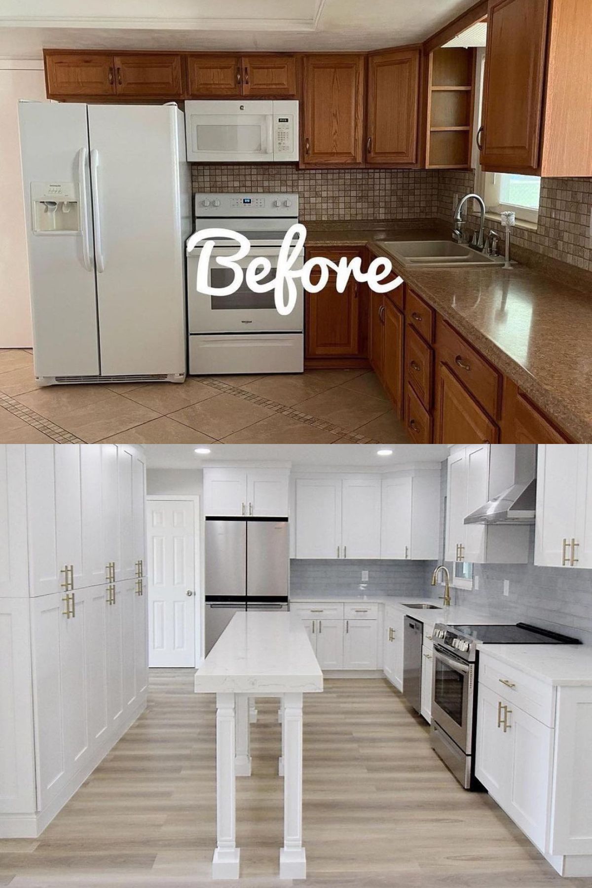
This kitchen needed a few structural changes and some serious polishing. A series of floor-to-ceiling cabinets and a slim island were introduced to update the space. Pure white finishes on the cabinetry and island paired with silvery accents give the kitchen a modern feel.
Brown floor tiles and granite countertops were replaced by light gray wood flooring and white laminate countertops. A gray backsplash was also installed to provide a subtle border between the countertop and upper wall cabinets.
18. Wood Galore
@jeff.stephensbrosconstruction
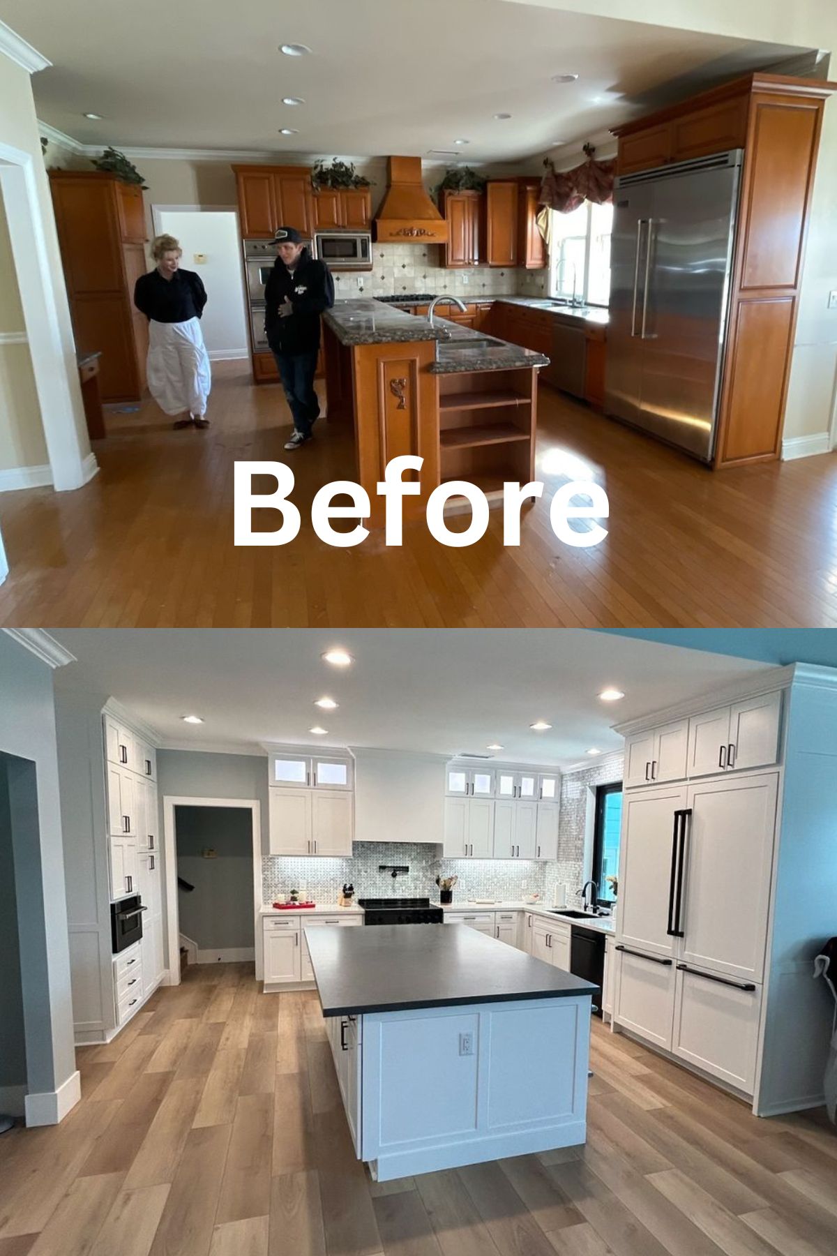
This dated kitchen had too many wood tones, and the homeowners wanted to remodel it to create a brighter, fresher space with added function. Painting the cabinets with a crisp white paint kicked off the remodel and rescued the kitchen from its sea of similar wood finishes.
Several small windows were added above some upper wall cabinets to capitalize on natural light. A much broader island brought a contrasting color through its dark countertop and high function to the space. Custom white doors were also made for the in-built fridge, maintaining a cohesive look throughout.

