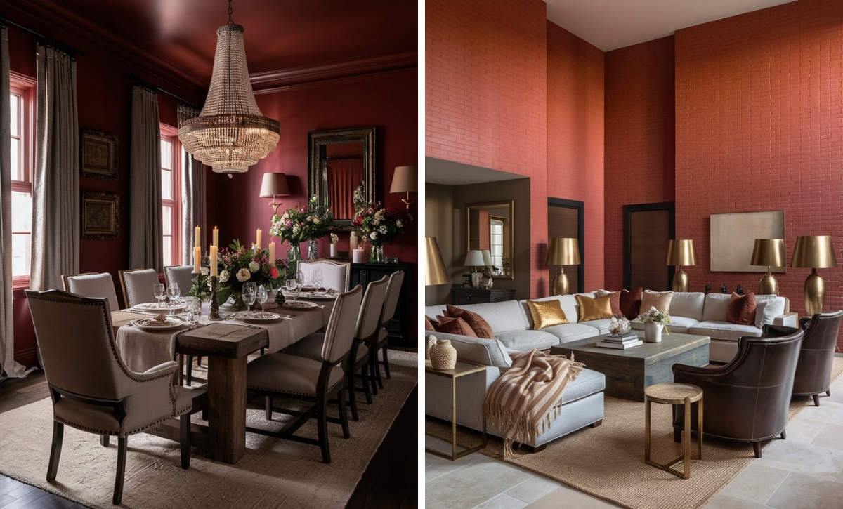
One of the most tricky parts of decorating your home is finding the right paint color to exude the mood and aesthetic you want.
The wrong shade can completely undo your décor, while the right paint will complement it and even bring out the beauty of other elements in the space. This is why homeowners spend countless hours searching for the “perfect” paint color.
Many homeowners prefer ivory as a timeless paint color. Its refined, elegant, and soothing feel provides a beautiful backdrop in any interior space. Its simplicity and calming feel allow people, furnishings, and conversations to take center stage.
Let’s look at some of the best ivory paint colors suggested by interior design experts.
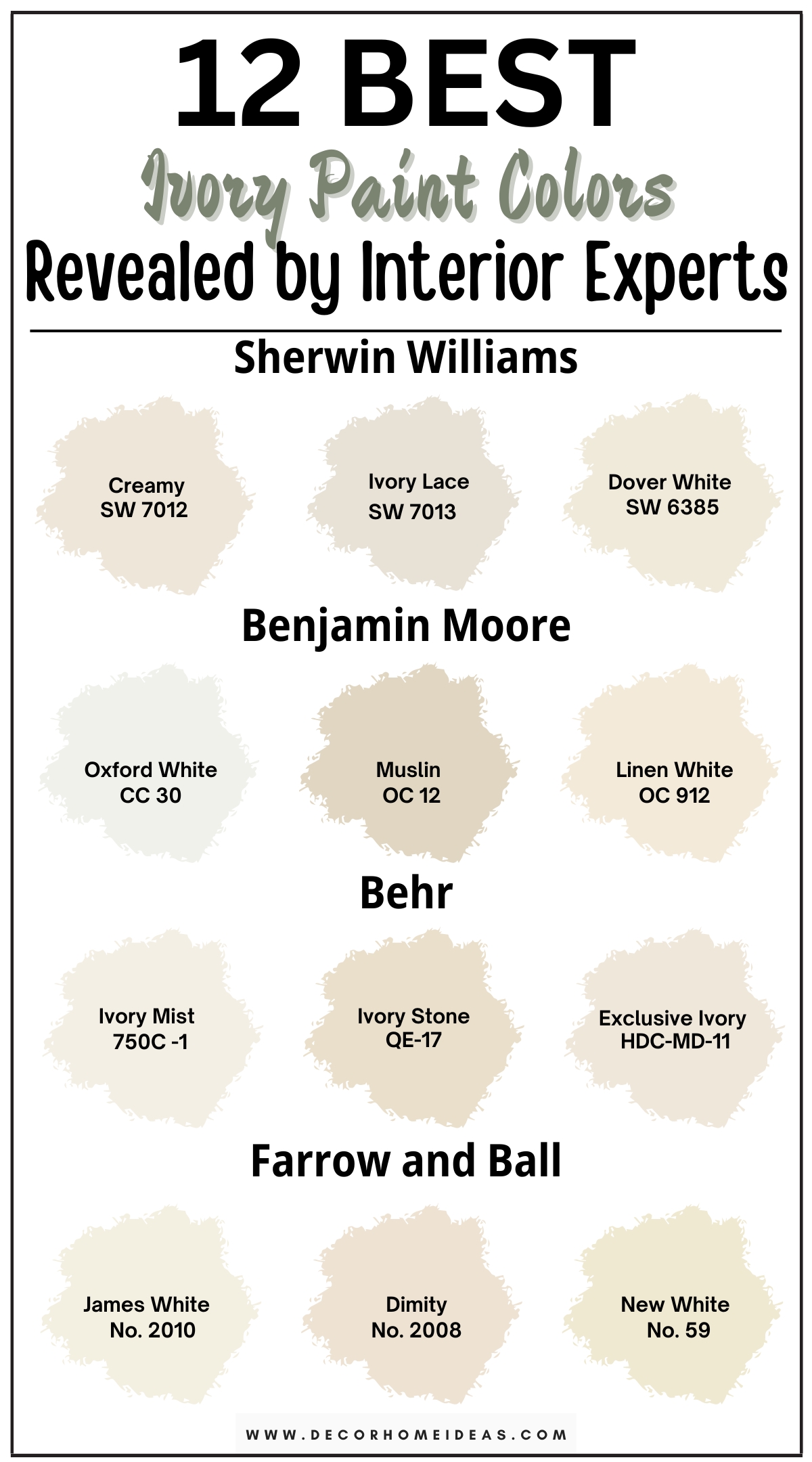
1. Sherwin Williams
Sherwin Williams Creamy
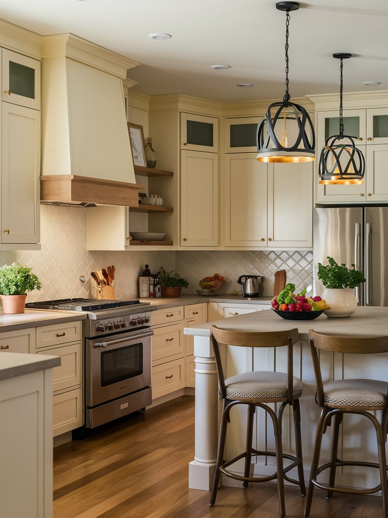
Sherwin Williams Creamy (7012) is an off-white color with a Light Reflectance Value (LRV) of 81, perfect for interior use in living rooms and kitchens. Its soft yellow undertones give it a neutral warmth.
This color will evoke different feelings based on your room’s lighting. In a southern or western-facing room, the yellow in the paint is likely to be more prominent, and for south and eastern-facing rooms, Creamy will make an excellent bounce color.
Considering its LRV, SW Creamy will work best as a wall paint, so avoid using it on trim and baseboards.
For a subtle combination, try complementing it with a shade like SW White Sand. This will especially work well in rooms where the lighting brings out the warmth in the color. Here, Creamy on the cabinets, drawers, and range hood complements the backsplash and natural wood tones in the space.
Sherwin Williams Ivory Lace
Sherwin Williams Ivory Lace (7013) is a bright, creamy white color that imparts a delicate grace to any space. It has a warm hue bordering on beige, and under bright light, the color displays cool pink undertones.
With an LRV of 79, Ivory Lace is considerably reflective. Its reflectance value makes it ideal for hallways, bedrooms, and kitchens.
When using it on the interior, you can pair it with bright colors such as SW White Snow (LRV 90)—since the two colors have an LRV difference of 11, they’ll contrast well without being stark against each other.
Notice how Ivory Lace has been combined with a bright white in this design to create an open, tranquil look, which is in clear contrast with the trim paint and adds to the visual interest of the space.
If you want an even more prominent contrast, try SW Sea Mariner. With an LRV of 19, the dark shader of Sea Mariner will make the Ivory Lace seem brighter and pure when used as the primary color. You can also reverse the application and use Sea Mariner as the primary and Ivory Lace for the trims and backboards.
You can also pair Ivory Lace with other Sherwin William shades such as Canvas Tan, Soft Sage, and Aleutian. This paint generally works well with darker hues since it neutralizes them, making the space cooler.
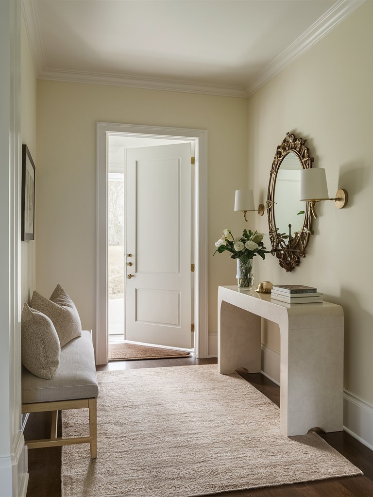
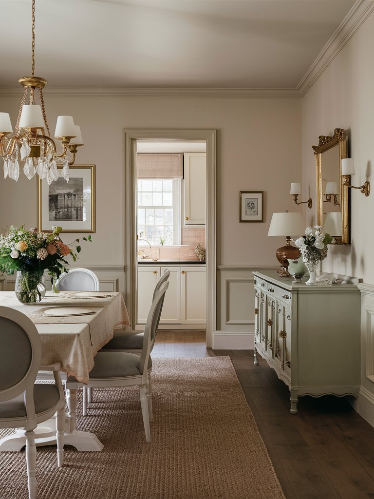
Sherwin Williams Dover White
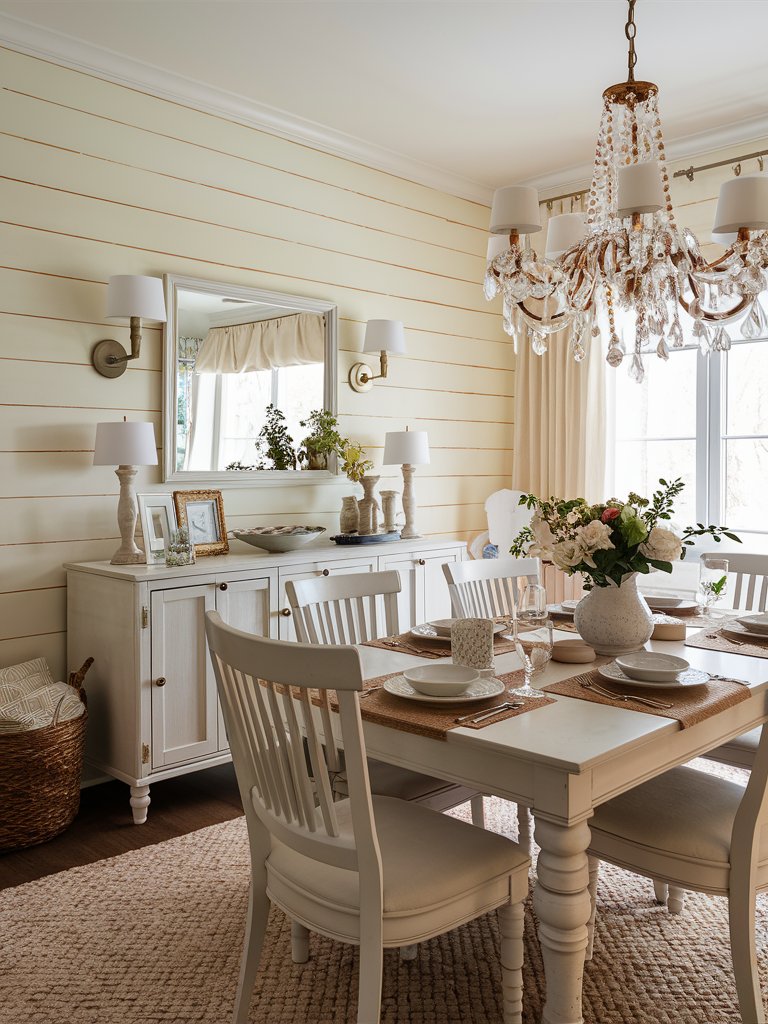
Sherwin Williams Dover White (6385) is one of the most famous interior colors. It’s favored in small spaces because it creates a sense of freshness, cleanliness, and simplicity. It evokes a feeling of a blank canvas, which can be used to develop and highlight the sense of space or add contrast.
With an LRV of 83, this color can be considered a warm white, which absorbs some of the light that bounces on it. The reflectance value of this color makes it ideal for creating a clean look without the space being too stark.
When designing with this color, add some textural elements, such as tile and brick or furs and molding, to make the space feel spacious yet interesting. Adding natural wood, stone, and marble pieces is also a great idea since the space will feel cozy under this creamy white background.
You can also use plants to improve your space’s visual appeal.
Being a neutral, Dover White will highlight most of your home’s architectural elements. Here, the paint is used as the primary wall color for this farmhouse-style dining area.
It works well to highlight the details of the bright white-colored furniture and also combines seamlessly with the natural fiber rug and the green and brown accents in the space.
SW Dover White pairs well with soft browns and tans like SW Dakota Wheat. It can also be paired with muted colors like SW Blue Waterloo. Its LRV value also lets it be paired with brighter whites, creating an ideal combo for farmhouse interiors.
2. Benjamin Moore
Benjamin Moore Oxford White
If you’re looking for a bright color that’ll make your home look warm and inviting while also allowing you to highlight decor details, Benjamin Moore Oxford White (CC-30) is the ideal shade for you. It’s an easy-to-clean, low-maintenance finish that’ll withstand wear and tear and work well for interior or exterior spaces.
BM Oxford white has warm yellow undertones with hints of green. However, it also has subtle undertones of cream and gray, which combine to create a smooth and calming hue. This versatility also means that it can be used in various settings.
With an LRV of 87, Oxford White reflects most of the light that bounces on it, making it ideal for brightening dark spaces or creating an inviting atmosphere in any space.
The color’s high LRV value also means that it’s less likely to fade. As such, it can create a classic, timeless look no matter what space it’s used in.
This color can be used on various surfaces in your home, including kitchen and bathroom cabinets, open-concept rooms, ceilings, trims and baseboards, and interior and exterior walls.
Oxford White has been used to ground this modern, contemporary space by giving it a clean, uniform look. The bright color helps highlight other vital elements in the space, such as the tan rug and furniture.
The feeling or mood that the color evokes will depend on other colors combined with or the décor around it. When placed under a cooler tone, Oxford White will look creamier and warmer in comparison.
However, a muted white can be paired as a neutral base paint or trim based on the look you want to create in your space.
Benjamin Moore Muslin
Benjamin Moore Muslin (OC-12) is a beige-like ivory color that brings an updated look to old-school beiges. Traditional beige paints can look dated in today’s modern spaces, but updated colors like Muslin create more depth with their subtle undertones.
Muslin has an LRV of 66.54, making it ideal for a medium-lit room without appearing too washed or muted. However, the color’s appearance may change throughout the day based on the amount of light the room receives. This color can settle into a warm, soft look with the right trim to contrast it.
Based on what you pair it with, Muslin will either show subtle orange undertones (when paired with pink items) or an orange-pink undertone (when paired with cream or yellows). Generally, this color pairs with paints with a light, earthy tone.
Muslin creates a chill, inviting atmosphere in this bedroom that encourages relaxation. Notice how the paint effortlessly combines with cool gray and bright white accents, bringing out the beauty of the minimal decor in the space.
BM Muslin is a great paint choice for balancing cool north-facing light. Although its warm undertones will be more prominent with south-facing or west-facing exposure, it handles intense heat much better than other saturated shades of beige.
Benjamin Moore Linen White
Benjamin Moore Linen White (912) should be your go-to choice for a more grounded ivory color bearing on cream. This color is much more interesting than traditional yellows and creams, which are more flat and bland.
It gives a soft, gentle, warm white look with several noticeable undertones. The warm tone exuded by the paint comes off smooth and creamy rather than crisp, fresh yellow.
With an LRV of 83, Linen white falls under the off-white range, so it won’t behave like traditional white paints, which usually appear less creamy or yellow. Since it has a creamy undertone, Linen White will appear yellow when paired with cooler tones like blue, green, or purple.
This warmth will be an excellent choice for northern-facing rooms since it helps balance the brightness. In southern-facing rooms, the yellow-orange undertone will be more prominent, so be careful when using the paint or sample it to know precisely how the space will look.
Here, BM Linen white has been used as a backdrop for the space, setting the stage to decorate and adding even brighter items such as the bright white furniture.
The paint’s warm undertones also make it easier to combine with earthy tones such as tan and brown, evident in different accents like the throw pillows, rug, table tray, and console table.
3. Behr
Behr Ivory Mist
If you’re looking for a bright color you can use in interior and exterior spaces, Behr Ivory Mist (750C-1) is one of the best paints you can choose.
This Semi-gloss paint and primer will provide a bright sheen to your home while keeping mildew and stains away since it’s resistant. This makes it ideal for use in areas with high traffic, such as hallways and corridors, or spaces prone to staining, such as mud rooms or kids’ rooms.
In terms of the undertones, Ivory Mist has very light shades of yellow and hints of green, red, and blue. The color evokes a tranquil, calm feel when paired with brighter whites, especially on the trims.
Behr Ivory mist has a high LRV of 85, which makes it ideal for reflecting light in dimly lit spaces. Perhaps the most unique aspect of the paint is its ability to hide stains. Moreover, its exceptional durability makes it ideal for residential and commercial properties.
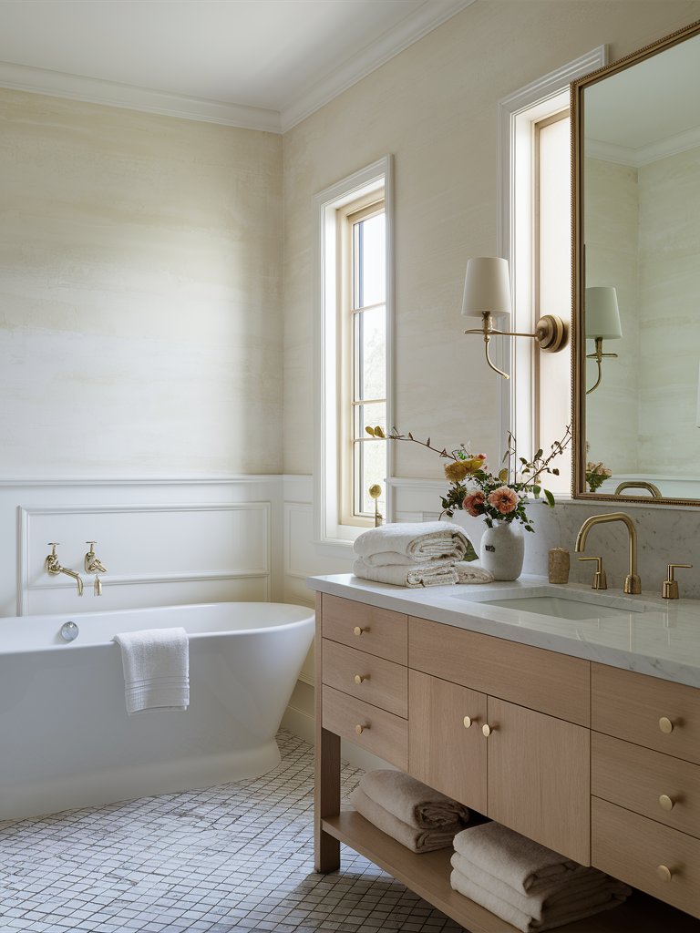
Its stain resistance and ability to withstand various temperatures and UV conditions make it the ideal choice in places like bathrooms, as evident in this design.
Behr Ivory Stone
Behr Ivory Stone (QE-17) is another semi-gloss paint ideal for busy spaces, with an eggshell sheen that hardly stains, thanks to its LRV of 74. Compared to other bright whites or ivory, this color appears sandy.
The color’s radiant, durable sheen gives it a polished look and makes it more vivid when paired with cool tones. This paint will work fine to give your space a chick-polished look. It’s perfect for well-lit rooms where you don’t want the paint color to be overly bright.
If you’re looking for a color that reflects some light while allowing your other brighter items to dominate the space, Ivory Stone will do the trick.
In this space, Ivory stone creates a subtle, bright space that allows more bright and cooler colors to be used without the space being too stark. The warm undertones of Ivory Stone balance out the otherwise too-bright accents in the room.
Prioritize natural materials such as wood and natural fibers to make the space more open and airy. You can even add a plant or two for extra visual interest.
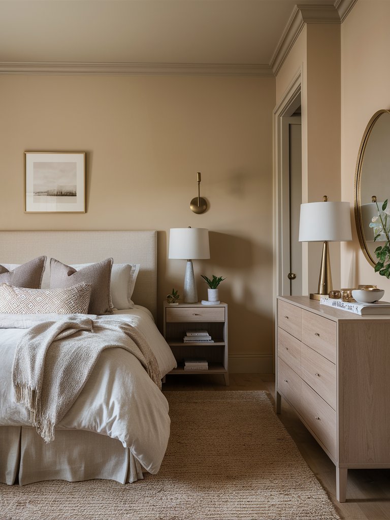
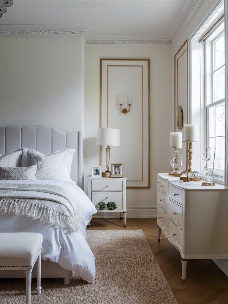
Behr Exclusive Ivory
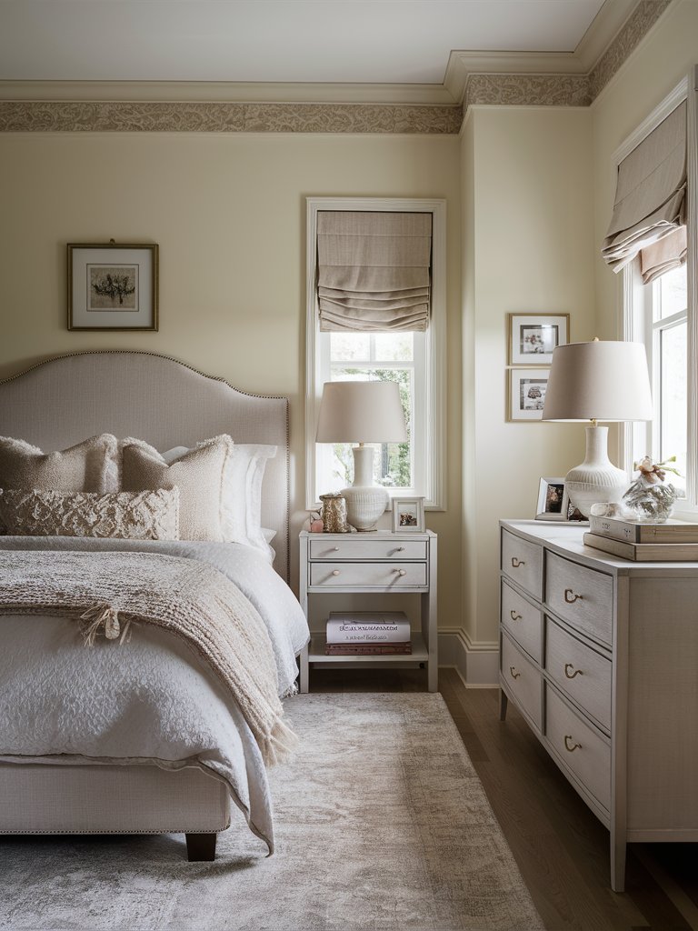
With an LRV of 76, Behr Exclusive Ivory (HDC-MD-11) is a soft ivory shade that reflects light exceptionally well, making spaces feel open, bright, and inviting. It’s an ideal choice if you’re looking to create a calming atmosphere with a touch of warmth.
Exclusive Ivory sits comfortably in the neutral palette, but what sets it apart is its delicate cream undertone. This adds enough warmth to soften a room without overwhelming it, making it perfect for bedrooms or any space you want to encourage relaxation and comfort.
Regarding pairing, Exclusive Ivory shines alongside other warm, earthy tones. It works beautifully with soft grays like Behr’s Silver Drop or greige hues like BM Revere Pewter. The subtle creaminess of the color also complements deeper shades like olive greens, charcoal grays, and rich browns, creating a balanced and harmonious look.
It’s particularly striking when paired with natural wood finishes or brass accents, offering a timeless, elegant contrast that enhances traditional and contemporary interiors.
In this bedroom, the color creates a backdrop for the cool gray tones of the bed and bedding to be prominent. Notice the availability of plenty of natural light, which is crucial in highlighting the beauty of the design and making the space more inviting.
Exclusive Ivory is also highly adaptable to different lighting conditions. In rooms with abundant natural light, it can brighten the space, while in dimmer rooms, its warmth adds a cozy, intimate feel.
It’s also an excellent choice for trim or cabinetry, offering just enough color to stand out while maintaining a neutral, clean look.
4. Farrow and Ball
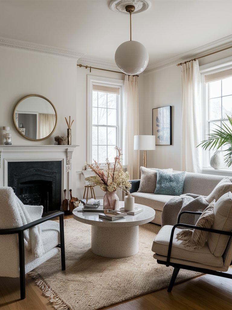
Farrow and Ball James White
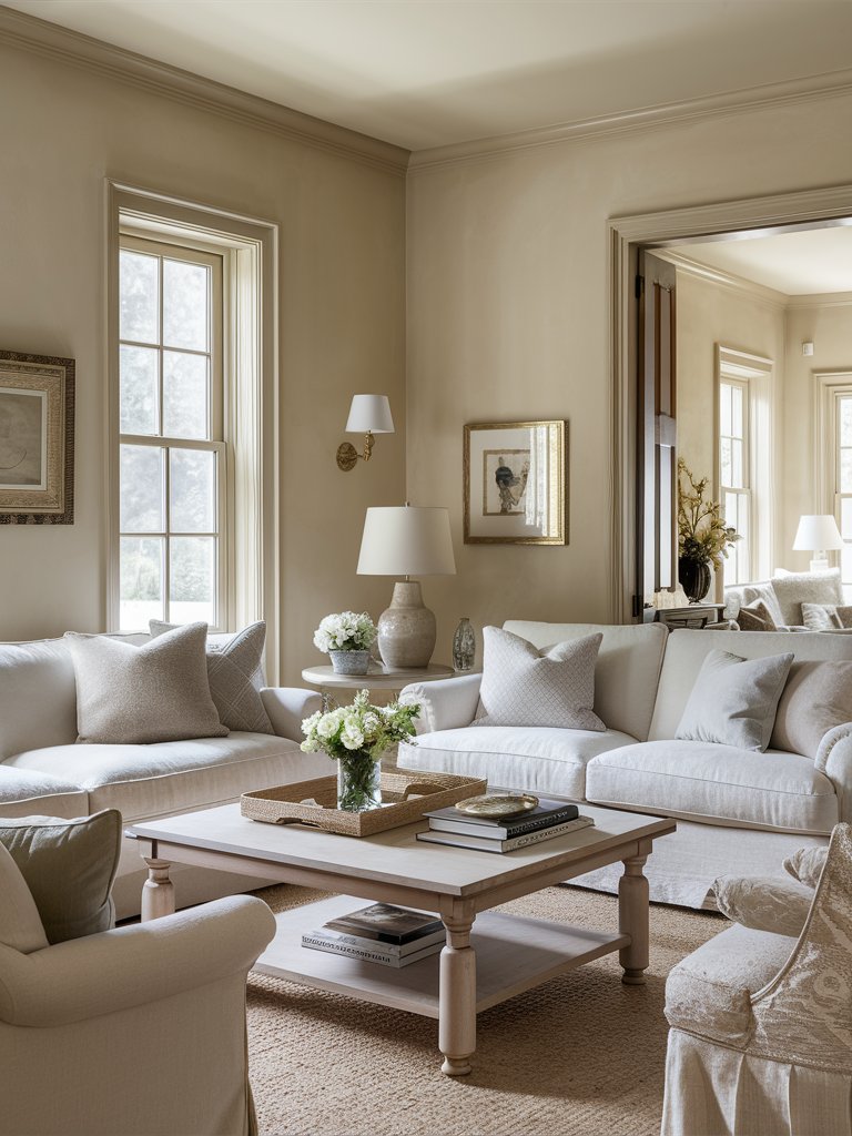
Initially created for a pretty garden, Farrow & Ball James White (No. 2010) is an off-white paint that has a fresh underlying green tone. The hints of green help create a calming, soothing, airy feel, which works particularly well in dark interiors.
The delicate green undertones of the color help promote a fresh, airy feeling reminiscent of early morning light filtering through the mist. It evokes a greener look with lighter white tones, especially in north-facing rooms.
With an LRV of 78, this color reflects a generous amount of light, creating bright rooms without being overbearing. Its light, reflective quality also helps smaller rooms feel more spacious while adding a calming depth in larger areas.
FB James White will work well in minimalist interiors and coastal-inspired spaces and brighten up traditional spaces by creating a clean background that is excellent for layering and adding bolder accents.
When used in a plain setting with no contrast, this ivory color will transform the room into a light, tranquil oasis, so it’s often preferred in bedrooms where you want to soak and relax after a long day.
This living room design shows the perfect use of this paint. The combination of gray and green accents makes the space calming and inviting, while the white paint and matching bright furniture make the space feel expansive.
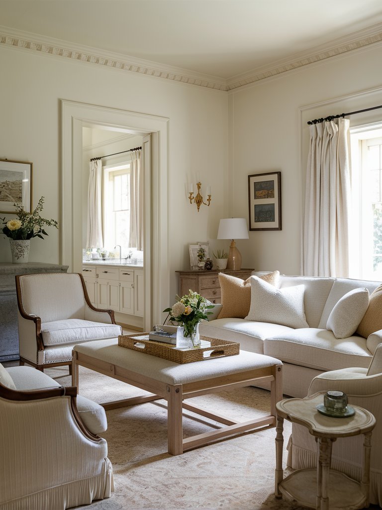
Farrow and Ball Dimity
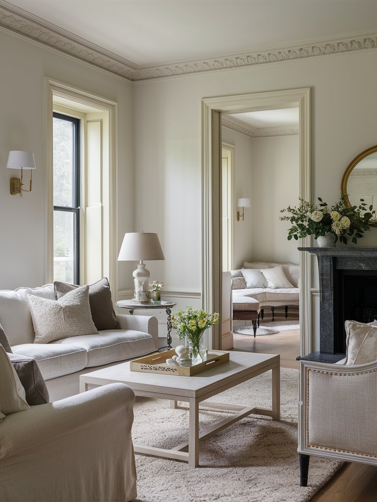
Farrow & Ball Dimity (No. 2008) is an absolute gem in the world of neutrals. It’s one of those colors that quietly exudes sophistication while adding warmth and depth to any space.
Its soft, creamy undertones give it a subtle blush warmth, making your space feel elegant and cozy. We primarily prefer it for interior spaces because it provides a neutral, lived-in feel without any sharpness or coldness.
Its LRV is around 70, reflecting enough light to brighten a room yet still retaining a touch of depth that makes it stand out from bright whites. Try it alongside soft pinks like FB Pink Ground or dusty blues like FB Light Blue for a charming, cozy feel.
Regarding furniture or decor pairings, it works beautifully with natural materials like wood, stone, and natural fibers by elevating the look and bringing a sense of harmony and organic flow to your space.
You can also match it with metal accents like brass to create a classic, refined impression. Here, a Dimity provides a perfect canvas for the brass metal accents, natural fiber rug, and light earthy tones used to decorate this space.
Farrow and Ball New White
As the name suggests, Farrow & Ball New White (No. 59) is one of the updated versions of white in interior design. A reasonably new color with a creamy tone, this ivory color feels fresher than similar traditional whites, such as FB Lime White.
With an LRV of 82 and a buttery undertone between neutral and soft cream, FB New White is an ideal choice for traditional and modern interiors. In addition to its understated, warm, cozy feel, New White also pairs with various colors for a classic, timeless palette.
It works well as the primary color in a room or as a trim color to highlight more dramatic shades. Pair it with soft grays or try cooler tones like blue-gray to create the perfect contrast.
Like other ivory colors on this list, it’ll feel cleaner when paired with warm tones like FB India Yellow and creamier when contrasted with brighter whites such as FB White Tie. It works exceptionally well in farmhouse-style interiors with other neutral bright colors.
This bedroom uses New White as the primary color, paired with matching furniture and bedding to create a minimalistic, modern look. The tan and brass accents in the room add visual interest. Even though the room has plenty of natural light, the space still looks calming and inviting despite the bright colors used.
What Color Compliments Ivory Paint Colors?
- Soft Gray
- Navy Blue
- Sage Green
- Terracotta
Soft Gray
Soft gray is a light, neutral shade that pairs beautifully with ivory, creating a serene and sophisticated look. The subtle contrast between these two colors adds depth and a touch of modern elegance without overpowering the space.
Use soft gray in larger elements like furniture, rugs, or accent walls to complement the warmth of ivory and create a harmonious environment.
Navy Blue
Navy blue is a deep, rich color that provides a striking contrast to the warm tones of ivory. This combination creates a classic and timeless palette that exudes sophistication and elegance.
Incorporate navy blue through decorative items like throw pillows, vases, or artwork to add depth and a touch of luxury to an ivory room.
Sage Green
Sage green is a soft, muted green with an earthy feel. Its natural, calming hue pairs well with the warmth of ivory, creating a balanced and tranquil atmosphere.
Try using sage green in textiles, such as curtains or throw blankets, to introduce a touch of nature and serenity to an ivory space.
Terracotta
Terracotta is a warm, earthy shade of orange-brown that adds a cozy and inviting touch to ivory. This combination creates a rich and comforting palette, perfect for creating a warm and welcoming environment.
Consider using terracotta in accessories like cushions, pottery, or accent walls to bring a touch of rustic charm and warmth to an ivory room.
Color Disclaimer
Please note that all paint colors displayed on this page are for illustrative purposes only. Due to variations in screen settings, lighting, and other factors, the colors you see on your screen may differ from the actual paint colors. We recommend viewing a physical color sample or swatch for the most accurate representation. Some images might be generated by AI to represent paint colors in different interiors