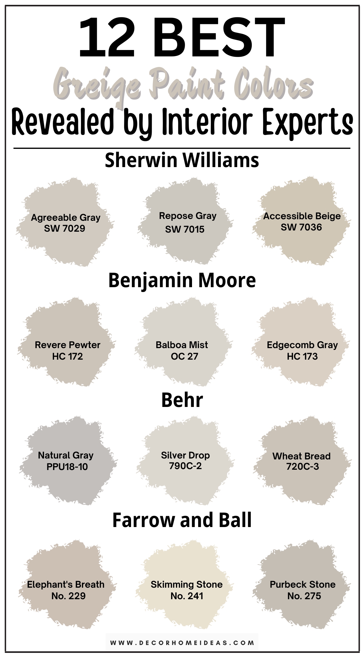
There are numerous ways to use gray paint—every gray paint color has its own unique undertone, personality, and potential to change a room’s ambiance. Greige paint colors combine the warmth of beige with the contemporary feel of grays for flexible and versatile colors that bring an opulent feel.
Let me first introduce you to the concept of LRV. A paint color’s LRV (Light Reflectance Value) tells you how light or dark a paint color is on a scale of 0 to 100, with zero being pure black and 100 being pure white.
The warm aspect of greige colors allows them to feel happy and inviting, but the gray prevents them from feeling overly cheery.
This gray base is inspired by the contemporary furnishings used in modern interiors, with fewer people using furnishings such as oak trim—this alleviates the need to stay within the yellow, gold-based warmth.
We’ve picked 12 of the best greige paint colors to help you achieve a warm, cozy contemporary space.
Take a look!
1. Sherwin Williams
Sherwin Williams Agreeable Gray
Sherwin Williams Agreeable Gray (7029) is one of their best-selling paint colors. It’s classified as a “mid-tone neutral beige,” and while it certainly nods gray, its warm undertone distinguishes it from traditional grays and puts it in the greige category.
Agreeable Gray has an LRV of 60, so it’s right on the end of a mid-tone color going light. This LRV allows the paint color to not wash away in bright light and gives it a serviceable amount of depth.
The color balances yellow and red warmth pretty well, and this flexibility in undertones is what makes it a widely used paint color.
SW Agreeable Gray’s slight purple undertones come through more often, mainly attributed to its interaction with cooler lighting, such as direct daylight or LED lighting. The paint color also has a very subtle green undertone that’s barely noticeable.
Since the paint color resembles a light taupe, it works excellently with cool grays, warm beiges, and creams. Agreeable Gray is very versatile as a wall color, creating a lovely backdrop for your decor.
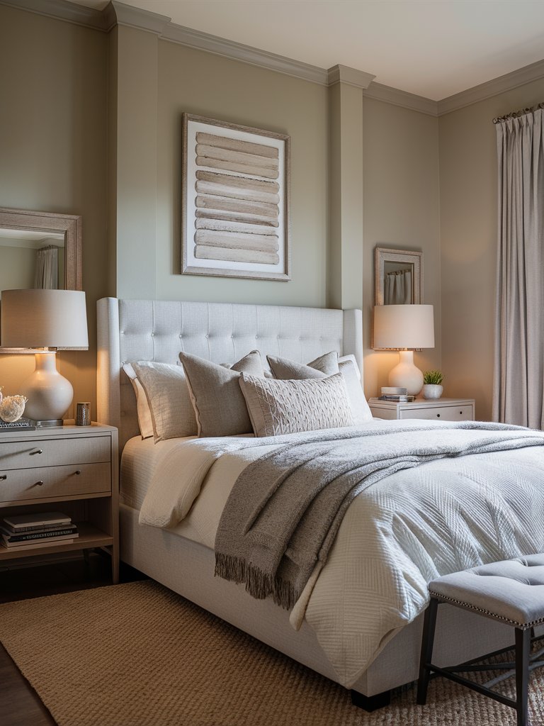
Agreeable Gray will highly depend on your lighting. The good news is if you have neutrals in your room, they’re likely to shift in the same direction undertone-wise—the paint color will hardly clash with any of your decor. Notice how the grays and browns in this bedroom blend seamlessly with the walls.
Since the color isn’t so light to be considered as an off-white, it would be much better to use an off-white on the walls and Agreeable Gray on the trim instead.
Also, if you have cherry wood cabinets in your kitchen, the paint color will bring out the red undertones of the cherry wood, making the cabinets even brighter and overwhelming the space—it’s not a good match.
SW Agreeable Gray’s passive warmth will make it lean a bit grayer in north-facing rooms, but it won’t go icy cold like other cooler, more traditional grays. In south-facing rooms or rooms with western afternoon sunlight, it’ll lean more to the warmer side but with a slightly cool edge.
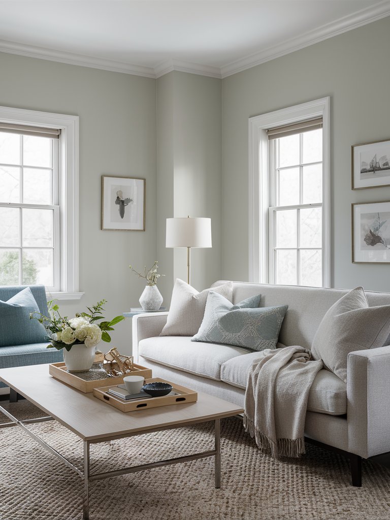
Sherwin Williams Repose Gray
Sherwin Williams Repose Gray (7015) is the most neutral of all the grays by Sherwin Williams and the lightest in terms of color. It’s a slightly warm, quintessential mid-tone greige color that leans a bit more to the gray side.
Repose Gray has an LRV of 58, so it’s a light-depth paint color but it’son the heavier side of the light range. The paint color has a nice balance of color and lightness, so it shouldn’t feel too dark or too light in most scenarios.
SW Repose Gray has two undertones, blue-gray, and violet-gray, favoring the violet-gray undertone more. The paint color hovers between cool and warm and could have a green undertone coming through in certain conditions.
Sitting on the cusp of cold and warm temperature-wise, this paint color is more susceptible to color shift, making it a little bit more unpredictable—you don’t know if you’re going to get a straight-up neutral gray, a greeny hue, or even some flashes of blue in certain cases.
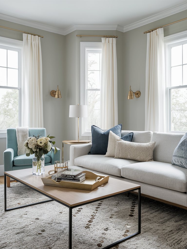
If you want to incorporate trendy clay, rose gold, or terracotta hues, they could really bring out the green in Repose Gray. The blue and gray on this living room’s seating are an excellent example of how to match the undertones in your decor with those of your paint color on the walls.
The violet-gray undertones become more pronounced in north-facing rooms, making the paint color appear darker, especially if you have a lot of shadows and less natural light.
Repose Gray excels in south-facing rooms because it maintains a light, neutral gray hue. You’ll also notice the blue undertone coming through.
NB: Other colors inside your room or even outside your windows can influence how Repose Gray reacts, so it’s always best to test out the color and ensure it pairs well with your décor as well as fixed elements.
Sherwin Williams Accessible Beige
Sherwin Williams Accessible Beige (7036) is one of the most popular beiges in the last two decades. However, despite its name, Accessible Beige is actually a warm gray paint color.
Accessible Beige has an LRV of 58, so it’s a light-depth paint color, but it’s on the lower end of the light range. It’s not bright and cheery like most beiges, has a bit more visual weight, and contrasts more with white trims.
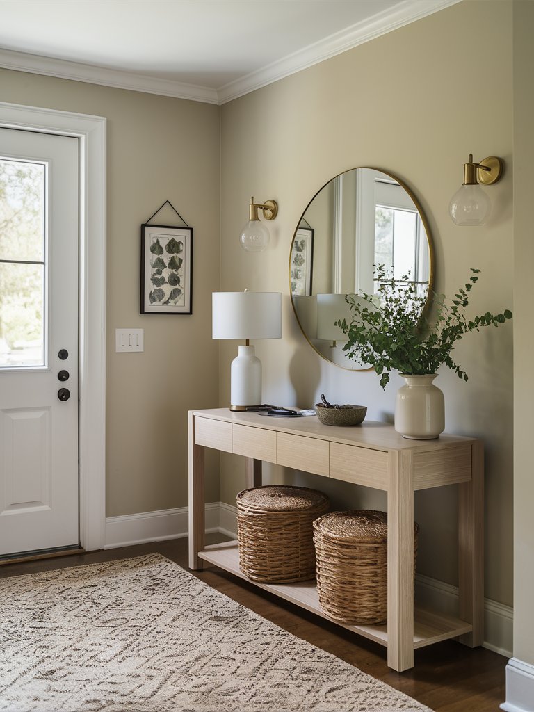
The touch of gray in Accessible Beige prevents it from appearing bright, warm, and cheery and keeps it very muted. The natural woven baskets and light wood tones on the console table in this entryway bring out the beige undertones in Accessible Beige on the walls.
In terms of undertones, SW Accessible Beige is pretty balanced in that it doesn’t overly lean to its green or pink side, but this will depend on the space it’s used in. Gray is the main undertone, but since it’s a beige, the paint color has an orange base that it sits on.
Since it’s very subtle, Accessible Beige is an excellent way to delve into the world of beiges without getting inundated with the committed orange-pink or orange-yellow warmth that’s commonly associated with most beiges.
Accessible Beige will look drab, gloomy, and flat in a dark room. The paint color might not be as warm as other beiges in bright, north-facing rooms. However, it’s excellent for infusing passive warmth in northern spaces or rooms with western morning light or eastern afternoon light.
Thanks to its gray undertone, Accessible Beige doesn’t lean warmer than most paint colors in south-facing rooms or rooms with western afternoon light.
If you plan on painting your home or space with SW Accessible Beige and your current wall color is darker than it, especially if it’s a dark, cool gray or has yellow or orange undertones, you must prime your walls first.
Failing to prime your walls will make the undertones of the current dark wall color bleed into the new, lighter wall.
Also, it’s never advisable to cut your paint colors. Cutting paint colors changes the ratio of a color, which, in turn, changes the undertones. This makes your paint color unpredictable.
If you have to cut it, please test your paint color to see how it will look with your fixed elements and the type of lighting in your home.
2. Benjamin Moore
Benjamin Moore Revere Pewter
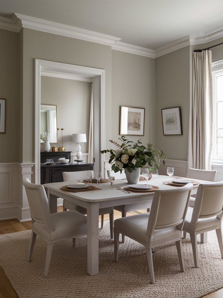
Benjamin Moore Revere Pewter (HC-172) has been one of the company’s best-selling colors for a decade or even two. This is because of its versatility as a paint color.
Revere Pewter is a transitional, warm gray paint color that bridges the gap between gray and beige, cool and warm. Everything about this paint color feels balanced; it’s a bit warm with some cool elements.
It’s a mid-tone color in terms of how dark it is, and it isn’t overly vibrant—it works pretty well in a number of different homes.
BM Revere Pewter has an LRV of 55.05, so it’s on the lighter side of mid-tone paint colors. Its added depth creates a subtle statement since it has that little bit of dynamism. It works with numerous color palettes and can be used as a ‘glue’ color to fill in gaps within your palette.
Revere Pewter leans more to its gray side, so you might notice a green undertone lurking in the background. This green undertone is highly dependent on lighting and fixed elements, so ensure you sample the paint first to avoid any surprises.
In south-facing rooms or rooms with plenty of natural light, Revere Pewter will look like a warm gray with the slightest green undertone, unlike the cool undertones you’d get with most gray paint colors. In north-facing rooms, it becomes muddy and darker.
Revere Pewter isn’t an ideal primary paint color for your whole house, but it works pretty well in well-lit open living spaces, bedrooms, and bathrooms. The above dining room utilizes natural light from the windows to keep the walls cozy and sophisticated.
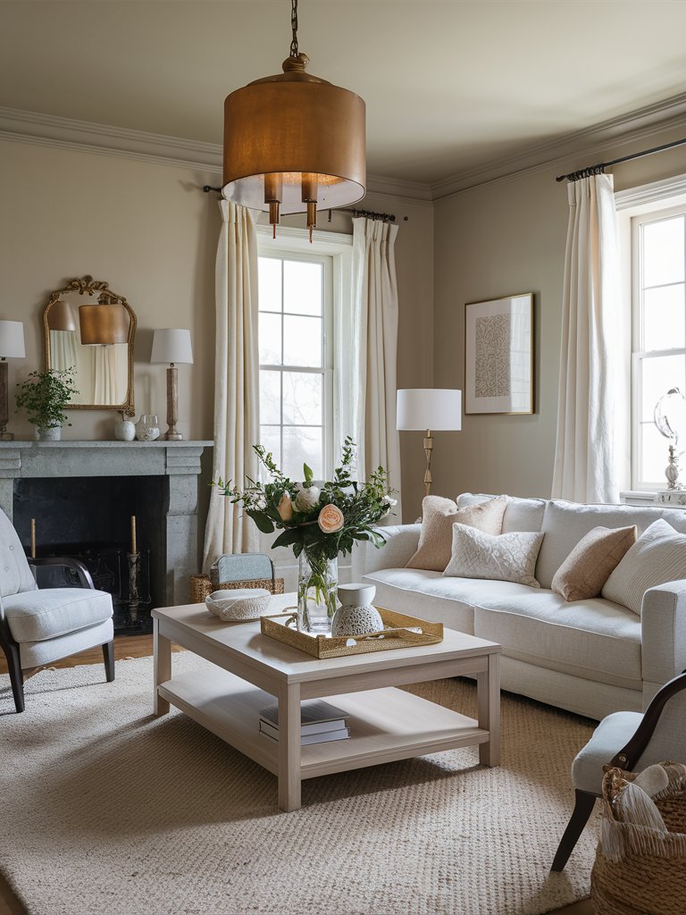
Benjamin Moore Balboa Mist
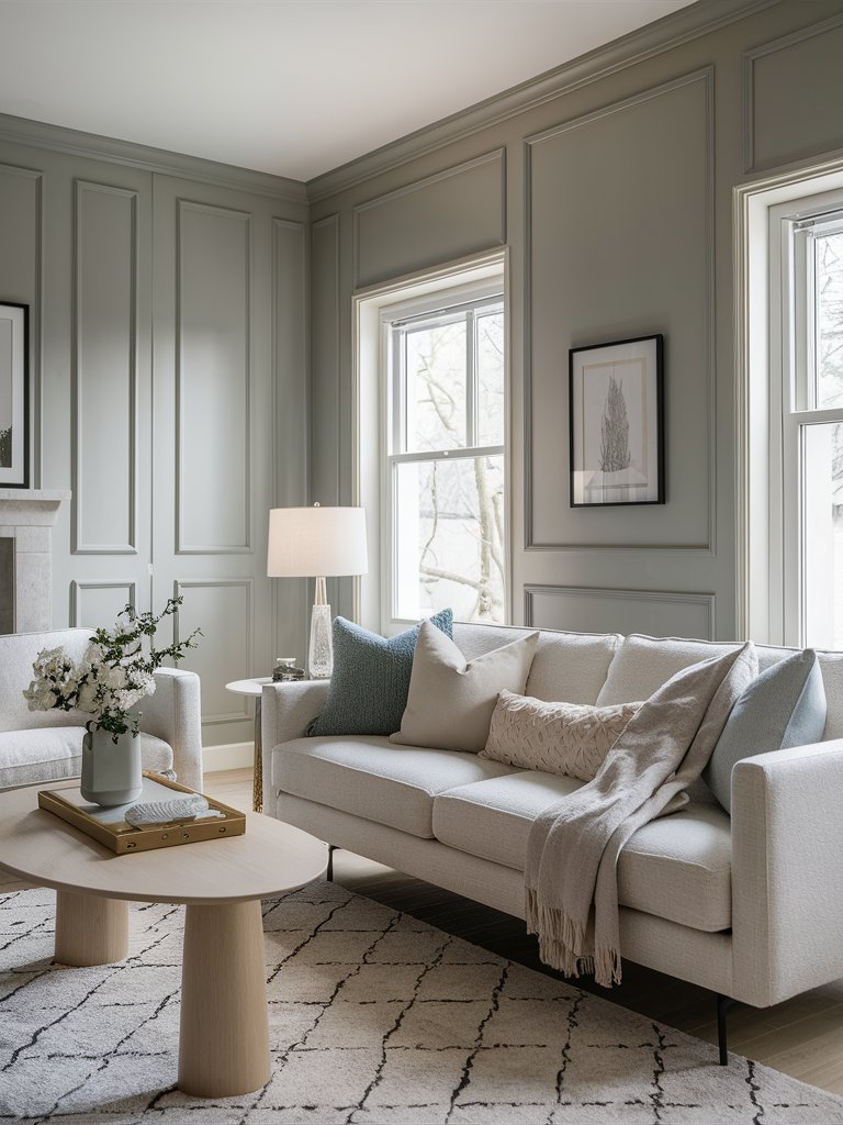
Benjamin Moore Balboa Mist (OC-27) is a gorgeous, versatile paint color that can be used in numerous design styles. It’s a greige paint color that combines a bit of gray with warm beige. If you want a relaxing, luxurious space, this is the perfect paint color for you!
Balboa Mist has an LRV of 65.53, so it’s a light color that could work really well as a primary wall color—paint colors in the 60s LRV range are ideal for more prominent areas since they make a space airy and spacious without necessarily sacrificing their actual color, as evident in the above living room.
BM Balboa Mist doesn’t have pronounced green or blue undertones but instead has a slight tinge of purple coming through. Balboa Mist will lean slightly purple-pink since it’s a warm paint color.
In south-facing rooms or rooms with a lot of natural light, Balboa Mist becomes a very pale violet-gray. It becomes darker in north-facing rooms, and the purple undertones become more pronounced.
The paint color works well in both south—and north-facing rooms, but it’s essential to compare the undertones of the fixed elements and furnishings in your home before making the final decision.
If you plan on using Balboa Mist in your bathroom, it’s critical to ensure that your walls and countertops are related in color and undertones. Countertops with earthy undertones will clash with Balboa Mist on the walls, making them look old and outdated.
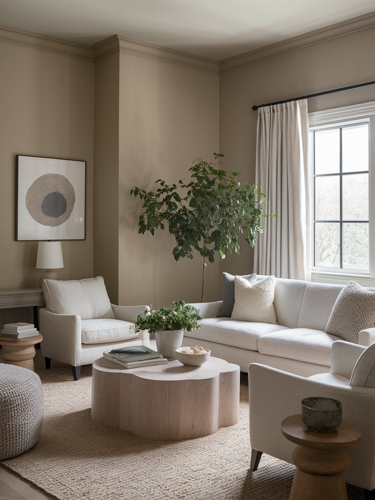
Benjamin Moore Edgecomb Gray
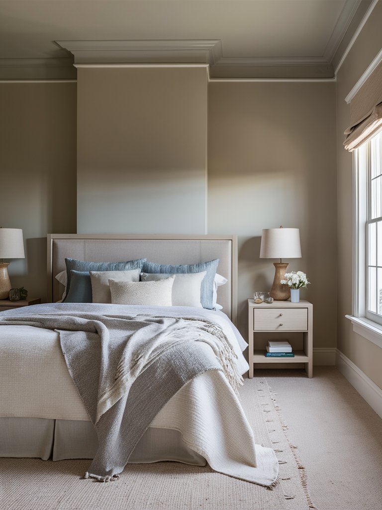
Benjamin Moore Edgecomb Gray (HC-173) is another best-selling paint color by the company. Most people regard this paint color as a lighter version of Benjamin Moore Revere Pewter.
While this is partially true, that same lightness gives it a slightly different feel undertone-wise, where the gray within Edgecomb Gray isn’t nearly as pronounced. This also limits the visible green undertone seen in Revere Pewter.
Edgecomb Gray combines the tried-and-true qualities of gray and the warm, comforting qualities of beige into a color that wonderfully coordinates with traditional and modern designs.
The paint color has an LRV of 63.09, so it’s an ideal primary paint color because it sits in a good spot lightness-wise.
BM Edgecomb Gray can be used in an understated minimalist setting or as a backdrop to a much more maximalist decor style with many accessories, artwork, furniture, and fixtures.
In north-facing rooms or rooms with less natural light, Edgecomb Gray will look a bit dingy, but it comes to life in south-facing rooms or rooms with plenty of natural light.
Here, the beige headboard and wooden nightstands pair perfectly with Edgecomb Gray on the walls for an inviting and tranquil sleep space.
3. Behr
Behr Natural Gray
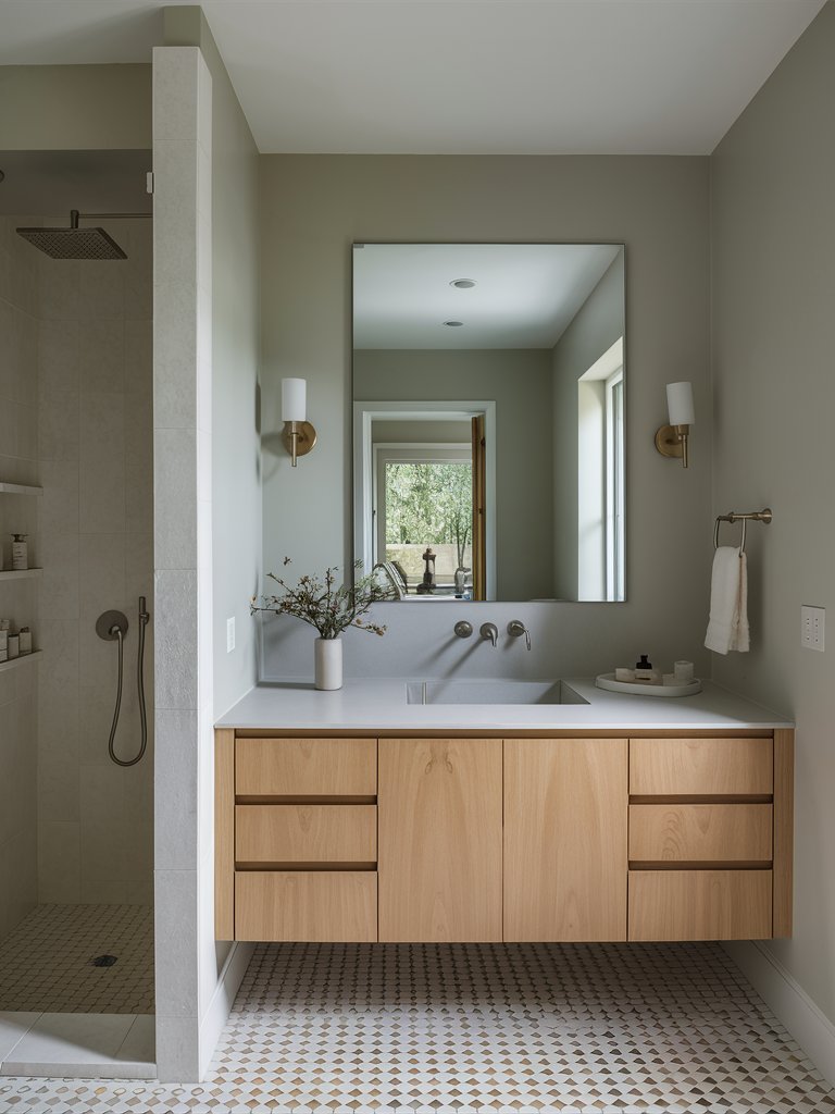
Behr Natural Gray (PPU18-10) is a medium-toned warm gray paint color that gives you a deep, neutral look. It’s a popular, versatile gray paint color that makes a space feel timeless and classic.
With an LRV of 53, Natural Gray is a mid-tone paint color on the lighter side. It feels soft, crisp, delightful, and refined and can be used in Scandi, transitional, modern, modern farmhouse, mid-century modern, and contemporary designs.
Behr Natural Gray can be used on kitchen cabinets, primary or accent walls, and even exterior shiplap walls. It pairs nicely with olive greens, light blues, coral pinks, light mauves, and crisp, creamy shades, but you have to sample the paint color first to find what works for you.
In this bathroom, light wood tones on the vanity have subtly contrasted Natural Gray on the walls while still creating a focal point. The patterned tiled floor adds interest, while the crisp white ceiling keeps things airy.
The paint color tends to appear dull and dingy in rooms without much light, so we recommend using it in rooms that receive plenty of natural sunlight.
Natural Gray slightly leans towards the warmer side in south-facing rooms and looks like a cool gray neutral in north-facing rooms.
Behr Silver Drop
Behr Silver Drop (790C-2) is a beautiful pale gray paint color with a bit of beige that warms it up. It’s a versatile greige paint color that can appear dark and cool in some scenarios and warm and bright in others.
With an LRV of 70, Silver Drop is on the lighter side of neutrals and bases. Its high reflective ability creates the illusion of larger, airier spaces. However, these spaces don’t feel awkwardly large due to the presence of the beige undertone that provides its warmth.
Behr Silver Drop tends to reflect various warm undertones surrounding it, so it can be classified as a chameleon. The paint color evokes a timeless feel, making it ideal for numerous interior design styles.
Silver Drop pairs well with crisp whites, sage greens, navy blues, and dark beiges and caters to Scandi, modern farmhouse, bohemian, and transitional interior design styles.
You can use the paint color on living room walls, kitchen cabinets, bedroom walls, or headboard accents.
Behr Silver Drop will feel warm and creamy in south-facing rooms and cold and bold in north-facing rooms, with the color changing as the day progresses and the sun shifts.
Behr Wheat Bread
Just like its name suggests, Behr Wheat Bread (720C-3) resembles the color of classic wheat bread. It’s a mid-tone greige paint color with very subtle gray and beige undertones, making it appear crisp and clean.
With an LRV of 56, Wheat Bread is a light color, but it’s right on the cusp of mid-tone paint colors. It has a creamy look, but its gray undertones tone it down, making the paint color cozy, warm, comfy, and sophisticated—you can see the depth of the paint color in this living room’s walls.
Wheat Bread leans more toward the warmer side but can make your space feel friendly, large, and cheery. It can be used on walls, trim, molding, exteriors, kitchens, and even wall paneling.
Behr Wheat Bread evokes a cool and calm atmosphere in north or east-facing rooms, with the gray undertones becoming more pronounced. On the other hand, it appears warm and cozy in south or west-facing rooms, with a slight tint of brown-beige undertone coming through.
Also, if your home has many windows and many trees outside, you might notice a slight green undertone if you’re using Wheat Bread on your walls.
4. Farrow and Ball
Farrow and Ball Elephant’s Breath
Farrow & Ball Elephant’s Breath (No. 229) is a soft, calming, warm gray paint color that works excellently as a neutral wall paint color.
Farrow & Ball describes the color as a “warm mid-gray with a hit of magenta” on its website, but depending on lighting, the paint color might exhibit slight violet/lilac undertones.
Elephant’s Breath is a versatile greige color used in dining rooms, bathrooms, living spaces, and bedrooms to create modern, sophisticated, yet pretty warm spaces. It pairs particularly well with white cabinets and trim in the kitchen.
The paint color works excellently well with warm, brown-based materials such as natural wood, jute, and rattan, but not so much with cool grays. Elephant’s Breath is also dark enough to be used as a floor color and light enough to work as an exterior wall paint color.
FB Elephant’s Breath appears slightly greige in south-facing rooms. It’ll look more gray in north-facing rooms, with the delicate lilac undertones becoming more pronounced.
Since it’s a chameleon, the paint color will take on different tones throughout the day, going from stoney gray and khaki green to pure gray.
Farrow and Ball Skimming Stone
Farrow & Ball Skimming Stone (No. 241) is a light, warm gray paint color filled with richness and depth. It’s part of the Farrow and Ball Contemporary Neutrals Collection, and the paint color is based on the old plaster used in the 1800s.
It’s a pretty versatile greige paint color and well-balanced, but it tends to lean more toward the warmer side of things. This highly depends on your room’s orientation, furniture, flooring, and lighting.
Skimming Stone is also a chameleon, feeling warm during some times of the day and cool at others. Its brown-pink undertones lend it a cheerful look.
FB Skimming Stone can be used in numerous spaces, including living rooms, bathrooms, dining rooms, and bedrooms. It could also work on the ceiling or an exterior wall paint color.
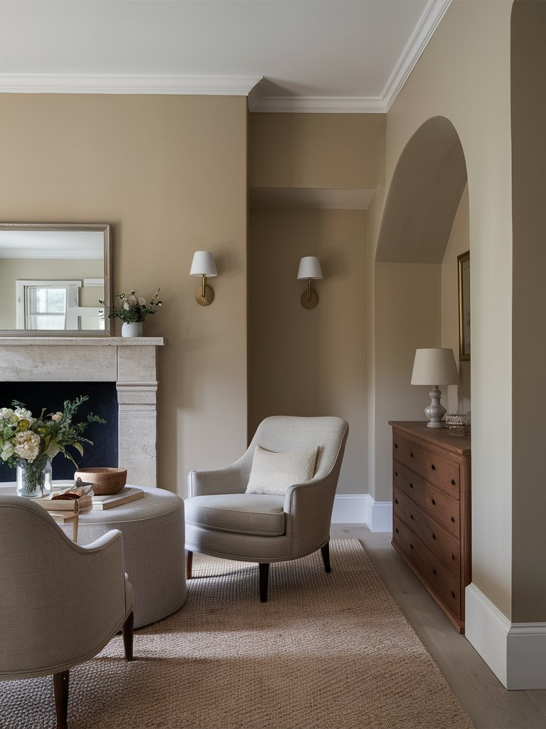
The wainscoting in the above living space is a perfect example of how to pair Skimming Stone on the walls with a much deeper and darker greige paint color.
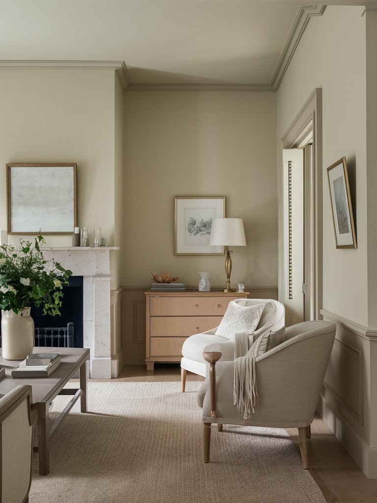
Farrow and Ball Purbeck Stone
Farrow & Ball Purbeck Stone (No. 275) is one of the company’s most popular paint colors. The paint color’s name draws inspiration from the beautiful limestone on England’s Jurassic Coast, the Isle of Purbeck.
Purbeck Stone feels like a mid-tone taupe combining gray and brown, with a dash of green peeking through. The paint color is dark enough to be noticed but also light enough to be used in more than one part of your home.
This sophisticated greige paint color evokes a calm, neutral feel, and its balanced warm and cool undertones bring complexity and depth to any space. This makes FB Purbeck Stone an ideal paint color for both contemporary and traditional spaces.
The mid-tone paint color is just barely on the lighter side and leans more to its warmer side. Its balanced warm-cool undertones shift between soft lavender and stoney greige.
Purbeck Stone works well on kitchen cabinets, millwork, walls, trim, and paneling. Consider pairing the color with deep blue-greens and rich, earthy tones like terracotta to infuse your space with warmth and depth.
Warmer materials and finishes like rattan and wood will also help emphasize the paint color’s warmth. The area rug and light gray wood floor in the above living room showcase how to create a continuous look from your floor to the walls using undertones in the wall paint color and your decor.
FB Purbeck Stone’s chameleon-like quality can be experienced during different times of day, depending on the light source and surrounding colors. You can witness various undertones, from warm greige to soft lavender, depending on the rooms you use it in.
What Color Compliments Greige Colors?
- Soft White
- Navy Blue
- Blush Pink
- Sage Green
- Charcoal Gray
Soft White
Soft white is a classic and versatile pairing with greige, adding brightness and airiness to the space. This combination creates a clean and elegant look, perfect for living rooms, kitchens, or bedrooms where a neutral, calming atmosphere is desired.
Incorporate soft white in trim, cabinetry, or textiles to keep the space light and fresh while enhancing the warmth of greige.
Navy Blue
Navy blue adds a rich, sophisticated contrast to greige, bringing depth and a modern edge to the room. The deep, cool tones of navy balance the neutral warmth of greige, making it an ideal pairing for offices, dining rooms, or formal spaces.
Use navy blue in accent furniture, artwork, or rugs to create a bold and striking look that complements the subtle tones of greige.
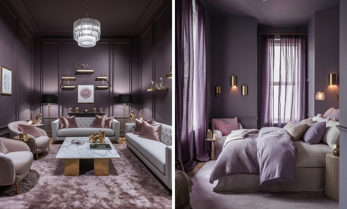
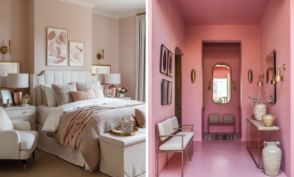
Blush Pink
Blush pink brings a soft, romantic touch to greige, creating a soothing and feminine palette. This combination works beautifully in bedrooms or living spaces where you want to introduce a hint of warmth and elegance.
Incorporate blush pink in throw pillows, curtains, or decorative accents to create a gentle contrast that enhances the muted tones of greige.
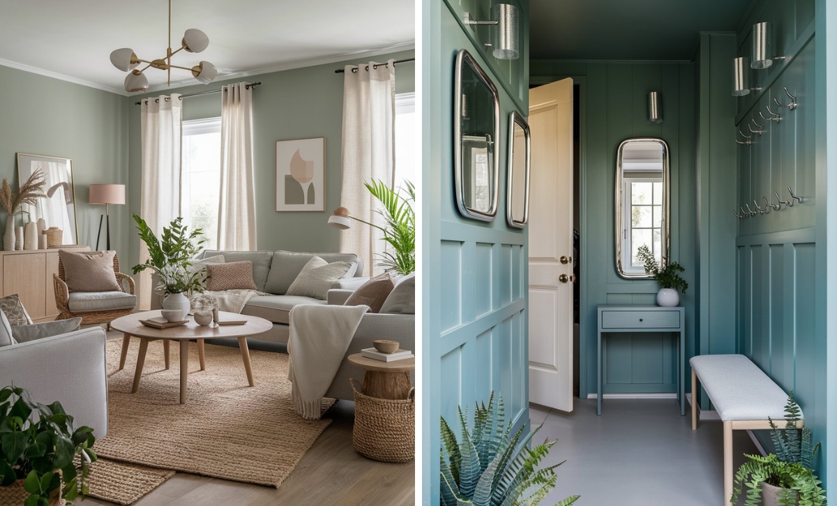
Sage Green
Sage green offers a fresh, organic complement to greige, creating a serene and nature-inspired look. This combination is perfect for spaces like bedrooms, kitchens, or living rooms, where a calm and grounded atmosphere is desired.
Use sage green in plants, accent walls, or upholstery to bring a refreshing pop of color that pairs beautifully with greige’s neutral warmth.
Charcoal Gray
Charcoal gray provides a sleek, modern contrast to greige, creating a stylish and understated palette. This combination adds depth and sophistication without overpowering the room, making it ideal for contemporary or minimalist spaces.
Incorporate charcoal gray in furniture, flooring, or accent walls to create a refined, balanced look that highlights the versatility of greige.
Color Disclaimer
Please note that all paint colors displayed on this page are for illustrative purposes only. Due to variations in screen settings, lighting, and other factors, the colors you see on your screen may differ from the actual paint colors. We recommend viewing a physical color sample or swatch for the most accurate representation. Some images might be generated by AI to represent paint colors in different interiors