Red is one of the most challenging colors to work with due to its high intensity and saturation. However, in the right settings, red has the power to create stunning design statements that can completely transform a space. The trick here is choosing the right shade and pairing it with complementary shades.
As it’s incredibly versatile, crimson can fit in both ultra-modern and traditional settings. However, it’s important to note that not all crimson reds are the same. The shade will vary from dramatic, bright, and energetic to deep and moody.
In terms of mood and ambiance, some crimsons exude a warm and cozy mood that invites historical charm, while others are like a breath of fresh air, with cool tones ideal for contemporary spaces.
With so many options to choose from in the market, we have prepared some of the best crimson shades to use on your interiors.
Take a look!
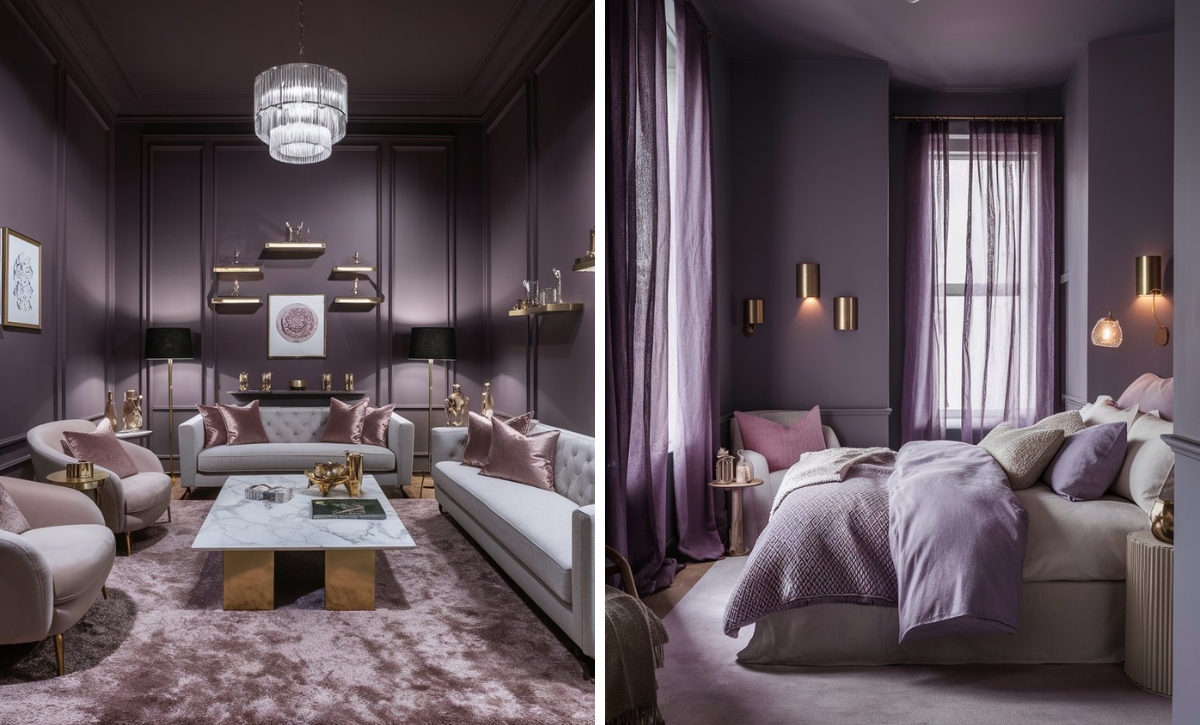
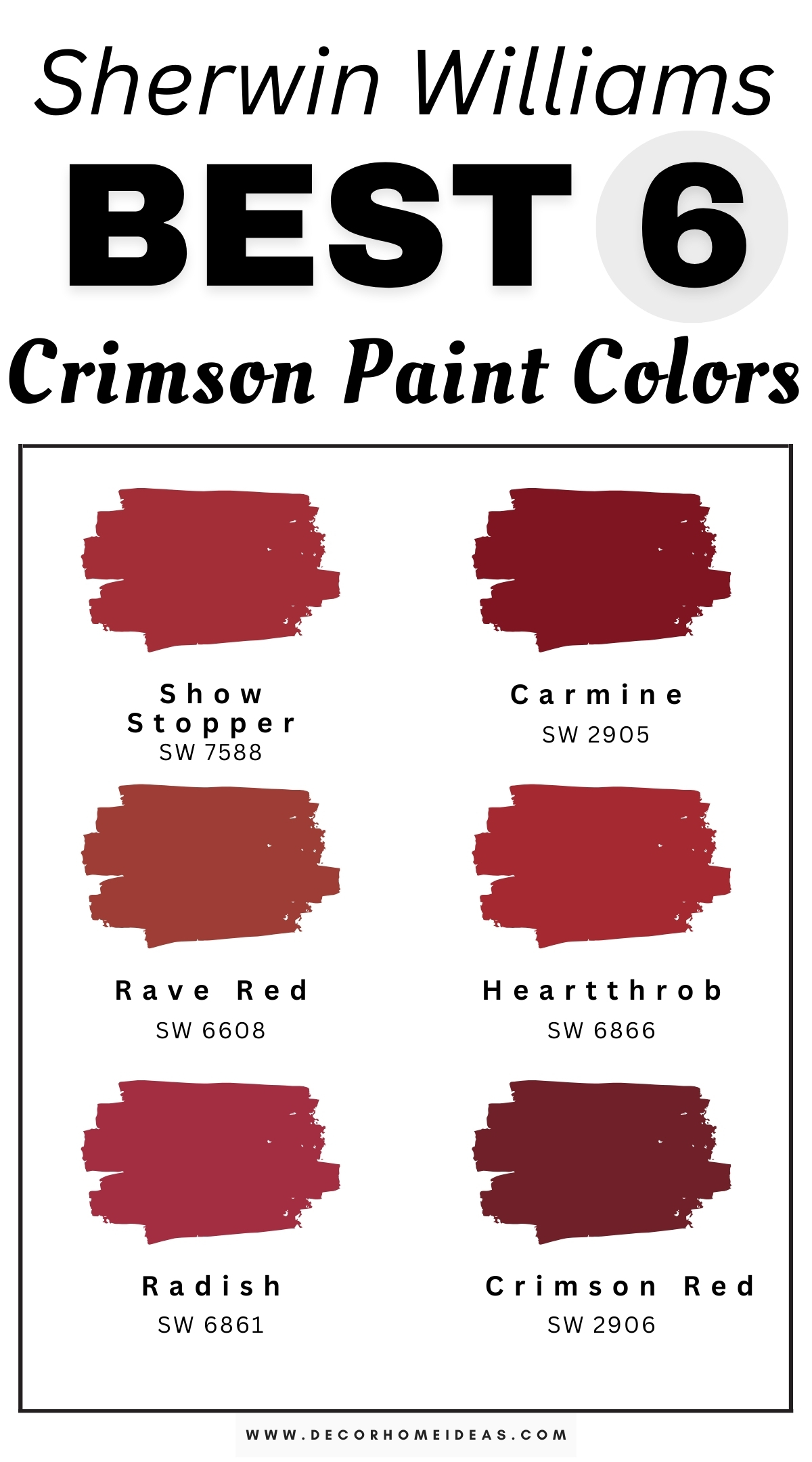
Sherwin Williams
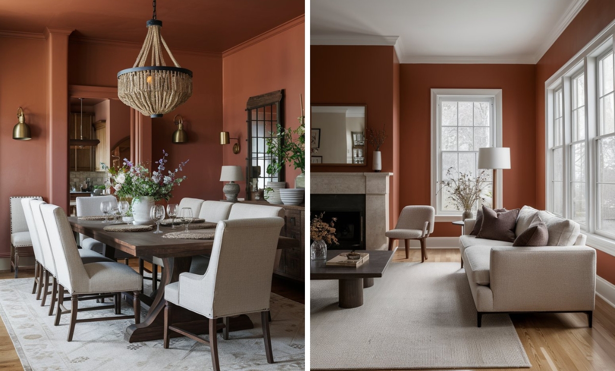
Sherwin Williams Show Stopper
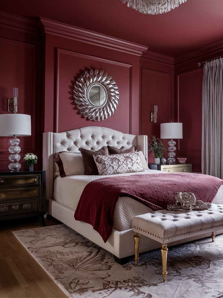
Sherwin Williams Show Stopper is a demanding crimson paint color befitting of the name show stopper. It has a bold red hue with subtle pink undertones, providing a modern twist to the traditional crimson shade.
However, this does not mean that the shade is reserved for only modern and contemporary spaces; Show Stopper can also be used in traditional spaces.
This shade is a good choice for showcasing the full spectrum of red brilliance, from a full wall color to an accent wall color.
Based on the applied lighting, Show Stopper will bring out different undertones. Under warm ambient lighting, the paint color adds a soft, romantic touch to a space showcasing dreamy pink undertones. When illuminated by bright direct light, it’ll read more red.
In this bedroom design, Show Stopper has been used to create a cozy, welcoming space. The enveloping crimson color in the room acts as the perfect blank slate for other neutral-toned materials to dominate. The combination of reflective elements such as mirrors and glass accents helps reflect light around the space, making it more airy and inviting.
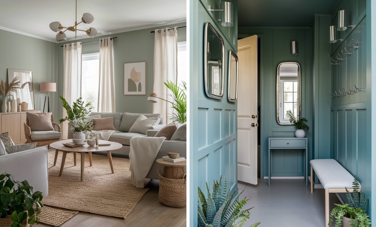
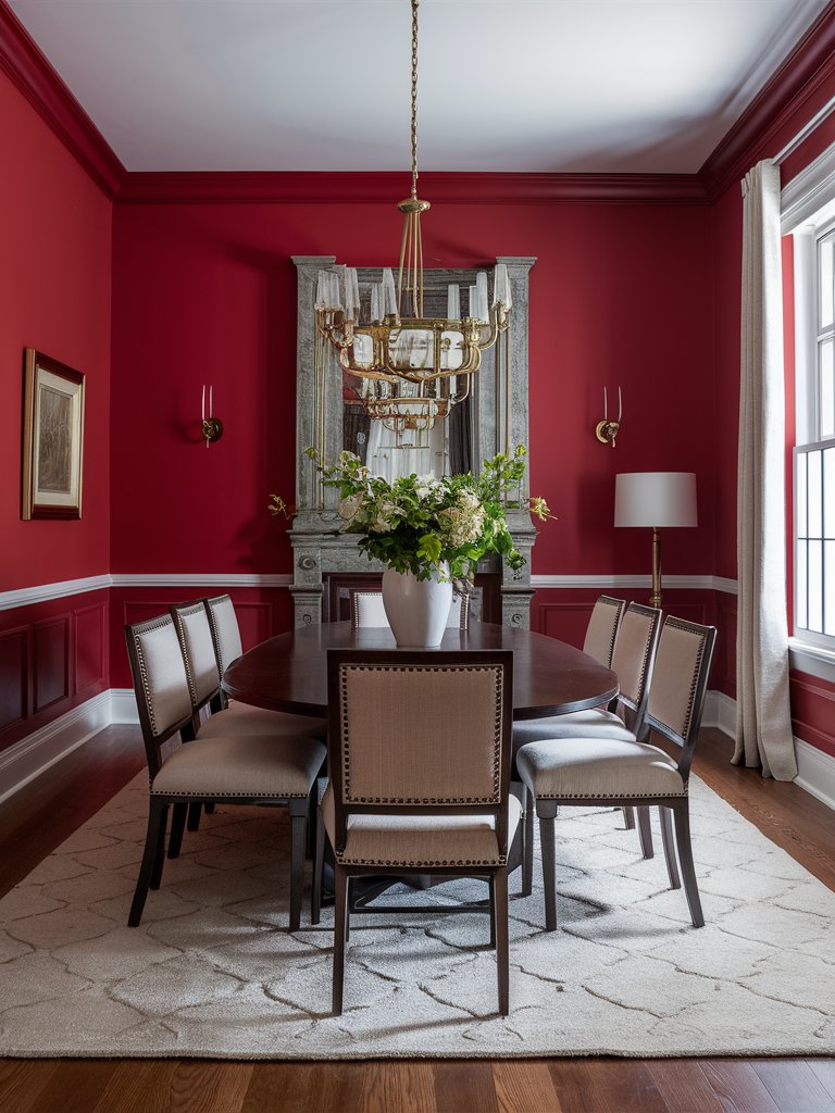
Sherwin Williams Carmine
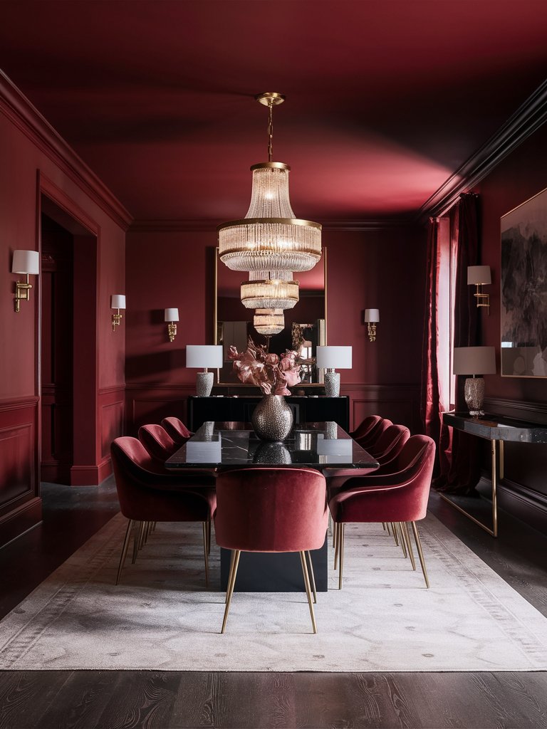
Sherwin Williams Carmine is a rich, deep red that exudes sophistication and warmth. This bold shade will make a striking statement in any space.
As a red with subtle blue undertones, this shade has a cooler, refined look compared to other red tomes that have orange or yellow bases. Its unique cool tone gives it a luxurious feel that is neither overly bright nor dark.
Depending on the type of lighting, Carmine may appear vibrant and full-bodied, showing its depth and richness in well-lit spaces. Under artificial lighting, Carmine can have an inviting and cozy edge to it, which enhances the sophisticated, slightly jewel-tone quality.
When used as a full wall color, it creates a grounding, enveloping atmosphere ideal for dining rooms, bedrooms, and libraries.
In this dining room, Carmine creates a lavish royal look when combined with the golden metallic accents. Notice how the color is combined with other red tones and darker accents to create a calm space. Reflective surfaces in the room help bounce light around the room to make the space look more spacious.
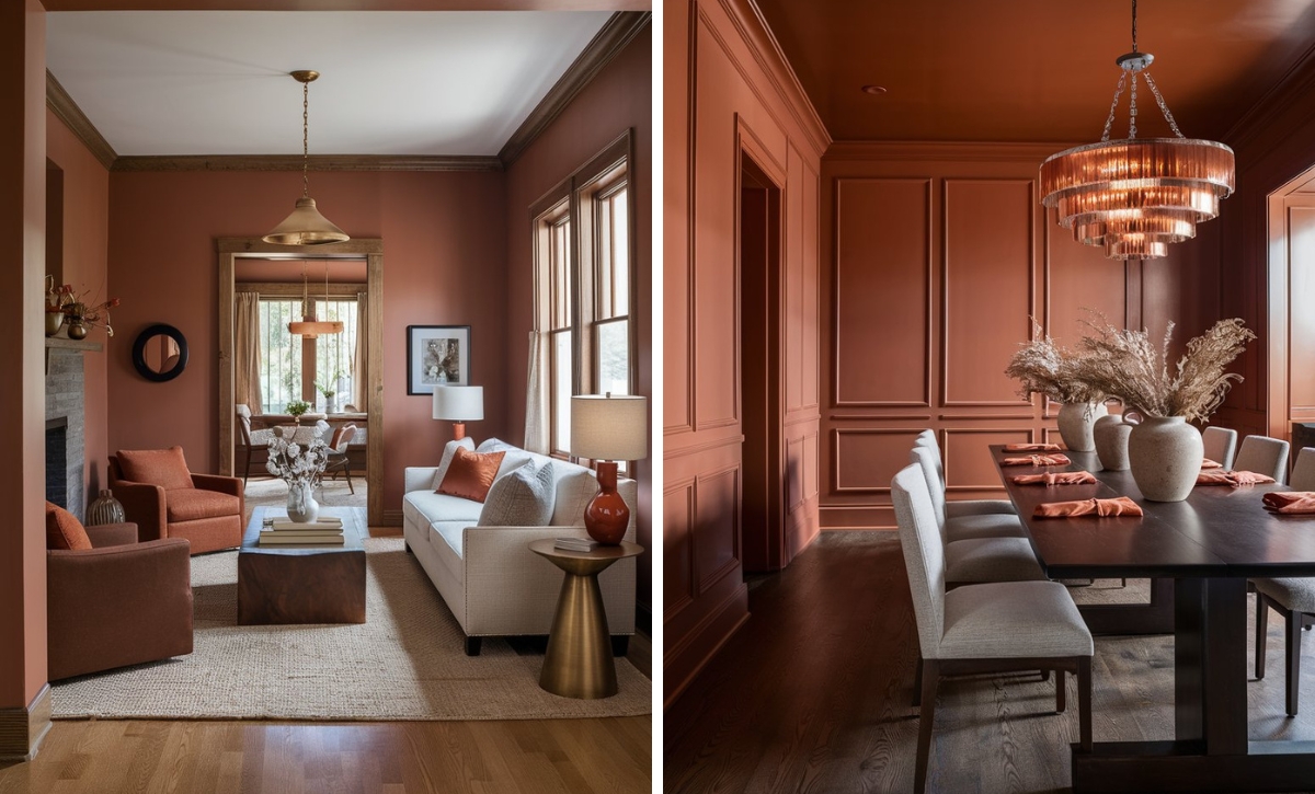
Sherwin Williams Rave Red
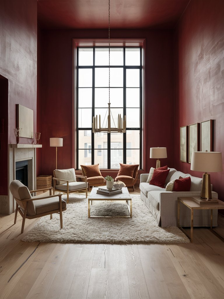
A high-energy red that radiates excitement and passion, Sherwin Williams Rave Red is the perfect shade for creating a lively, dynamic atmosphere.
Its subtle orange undertones give it an approachable and playful mood compared to other cooler reds. As the name suggests, Rave Red is meant to inspire excitement and creativity.
The best place to apply this shade is in spaces where you are looking to stimulate conversation and activity. Its confident, playful nature allows it to pair well with contemporary and eclectic designs. It works well with neutral tones like gray, black, white, and beige, which balances its intensity.
Here, Rave Red has been used to create the ideal conversational space. The light beige tones help balance out the space, while the brown-orange accents help promote the cozy vibe. Even with plenty of natural light, the living room still manages to have a warm feeling due to the complementary accents used.
Sherwin Williams Heartthrob
If you are looking for an emotion-evoking red, you won’t get any better than Sherwin Williams Heartthrob. This shade stimulates the brain and speaks of passion and strength.
In most spaces, Heartthrob is used sparingly to avoid overshadowing other colors. It’s also used in combination with other bold colors to create a refreshing space that is full of energy.
As one of the reds associated with boldness and confidence, Heartthrob is used as an accent color. Even though it can be used as a complete wall color, it’s essential to be careful how you use this shade as it can become overpowering.
Combine it with light tones and metallic accents to infuse a modern, luxurious touch.
Notice how Heartthrob adds a touch of character to this space. The paint color has been creatively combined with light tones like white and beige to neutralize its strong dramatic presence. The brown accents of the furniture contribute to grounding the space, while the metallic accents add a royal touch.
Sherwin Williams Radish
For those looking for crimson tones with depth, Sherwin Williams Radish won’t disappoint. This paint color has darker undertones that exude richness and elegance, making it a good choice for spaces where a touch of drama is desired.
One of its most unique qualities is that it can add a sense of sophistication to your space while still maintaining its warmth and vibrancy.
The best place to use Radish is in rooms where you want to make a statement. In south-facing rooms or spaces with plenty of natural light, this color will reveal soft, velvety textures that will add an element of elegance to a space.
When used in north-facing rooms or spaces with warm lighting, the color will take on a deeper and more dramatic hue that will make a space more intimate.
In this space, Radish creates a soft, intimate feel that envelopes the whole space. Combining Radish with items in matching shades and subtle dark tones creates a modern minimalist look.
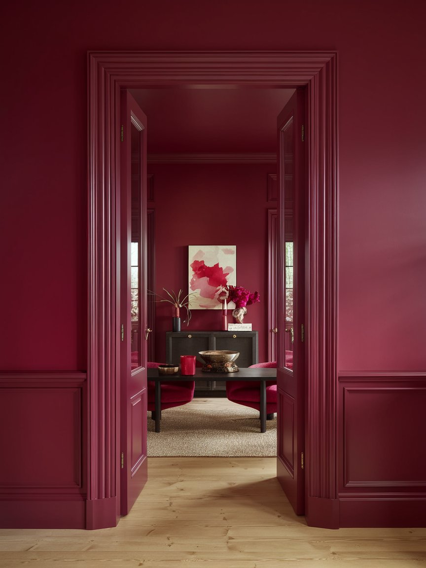
Sherwin Williams Crimson Red
Classic color lovers will appreciate Sherwin Williams Crimson Red. It has a deep rich hue that’s the epitome of sophistication.
Crimson Red has a blue base that balances its vigorous intensity, giving it a mysterious coolness. For many interior designs, this shade will go on the accent wall, as it can invigorate and create a captivating feel that is ideal for focal points.
Crimson Red is highly versatile and can hence be applied in different settings depending on the lighting techniques employed. Under warm lighting, its blue tones become more pronounced, contributing to the depth of the space.
It can also be employed in different rooms, from dining rooms to living rooms. Additionally, the color is highly adaptable, making it a timeless choice for many designers.
In this dining room, Crimson Red is used to create an inviting, traditional-looking space. The glass and metallic accents add a unique rustic touch, and the traditional console adds to the space’s vintage air.
Color Disclaimer
Please note that all paint colors displayed on this page are for illustrative purposes only. Due to variations in screen settings, lighting, and other factors, the colors you see on your screen may differ from the actual paint colors. We recommend viewing a physical color sample or swatch for the most accurate representation. Some images might be generated by AI to represent paint colors in different interiors