As a color associated with joy, love, passion, and vigor, crimson is one of the most versatile colors you can use on your interiors.
Historically, crimson has been used to make a statement since the Paleolithic era, and its use extended to other periods like ancient Rome, the Han Dynasty, and even Queen Elizabeth I reign. Its use is a testament to the symbolism that the shade carries: prestige, royalty, and authority.
In the modern world, crimson and other similar hues have been used by designers to add depth and inject vibrance and energy into a room. This makes it an invaluable option for designers looking to make a statement or add drama when designing.
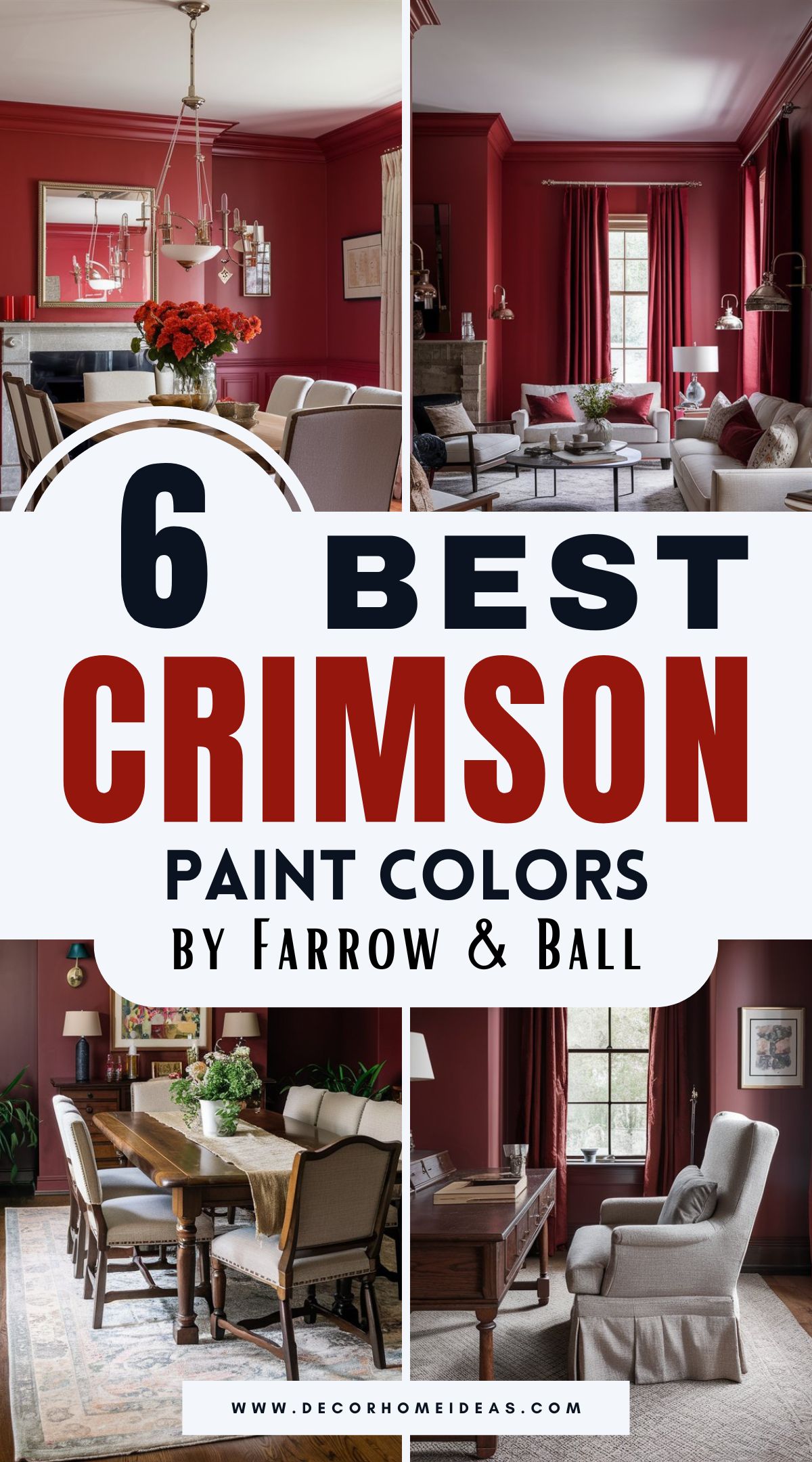
With a variety of crimson options in the market, we have prepared six ideal shades from Farrow and Ball that will bring a “wow” factor to any space.
Take a look!
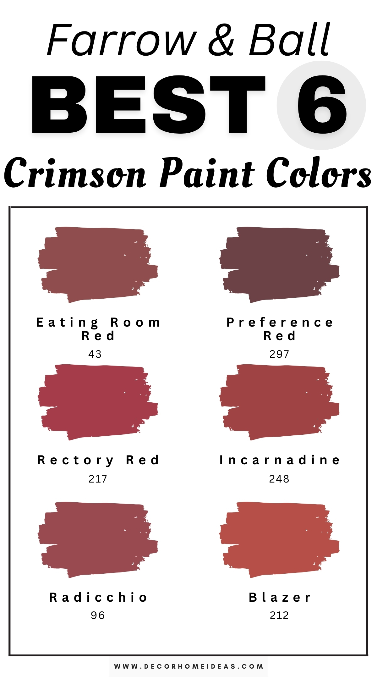
Farrow & Ball
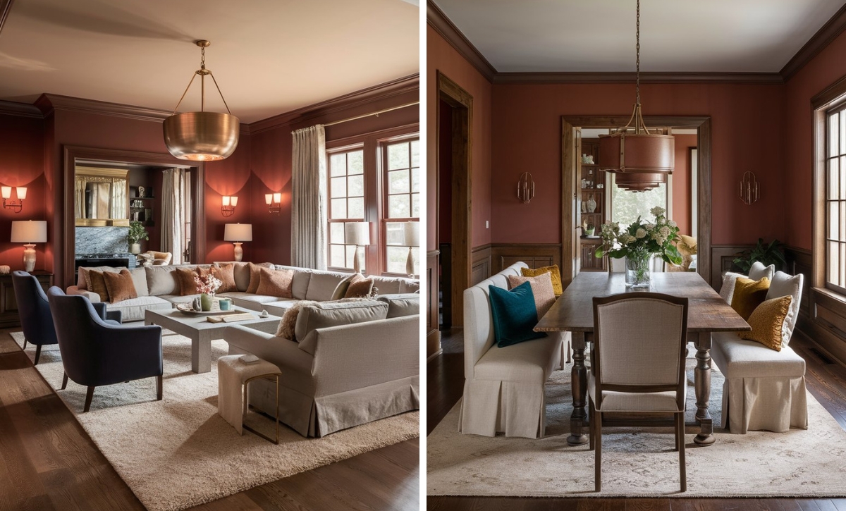
Farrow & Ball Eating Room Red
As a color specifically engineered for dining spaces, Farrow and Ball Eating Room Red has a warm and inviting air about it. It has subtle earthy undertones that create a welcoming and cozy atmosphere, making it ideal for spaces where you are looking to share rooms or encourage gatherings.
Since it creates a sense of warmth and hospitality, it’s essential to pair this paint with shades that will complement and enhance its inviting nature.
Eating Room Red pairs well with natural wood and soft neutrals, creating a cozy and harmonious look. You can also add subtle earthy tones to the space to add a bit of a grounding look.
Eating Room Red has been paired with soft shades like white and cream in this dining room to create the perfect contrast. Notice how the color also combines well with brown wooden tones to give the room a bit of authenticity. With plenty of natural light in the space, the room appears inviting while still being open and airy.
Farrow & Ball Preference Red
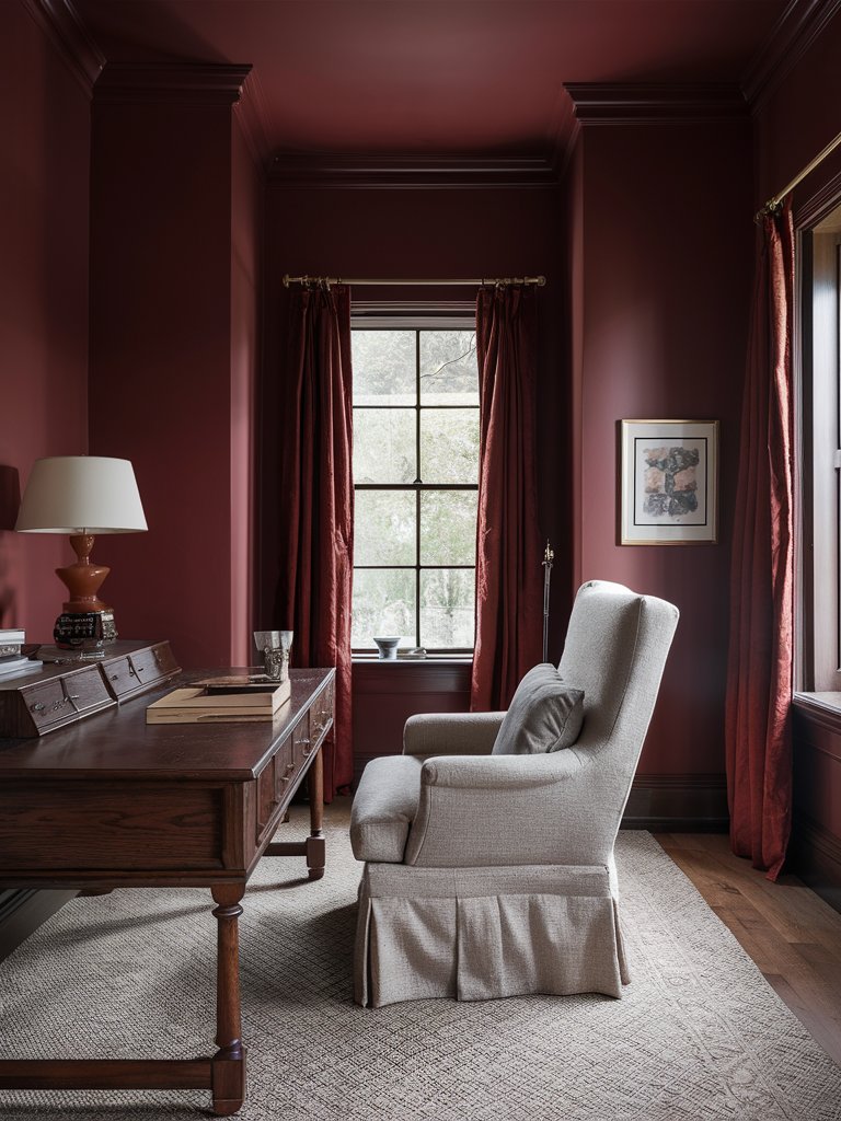
A deep and rich red named in honor of the original Farrow and Ball trade name Preference Paints, Farrow & Ball Preference Red is a Baroque color mainly based on neutrals.
However, it can also combine well with bright paints like pink and darker shades like Paen Black, making it the preferred choice for modern homes.
The color has slight brown undertones that prevent it from feeling too sharp or aggressive, making it more versatile than most traditional reds. This earthiness gives it a distinctly historic quality, reminiscent of English manor libraries and classic dining rooms, while still feeling contemporary enough for modern spaces.
Since it combines well with a broad spectrum of colors, the combinations will be crucial when using Preference Red as a full paint color.
Preference Red has been combined with light neutral tones like light gray and beige in this study space to lighten the mood. Brown earthy tones on the furniture give the study area a timeless, classic look.
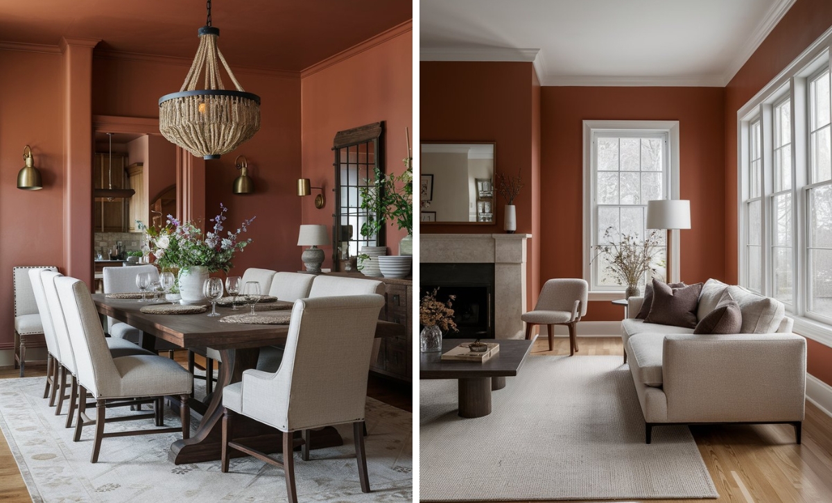
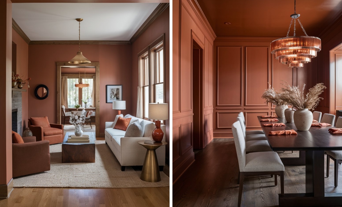
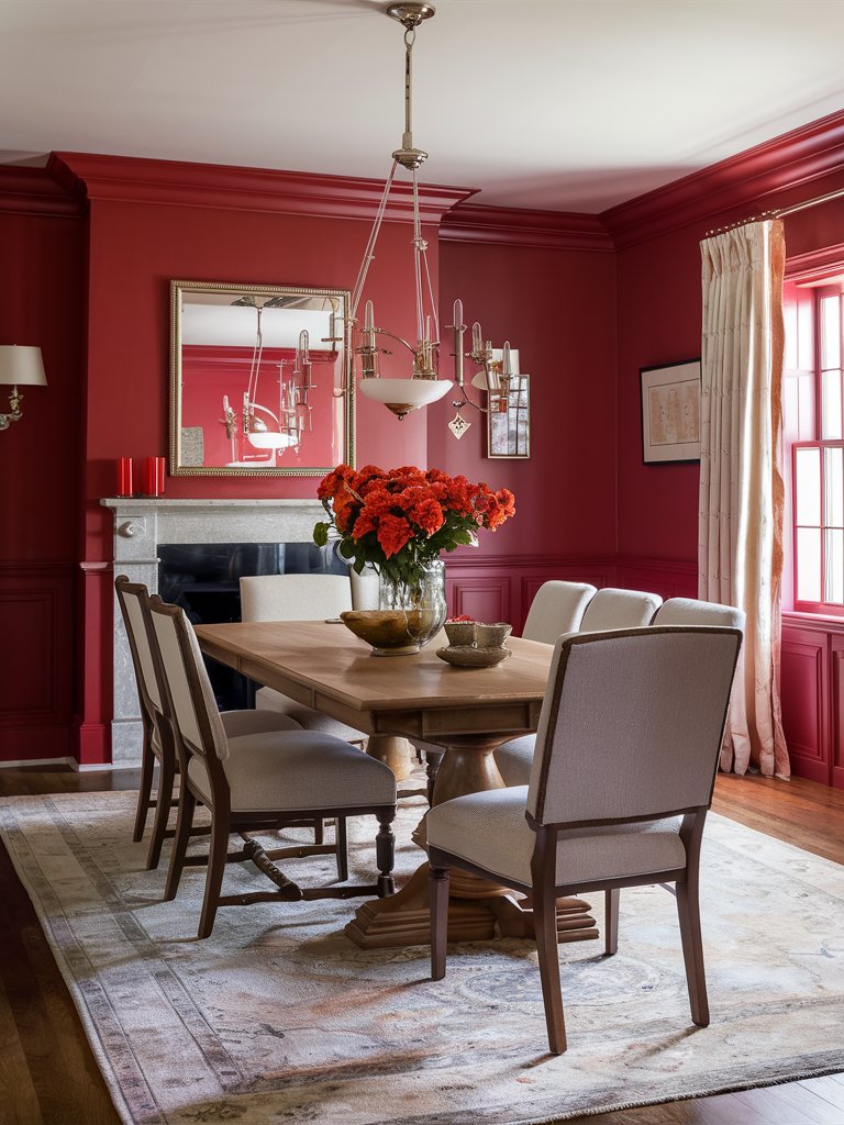
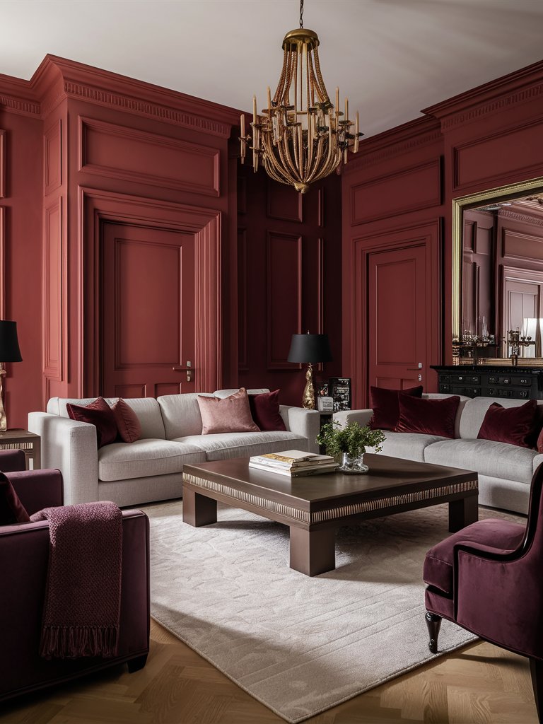
Farrow & Ball Rectory Red
Farrow and Ball Rectory Red is a vibrant crimson shade that exudes energy and passion. It’s the perfect paint color for creating a lively and inviting atmosphere. With red and subtle orange undertones, this shade will add an instant feeling of warmth to any space.
It works well in spaces where you want to add a sense of playfulness or creativity, such as art rooms, playrooms, and home offices. It can also be used in spaces where you want to foster engagement and conversations, like living rooms or conversation pits.
While it’s one of the best crimson shades for accent walls or highlighting architectural details, you can take the more daring approach and use it as a full paint color.
Rectory Red creates an air of liveliness in this living room, making it the ideal conversation space. Notice how the paint color combines with golden accents, like the armchair and throw pillows, adding a touch of class to the room. Even though dark-toned furniture is used in the space, plenty of light enhances the open, airy feel and contributes to the coziness.
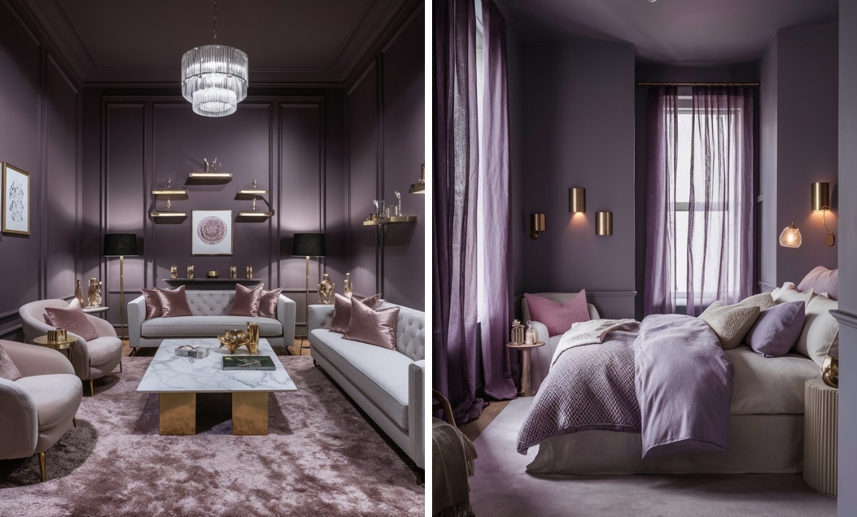
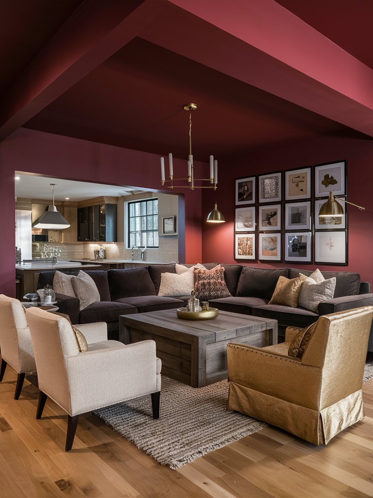
Farrow & Ball Incarnadine
Farrow and Ball Incarnadine is one of the most refined reds on the market today. Its complex hues allow it to adapt to a variety of spaces, whether you are going for a classic, transitional, contemporary, or modern look.
This shade will also work well in a variety of rooms, so don’t be shy about using it in your living room or bedroom. The only thing you should be concerned about is how you pair it.
Incarnadine will pair exceptionally well with light, neutral tones. It can also work well with earthy tones that help add ground and balance to the shade. If you are looking to create a bit of a classy royal feel, then add subtle metallic accents to it.
This shade will reveal its full depth in spaces with plenty of natural light, adding a luxurious, elegant element to a room. Artificial light will add a bit of a cozy, intimate glow to Incarnadine, making it feel more warm and comfy.
Here, Incarnadine gives the living room a royal look with a combination of red, purple, and light-toned furniture that combine well to provide the space with a diversified feel. One key factor that elevates the royalty feel in the space is the subtle golden accents on the chandelier, mirrors, and table lamps.
Farrow & Ball Radicchio
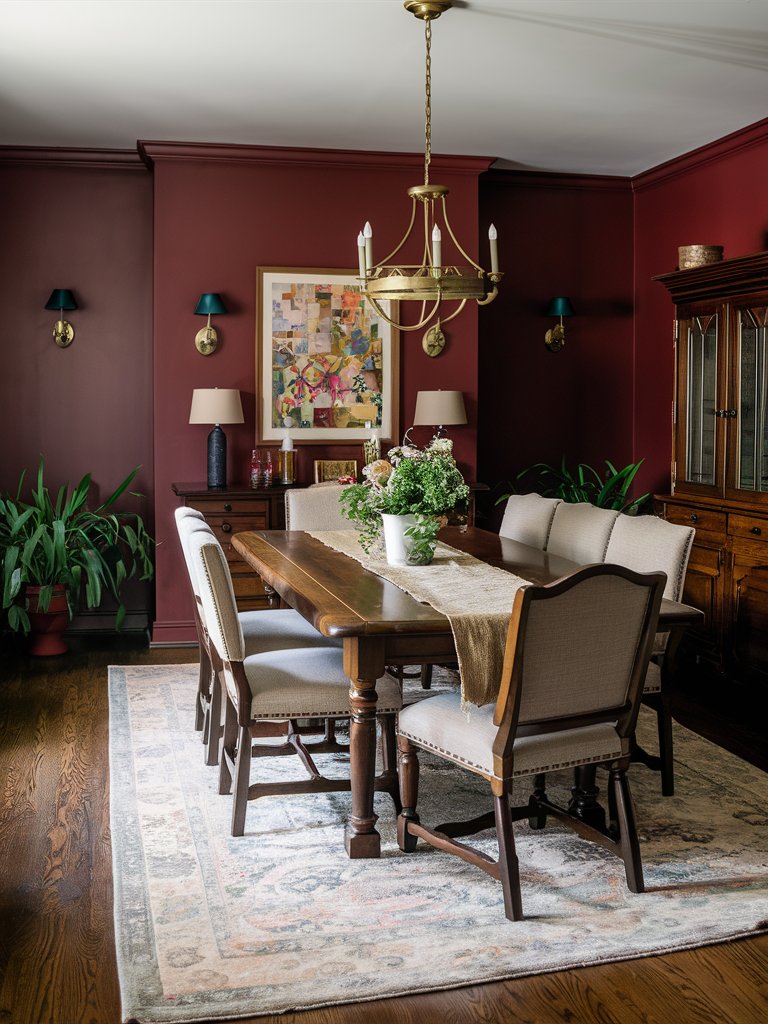
Farrow and Ball Radicchio is a complex pink-red crimson tone with the perfect blend of pink and plum undertones, giving it a distinct appearance. As a paint color named from the Italian chicory vegetable radicchio, it reflects its particular mix of rosy and purple-red tones.
Radicchio makes an ideal paint color for dining rooms, drawing rooms, and living rooms, spaces where its unique undertones create an inviting atmosphere.
In bright natural light, the paint color tends to reveal more of its pink undertones, while in dimmer or artificial lighting, the deeper red aspects become more prominent.
When paired with Farrow & Ball’s signature matte finish, Radicchio creates a soft, chalky appearance that helps mute what could otherwise be an overwhelming color.
In this dining room, Radicchio elevates the traditional classic look of the space. The color combines well with the wooden furniture accents in the room, adding a rustic, timeless touch. Plenty of houseplants strategically placed in the room improve the visual interest and make the space seem livelier.
Farrow & Ball Blazer
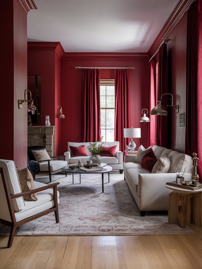
For those looking for a crimson shade with a sophisticated touch, Farrow and Ball Blazer is impossible to miss. It’s a bold shade that adds a sense of drama and sophistication to any room and is one of the most exciting reds to add to your home palette.
What makes Blazer really unique is its versatility, as it works well as an entire wall color for traditional and modern spaces alike. It’s well suited for social spaces such as entertainment, living, and dining areas.
As one of the bright crimson shades, Blazer will pair well with contrasting colors such as white and black to create a striking, modern, bold touch. Its vibrant nature adds a sense of dynamism and excitement to any space, making it more memorable and enjoyable.
Notice how Blazer has been used in this living room to add a dramatic touch, making the space read more modern. The paint color has been paired with contrasting lighter shades matching the ceiling, giving the room a balanced look. Plenty of natural light in the room makes the space open and airy, while the high ceiling adds a spacious, expansive look.
Color Disclaimer
Please note that all paint colors displayed on this page are for illustrative purposes only. Due to variations in screen settings, lighting, and other factors, the colors you see on your screen may differ from the actual paint colors. We recommend viewing a physical color sample or swatch for the most accurate representation. Some images might be generated by AI to represent paint colors in different interiors