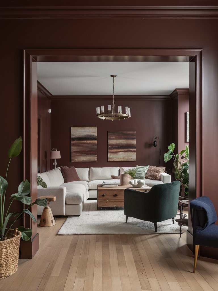
For those looking for a dramatic statement, red can really be a helpful color. Crimson is a vibrant red color that packs a punch, whether used on accent walls or as an all-over color. It has the potential to transform your space and wow guests.
Most designers associate crimson with being empowering, joyful, and unique. With recent interior design trends such as dopamine décor, crimson has emerged as the perfect color to create drama and intrigue in different spaces.
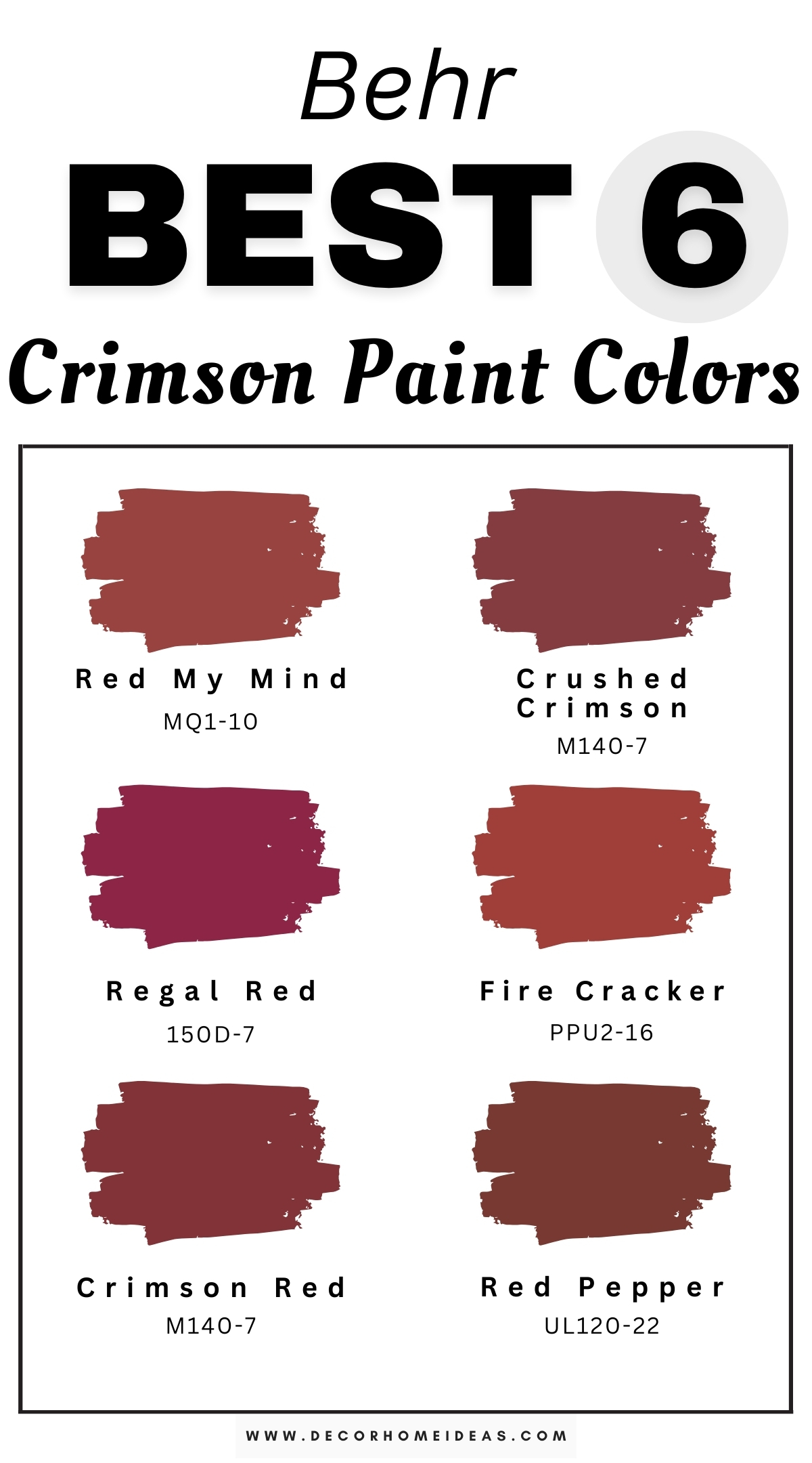
What makes this color particularly interesting is that almost all variations have unique undertones, making it highly versatile. Here are some of the best crimson hues from Behr that can transform your next interior design project.
Take a look!
Behr
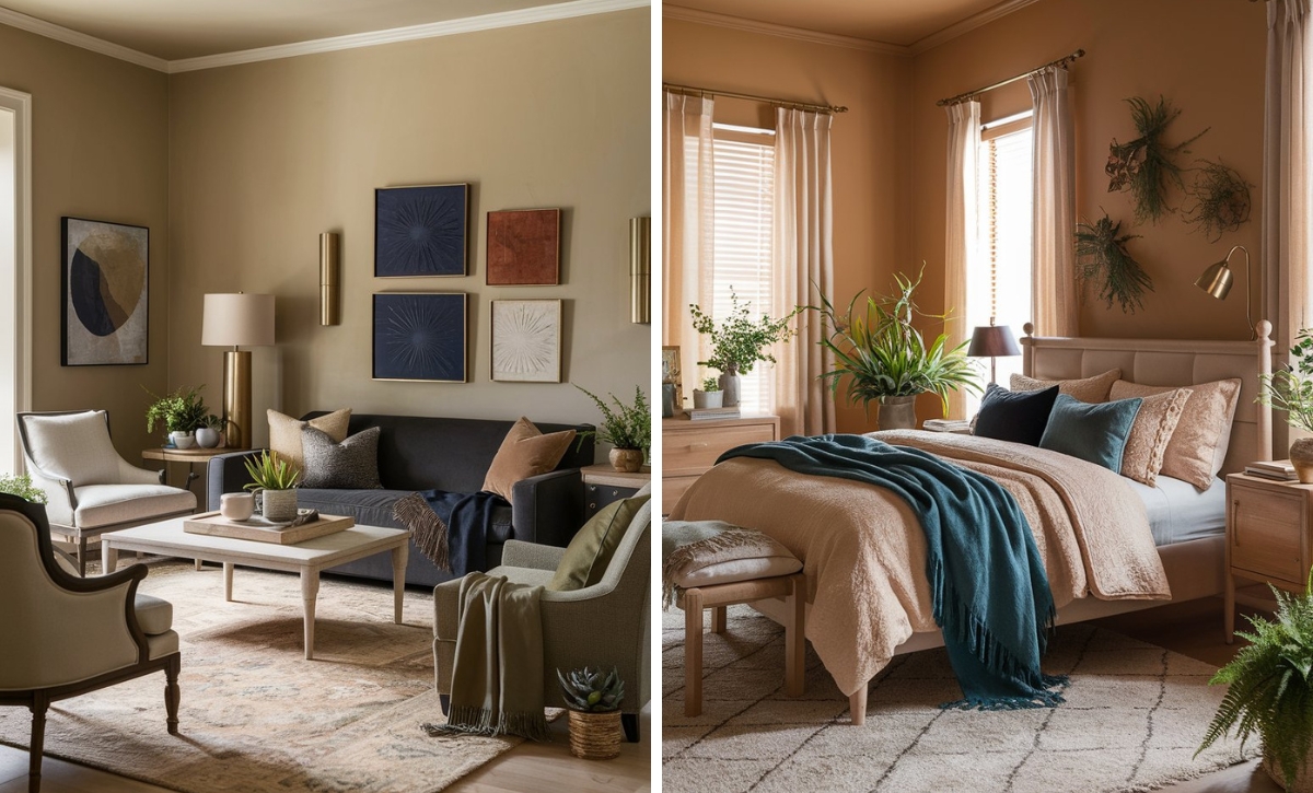
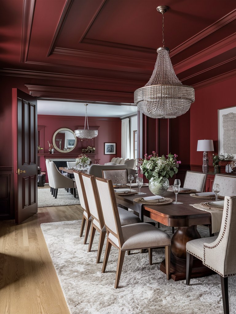
Behr Red My Mind
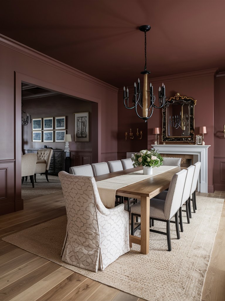
Behr Red My Mind is a high-energy red with subtle orange undertones that give it incredible warmth and vitality. This paint color will not only make a statement in your space but also bring a unique chocolate look.
In the presence of sufficient natural light, this shade brings out its high intensity while maintaining a sophisticated edge that prevents it from feeling garish.
Red My Mind pairs exceptionally well with crisp whites for modern contrast or warm creams for a softer look. It’s particularly effective in spaces meant to energize, such as dining rooms, creative spaces, or accent walls.
The color works beautifully with both warm wood tones and cooler metals, making it versatile for various design schemes.
What really sets it apart from the rest is that while it may seem to have a muted look, Red My Mind will never fade into the background. The color maintains enough sophistication to be used in contemporary and traditional settings.
Here, the paint color has been combined with soft beige colors to create a soft, inviting atmosphere for this dining room space. Darker accents used to decorate the space, such as the chandelier and the mirror, give the space a unique goth look.
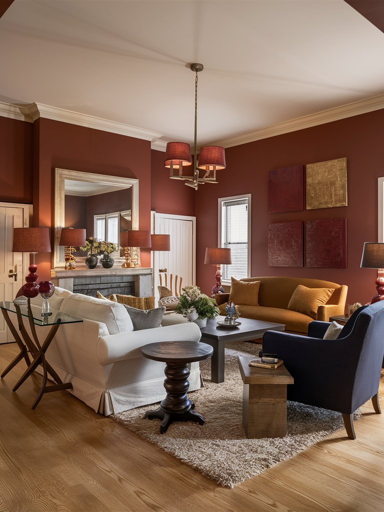
Behr Crushed Crimson
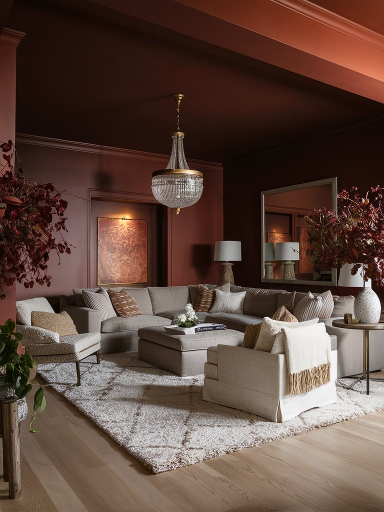
If you are looking for a color with warm but modern chrome-like quality, Behr Crushed Crimson should be on the top of your list. It has a notable violent undertone that adds an incredible depth to any space.
Based on the lighting condition, this paint color reads as a rich, velvety crimson in bright natural light. In contrast, under warmer artificial light, the dark qualities will become more prominent, making the shade deepen to an almost burgundy tone.
Crushed Crimson is ideal for creating intimate spaces without feeling oppressive. It makes a particularly interesting choice for accent walls and spaces designed for entertainment.
The warm, inviting nature of this paint color is evident in this living room space, where it has been combined with soft, muted shades such as gray and beige to create a cozy ambiance. Notice how the color compliments the subtly metallic accents and reflective elements in the space to give the room an air of mystery.
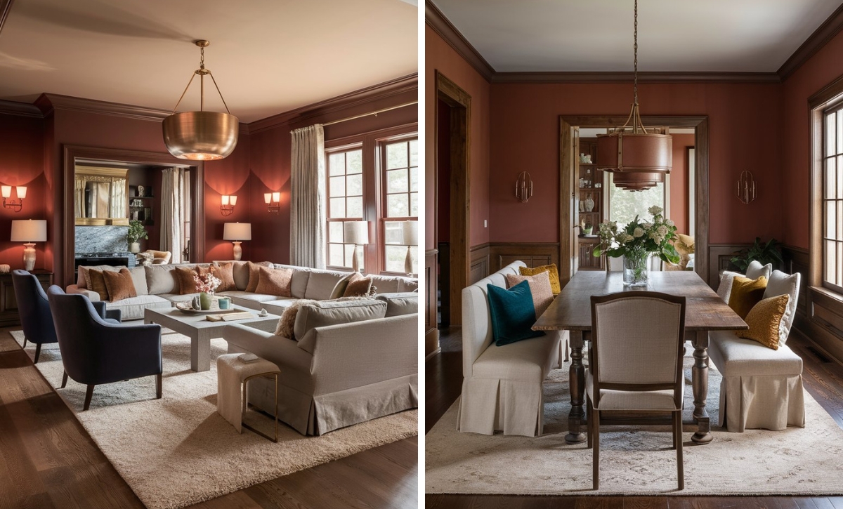
Behr Regal Red
Behr Regal Red is a stately, medium-deep crimson with balanced, warm undertones. In natural light, it exhibits refined depth without leaning too burgundy or orange.
The paint color maintains remarkable consistency across lighting conditions, showing only subtle shifts from bright daylight to artificial illumination.
This paint color pairs well with both warm and cool neutrals. It shows especially well against crisp whites for contrast or warm creams for elegance. The color works harmoniously with both brass fixtures, which enhance its warmth, and chrome elements that emphasize its clarity.
Natural light and light-toned elements are crucial in emphasizing the boldness of this tone as they create the ideal contrast. It’s important to be careful about how you apply Regal Red, as it tends to feel overpowering if not combined with the right tones.
In this living room space, the color combines well with white and beige colors to give the space a well-balanced look. Notice how the color has been complemented by a light-toned white used on the ceiling to provide the space with an open, airy look. The shiny silvery accents add a touch of luxury to the space. At the same time, wooden furniture emphasizes the authenticity of the space.
Behr Fire Cracker
Picture the crimson color of dying flames, the warmth, and coziness embedded in them—Behr Fire Cracker elucidates just that feeling. It’s an intense crimson with remarkable orange undertones that add energy to any space where the shade is used.
In natural light, Fire Cracker displays a bold, almost coral-like quality while maintaining its red base. It pairs well with cool tones like grays that temper its intensity and warm whites that add to its vibrancy.
This is distinctly a statement color, ideal for contemporary designs seeking bold impact. Its warm undertones prevent it from feeling harsh while maintaining a striking visual presence. Use it as an accent color or a full wall color in well-lit spaces where its dynamic quality can be fully appreciated.
Here, Fire Cracker adds a touch of warmth and character to the space. Notice how the paint color combines well with neutral tones like white, beige, and light brown to balance out the bold shades in the space. Since it’s a fairly balanced crimson, dark shades, and light shades can equally be used to contrast the space.
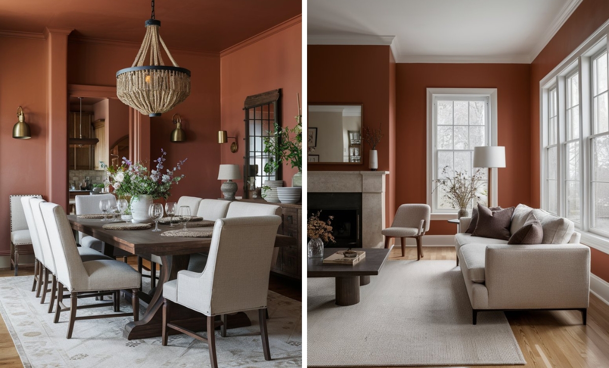
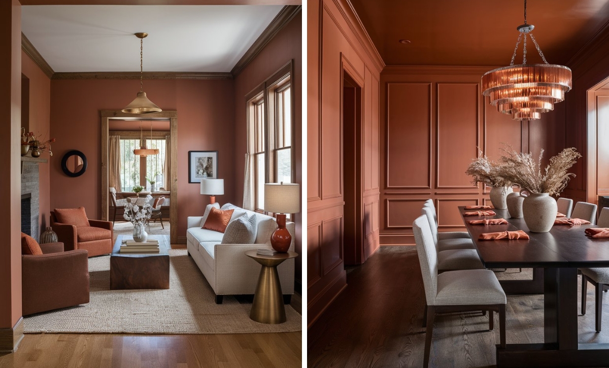
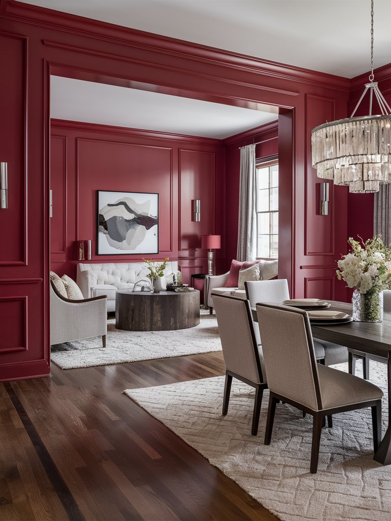
Behr Crimson Red
For those who desire drama and boldness in their spaces, Behr Crimson Red is the perfect choice. It’s a sultry tone with deep, moody undertones that provide a striking yet defined aesthetic that can transform any space into the ideal showpiece.
Its versatility allows it to blend seamlessly with contemporary and classic design styles. This shade will show its full depth in well-lit spaces where it displays a unique interplay of brown and red hues.
When used in dimly lit spaces, Crimson creates an intimate, cozy atmosphere. As such, it’s an excellent choice for spaces where you are looking for comfort and relaxation.
When paired with rich textiles such as velvet and silk or metallic accents, Crimson exudes a luxurious feel, as can be noted in this royal-style dining room space. With light-toned furniture adding a sense of balance to the space and wooden elements giving the space a grand look, Crimson combines well with subtle glass accents in the room to provide the room with a luxurious, royal feel.
Behr Red Pepper
True to its name, Behr Red Pepper is a shade that brings a bit of spice to your home with its warm, vibrant tone. This crimson paint color has an element of uniqueness to it as it reads brown in many spaces.
Its color, which is reminiscent of autumn leaves, will show varying degrees of intensity and undertones depending on the colors that it is paired with.
Red Pepper is an eye-catching accent color that can draw attention and add a sense of mystery in otherwise subdued areas. It can also be used as a contrast color, especially in neutral spaces.
Since it has a warm ambient nature, this shade is excellent for areas where interaction and activity are encouraged, such as entertainment spaces and living rooms. In such regions, Red Pepper infuses the perfect mood for lively conversations and interactions.
In this living room space, Red Pepper has been combined with light-colored furniture and earthy tones to create a grounding effect in the space. By using brown, natural wood, and green accents in the space, the room adds a calm, inviting atmosphere. Notice how the natural light makes the room look open and airy while the warm Red Pepper tone maintains a certain degree of coziness.
Color Disclaimer
Please note that all paint colors displayed on this page are for illustrative purposes only. Due to variations in screen settings, lighting, and other factors, the colors you see on your screen may differ from the actual paint colors. We recommend viewing a physical color sample or swatch for the most accurate representation. Some images might be generated by AI to represent paint colors in different interiors