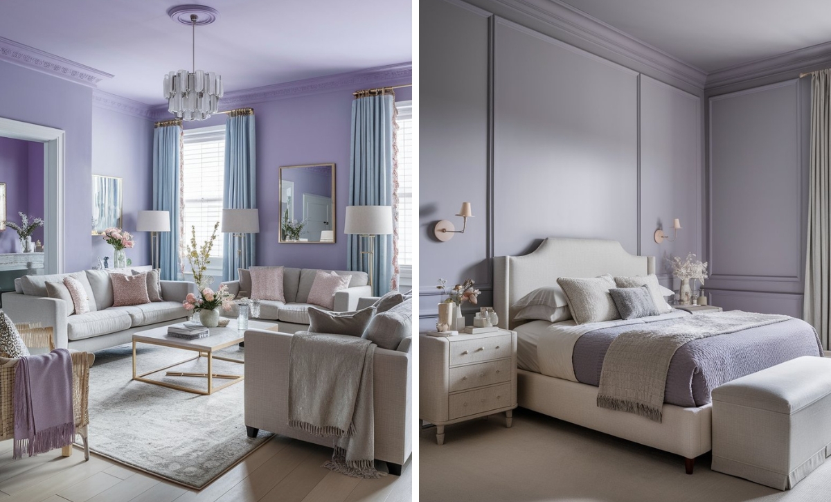
Designers have been dealing with grays and whites for a long time, but with the numerous versatile shades in the market today, people have returned to embracing color and warmth. Beige is one of the forefront shades that has started appearing again in most homes.
Beiges now have deep and rich or soft and warm tones, making them more of a canvas compared to being a slate like the traditional beiges. They also have various undertones, including grays, browns, yellow, reds, and greens, making them very versatile.
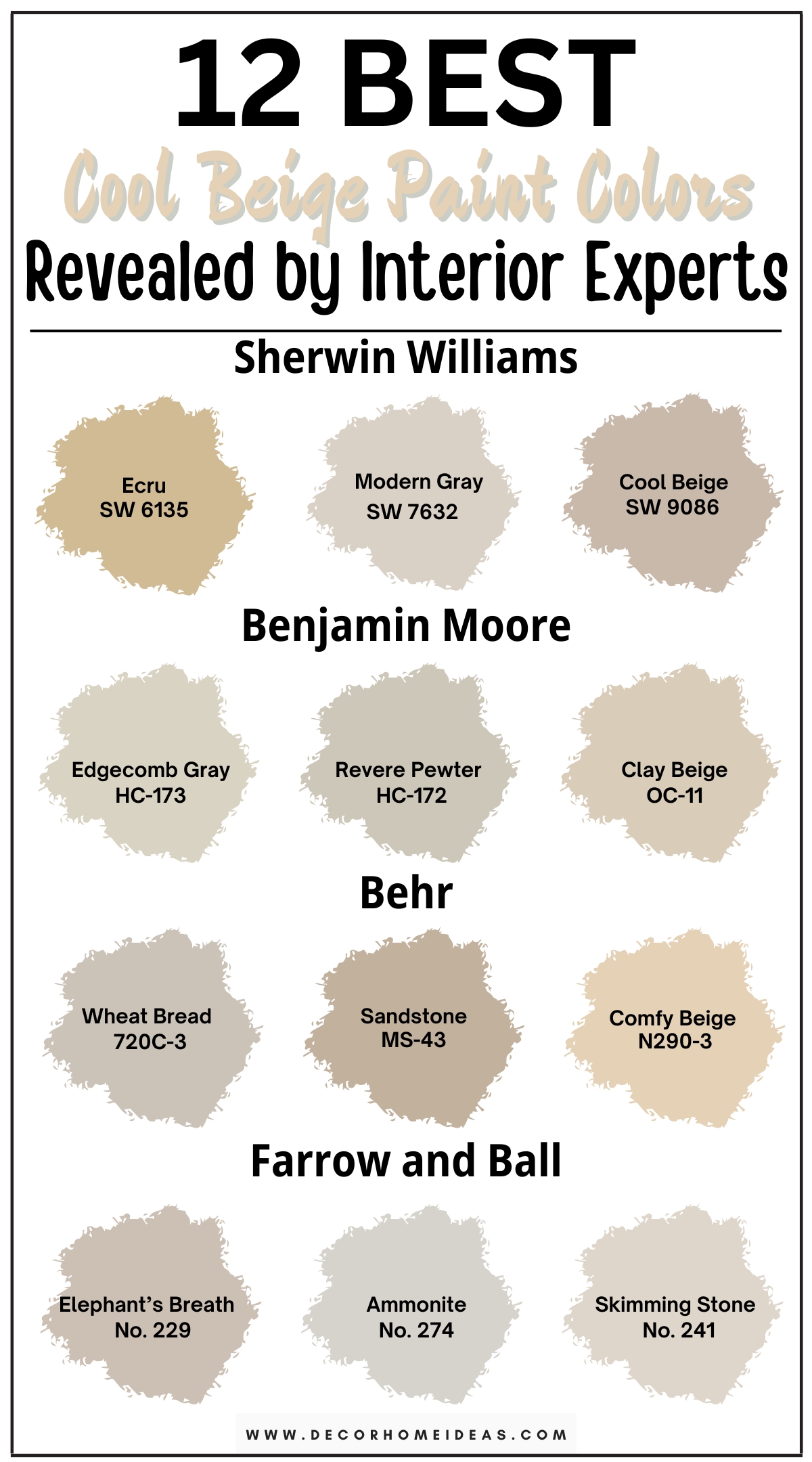
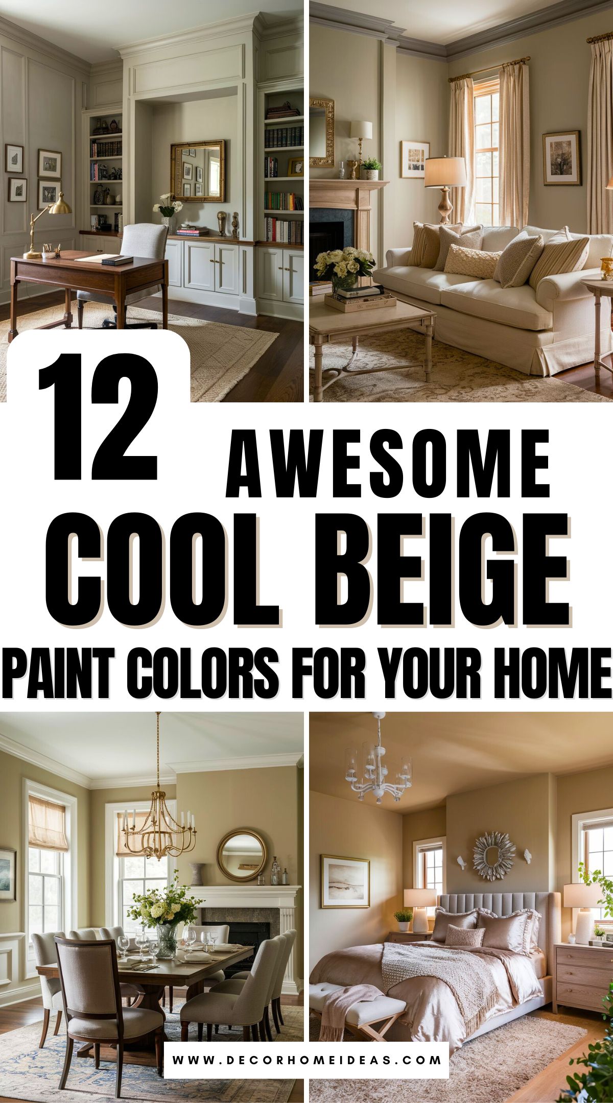
Today, we’ll focus on beige shades on the lighter side of things but with a bit more depth. Here are 12 cool beige paint colors adored by interior designers.
Take a look!
1. Sherwin Williams
Sherwin Williams Ecru
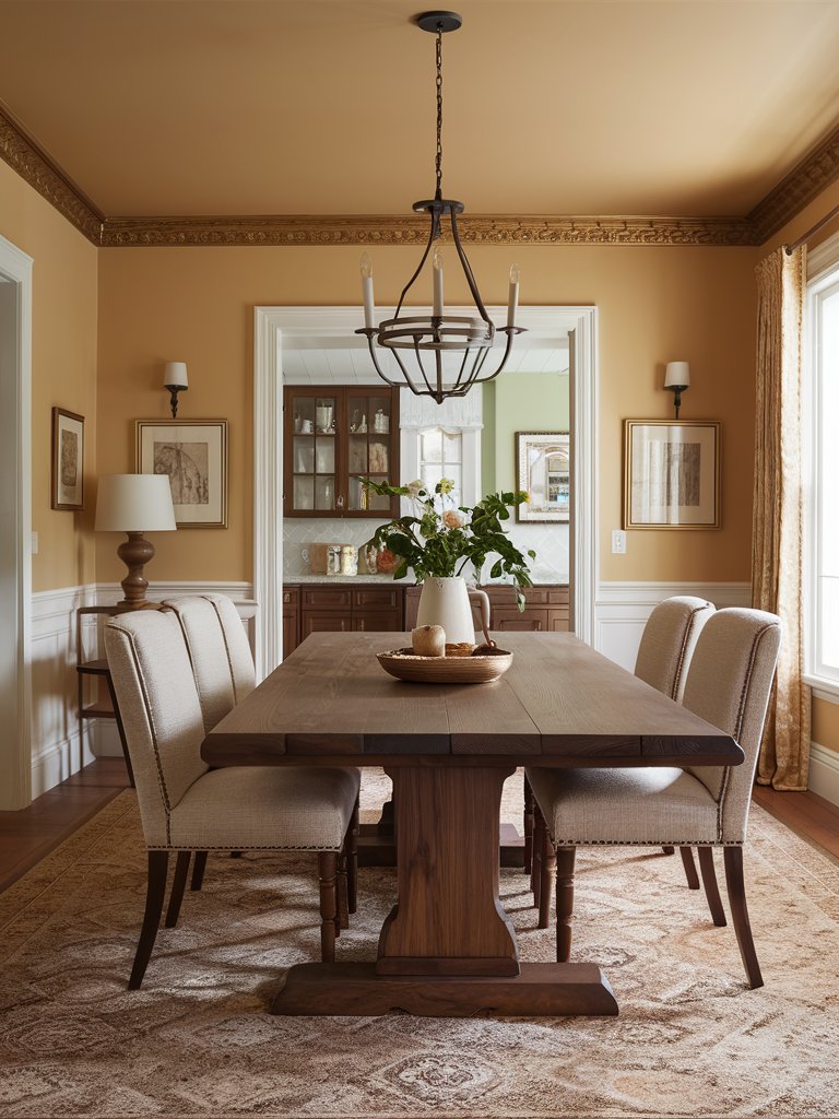
Sherwin Williams Ecru (6135) is a beige, grayish-yellow with brown undertones that mimics unbleached linen. It’s more cream-tan than white and has more warmth but won’t dominate a room like a dark taupe or charcoal.
Ecru creates a warm, neutral backdrop in spaces that enhances the vivid colors and patterns typically used in designs. Its neutrality allows it to complement various colors, making it a popular choice for modern and traditional interiors.
SW Ecru has an LRV 51, which means it’s a mid-tone paint color.
Ecru is an excellent choice for interior walls in living spaces, bedrooms, or kitchens, as its warmth creates a welcoming atmosphere. This makes it suitable for open-concept designs—the above dining room is an excellent example.
Also, you can use Ecru outdoors. It blends well with natural surroundings and provides a timeless look to home facades.
Sherwin Williams Modern Gray
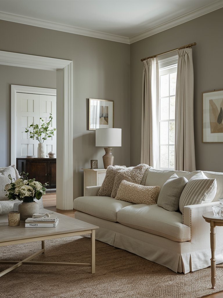
Even though it has gray in its name, Sherwin-Williams Modern Gray (7632) is a cool, warm-leaning beige with some gray mixed in that settles it down.
It also has a brown, earthy aspect that gives it a taupe-greige look rather than a warm gray one. However, since it’s lighter, it feels a bit more airy, open, and buoyant. The above living space just goes on to show how easy it can be to classify it as a gray rather than a beige.
Modern Gray mostly reads neutral but has a tiny touch of pink undertone that creates a soothing, calming backdrop.
Modern Gray has an LRV of 62, so it isn’t too light or dark, making it perfect for spaces where you don’t want a moody or dramatic feel. Its LRV also means it can hold its depth relatively well in bright or well-lit rooms.
However, it can feel drab in darker spaces, especially with limited interior lighting.
Modern Gray pairs well with a cherry oak finish on furniture, molding, ceiling, trim, or cabinets. It’s also an excellent hallway color.
It would be best to avoid using this paint color everywhere since it’ll be too monochromatic. Consider using it in a particular bedroom, on walls with kitchen cabinets, and accent it with creamy whites, off-whites, and darker bold colors.
Modern Gray leans considerably into its warmer side in south-facing rooms or rooms with afternoon western sunshine, appearing almost like a beige tan. In north-facing light, its warmth falls back, but it won’t look cold.
Sherwin Williams Cool Beige
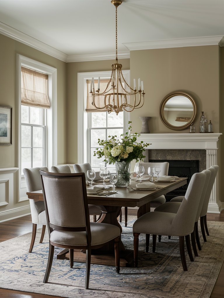
Sherwin-Williams Cool Beige (9086) is a gentle, warm beige that bridges the gap between overly golden, warm, and icy, cool colors.
With an LRV of 48, Cool Beige falls in the medium range. It can look a bit heavy in low-lit rooms due to its depth and gray backdrop, especially if the room has northern light.
Cool Beige has very passive undertones, including a bit of gray, a subtle brown-pink, and sometimes even a flash of green, but on odd occasions. This makes it very flexible but also unpredictable, so you have to sample the paint color before using it in a room.
Cool Beige is an excellent choice for living rooms and common areas to create a welcoming feel. It pairs nicely with other neutrals like whites, tans, and grays, making it a versatile backdrop for different styles.
Here, white on the trim and ceiling pairs with Cool Beige on the walls for a relaxed and understated atmosphere. Brass tones on the chandelier and wall mirror’s frame add more warmth, with the mirror helping reflect light into the space for a calm, restful environment.
Pair it with earthy tones like browns and muted greens or deeper accent colors such as navy blue or charcoal gray to create a cohesive look—this allows Cool Beige to serve as a neutral anchor for the bolder decor.
In north-facing light, Cool Beige leans more into that subtle gray undertone but retains its soft, passive warmth. However, the paint color reveals its true magic in south-facing rooms or rooms with afternoon western light, leaning to its warm undertones without being toasty.
2. Benjamin Moore
Benjamin Moore Edgecomb Gray
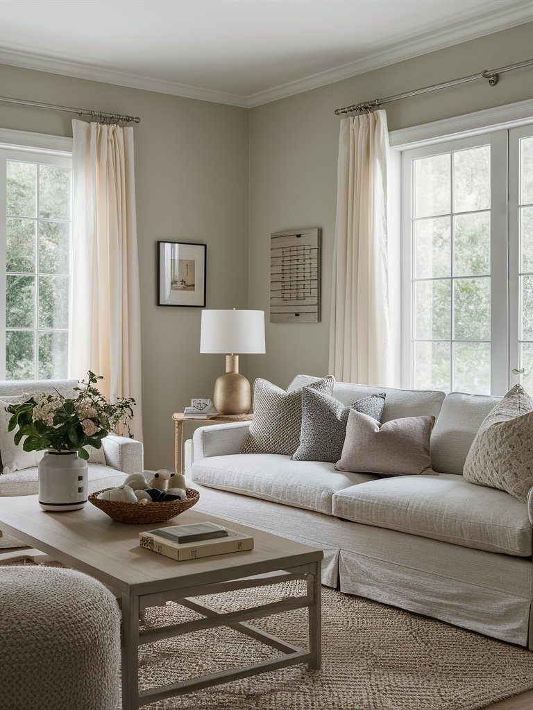
Benjamin Moore Edgecomb Gray (HC-173) is a soft, warm gray that leans towards greige, blending the qualities of both gray and beige. Its warm undertones give it a light taupe or beige appearance, which can also read as a subtle warm gray.
Edgecomb Gray has an LRV of 63, reflecting light easily without creating too much bleakness.
Its LRV makes it light enough to keep your space airy while its depth sets the mood of a space—it doesn’t feel like plain off-white neutral. You can see how ample natural light in the above living space helps bring out that airiness of Edgecomb gray.
Edgecomb Gray’s versatility allows it to adapt to various design settings. It is a subtle backdrop for minimalist spaces or a vibrant canvas for maximalist rooms with many accessories, artworks, furniture, and fixtures.
Edgecomb Gray interacts with different wood tones, such as traditional oak and red-toned woods, although we advise sampling first to ensure harmony.
Benjamin Moore Revere Pewter
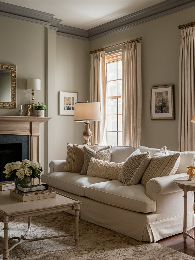
Benjamin Moore Revere Pewter (HC-172) is a versatile gray paint color that seamlessly blends gray and beige. It offers a harmonious balance between cool and warm undertones. It has a warm feel mixed with some cool elements,
Revere Pewter’s balance between cool and warm hues makes it adaptable to different design styles and lighting conditions. This makes it ideal for those who prefer a neutral yet sophisticated look.
With an LRV of 55, BM Revere Pewter falls on the lighter end of mid-tone paint colors. Thanks to its added depth, it has some dynamism, creating a subtle statement in spaces.
The color leans towards gray with subtle beige undertones; in different lighting, it can even exhibit a faint green undertone.
There may be better choices for a primary paint color throughout your home than Revere Pewter, but it performs nicely in bright, open living areas, bedrooms, and bathrooms.
Revere Pewter looks like a warm gray in south-facing rooms and will likely exhibit a slight green undertone. It becomes muddy and darker in north-facing rooms.
The creamy beige curtains in this living room provide a visual break from Revere Pewter on the walls while still complementing them. The light wood mantel brings some contrast, while cool grays on the couch help keep the space simple and not overbearing.
Benjamin Moore Clay Beige
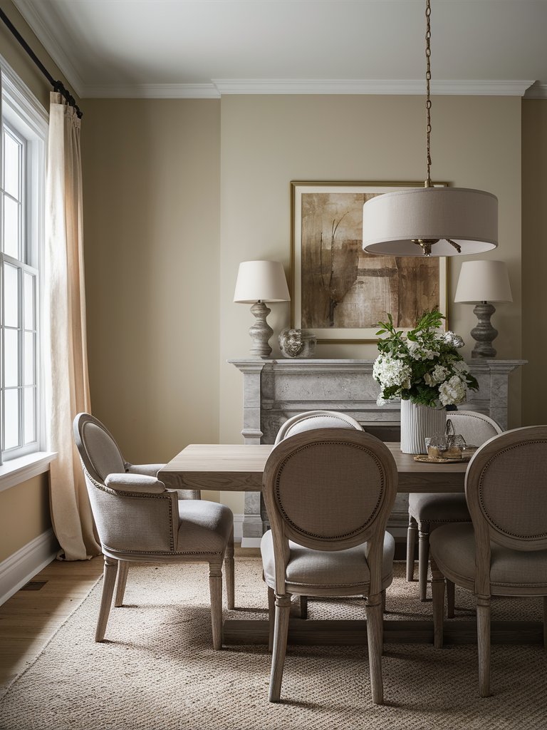
Benjamin Moore Clay Beige (OC-11) blends gray and beige, creating a neutral color that fits nicely in various spaces. Clay Beige is the go-to choice if you want a paint color that’s cooler than a beige but warmer than a gray one!
Clay Beige has an LRV of 55, reflecting a moderate amount of light. This makes it a good neutral color that works well in various lighting conditions.
In terms of undertones, Clay Beige has a drop of beige and a bit of gray. There’s also the slightest of green undertones. This makes it a chameleon; it’ll change color depending on lighting conditions in your room.
It’s essential to compare Clay Beige with your furnishings and flooring before applying it to your walls. Darker wood tones like walnut provide a lovely contrast, and they pair well with fabrics in greenish-gray, baby blue, or darker green shades, giving an elegant appearance.
The above dining room is a prime example, with darker gray hues on the furniture and mantel helping provide contrast while keeping the space cohesive.
It has a creamy-beige look in south-facing rooms without committing to yellow undertones that you usually see with typical beige paint colors.
In north-facing rooms or rooms with little natural lighting, you might notice that slight green-beige undertone coming up, especially on cloudy or rainy days or if your room has a lot of shadows.
3. Behr
Behr Wheat Bread
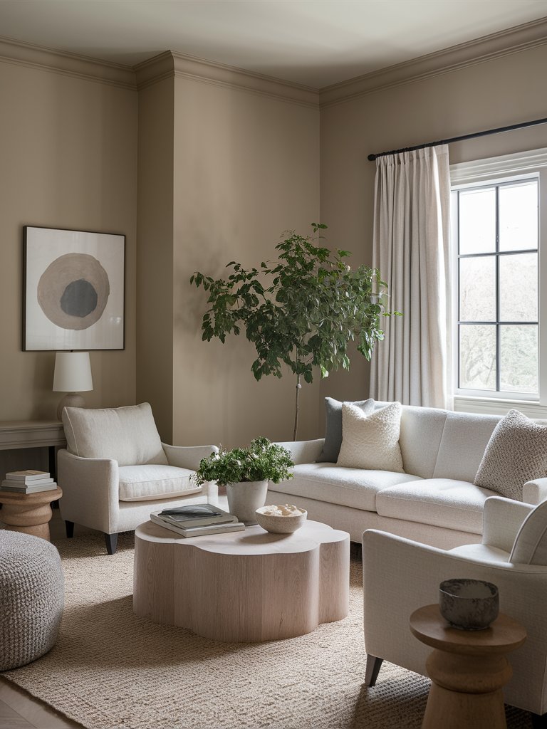
Behr Wheat Bread (720C-3) is a mid-tone greige paint color with very subtle gray and beige undertones, making it appear crisp and clean.
Wheat Bread has an LRV of 56, making it a light color, but it’s right on the end of mid-tone paint colors. Although it takes on a creamy look, the gray undertones subdue it, giving it a cool, comfy, and sophisticated feel, as evident in the above living room.
It leans more toward its warmer side, but its lightness makes a space feel cheery and massive. Wheat Bread works well on walls, molding, trim, and kitchens.
The gray undertones become more pronounced in north-facing rooms, where the color evokes a relaxed and calm ambiance. In south-facing rooms, it appears cozy and warm and exhibits a hint of brown-beige undertone. You might also see a slight green undertone if many trees are outside.
Behr Sandstone
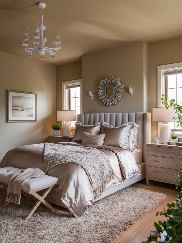
If you want a cool beige paint color that offers versatility and elegance, Behr Sandstone (MS-43) is your go-to choice. This beige hue is perfect for homeowners and interior designers seeking a neutral palette that can adapt to various interior settings.
With an LRV of 45.76, it has a subtle blend of beige and light browns that often carries undertones of peach or gray, offering a versatile palette that complements modern and traditional spaces.
This adaptability makes it an ideal choice for any room, from kitchens to living areas, creating a warm, relaxed look in open-plan spaces. Consider pairing it with rich wood finishes or metallic accents for an elevated look.
In south-facing rooms, Sandstone leans more to its warmer side, making spaces feel cozy and inviting. On the other hand, it takes on a slightly cool look in north-facing rooms or rooms with limited natural lighting, but its gray undertones still help it maintain its depth.
Sandstone on this bedroom’s walls and ceiling adds considerable depth, but it also keeps things airy thanks to its subtle yellow undertones. The gray headboard blends well with the walls, while velvet bedding adds a sense of luxury with a distinctive soft feel.
Behr Comfy Beige
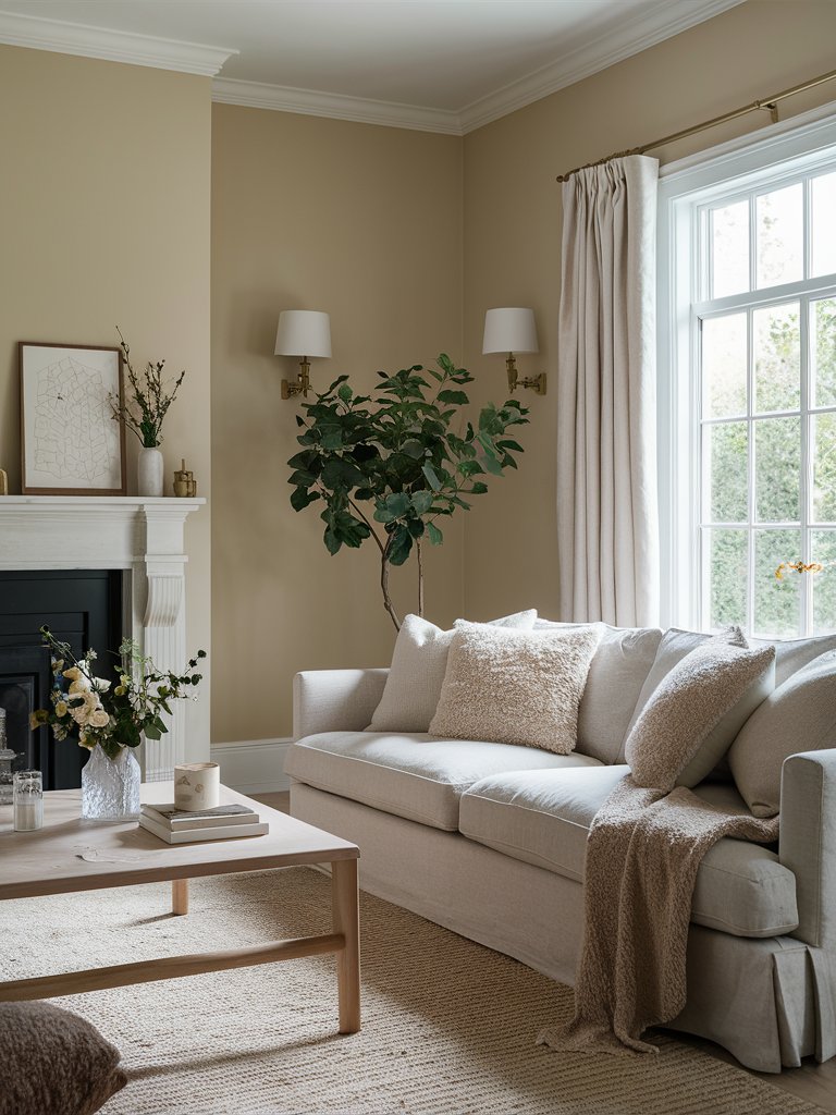
Behr’s Comfy Beige (N290-30) is a cool beige with an earthy, muted feel, offering warmth and comfort.
Comfy Beige has an LRV of 66, so it reflects a reasonable amount of light without being too bright. It can also help brighten a space.
Its beige undertones anchor the color, ensuring it remains balanced in different interior settings. It has a gentle warmth that enhances a home’s coziness, especially in living spaces and bedrooms.
Comfy Beige is a versatile color that caters to a range of interior design styles, including modern boho, farmhouse, minimalist, and Scandi. It also pairs well with light woods, matte ceramics, and soft linens.
Notice how warm grays in this living room bring out that subtle warmth of Comfy Beige on the walls, while lighter grays pair nicely with the paint color for a clean, cozy look.
In north-facing rooms or rooms with little natural light, it might take on a slight gray look. Its full warmth and coziness is experienced in south-facing rooms.
4. Farrow and Ball
Farrow and Ball Elephant’s Breath
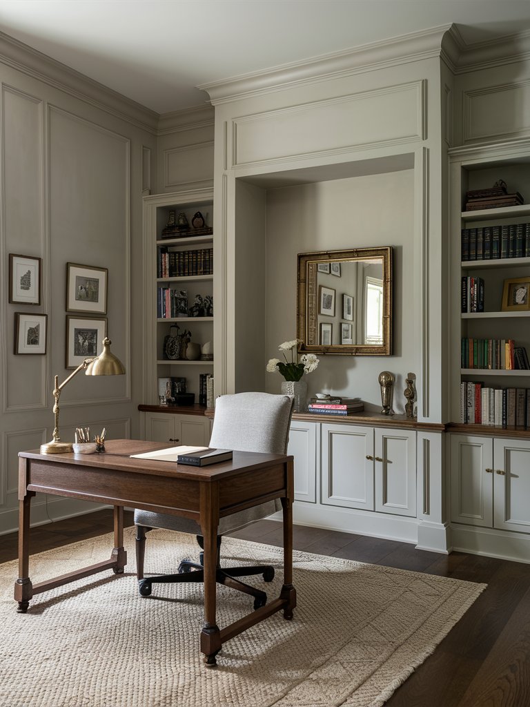
Farrow & Ball Elephant’s Breath (No. 229) is a soft, calming, warm gray paint color with a hint of magenta. Its beige-like quality stems from its balance of warm gray and subtle pink undertones.
You can use this paint color in living spaces, dining rooms, bedrooms, and bathrooms, and it will go really well with white trim and cabinets in the kitchen.
Elephant’s Breath doesn’t pair well with cool grays but works excellently with warm, brown-based materials such as natural wood, rattan, and jute.
The dark wood floor in the featured home office grounds Elephant’s Breath on the paneled walls, open shelves, and cabinets, while dark wood tones on the desk and light gray on the chair make the space harmonious. Brass tones on the mirror and table lamp bring a sense of elegance and refinement.
In north-facing rooms, Elephant’s Breath leans more to the gray side and exhibits delicate lilac undertones. On the other hand, the paint color will appear slightly greige in south-facing rooms. Being a chameleon, it’ll change colors as the day progresses, going from stoney gray and khaki green to pure gray.
Farrow and Ball Ammonite
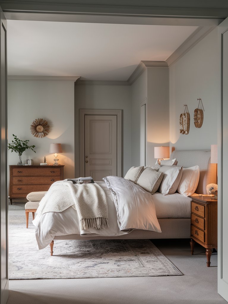
Farrow & Ball Ammonite (No. 274) is a light, gray-beige shade with a unique gray undertone that adds depth, texture, and personality to a space. This gray tone also gives the paint color a deep complexion that you usually don’t see in other common neutral paint colors.
With an LRV of 68, Ammonite reflects a fair amount of light. It can hold its saturation throughout the day despite its generous level of reflection, unlike other paint colors in the same LRV range. Furthermore, its matte-like finish makes it calming in well-lit or moderately-lit spaces.
The best thing about this paint color is its chameleon-like quality. Ammonite reads as a light gray under bright natural light and will appear as a dark gray with slight green undertones in lowly lit spaces.
Ammonite is suitable for living areas, bedrooms, and other rooms that benefit from a warm, inviting atmosphere. You can see how it pairs with soft grays and cool off-whites in the above bedroom to create a cohesive yet cozy look. Wood tones on the furniture add color and contrast to the scheme.
Farrow and Ball Skimming Stone
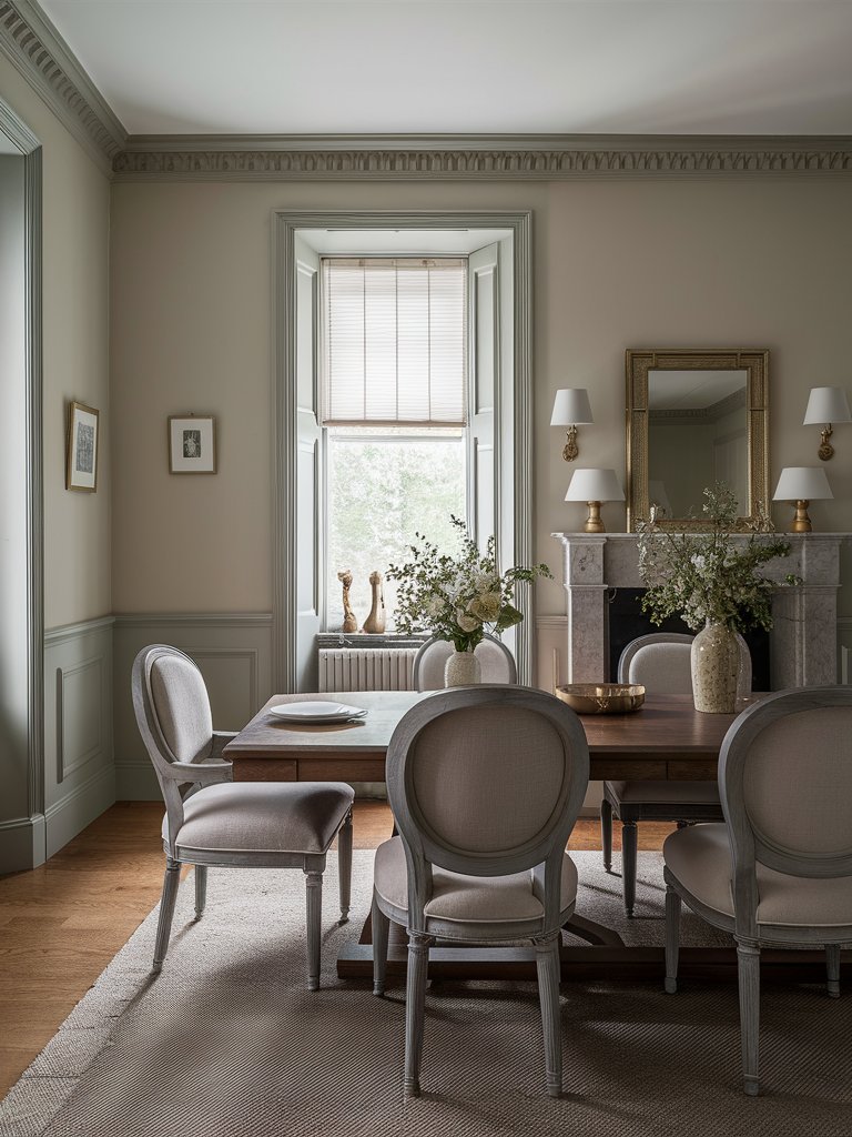
Part of the Farrow and Ball Contemporary Neutrals Collection, Skimming Stone (No. 241) is a light, cool gray-beige paint color full of depth and richness.
The paint color is well-balanced and quite versatile and leans more to its warmer side—however, this will depend on your room’s flooring, lighting, furniture, and orientation.
It also possesses a chameleon-like quality, so it might appear cool at some times of the day and warm at others. The color has brown-pink undertones that give a cheery look, even with the presence of the gray backdrop.
Skimming Stone will work in most common spaces, such as living rooms, bedrooms, dining rooms, and bathrooms. You can also use it on your ceiling or a primary body color for your exterior.
Here, Skimming Stone on the walls creates a nice contrast with a warmer gray shade on the wainscoting, crown molding, and trim. The gray area rug and chairs complement the walls, while the wood floor anchors the palette.
What Color Compliments Cool Beige Paint Colors?
- Slate Blue
- Charcoal Gray
- Soft Lavender
- Olive Green
Slate Blue
Slate blue is a muted, cool shade that pairs beautifully with cool beige. This combination creates a calming and sophisticated atmosphere, ideal for spaces where you want a serene and elegant feel.
Use slate blue in textiles, such as curtains, throw pillows, or rugs, to add a touch of tranquility and enhance the coolness of beige.
Charcoal Gray
Charcoal gray is a deep, rich color that offers a striking contrast to cool beige. This pairing creates a modern and refined look, adding depth and a touch of drama to any space.
Incorporate charcoal gray in furniture, accent walls, or decorative accessories to create a chic and balanced environment that complements the cool beige.
Soft Lavender
Soft lavender is a gentle, cool tone that adds a subtle pop of color while maintaining the soothing quality of cool beige. This combination creates a fresh and harmonious atmosphere, perfect for bedrooms or living areas.
Add soft lavender through accessories like throw blankets, wall art, or small decorative items to introduce a delicate touch of color and elegance to a cool beige room.
Olive Green
Olive green is an earthy, muted shade that complements the neutral tones of cool beige. This combination brings a sense of nature and tranquility to your space, creating a grounded and balanced look.
Consider using olive green in plants, textiles, or decorative items to introduce a refreshing and organic element to a cool beige room.
Color Disclaimer
Please note that all paint colors displayed on this page are for illustrative purposes only. Due to variations in screen settings, lighting, and other factors, the colors you see on your screen may differ from the actual paint colors. We recommend viewing a physical color sample or swatch for the most accurate representation. Some images might be generated by AI to represent paint colors in different interiors

