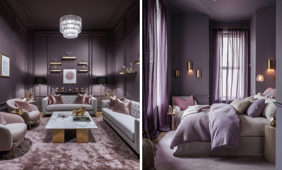
Red is one of the colors slowly making a comeback in the interior design field. It’s a vibrant, highly saturated hue that can make stunning design statements, especially in rooms where you are looking to add warmth or a dramatic look.
Reds are also highly versatile and relatively timeless. They can be used to add a midcentury look to a space or in modern, contemporary design.
The main trick to working with red tones is choosing the colors and accents to pair them with. It’s also essential to ensure you’re using just the right amount of this shade, as it can sometimes become overbearing.
While a wide variety of reds are available, not all shades are the same. Some may appear warm and earthy, while others exude bright, deep, energetic moods.
One of the vibrant shades of red is Cherry Red, and in this article, we’ve prepared some of the best shades of this color from Sherwin Williams that you can try.
Take a look!
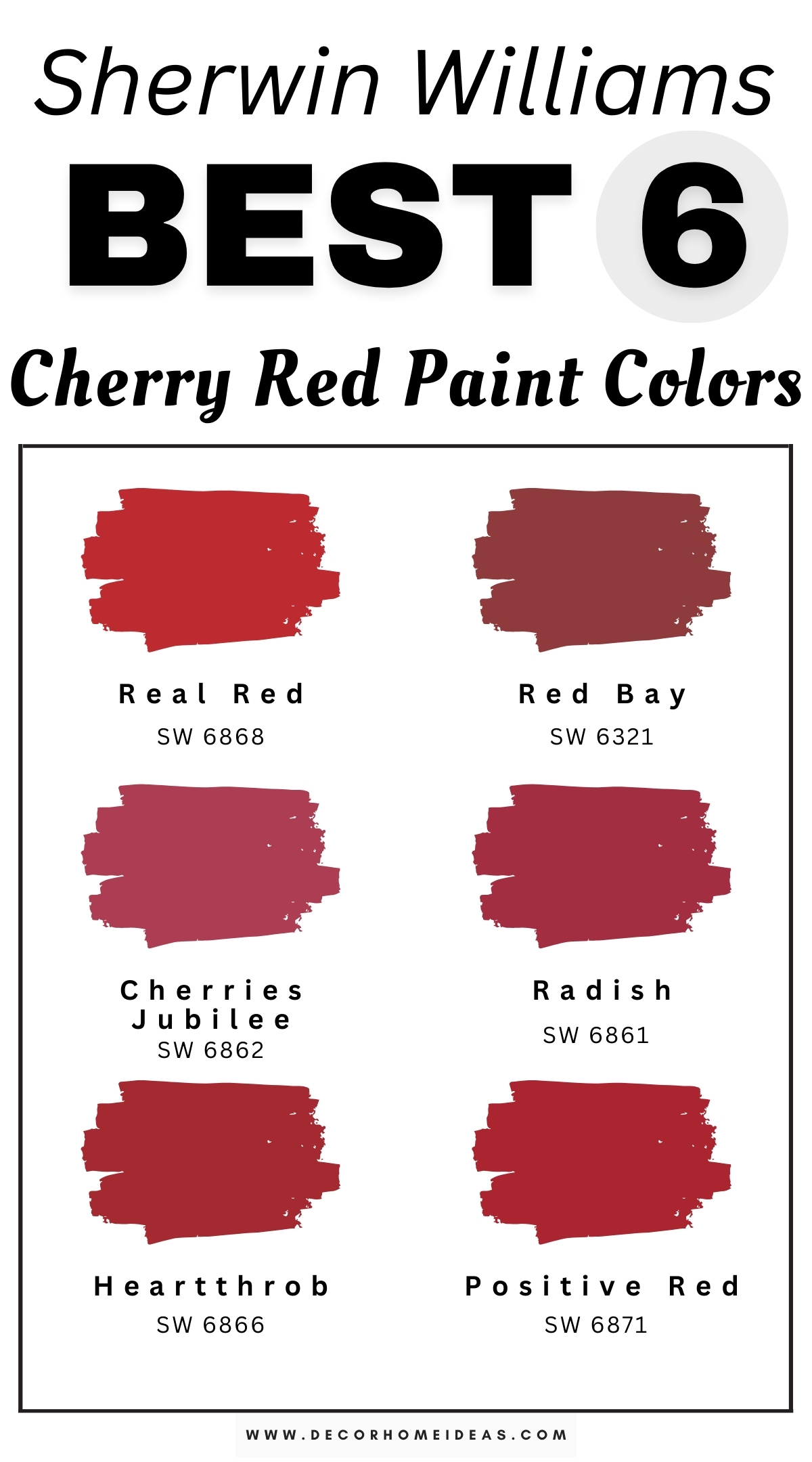
Sherwin Williams
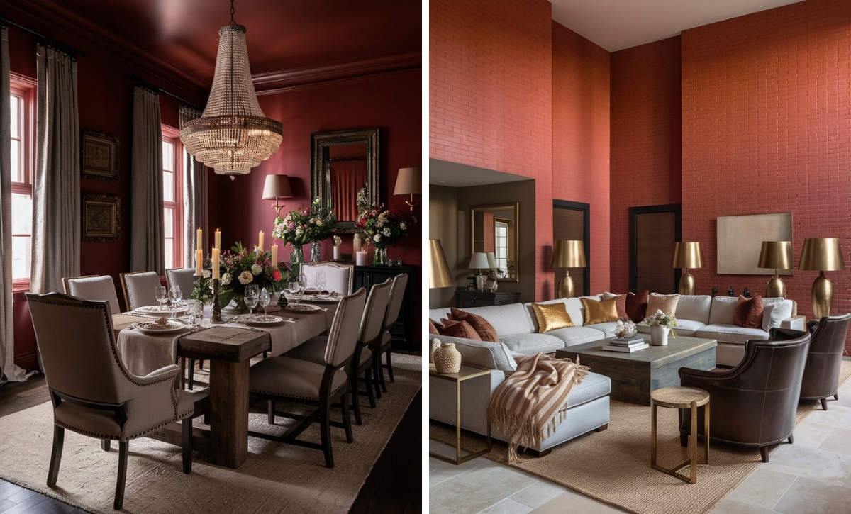
Sherwin Williams Real Red
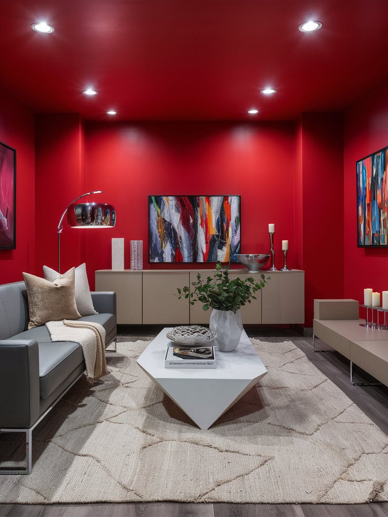
Sherwin Williams Real Red is a shade that delivers precisely what the name promises; a true classic red that stands as a benchmark in the color spectrum. It’s one of the most vibrant and attention-commanding cherry reds that is highly versatile despite its boldness.
Unlike reds that lean heavily on orange or purple, Real Red maintains a striking purity that makes it instantly recognizable as the archetypal red.
Its chroma intensity remains consistent across various lighting conditions. However, it appears more energetic in natural daylight and slightly more subdued under incandescent lighting.
The paint color’s high energy makes it excel in spaces designated for entertainment or social interaction, such as living rooms, conversation areas, or dining rooms.
Real Red makes a dramatic statement in this modern-styled living room while adding an air of warmth. The color perfectly contrasts the light-toned neutral shades in the room, such as beige and gray. The polished metallic silver accents complement and enhance the vibrant nature of the paint. Notice how the color maintains a commanding presence even in the absence of natural light.
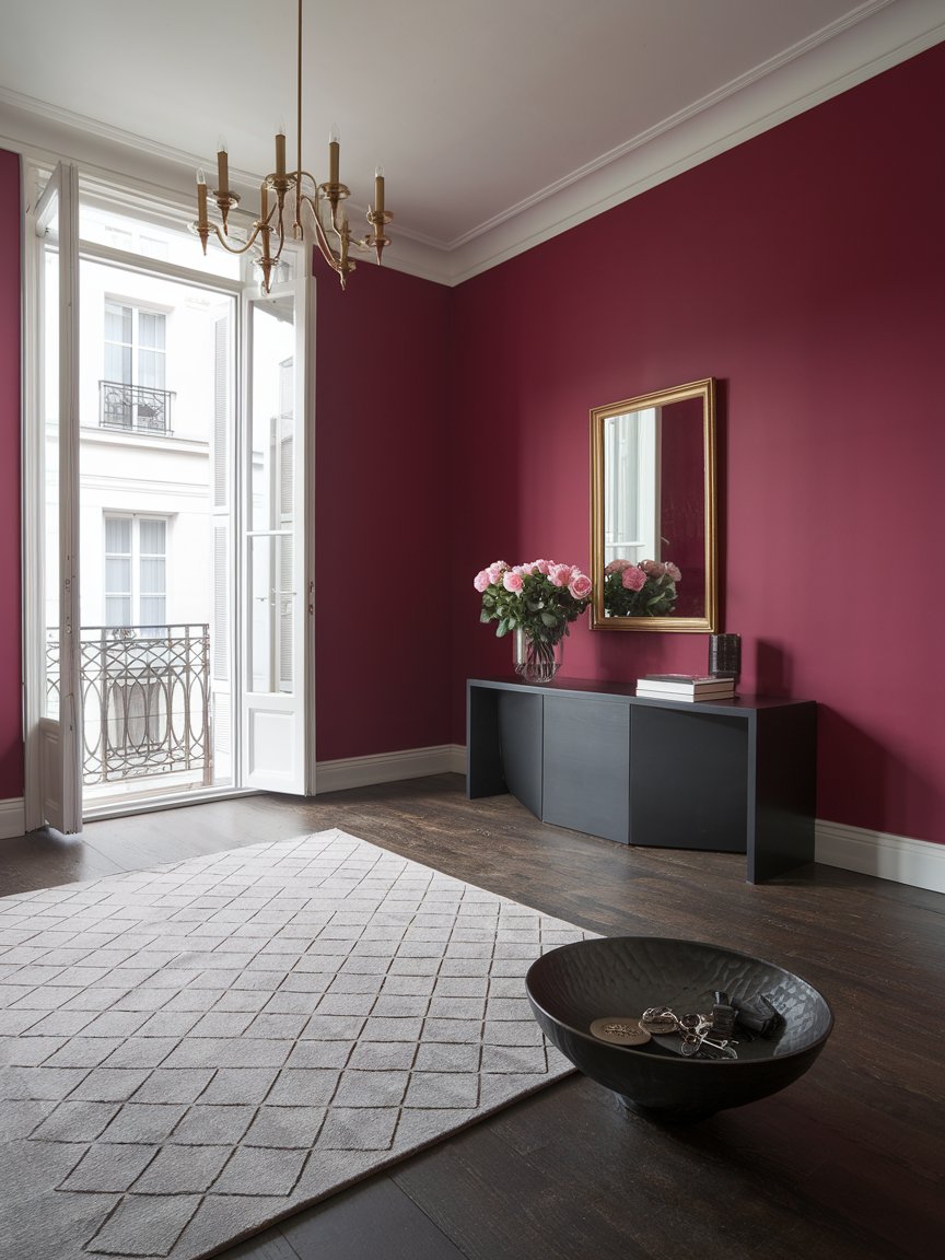
Sherwin Williams Red Bay
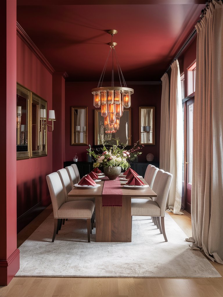
Unlike Real Red, which takes a more traditional approach to red, Sherwin Williams Red Bay is more sophisticated. It offers a nuanced, earthy, almost crimson-like cherry red with remarkable depth.
This intriguing shade covers the middle ground between a statement red and a versatile neutral. As a red with earthy undertones, Red Bay is highly adaptable, combining well with a variety of color schemes.
The shade has a complex personality. It reads as a muted red infused with subtle brown undertones to create a richness reminiscent of aged leather or fine mahogany.
Unlike more assertive reds that demand attention, this paint color creates ambiance through subtlety. It envelops spaces in a warm embrace that feels both timeless and contemporary.
Unsurprisingly, Red Bay is exceptionally compatible with natural materials. Wood tones (particularly medium to dark varieties) find a harmonious companion in this color, allowing grain patterns to stand out without competition. Similarly, stone surfaces, whether limestone or slate, develop enhanced textural presence against Red Bay’s earthy backdrop.
Red Bay infuses the spaces in this dining room with a luxurious, inviting mood reminiscent of royal dining rooms. The light-toned curtains and seats bring an element of balance, complementing the darker red dues. A natural wood table enhances the earthy undertones of the shade and brings a grounding effect. Plenty of mirrors help maximize the natural light, while the gold accents add a subtle royal touch.
Sherwin Williams Cherries Jubilee
Sherwin Williams Cherries Jubilee is a captivating red that strikes a balance between vivacity and sophistication.
What makes this shade stand out from other cherry red colors on this list is that it’s multidimensional. It offers a complex visual experience with subtle berry undertones that give it an almost tactile quality. The color has a jewel-like luminosity that animates walls rather than simply covering them.
Pair Cherries Jubilee with cream whites to create a crisp contrast, deep charcoals to add some sophisticated drama, or even invigorate the color with deep blues.
To make a classy, timeless look, consider adding gold or brass accents referencing the shade’s historical color scheme while remaining thoroughly contemporary.
Cherries Jubilee creates an intimate, welcoming space despite the expansive nature of this living room. The soft neutral shades and natural fiber rug add to the space’s authenticity while providing a contrast that doesn’t impact its coziness. Notice how the blue-toned curtains and armchairs have been used to improve the space’s visual interest.
Sherwin Williams Radish
Sherwin Williams Radish is one of the most versatile and usable reds, delivering an unexpected twist on the traditional red. Curated to capture the essence of its namesake vegetable, this shade is bold but still manages to stay slightly playful.
It has subtle pink undertones that give it a fresher and more contemporary look than other classic reds. It’s this unique undertone that creates a brightness that energizes spaces without the heaviness associated with other crimson reds.
Radish works best in creative environments; use it in home offices, dining areas, paint rooms, and areas where you need an energetic presence.
In terms of design contexts, this shade will work in various spaces, from contemporary to traditional settings, where it can offer a refreshing update on the conventional color schemes.
Notice how Radish creates the perfect backdrop for light-toned and dark accents to dominate this space. The shade’s balanced tone ensures that the light neutral tones don’t look overly bright, and neither do the dark tones look excessively drab.
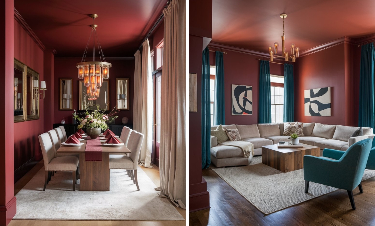
Sherwin Williams Heartthrob
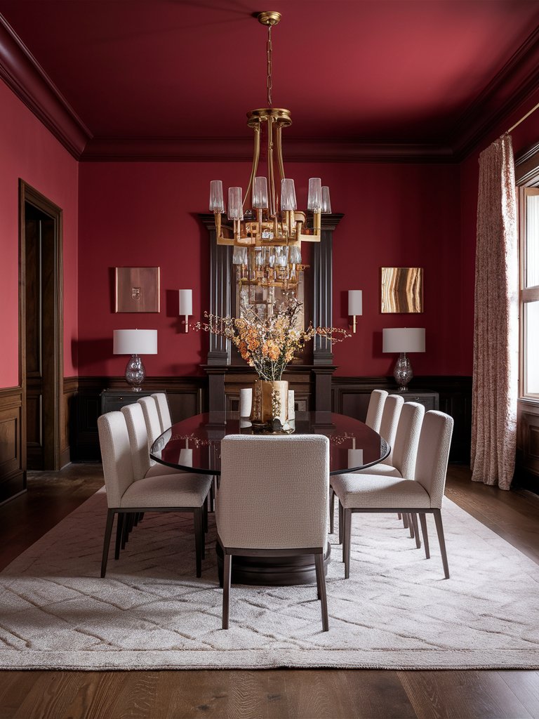
Passionate reds don’t come much better than Sherwin Williams Heartthrob! It’s one of the statement-making cherry reds that commands attention no matter the space it’s used in.
The paint color has a perfect balance of intensity and warmth, making it a standout option among the other cherry red options. Heartthrob has subtle blue undertones that evoke exceptional depth while steering the paint color away from orange territory.
This cooler orientation enables it to create drama and elegance. It gives the paint color a proper distinction from other casual reds in the spectrum.
Heartthrob is a good choice for spaces where you are looking to create intentional focal points. When applied as a full wall color, it creates an intimate atmosphere, perfect for powder rooms and statement entryways.
Heartthrob creates an intimate, passionate space in this dining room for enjoying a family meal or a good conversation. The warm tone complements the brown, earthy color of the wainscoting and trims. Reflective metallic surfaces create a sophisticated modernity and add a touch of luxurious drama.
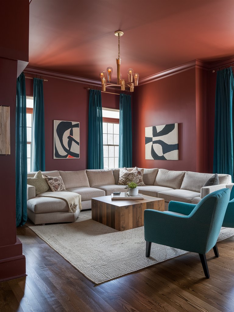
Sherwin Williams Positive Red
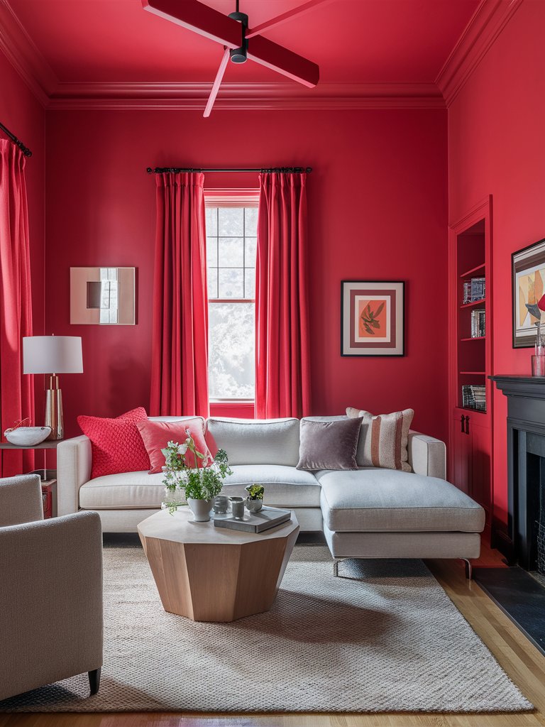
As the name suggests, Sherwin Williams Positive Red is an optimistic red that will instantly brighten up your space. This shade is highly complex and occupies a sweet spot in the red spectrum, so you should use it when you’re completely sure how you will match it.
Its subtle orange undertones give it a warm, welcoming quality without veering into coral territory. Despite its saturated hue, this shade displays versatile characteristics that are suitable for both residential and commercial applications.
In homes, it can be used in conservation-friendly spaces such as living rooms and dining rooms. Pair it with crisp whites to create a classic contrast. For more adventurous combinations, certain blues in the teal family create unexpected yet harmonious tension.
Matching Positive Red curtains create a uniform look that enhances the minimalist aesthetic of this modern living room space. The light-toned furniture provides the perfect contrast for the bright, energetic red while balancing the space. Plenty of natural light brings out the color’s richer, complex undertones.
Color Disclaimer
Please note that all paint colors displayed on this page are for illustrative purposes only. Due to variations in screen settings, lighting, and other factors, the colors you see on your screen may differ from the actual paint colors. We recommend viewing a physical color sample or swatch for the most accurate representation. Some images might be generated by AI to represent paint colors in different interiors