Creating a cozy vibe in your interiors is one of the ways to ensure your space is always warm, welcoming, and enjoyable. For most people, this means going for warm, neutral tones like browns, taupes, warm grays, and greiges.
However, for those who are adventurous enough, even warm, bright shades like orange and red can be used to elicit the same effect. One effective red shade for this purpose is cherry red. It’s a classic red tone that transcends trends, remaining a timeless choice that can add an extraordinary experience to your spaces.
Cherry red increases energy levels and creates an atmosphere of confidence and passion. Unlike neutral shades that may appear subdued, this shade makes a definitive statement, bringing a sense of authority while simultaneously creating a welcoming mood that your guests will appreciate.
Farrow & Ball manufactures some of the most unique cherry red paint colors. In this article, we’ve prepared six of the best shades you can try from their catalog.
Take a look!
Farrow & Ball
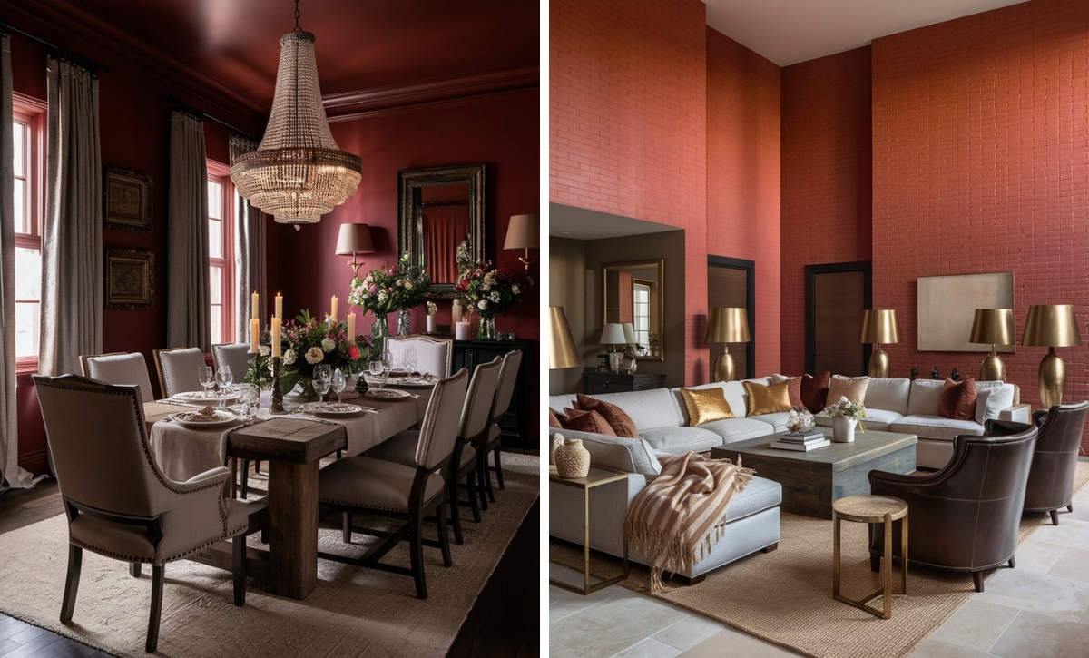
Farrow & Ball Blazer
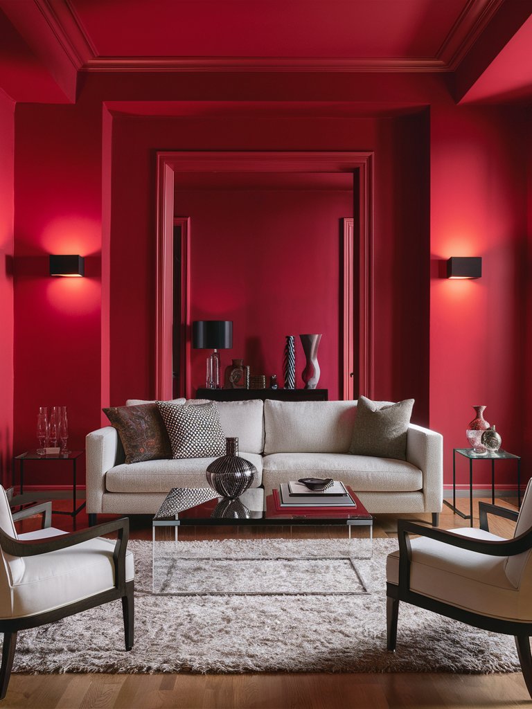
Farrow and Ball Blazer is a confident cherry red paint color with an unmistakable presence. It’s a shade that perfectly balances attention-grabbing and versatility.
Depending on what it’s paired with and the lighting conditions, this shade shifts between a rich vermilion and a warm terracotta. Its chameleon quality makes it one of the go-to reds for those looking for velvety reds.
What makes Blazer stand out from similar reds in the market is its perfect balance of intensity. Neither too bright to overwhelm nor too muted to fade away, it hits that sweet spot that professional designers constantly seek.
The color’s depth comes from Farrow & Ball’s signature high-pigment formulation, creating a dimensional quality rarely found in standard paint offerings. Since it works seamlessly with neutrals, Blazer is highly adaptable in both traditional and modern spaces.
In this modern-styled living room, Blazer creates a warm, welcoming, cozy vibe while still helping the space maintain an element of subtlety and progress the minimalistic aesthetic. It acts as the perfect backdrop to allow light-toned shades on the sofa and armchairs and dark-toned accents on the décor to dominate the space.
Farrow & Ball Picture Gallery Red
As the name suggests, Farrow and Ball Gallery Red is a museum-worthy hue capable of creating an undeniable impact in your space. This unique cherry red hue has been inspired by classic art world traditions, creating timeless and boldly current spaces.
It’s one of the few red shades that combines cherry and burgundy undertones to create a sophisticated, chic look. With a medium tone, Gallery Red absorbs and reflects light, creating visual interest even in the most fundamental spaces.
It’s ideal for spaces such as libraries and studies, where the paint color can add an enveloping intellectual atmosphere that encourages focus and contemplation. This creates a color experience that can’t simply be matched by other red tones.
Pair it with dark woods, brass accents, and creamy whites to create a color scheme that feels curated rather than contrived.
Gallery Red pairs well with warm, earthy, and neutral tones in this living room to create a well-rounded color palette. The natural light brings out the paint color’s warm burgundy undertones, which have been complemented by the warm-toned chairs. Notice how the shade contrasts the crisp whites while the metallic accents enhance its aesthetic appeal.
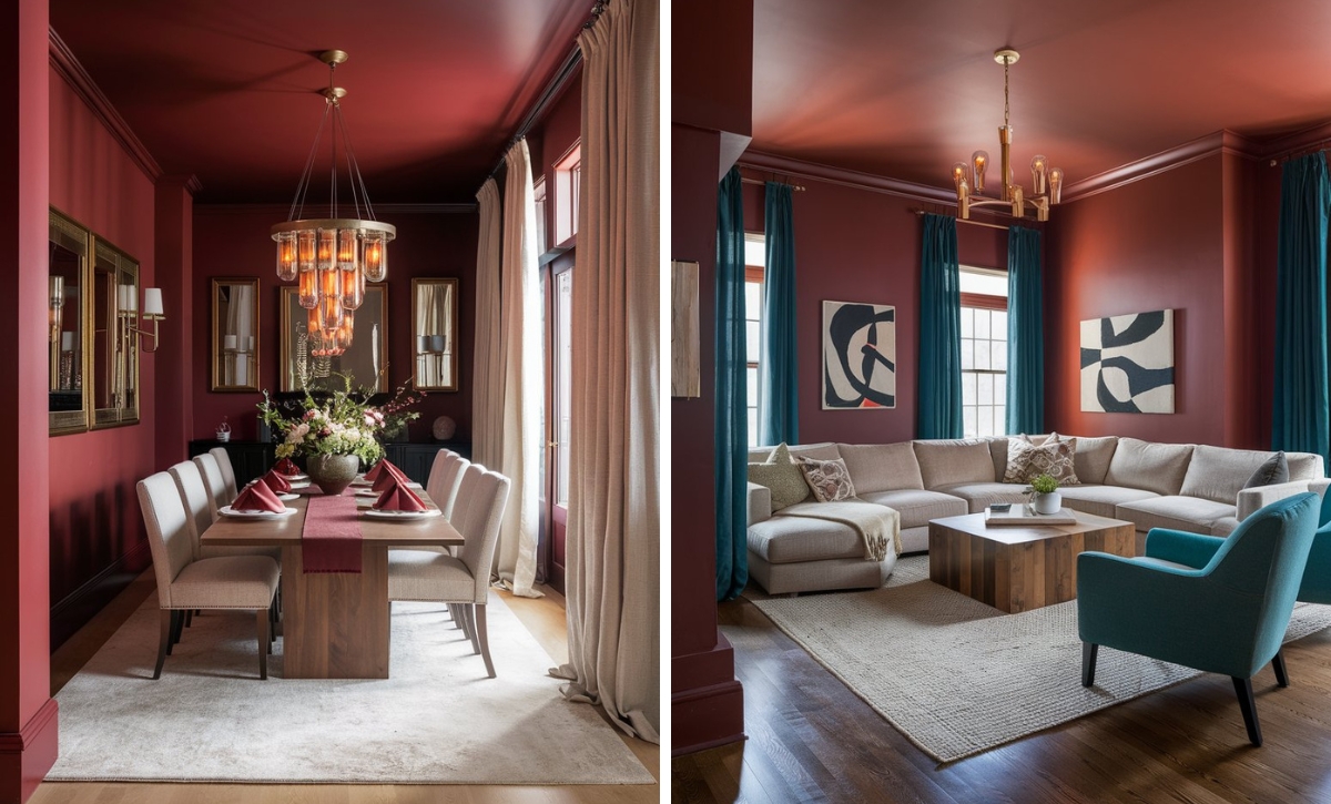
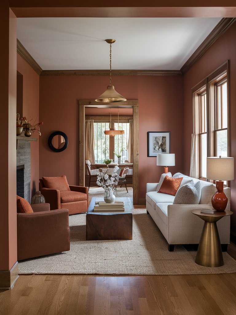
Farrow & Ball Rectory Red
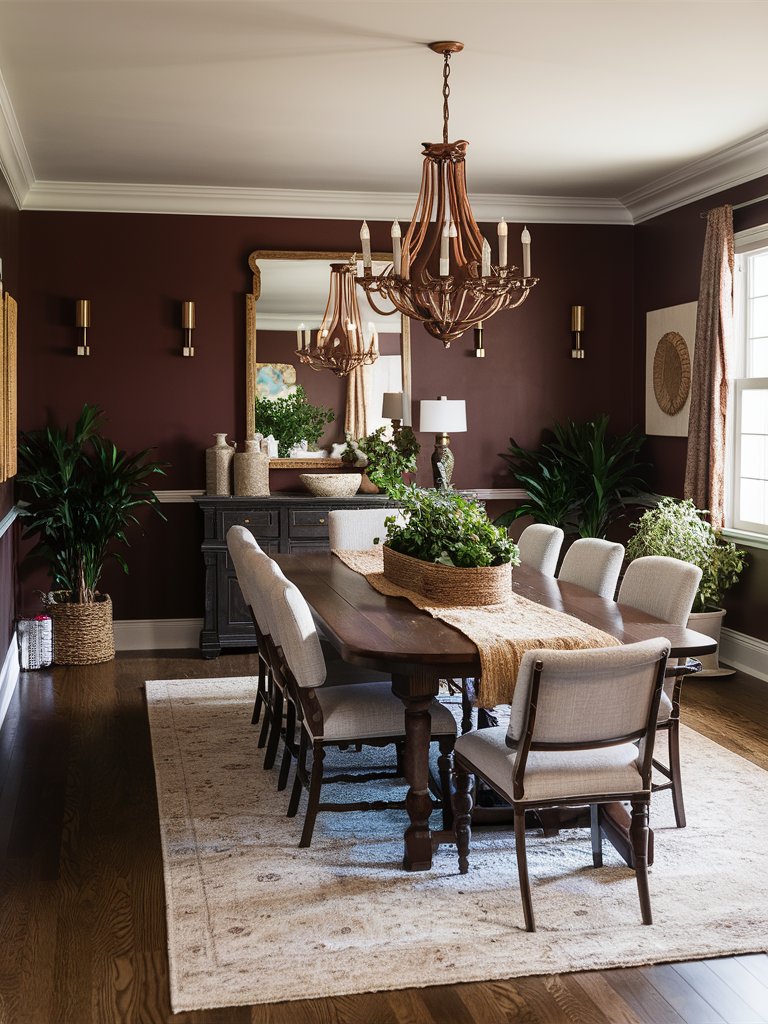
Farrow and Ball Rectory Red is one of the few cherry red tones rooted in historical traditions and is a refined color capable of making a statement in any room.
It’s a deep, historical, earthy red that carries the weight of architectural heritage while still managing to be relevant in modern spaces. Its unique undertones give it a brick or russet look based on the lighting conditions, creating spaces that feel responsive to their natural environment.
Rectory Red builds a warm and welcoming mood in dining rooms and entertaining spaces that encourage lingering conversations. The color performs exceptionally well in rooms with abundant natural light, where its complexity truly emerges. It also holds its own in spaces lit primarily by artificial lamps and fixtures.
In terms of color pairing, this shade works with warm neutrals, wooden elements, and natural stones, creating cohesive spaces.
In this high-ceiling living room, the use of natural wood furniture and a natural fiber rug creates a well-rounded space that not only feels grounded but also authentic. Since the room has plenty of natural light, the dark-toned sofa works well to add an element of contrast with the brighter Rectory Red. Combining light neutrals and dark shades creates a gradual color palette that gives the space a cohesive look.
Farrow & Ball Radicchio
Farrow and Ball Radicchio is a cherry red tone that offers a lively yet measured take on red paint colors. This shade is perfect for adding energy to your interior spaces without being too overbearing.
Radicchio draws its inspiration from Italian chicory, delivering a mature balance of brightness and restraint. Depending on the light quality, the color’s undertones shift between pink and coral red, creating spaces that feel dynamic throughout the day.
Unlike deeper reds that can darken a space, this hue maintains a certain clarity, bringing life to even north-facing rooms. Since it contains subtle coral undertones, Radicchio is warmer and more forgiving than many reds in similar brightness ranges. This quality complements warm and cool neutrals, giving interior spaces a high degree of flexibility.
This dining room space exemplifies Radicchio’s qualities of not being too bright to age or too muted to make an impact. Being a dark-toned red, it perfectly contrasts with other light-toned elements like the rug and the dining seats. Its subtle brownish undertones also allow it to combine well with natural wood, while the metallic accents improve the visual interest and add a rustic appeal to the room.
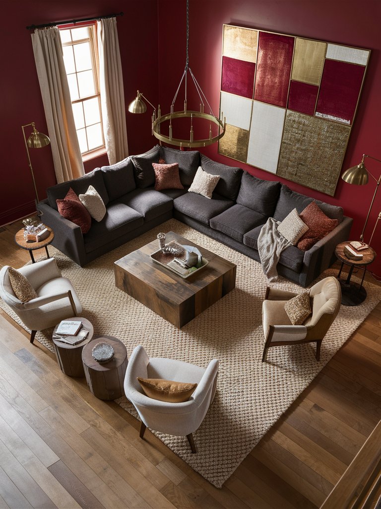
Farrow & Ball Incarnadine
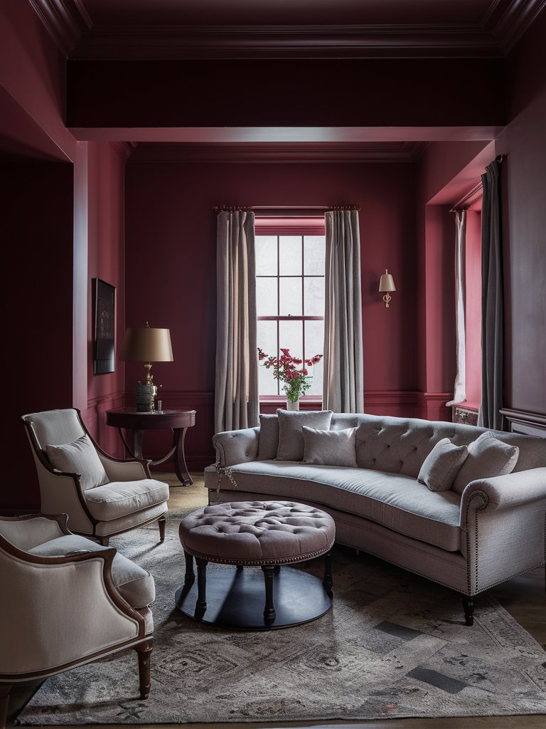
For those looking for cherry reds that are more traditional or of historical quality, Farrow and Ball Incarnadine is the color to go for. It’s a powerful yet controlled red with a remarkable depth that will command instant attention in your space.
This shade may read as either bright crimson or carmine. Still, under neutral ground, it manifests as a true red that avoids veering too far into either orange or blue territories.
While Incarnadine provides immediate visual impact, it’s sufficiently complex and doesn’t strain the eyes even with prolonged viewing.
Incarnadine creates an atmosphere of drama and intention in formal dining rooms and statement spaces. Its tonal range becomes more apparent when used in rooms with varied lighting.
Incarnadine creates a cozy, almost cocoon-like effect in this conversation space, making it the ideal area for heated discussions. Notice how the color pairs well with both cool whites and warm neutrals to create a design scheme that feels bold yet balanced. The subtle metallic accents and Chester-style sofa add some historic flair.
Farrow & Ball Charlotte’s Locks
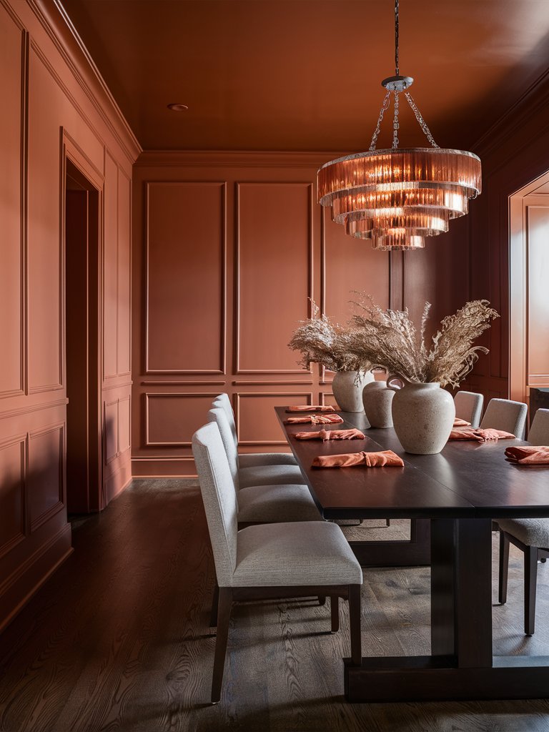
Farrow and Ball Charlotte’s Locks is a fiery orange-red that will infuse your spaces with unmistakable energy and warmth. It captures the intensity of autumn foliage and sunset skies, delivering walls that glow with amber-tinged radiance.
The shade is the perfect balance of burnished copper and rich pumpkin, creating surfaces that feel alive and responsive to their environment.
Charlotte’s Locks offers a perfect solution for homeowners seeking impact without harshness. It pairs naturally with navy blues, deep greens, and warm neutrals, creating color schemes that feel balanced rather than overwhelming.
Charlotte’s Locks excels in rooms that receive warm afternoon light, where the paint color seems to capture and amplify the sun’s glow.
Here, Charlotte’s Locks creates an inviting and welcoming dining room space that evokes a sunset feel. Notice how natural light brings out the shade’s orange undertones, giving the space a vibrant energy ideal for conversations or sharing meals. Since the color is reasonably reflective, it creates a cozy atmosphere that still feels open and airy.
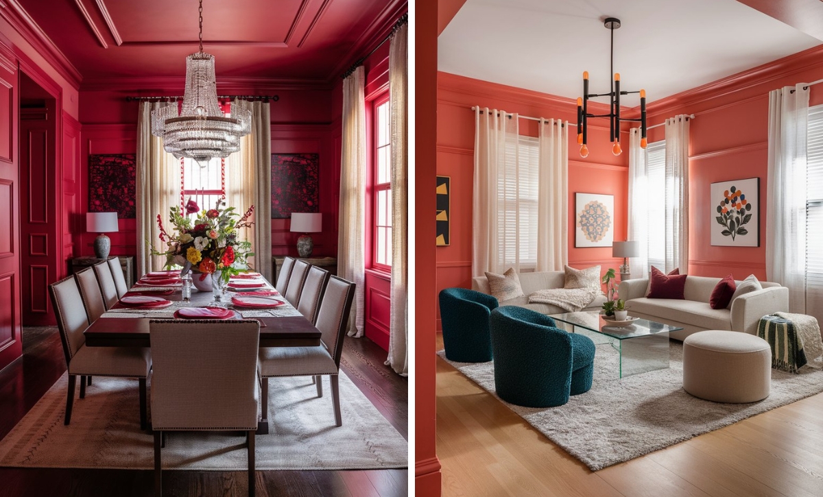
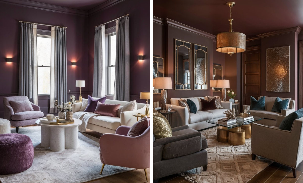
Color Disclaimer
Please note that all paint colors displayed on this page are for illustrative purposes only. Due to variations in screen settings, lighting, and other factors, the colors you see on your screen may differ from the actual paint colors. We recommend viewing a physical color sample or swatch for the most accurate representation. Some images might be generated by AI to represent paint colors in different interiors