Fun Fact! Research in color psychology shows that warm tones like cherries, crimson, and burgundy promote feelings of excitement and energy when used indoors. This makes such shades ideal for spaces like dining and entertainment areas where lively interaction is desired.
From a designer’s standpoint, shades like cherry red bring a bold yet sophisticated mood to a room. These paint colors are also highly versatile, making them applicable in other intimate settings like studies and reading nooks where they create a cocooning yet inspiring effect.
In most settings, cherry red is used as an accent color to reveal intricate architectural details or as a ceiling color to create an unexpected visual interest. When used as a full wall color, it adds an enduring presence and a character-filled environment.
Unlike other color trends that may quickly become dated, cherry red is a timeless choice that has adorned interiors from the Victorian era to mid-century modern designs. We’ve prepared six of the best cherry red paint colors from Benjamin Moore that you can invigorate your interiors with.
Take a look!
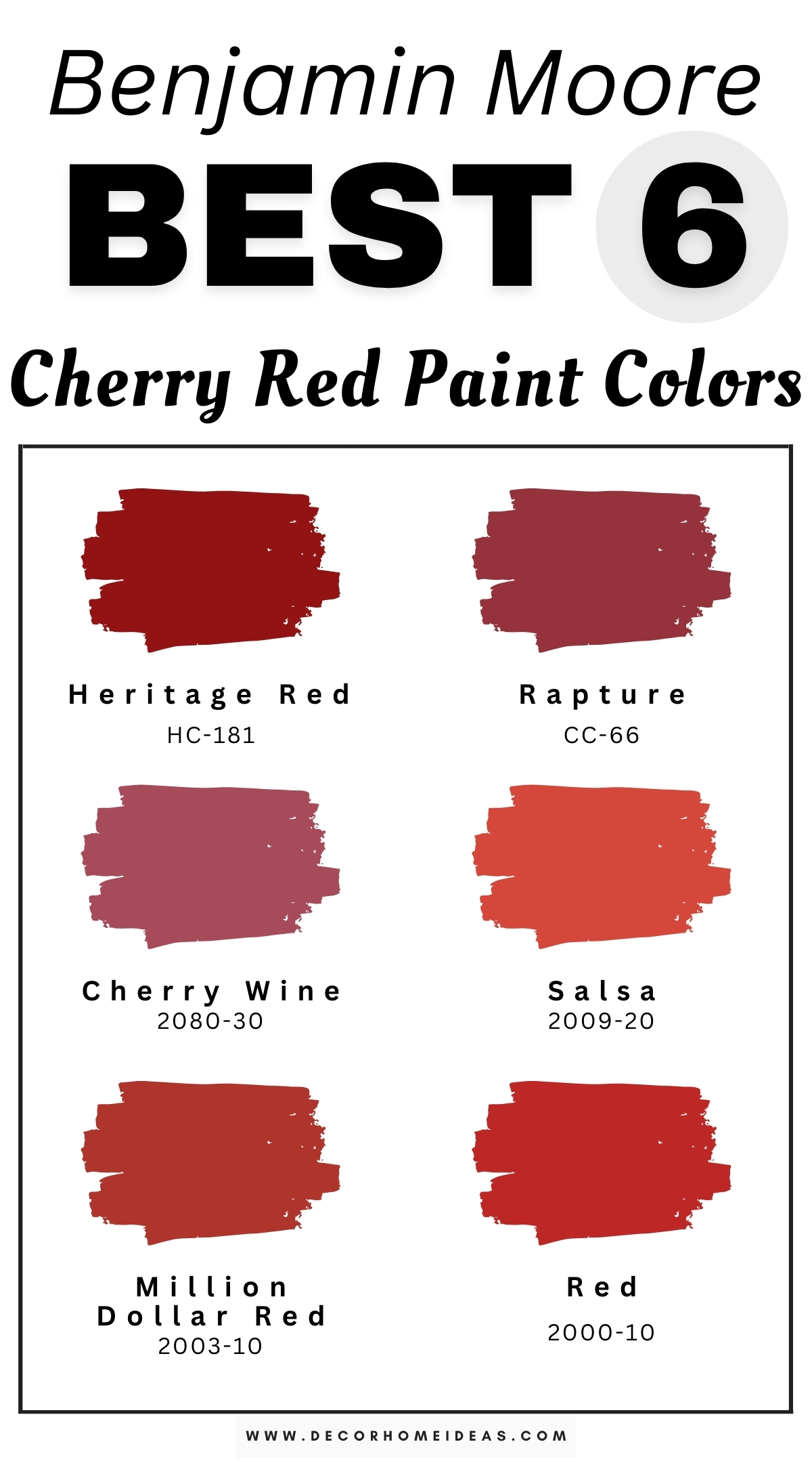
Benjamin Moore
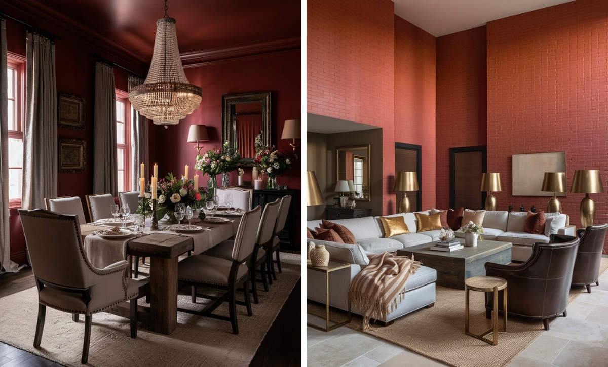
Benjamin Moore Heritage Red
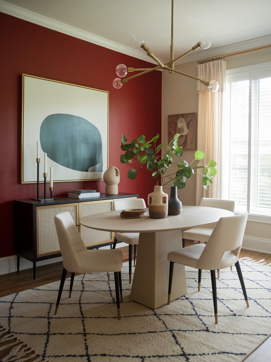
Benjamin Moore Heritage Red is one of the most unique reds in the premium paint market, thanks to its nuanced and historic-inspired character. It’s a shade that balances boldness with refinement, making it a good choice for spaces you are looking to add depth.
Heritage Red features subtle burgundy undertones and a faint touch of brown that creates a particular richness reminiscent of classic spaces. The stand-out quality of this color is its ability to evoke a nostalgic feel.
When used in traditional spaces, it effortlessly creates a feeling of authenticity from the colonial and federal periods. This makes it one of the go-to cherry red choices for historical restoration projects.
However, its use in historical projects doesn’t constrain it to only the classics. When paired with clean lines and minimal furnishings, this shade transitions beautifully into modern settings to create a minimalist accent that doesn’t overwhelm the eye.
Notice how Heritage Red on the accent wall creates an inviting and welcoming feel around this dining room. The color matches the soft shades, such as creams and white, which help elevate the airy feel. The paint color creates a focal point and makes the otherwise muted space more energetic and lively.
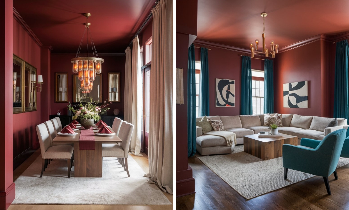
Benjamin Moore Rapture
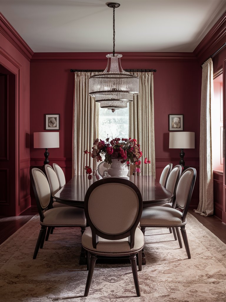
Firmly fixed on the mauve-pink spectrum, Benjamin Moore Rapture is a masterful expression of soft velvet cherry tones. It’s one of the few reds that occupies a fascinating middle ground between subtle purple and traditional pink tones.
This unique color combination gives it an atmospheric quality rarely found in more conventional paint selections. In terms of undertones, Rapture has subtle gray ones that temper its brightness, resulting in a complex shade that shifts with changing light conditions.
Pair this shade with warm neutrals like gray to create a smooth, subtle, sophisticated space or deeper tones like navy blue to create a dramatic and unexpected contrast. Since it also contains earthy undertones like brown, this shade will work well with muted greens and earthy terracotta to create a complex and layered environment.
In this dining room, Rapture’s energetic nature creates an intimate space that doesn’t feel overly constrained. Light-toned shades help balance out the deep red shades, while the large chandelier acts as the centerpiece and contributes to the Victorian-era aesthetic.
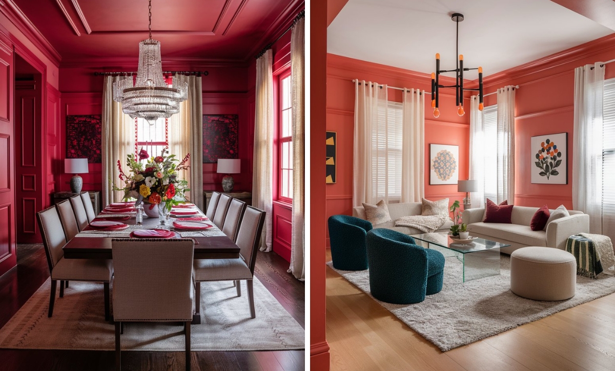
Benjamin Moore Cherry Wine
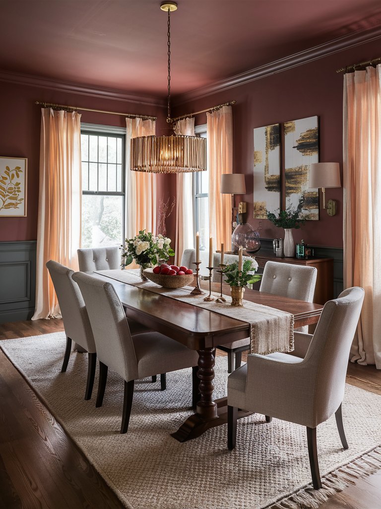
If you’re looking for a shade that will add instant coziness to your space, even with a minimal accent, Benjamin Moore Cherry Wine is the color to go for.
It has a fascinating combination of vibrant red and burgundy, making it a good choice for spaces where you want boldness and refinement.
Cherry Wine has a jewel-like quality, so how it reads may shift throughout the day. When used in rooms with plenty of natural light, its energetic red notes become more pronounced. Under evening light or artificial lighting, its deeper, mysterious burgundy aspects will be more vivid.
Pair this shade with crisp, deep charcoals and blacks to create sophisticated, moody environments, or crisp whites for a more classic look. If you’re looking for a more striking look, consider adding golden accents.
Here, Cherry Wine matches and complements the natural wood brown accents, providing a unique, grounding quality. The matching pinkish curtains enhance the warmth and coziness provided by the color, while subtle metallic accents add an element of elegance to the entire design.
Benjamin Moore Salsa
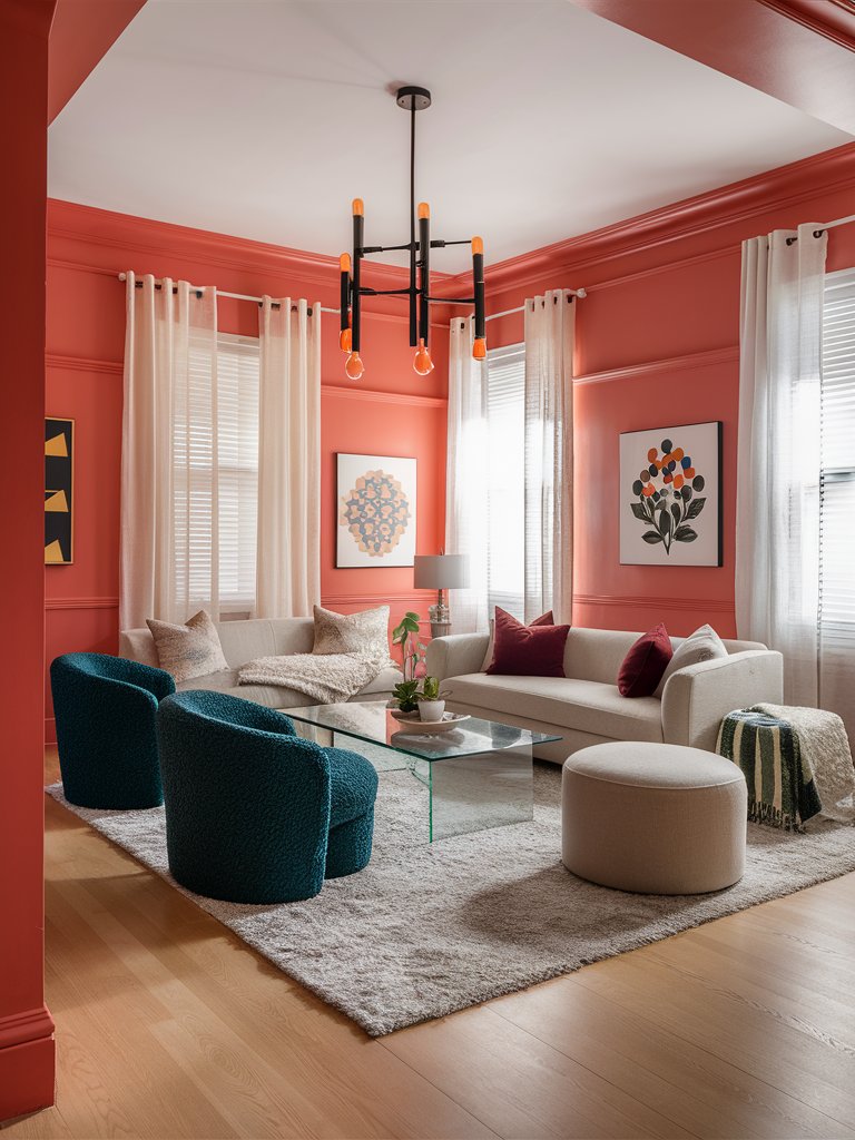
Energetic and dramatic reds don’t come much better than Benjamin Moore Salsa. This shade is the true embodiment of vibrant energy, delivering a powerful visual statement that transforms ordinary rooms into dynamic, engaging environments.
The paint color’s vibrancy is attributed to orange undertones that reveal themselves with remarkable clarity without being overly aggressive. Unlike other deeper reds that may feel heavy or somber, this shade maintains its invigorating quality through different lighting conditions.
In a space with plenty of natural light, the brightness will enhance the paint color’s energetic, festive aspect. It’ll read more refined and cozy in spaces with warm artificial light, creating a welcoming sense instead of being overwhelming.
Salsa is preferred for modern and contemporary styled spaces due to its dramatic statement-making quality, especially when juxtaposed against crisp white surfaces, glass, or minimalist concrete.
Notice how Salsa adds an element of drama and sophistication to this modern-style living room. Plenty of light-toned neutral shades help balance out the room, while clean lines and well-defined spaces contribute to the minimalistic aesthetic. With ample natural light, the color’s orange undertones are more prominent, giving the room an airy and open feel.
Benjamin Moore Million Dollar Red
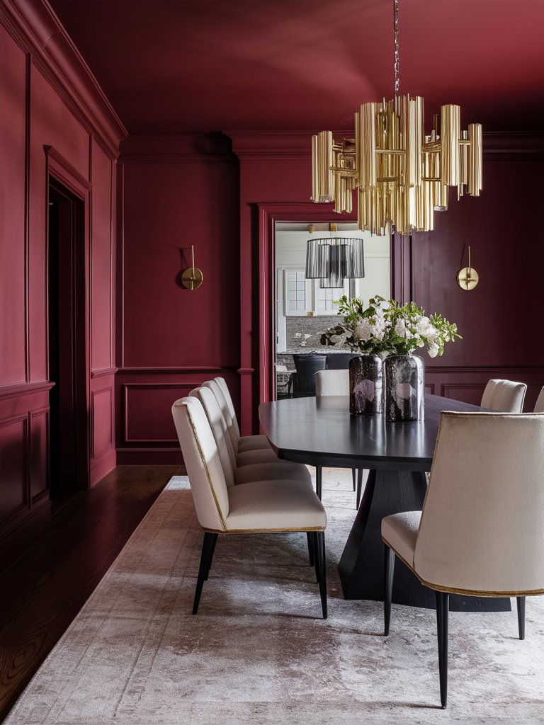
As the name suggests, Benjamin Moore Million Dollar Red is one of the cherry red tones that epitomizes luxury. It’s a deep red that offers a dramatic presence that lives up to its name.
Since it has a high degree of intensity, this shade is highly preferred in traditional settings, where it references the sumptuous interiors of historic theaters and elegant estates.
Million Dollar Red has an extraordinary characteristic: it’s a deeply saturated red tone with subtle blue undertones that contribute to its depth and complexity. Unlike brighter reds like Salsa, which feel trendy, this color adds a timeless gravitas that makes it even more intriguing.
Under bright natural light, it has a clear, deep red look, while warm artificial light will enhance its burgundy undertones. Pair it with bright neutrals to create a dramatic contrast or navy blue and muted gold accents for more striking results.
Million Dollar Red creates a unique, cozy, yet minimalistic vibe in this dining room. The minimal accents and décor give the room a clean, refined look, while the red shade creates the perfect background for the dining area to dominate the room and be the center of attention. The light-toned rug and chairs create the much-needed contrast in the space.
Benjamin Moore Red
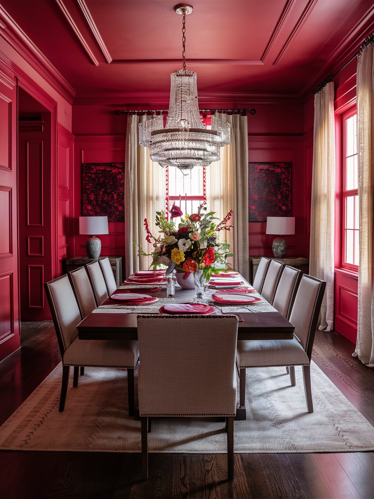
Benjamin Moore Red is a definitive and iconic hue, a true primary red that delivers remarkable clarity and presence. As one of the flagship colors from Benjamin Moore, it’s a perfectly calibrated shade that avoids veering into either orange or blue undertones.
Since it was one of the true reds, this shade is a quintessential reference point within the cherry red spectrum. It has exceptional color purity that can hardly be matched by other red shades, maintaining a remarkable consistency no matter the lighting conditions. This makes it an ideal choice where color stability is desired.
Despite the paint color’s consistent nature, the level of warmth intensity will vary. In bright light, it’ll read more energetic but add a cozy ambiance under warm light.
Red infuses this dining room with a cozy, enveloping sense. Natural light brings out the shade’s hot pink undertones, making the space more vibrant. Neutral tones balance out the shade’s energetic tone to make it less overbearing.
Color Disclaimer
Please note that all paint colors displayed on this page are for illustrative purposes only. Due to variations in screen settings, lighting, and other factors, the colors you see on your screen may differ from the actual paint colors. We recommend viewing a physical color sample or swatch for the most accurate representation. Some images might be generated by AI to represent paint colors in different interiors