Decorating with red was one of the most enduring interior design trends in 2024, and it looks like this trend will still continue in 2025! And cherry red is the latest variation of this alluring color to come into the fray in the interior design world.
One of the reasons red has been popularized in most interior spaces is the “red theory.” According to this social media theory, adding a small amount of red in spaces will create a lot of impact. This has led to many people trying to experiment with this tone.
Cherry red is one of the unique red tones, with undertones varying from pink to violet. It offers a more vibrant and brighter tone compared to burgundy or maroon. Spaces painted with this color will feel playful, cozy, or warmer.
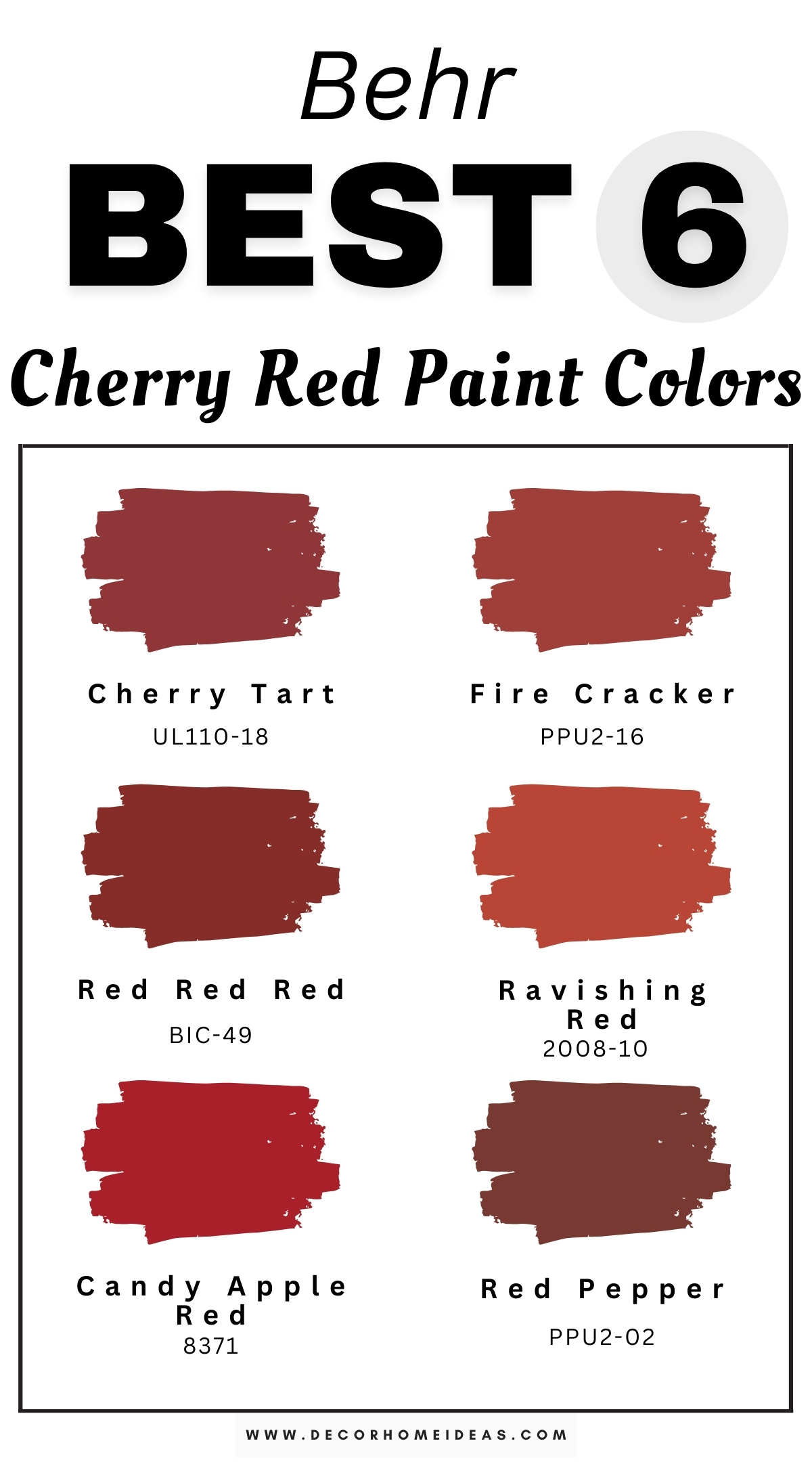
While it may make for a good indoor color, cherry red requires a lot of thoughtful implementation, from furniture selection to accent pieces. With numerous tones of cherry red paints to choose from the market, we’ve prepared six of the best cherry red shades from Behr you can try.
Take a look!
Behr
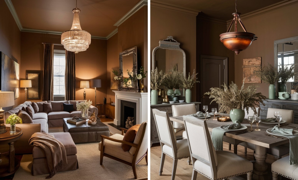
Behr Cherry Tart
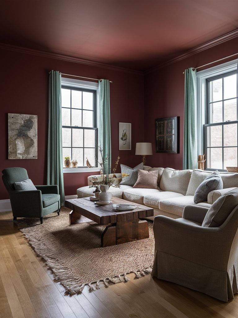
Behr Cherry Tart is a vibrant, medium-intensity red with subtle blue undertones that distinguish it from warmer, berry-toned reds in the Behr collection. It’s one of the cherry red tones with high light reflectivity and a remarkable depth, giving the shade a chameleon-like quality and high visual interest.
It’s a mid-range red pigment that absorbs moderate light while maintaining enough depth to enhance the room’s brightness. This balance prevents it from falling into the same pitfall as other dark reds that may make a space dim and oppressive.
Pair Cherry Tart with cool grays to create striking contrasts and earthy neutrals for a well-rounded space. If you prefer boldness, try navy accents or matte black trims to add some architectural emphasis.
Cherry Tart matches other natural accents to give this living room an authentic, earthy look. The natural fiber rug and wooden table complement the brown undertones, while the gray and earthy green accents add a grounding element. The space feels airy and cozy, with plenty of natural light and light-toned furniture, perfect for a quiet evening.
Behr Fire Cracker
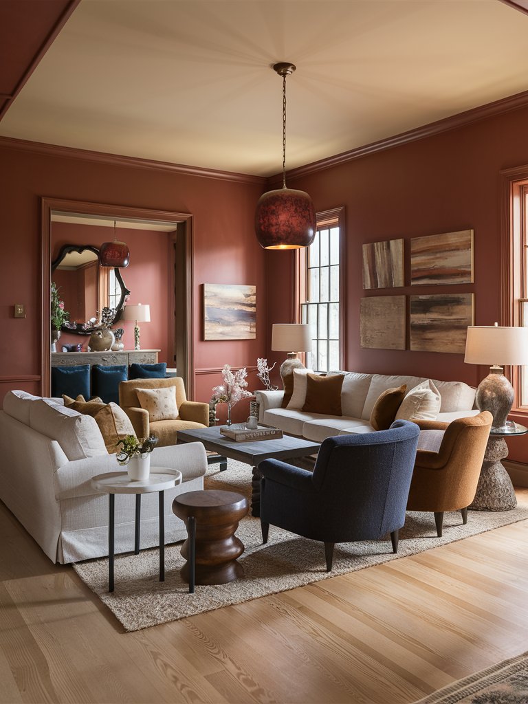
If you’re looking for a vibrant, invigorating cherry red, Behr Fire Cracker will do the trick. It’s a distinctive, energetic red with orange undertones that sets it apart from other cooler cherry-inspired reds.
This shade lives up to its name as it’s vivid, lively, attention-grabbing, and full of visual heat that activates spaces to add a remarkable intensity.
Fire Cracker works well as a statement element, precisely highlighting architectural details. This makes it ideal for accent walls or creating focal points as it adds punch contrast in neutral environments. However, this doesn’t mean it can’t be used as a complete wall color.
When applied as the primary color, it creates a dynamic color experience that evolves with the lighting conditions. Under bright morning light, the orange undertones become more amplified, making a space warmer and playful. Warm artificial light or evening light will bring out its deeper red notes.
Notice how Fire Cracker adds a welcoming, cozy vibe to this living room. The natural light brings out the orange undertones, which match the brownish accents, such as the throw pillows and armchairs. Since it’s a somewhat muted red, it pairs well with soft neutrals like cream and white, which also help contrast the color.
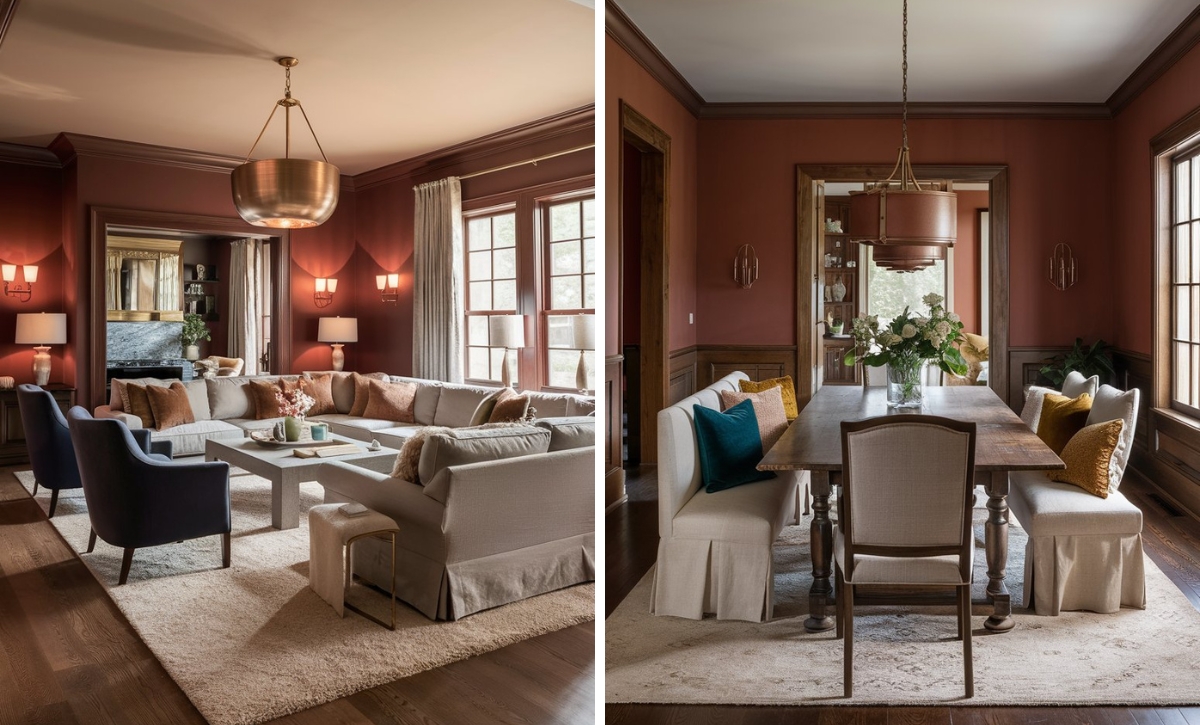
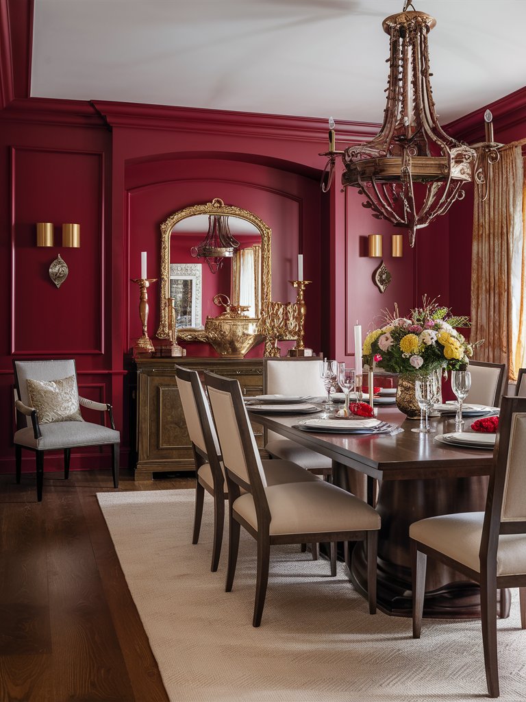
Behr Red Red Red
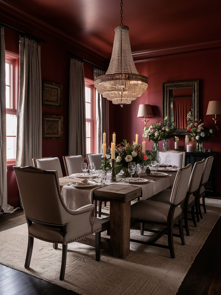
Archetypal reds don’t come much better than Behr Red Red Red. As the name suggests, it’s one of the true reds with remarkable chromatic purity. It comes with purple undertones and subtle orange influences that add a bit of warmth to your space.
As one of the original red tones, this shade aligns particularly well with the classic color theory and, as such, stimulates energy to draw immediate visual attention. It’s a minimal reflectant red that tends to absorb light rather than reflect it.
The shade creates an intimate atmosphere in smaller spaces, but it can serve as a visual anchor in large spaces. Its low reflectance ability leads to neutral colors reading differently when placed next to it.
Pair Red Red Red with crisp walls to create sharp contrast and implement a modern aesthetic, or cool grays to create some visual tension. If you want to use it in a traditional setting, pair it with natural wood to tamper with its boldness.
Red Red Red adds a welcoming atmosphere and a bit of historical charm to this classic-style dining room. The shade creates a cozy, cocooning feel, while lighter shades like white enhance the dining room’s spacious feel. Notice how the mirrors help reflect light and contribute to the rustic charm.
Behr Ravishing Red
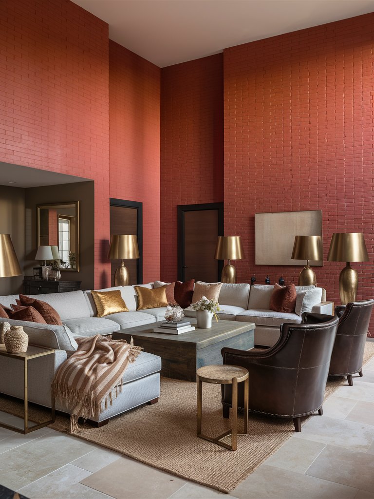
Behr Ravishing Red is a dynamic, high-energy red with subtle coral undertones. It is one of the few versatile, vibrant reds in the market. This shade occupies a unique position in the red spectrum, sitting between a true primary red and reds with orange influences.
This makes it a highly versatile red paint color that can bridge multiple design aesthetics.
It works successfully in small accent applications or large feature walls, as it doesn’t overwhelm the surrounding elements.
Ravishing Red contrasts with crisp whites or light grays, establishing a clear visual hierarchy within spaces. It harmonizes effectively with warm neutrals in the taupe family for more nuanced combinations and creates unexpected sophistication alongside muted olive greens.
Pairing the paint color with matte black accents in contemporary settings adds architectural emphasis and grounds its vibrant nature.
Ravishing Red creates an intimate space despite the high ceiling of this living room. Well-defined spaces and subtle décor promote the contemporary living space’s minimalist aesthetic. Notice how the brass metallic accents of the area lamps and throw pillows help enhance the look and feel of this color.
Behr Candy Apple Red
Behr Candy Apple Red is a color that mimics its namesake treat. It’s a bold cherry red with unmistakable subtle blue undertones that help it create a cooler, more jewel-toned appearance not common in the Behr collection.
This quality allows it to create a distinctive hue that has a remarkable depth and captures attention without appearing flat or artificial.
Use Candy Apple Red in spaces with plenty of natural light to create a cooler dramatic effect. The shade maintains its vivid character while developing subtle richness as the light becomes warmer. While it may make spaces feel more intimate, prudent application is essential in rooms with limited natural light.
The paint color develops an intriguing complexity when paired with taupe neutrals and warm grays. Pairing it with whites will create a classic contrast reminiscent of royal palaces.
Candy Apple Red brings some Victorian-era charm to this dining space. Notice the balance of light, neutral tones, and earthy tones to give the space an authentic, classic look. Plenty of shiny metallic accents add a lavish royal look. Natural light helps focus the dining area and creates a spacious, expansive look.
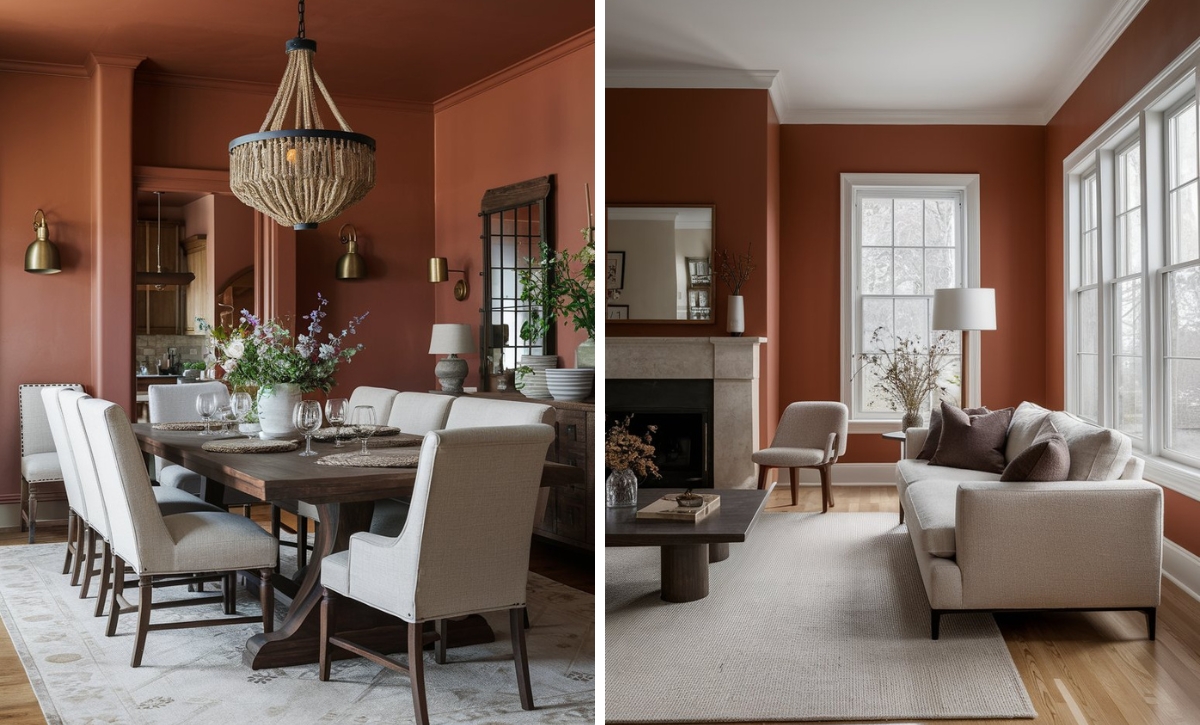
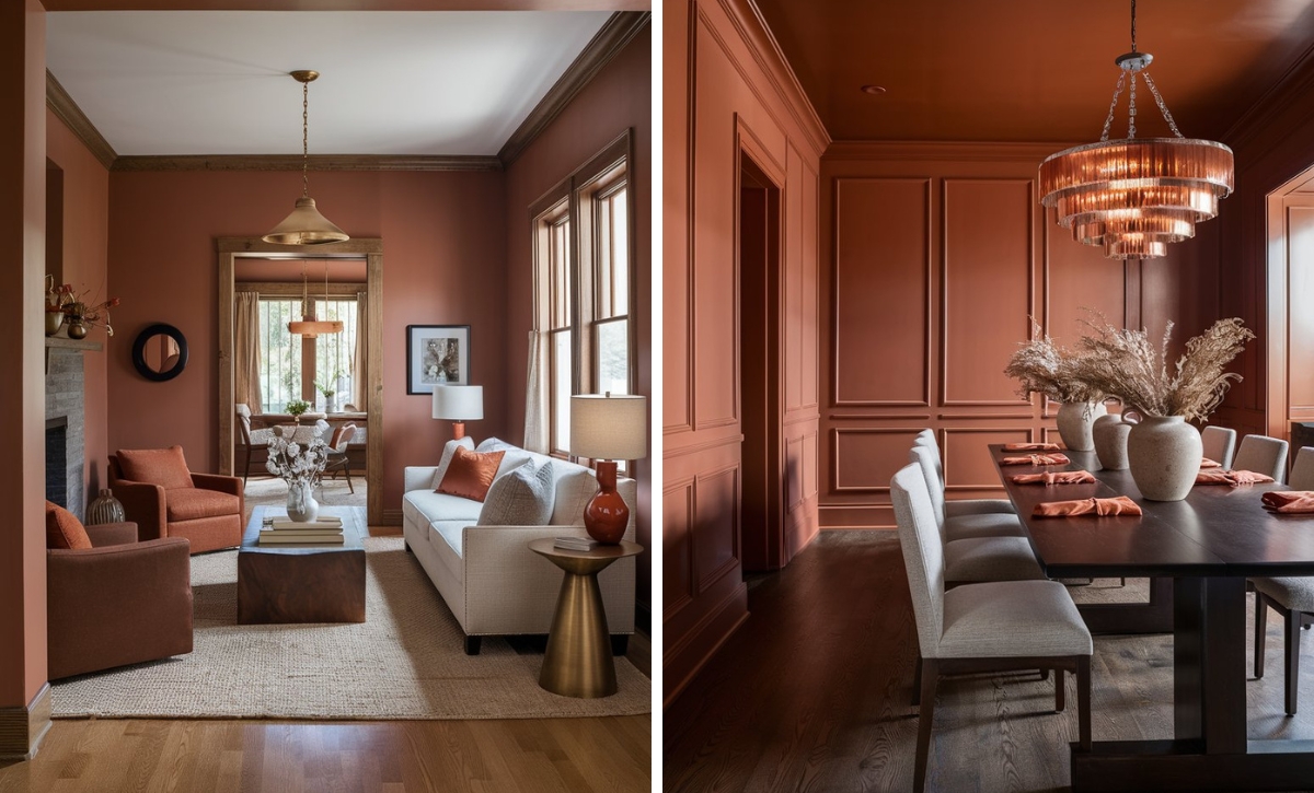
Behr Red Pepper
If you’re looking for a unique-toned red, Behr Red pepper is the perfect candidate. It’s a distinctive, earthy-toned red with terracotta undertones that separate it from brighter primary reds in the red spectrum.
Red Pepper is a warm-leaning hue that delivers depth and nuance that changes based on the light patterns.
One of the shade’s most unique qualities is its ability to work in a variety of settings. Under natural daylight, its rusty undertones become more pronounced, creating a grounded, almost historical quality that works well in traditional architectural settings.
Red pepper develops more richness when used under warm-toned lighting, becoming more enveloping and intimate.
Notice how Red Pepper is contrasted by the light-toned furniture to help create a welcoming, earthy space. Plenty of natural light adds a rustic warm touch, while other neutral shades like gray enhance the progressive, muted, but welcoming pattern.
Color Disclaimer
Please note that all paint colors displayed on this page are for illustrative purposes only. Due to variations in screen settings, lighting, and other factors, the colors you see on your screen may differ from the actual paint colors. We recommend viewing a physical color sample or swatch for the most accurate representation. Some images might be generated by AI to represent paint colors in different interiors