Decorating your interiors can be challenging because there are countless decor items and paint colors to choose from. Most people prefer the comfort of bright, neutral classics like white, cream, and beige, while others prefer timeless colors that will withstand the test of time.
One of these timeless options is burgundy. This shade has deep, rich tones that add warmth and bring a sense of sophistication to a room, making it ideal for spaces where you want to create an elegant, cozy vibe.
What has made burgundy pop into the interior design scene is its versatility and ability to be used in a variety of spaces, from living rooms to bedrooms and even offices.
This color doesn’t disappoint either in terms of interior design styles—it can be applied to traditional, modern, and transitional spaces.
If you want to add some burgundy magic to your interiors, we have prepared some of the best burgundy paint colors from Benjamin Moore, which you can try.
Take a look!
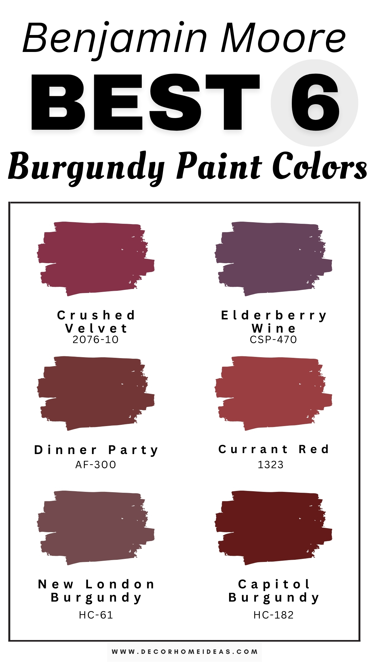
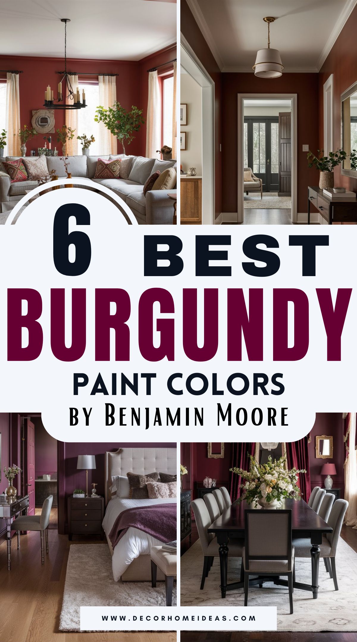
Benjamin Moore
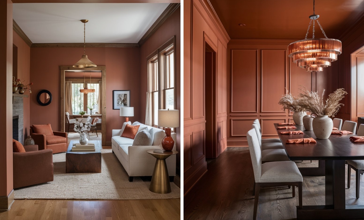
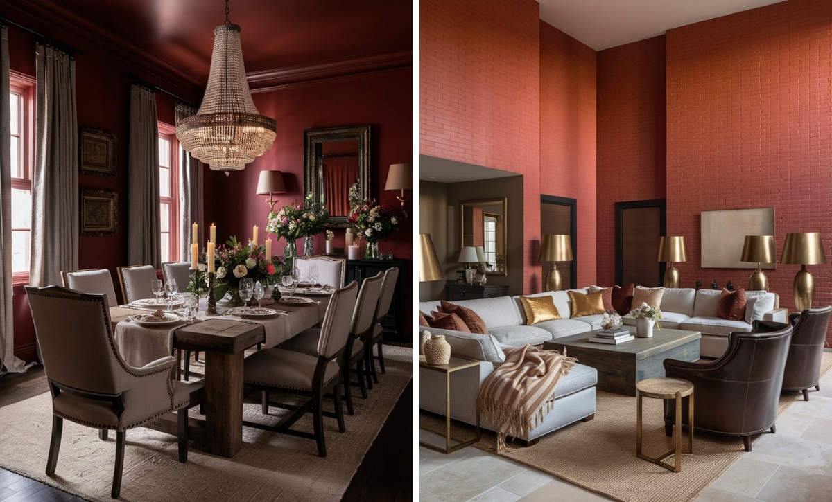
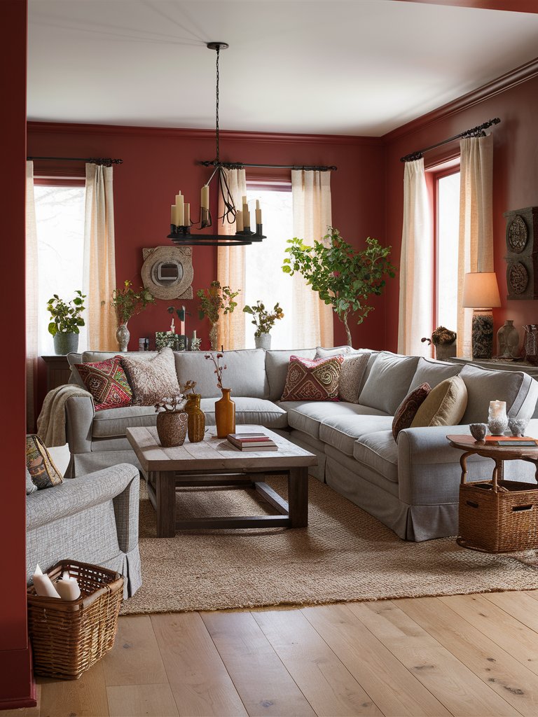
Benjamin Moore Crushed Velvet
Benjamin Moore Crushed Velvet is a unique burgundy tone with purple undertones that manage to be both regal and remarkably versatile, striking a good balance between drama and sophistication.
It has a smooth, soft quality reminiscent of its namesake fabric. Crushed Velvet will show its burgundy quality in spaces with plenty of natural light. In contrast, artificial light will emphasize its amethyst qualities.
This shade is defined by its versatility, as it pairs well with a variety of design styles. It creates an air of old-world luxury when used in traditional spaces, especially when paired with brass or gold accents.
In modern spaces, Crushed Velvet adds a contemporary edge when used either as an accent wall color or a whole wall color, in which case, it’ll create a cozy, enveloping feeling.
In this living room, Crushed Velvet has been used to add a bit of drama and intrigue. The neutral tones on the furniture, rug, and other décor elements help balance the color’s deep burgundy shade. Warm tones on the lighting help further the space’s cozy ambiance, while the matching wall décor improves this high-ceiling living room’s visual interest.
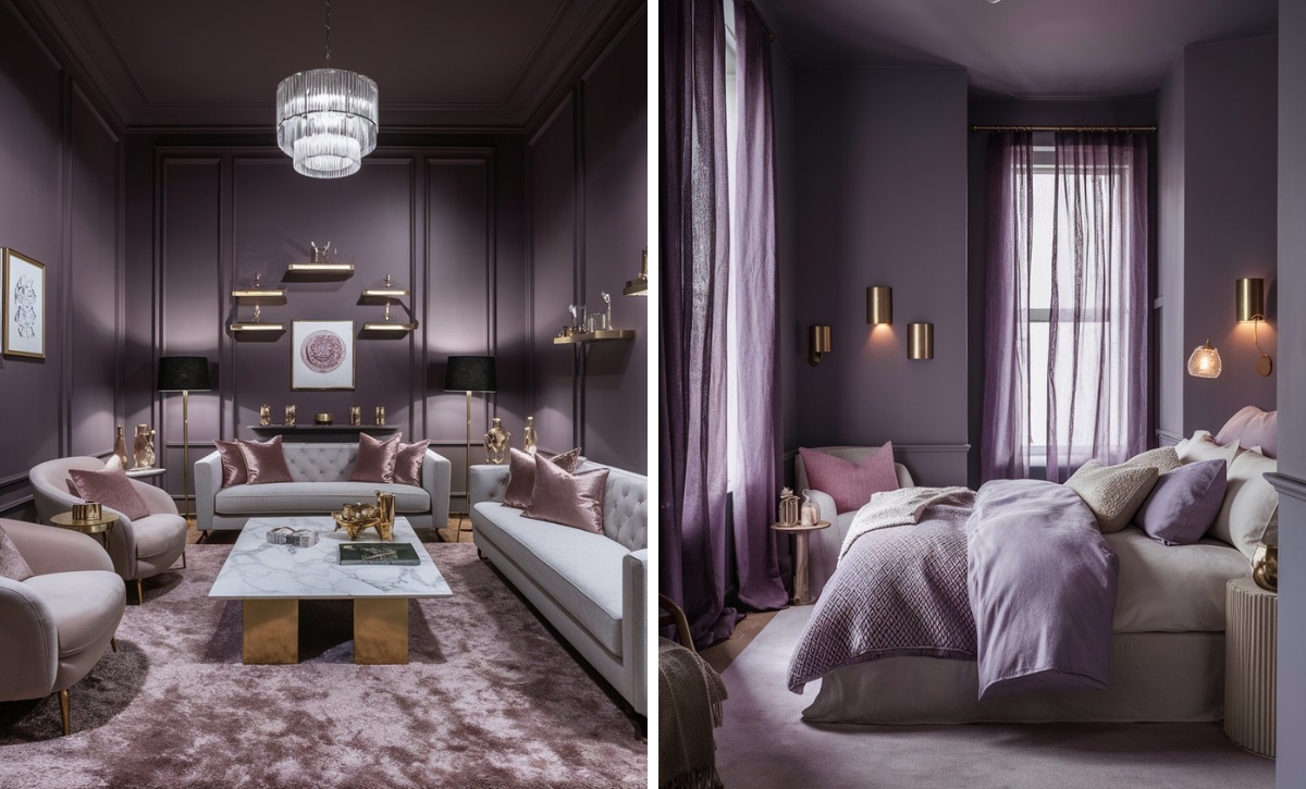
Benjamin Moore Elderberry Wine
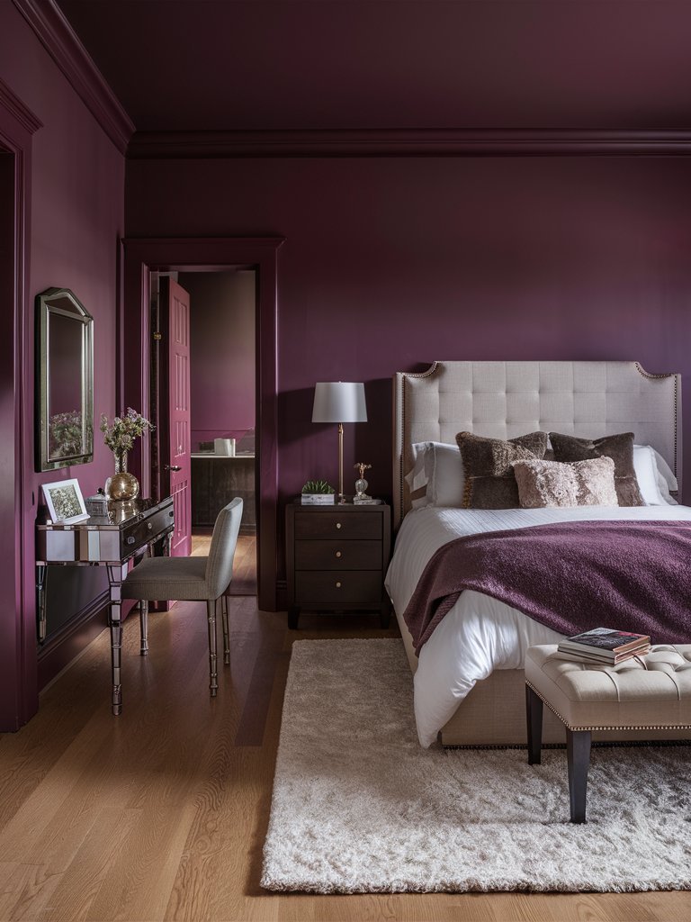
If you’re looking for a purple shade that will set your space apart, then Benjamin Moore Elderberry Wine is a shade you can’t afford to miss out on.
It has unique purple-red undertones that straddle the line between moody noir and sumptuous berry tones. Unlike other conventional burgundy paint colors, this shade’s purple undertones are more prominent; in fact, many people confuse it for a purple hue.
Elderberry Wine has a unique chameleon-like quality, making it ideal for spaces where you want to add a bit of intrigue.
Under bright morning light, its berry notes become more evident. Evening light will emphasize its deeper purple base, creating an evolving backdrop that feels dynamic and alive. It’s the ideal shade for creating a dramatic impact without veering into gothic territory.
Here, Elderberry Wine creates a soft, calm, inviting aura, ideal for relaxing after a long day. The color creates a cozy charm without being too overbearing. While it isn’t a bright neutral, it maintains a calm atmosphere around the bedroom. Plenty of natural light reveals its purple undertones, while the shiny reflective accents contribute to the space’s royal feel.
Benjamin Moore Dinner Party
Benjamin Moore Dinner Party is a sophisticated burgundy tone with a masterful balance of depth and warmth.
Even though it has a rich saturation, this burgundy tone stands out for its nuanced tones, which prevent it from feeling too overwhelming or harsh.
As the name suggests, this shade naturally excels in dining rooms, where it creates an inviting atmosphere. However, it isn’t a single-use paint color; it can also be used in studies, living rooms, and even bedrooms, where it creates a cocooning effect.
One of the most unique aspects of this paint color is that it can make large spaces feel more intimate and be applied in smaller rooms without making them feel cramped.
In this dining room, natural light reveals the refined, earthy quality of Dinner Party and creates a grounding effect. Notice how the shade is contrasted by bright, softer shades like white and cream. The balanced, bright, neutral shades on the ceiling and the rug make the space look large, adding a spacious, luxurious effect.
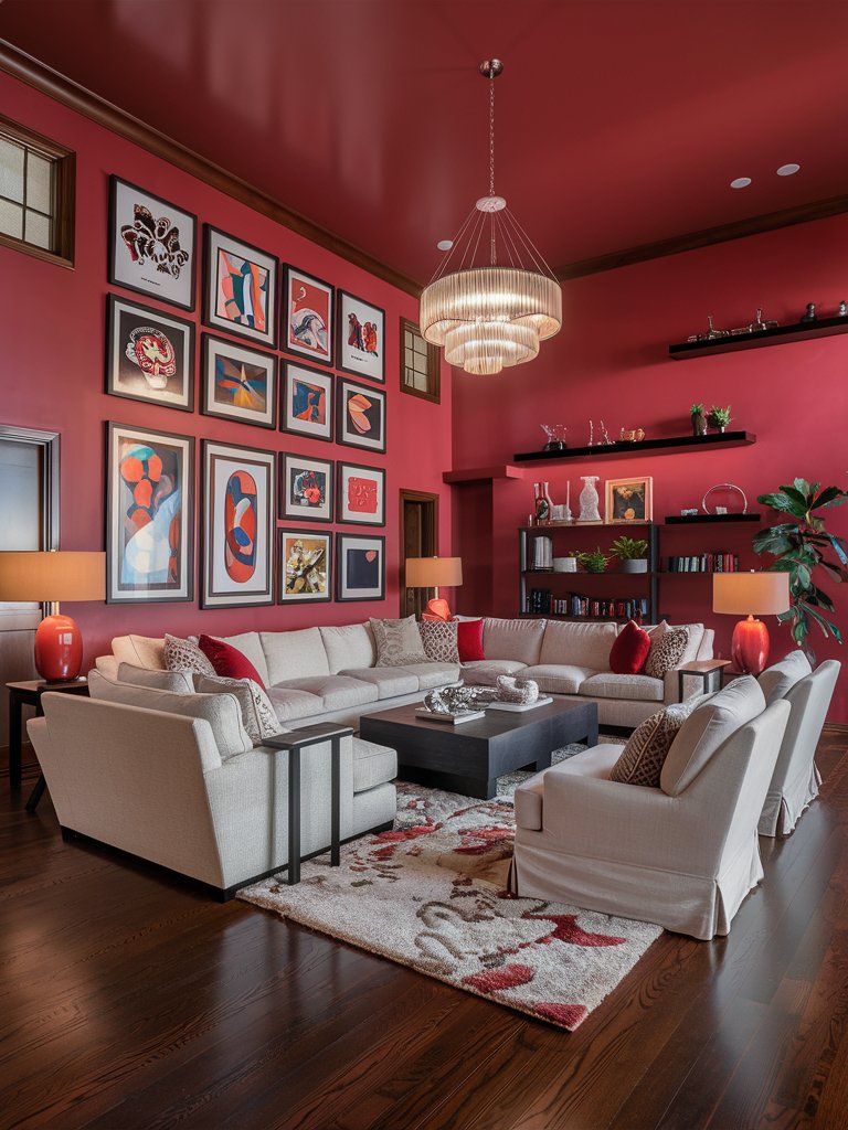
Benjamin Moore Currant Red
Benjamin Moore Currant Red leans into the complex burgundy territory. It’s a deep, saturated color that embodies the richness of ripe berries. For those looking for a nostalgic red, this shade is the perfect match.
The paint color has remarkable depth and a more nuanced quality compared to other crimson or burgundy shades. It also maintains warm, unmistakable red undertones.
Currant Red excels at creating atmospheric spaces that feel bold and refined. Use it in spaces where you want to stimulate conversation, like living rooms or dining rooms. It can also add an air of sophistication to studies and libraries, where it brings an element of intellectual warmth.
The paint color pairs well with cool and warm neutrals and works well with metallic accents.
In this living room, Currant Red creates a warm, welcoming ambiance and adds an element of vibrancy. The earthy brown tones and medium to dark décor accents on the space add an element of sophistication. Notice how the color balances out the cool neutral tones like cream and light gray with earthy tones to develop a unique take on the “boho” style living room.
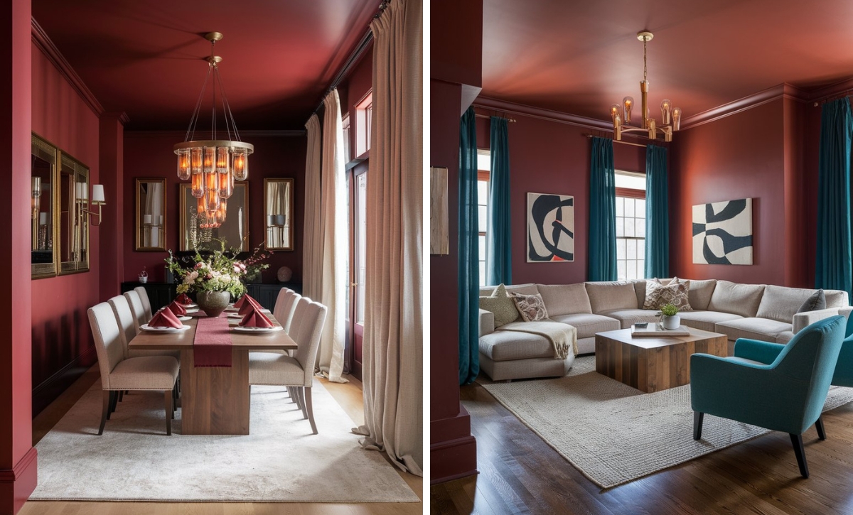
Benjamin Moore New London Burgundy
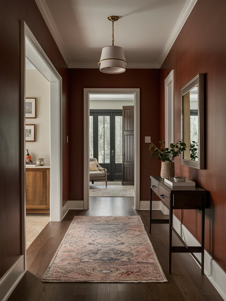
Benjamin Moore New London Burgundy is a burgundy tone with a bit more versatility, having the perfect combination of red and purple tones. These sophisticated undertones give it a chrome-like quality that will add drama to any space and instantly wow your guests.
The warmth and depth offered by New London Burgundy make it an elegant choice for formal sitting areas and dining rooms. Pair it with classic creams to create a bit of contrast and add a timeless, refined aesthetic to your room.
Its chrome-like quality also enables it to combine well with metallic accents like silver, brass, and gold.
New London Burgundy creates an inviting atmosphere in this hallway, perfect for ushering guests in. The color combines well with the dark wooden furniture to create an earthy aesthetic that helps ground the space. The light-toned shades generate a bit of contrast and help balance out the space, while the minimalist décor makes the hallway look open and inviting.
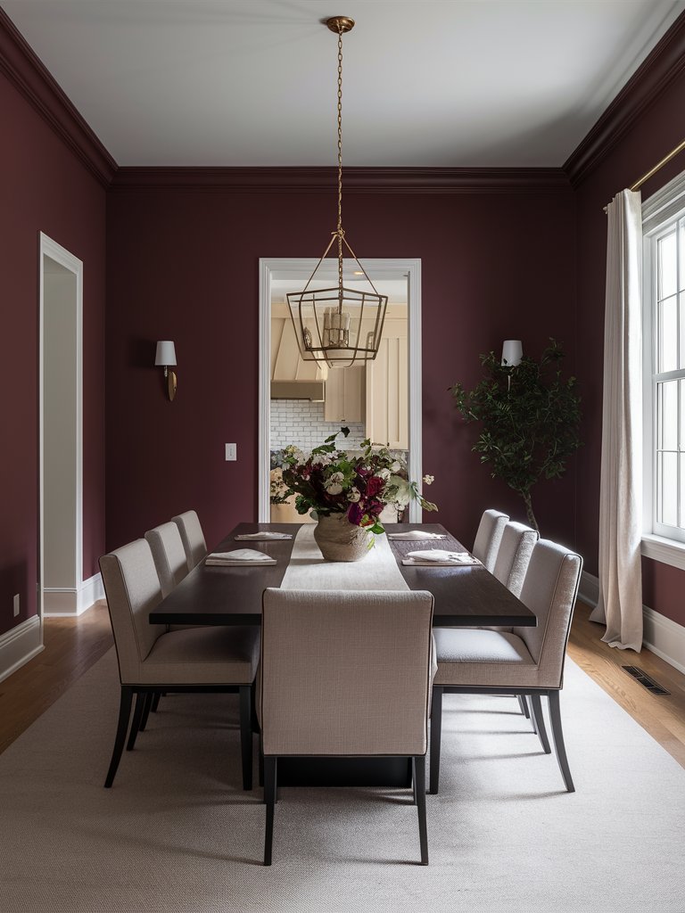
Benjamin Moore Capitol Burgundy
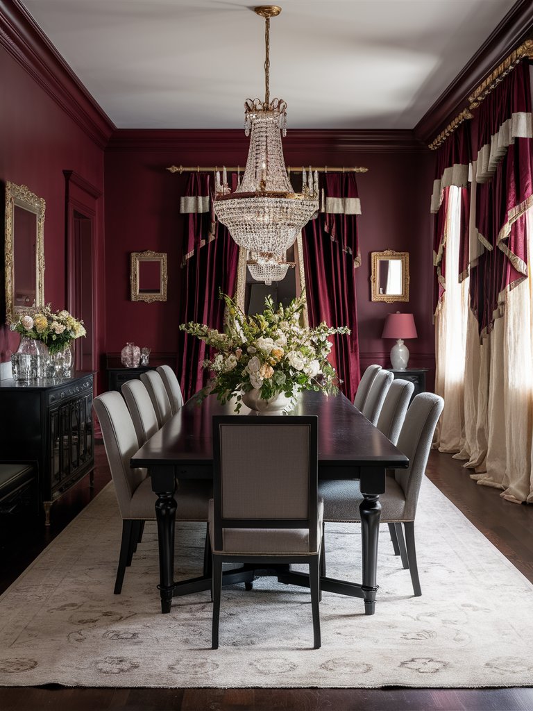
Benjamin Moore Capitol Burgundy is a historic-inspired burgundy that carries the gravitas of traditional interiors while still remaining relevant in modern and contemporary settings.
It’s one of the attention-commanding burgundies, with a balance of wine tones and subtle brown undertones. If you’re looking to create a royal-like interior, this shade will fit right in.
Capitol Burgundy imparts a sense of timeless elegance when used in formal spaces. It has proven to be particularly effective in libraries, executive offices, and dining rooms. Its presence brings an element of authority and refinement, one of the reasons it creates a royal-like feel.
It pairs exceptionally well with traditional architectural details, making it a good choice for historic renovations and classical interiors.
In this dining room, Capitol Burgundy brings an instant air of royalty. Light-toned elements help create the perfect balance with the darker burgundy shade. Subtle gold metallic accents and details in the room add to the classy, royal look.
Color Disclaimer
Please note that all paint colors displayed on this page are for illustrative purposes only. Due to variations in screen settings, lighting, and other factors, the colors you see on your screen may differ from the actual paint colors. We recommend viewing a physical color sample or swatch for the most accurate representation. Some images might be generated by AI to represent paint colors in different interiors