When most people think of brick red, they picture it as an exterior paint color, and for a good reason too: brick red is one of the few red tones perfect for hiding dirt and imperfections such as splatter and creases in exterior spaces.
However, being a great exterior paint color doesn’t alienate brick red from interior spaces. In fact, it’s a standout option to achieve both when you want a sense of modernity and dramatic appeal in spaces. It makes a good accent wall color, and since it’s softer than its more dramatic red counterparts, it also works well as a full wall color.
This shade is highly versatile, with a unique blend of modern and classic qualities. For a contemporary look, it can be paired with light neutral shades such as crisp whites, earthy tones like brown and taupe, and even darker shades like black.
Brick red is also a great option to layer textures or patterns in your interiors. Its inviting nature also makes it a great addition to spaces where you want to infuse warmth or create a welcoming mood. That said, here are some of Benjamin Moore brick red paint colors you can try.
Take a look!
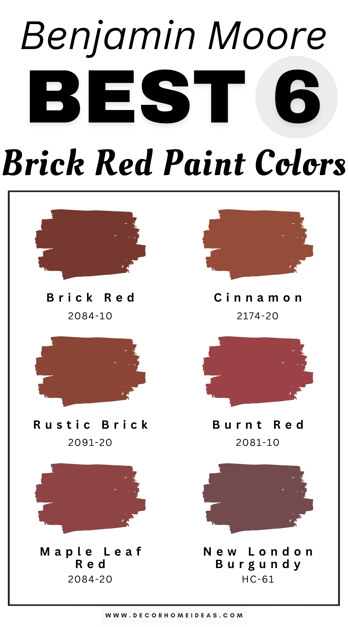
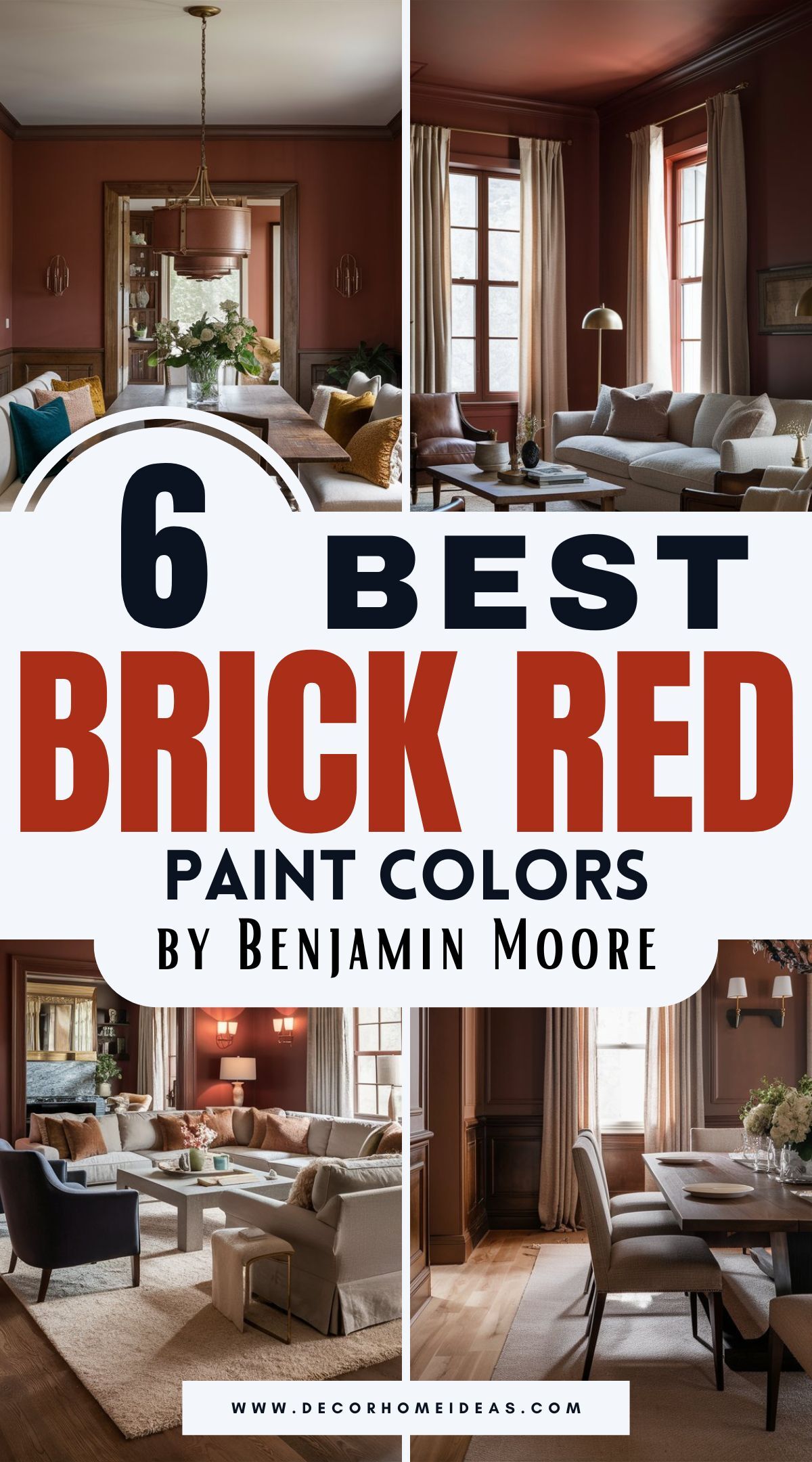
Benjamin Moore
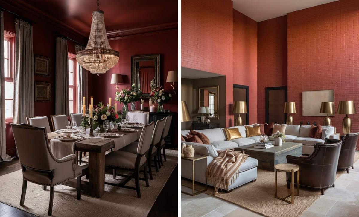
Benjamin Moore Brick Red
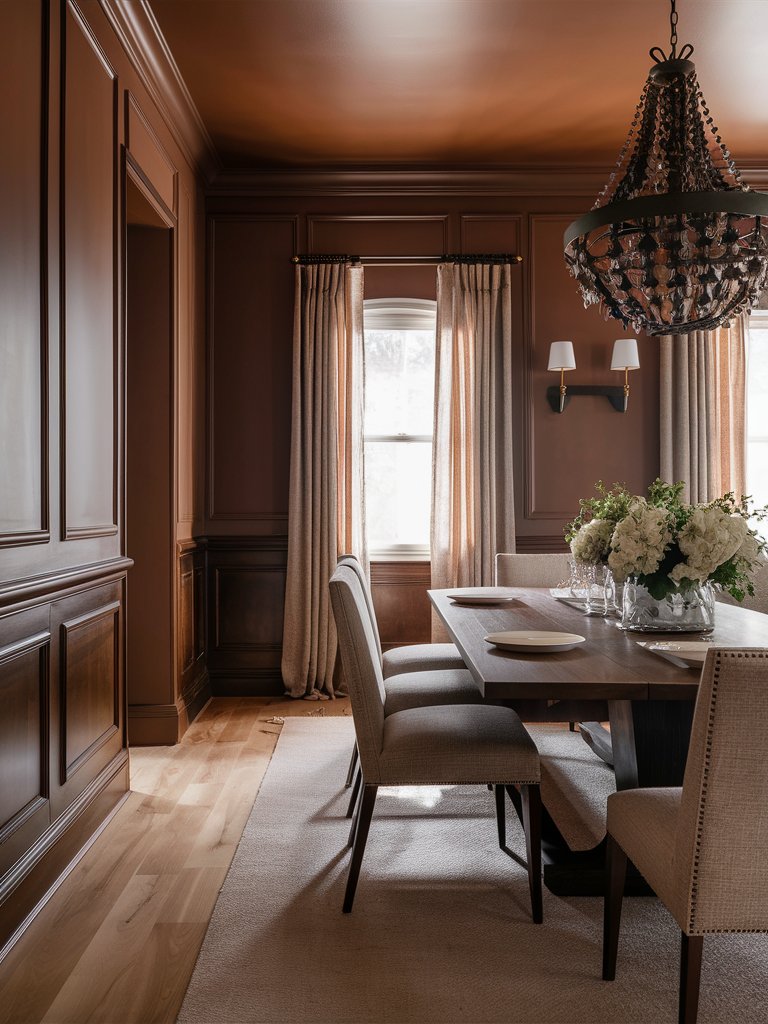
Not all red tones need to be intense to make a statement—sometimes subtlety is the way to go. Benjamin Moore Brick Red exemplifies this concept. It is a mid-toned red that delivers a quiet, pleasant energy.
This shade draws inspiration from traditional clay brick but is more versatile than its namesake counterpart. Its complex pigmentation, with an interplay of red oxides and brown undertones, creates a unique rustic look that doesn’t look overly synthetic.
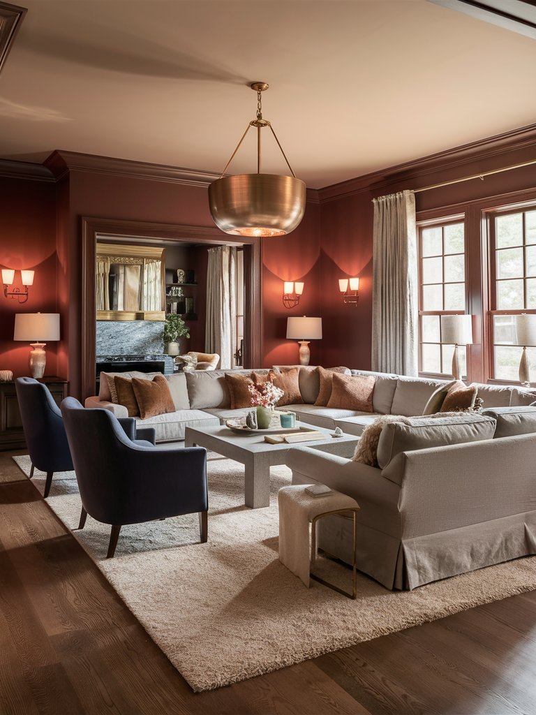
Since it carries more brown undertones than orange ones, Brick Red is one of the most versatile traditional reds in Benjamin Moore’s Historic Collection. Despite this, it excels in colonial, Victorian, and craftsman homes, striking an impressive balance between statement-making and historic appeal.
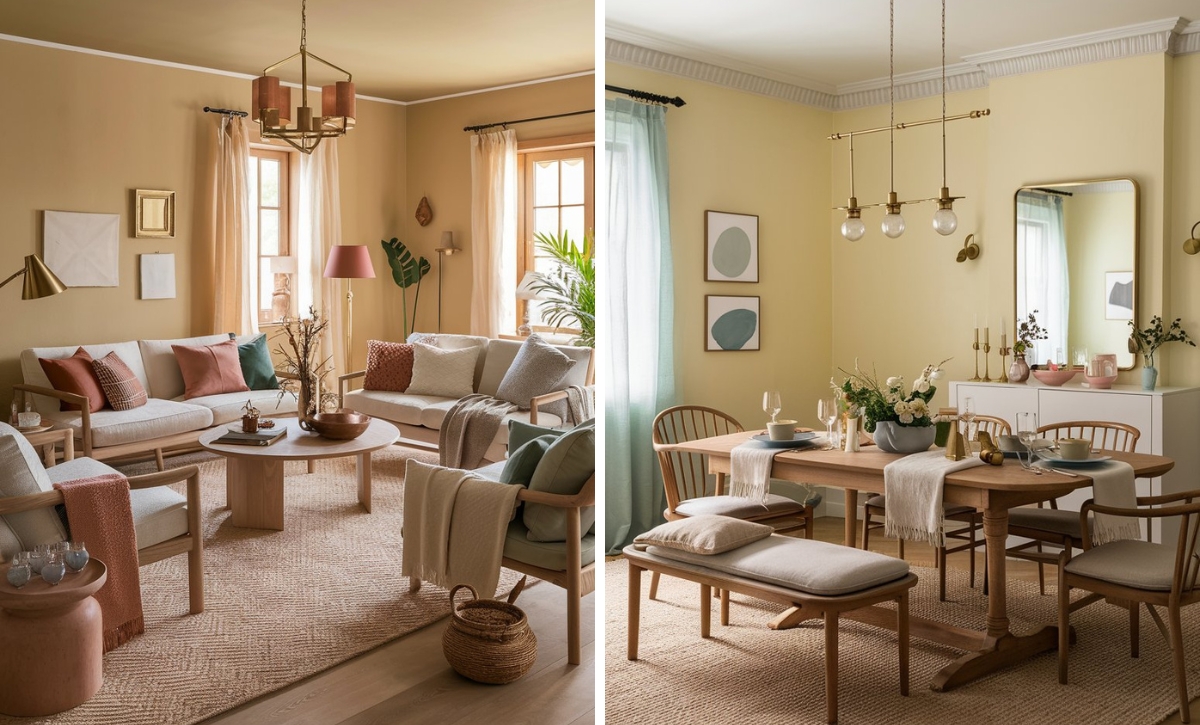
Use it in spaces such as living rooms and dining rooms to create an atmosphere ideal for gatherings.
Brick Red combines well with light-toned seats and darker accents in this dining room, such as the chandelier. The lighter hues help contrast the paint color, while its brown, earthy undertones ensure good color consistency even with darker shades.
Benjamin Moore Cinnamon
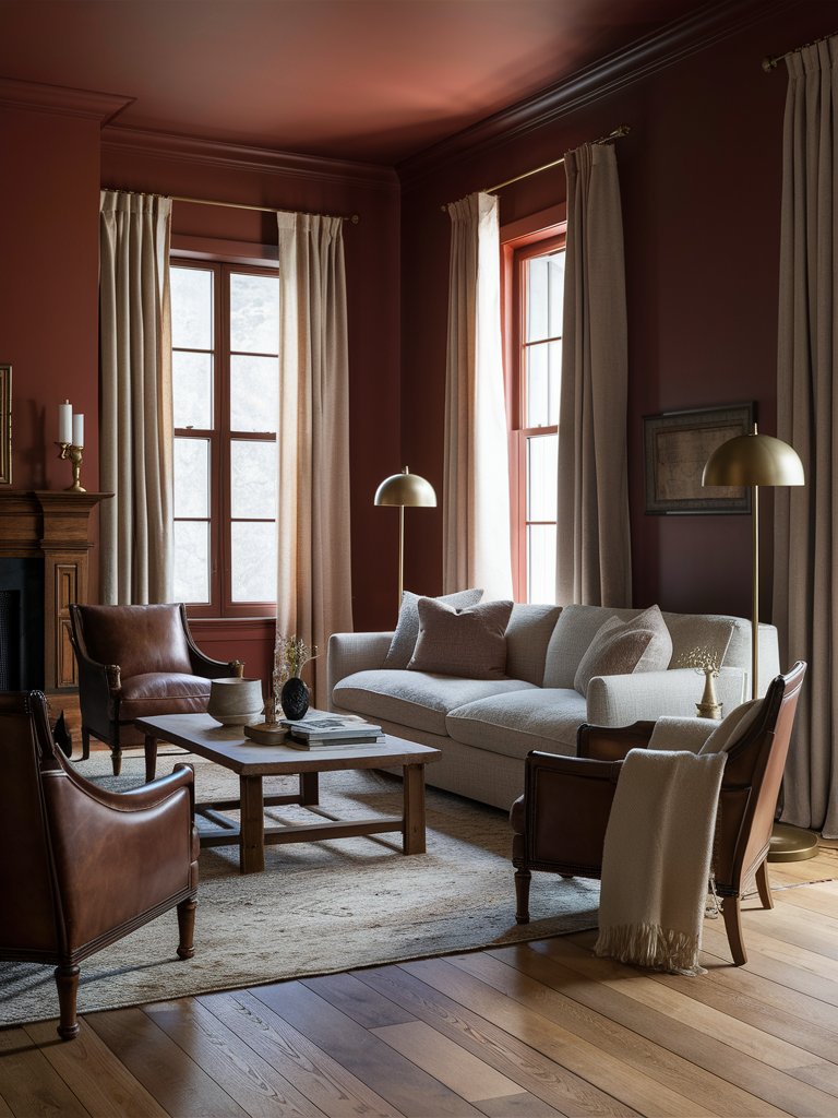
Benjamin Moore Cinnamon is a brick red shade with substantial depth that creates a classic aesthetic. It’s one of the best colors to use on an accent wall but is also eye-catching enough to stand alone without other decorative elements.
This shade embeds spaces with a narrative quality that unfolds gradually rather than announcing itself immediately. Unlike other cooler neutrals, Cinnamon will actively participate in how a space feels.
The paint color demonstrates remarkable temporal qualities, shifting from a more pronounced russet in the morning light to a mellow amber-brown as evening approaches. This chameleon quality keeps spaces feeling dynamic rather than static.
Since Cinnamon is reasonably reflective, it maintains a vibrant feel that prevents it from looking flat, as can be the case with other darker-toned reds, especially in limited light.
Plenty of natural light makes this living room feel open and airy, while the warm undertones of Cinnamon bring on a cozy vibe. The paint color combines with subtle metallic accents, which help enhance it, and brown leather armchairs, which complement the shade’s undertones.
Benjamin Moore Rustic Brick
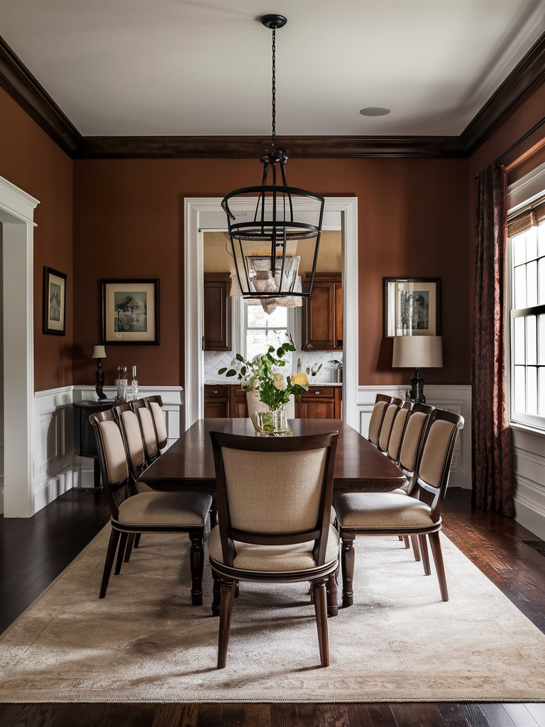
Benjamin Moore Rustic Brick embodies the authentic character of weathered clay with a contemporary sensibility that makes it exceptionally versatile for interior applications. Its pigmentation perfectly balances earthy red with subtle taupe undertones, creating a rustic red with remarkable depth.
This shade reads differently depending on the lighting conditions. Under bright natural light, its warm undertones will appear more prominent. In contrast, warm light will bring out its more complex terra cotta notes.
What’s remarkable about Rustic Brick is that it creates an immediate sense of enclosure without feeling too oppressive. It can be used in various spaces, from living rooms where you want a bit of a chit-chat mood to studies and libraries where you want a calm and intimate vibe.
Rustic Brick combines earthy tones in this dining room to create a unique grounding quality. The crisp white shade on the wainscoting provides a bit of contrast to the brick red shade, while the cream-colored dining seats promote a progressive neutral-toned earthy palette. Plenty of natural light brings out the warm undertones, which add an almost beckoning quality to the room.
Benjamin Moore Burnt Red
Like many other shades in this list, Burnt Red is a sophisticated color with an intensity that transcends most typical red offerings.
However, unlike most of the tones mentioned above, which are rustic and have strong brown undertones, this shade is a balanced mix of true red and controlled earthy undertones. The result is a hue that creates drama and captures attention while remaining livable in interior spaces.
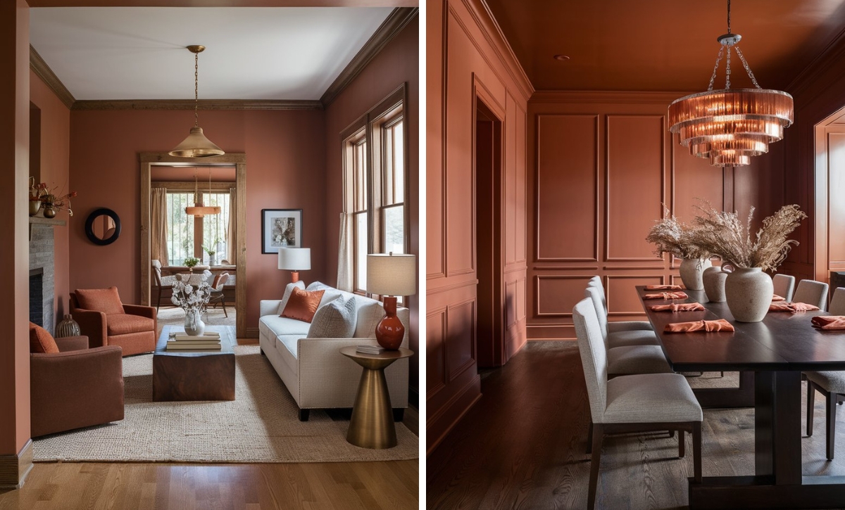
Burnt Red is a good option for an eclectic wall. It highlights architectural features, especially behind fireplaces or built-in shelving. Even when used as a complete wall color, this shade creates a dramatic impact while maintaining its overall spatial balance.
Burnt Red makes rooms feel intimate rather than cramped or constrained when used in smaller spaces. Pair it with wood finishes and other warm tones like walnut and cherry to create a cozy, warm space, or add metallic accents to enhance the color’s richness.
Burnt Red adorns the walls of this living room for a cozy feel, while light-toned furniture adds an element of balance. Warm lighting and metallic accents, such as the chandelier, enhance the shades’ cozy feel, while subtle brown accents help tie the shades together.
Benjamin Moore Maple Leaf Red
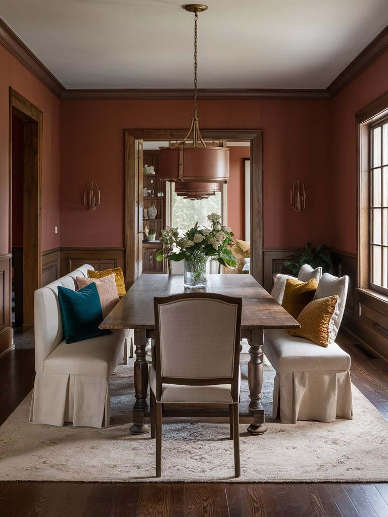
Benjamin Moore Maple Leaf Red presents an unexpected twist on the traditional red hue. It’s a warm red with nuanced amber undertones that bridge the divide between a statement color and a versatile neutral.
Maple Leaf Red infuses spaces with a sense of comfort while maintaining a warmth that makes any room feel cozy. One of its most unique qualities is that it provides stimulation without any agitation, making it ideal for spaces such as studies and powder rooms.
Additionally, Maple Leaf Red’s welcoming nature makes it ideal for guest spaces like dining and living rooms. This shade pairs particularly well with wooden cabinetry, wainscoting, and stone finishes, creating a visually grounding look.
Maple Leaf Red pairs well with the natural wood finish on the wainscoting and the wooden furniture in this traditionally styled dining room. Other neutral-tone accents, such as the throw pillows and metallic accents, contribute to the cozy feel while significantly improving its visual appeal.
Benjamin Moore New London Burgundy
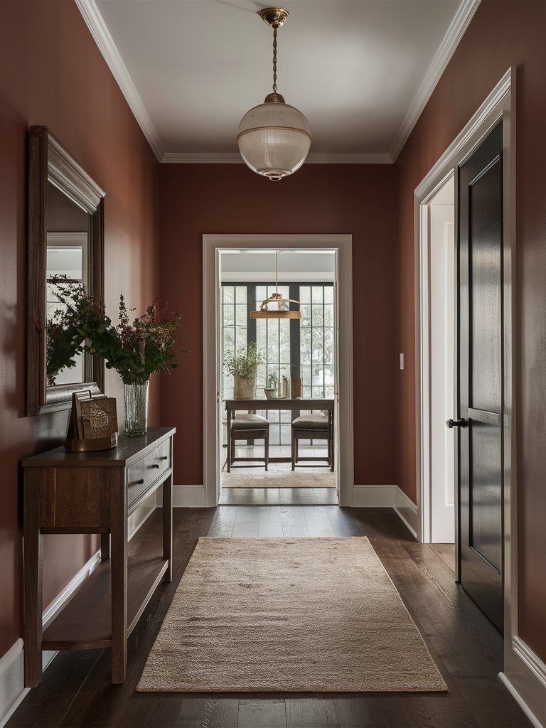
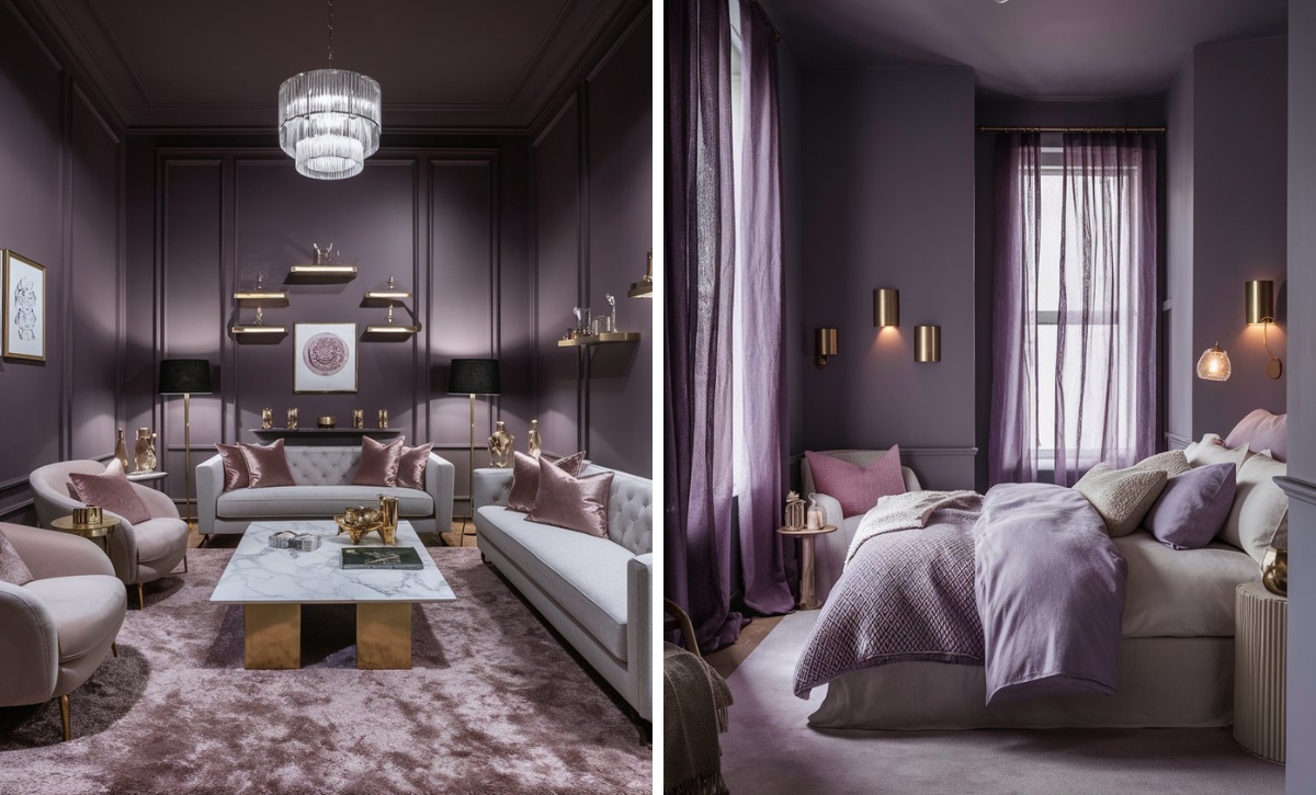
Benjamin Moore New London Burgundy is a unique brick red shade that delivers stately depth. It’s a wine-inspired hue that rests between a deep red and velvety purple. It’s the ideal shade for creating elegant and distinctly memorable spaces.
When used in interior spaces, this shade projects confidence without aggression, a difficult balance to achieve with most warm, deep saturated colors. The color absorbs significant light with its low LRV, creating rooms that feel enveloping rather than expansive.
Presenting as a deep burgundy base with subtle blue undertones, this shade creates warmth without appearing too sweet.
In living spaces, this color transforms walls into backdrops of exceptional substance. Unlike typical reds that demand immediate attention, New London Burgundy creates a slow-burning visual impact that reveals itself gradually the more time you spend in the space.
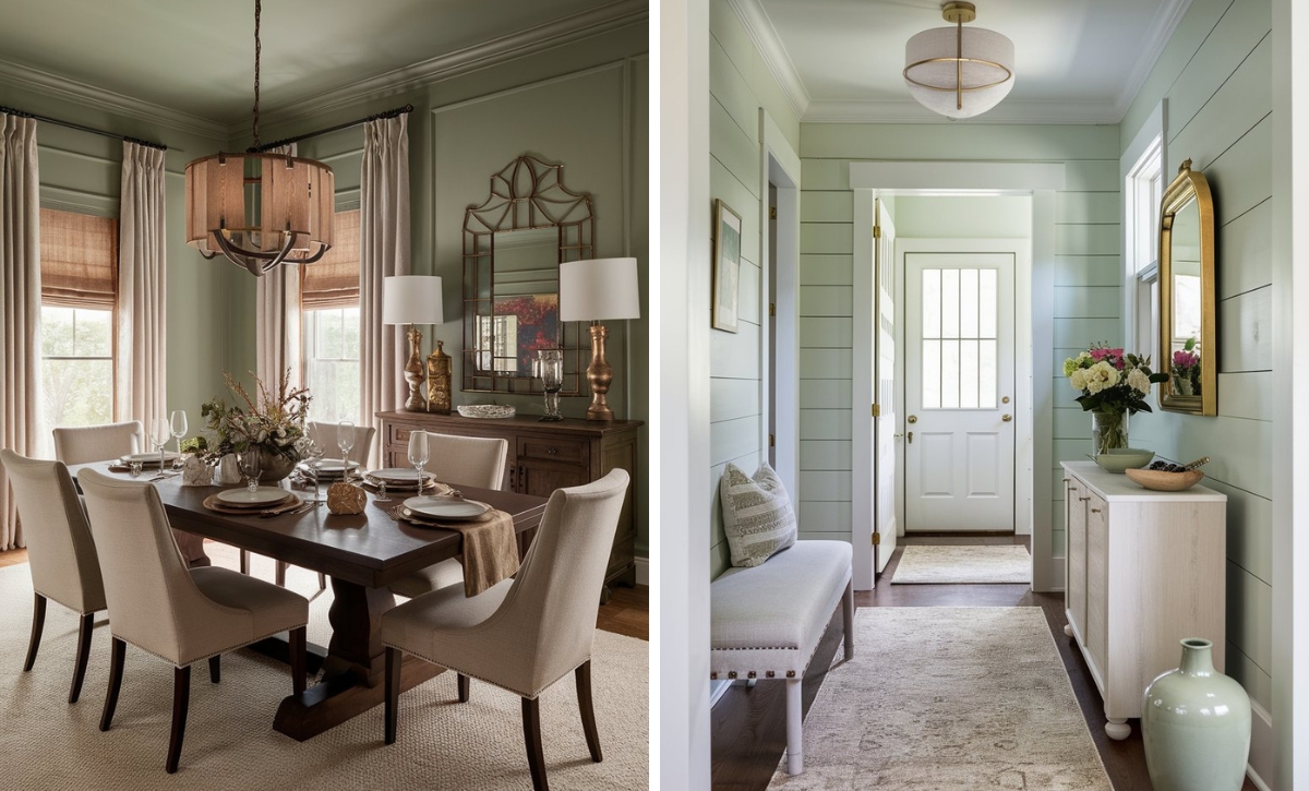
Matching warm tones in this hallway, such as brown, enhance New London Burgundy on the walls and deepen the inviting mood. Plenty of natural light enables the space to be engaging while still maintaining an air of calmness.
Color Disclaimer
Please note that all paint colors displayed on this page are for illustrative purposes only. Due to variations in screen settings, lighting, and other factors, the colors you see on your screen may differ from the actual paint colors. We recommend viewing a physical color sample or swatch for the most accurate representation. Some images might be generated by AI to represent paint colors in different interiors