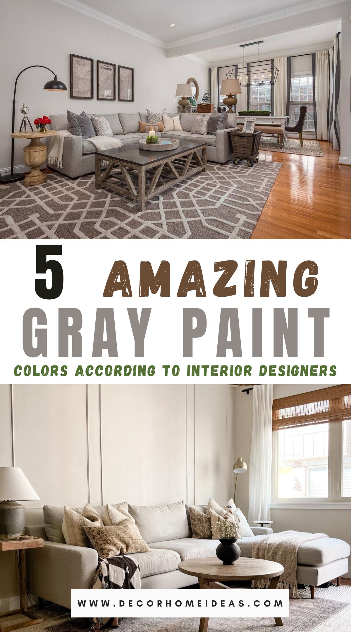
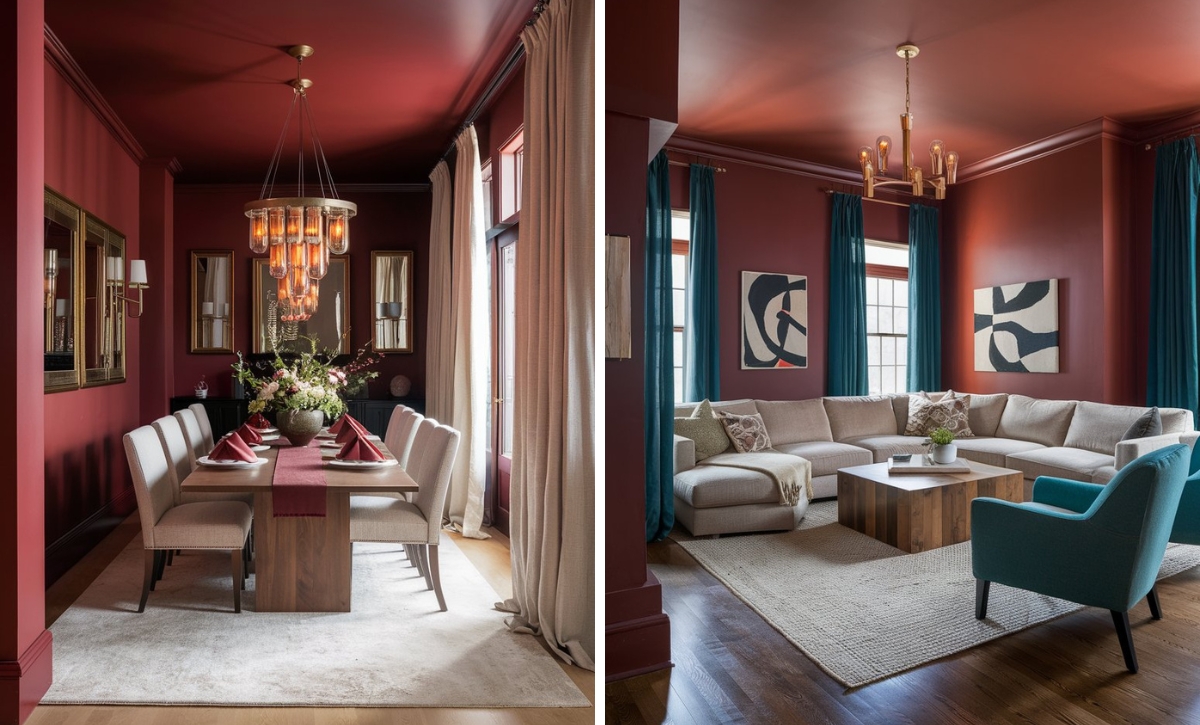
Despite not being a commonly preferred color nowadays, gray is still consistently used by skilled interior designers due to its versatility.
Gray paint can create various moods and atmospheres based on the shade’s intensity and warmth, whether used as a standalone color or as a backdrop for brighter hues.
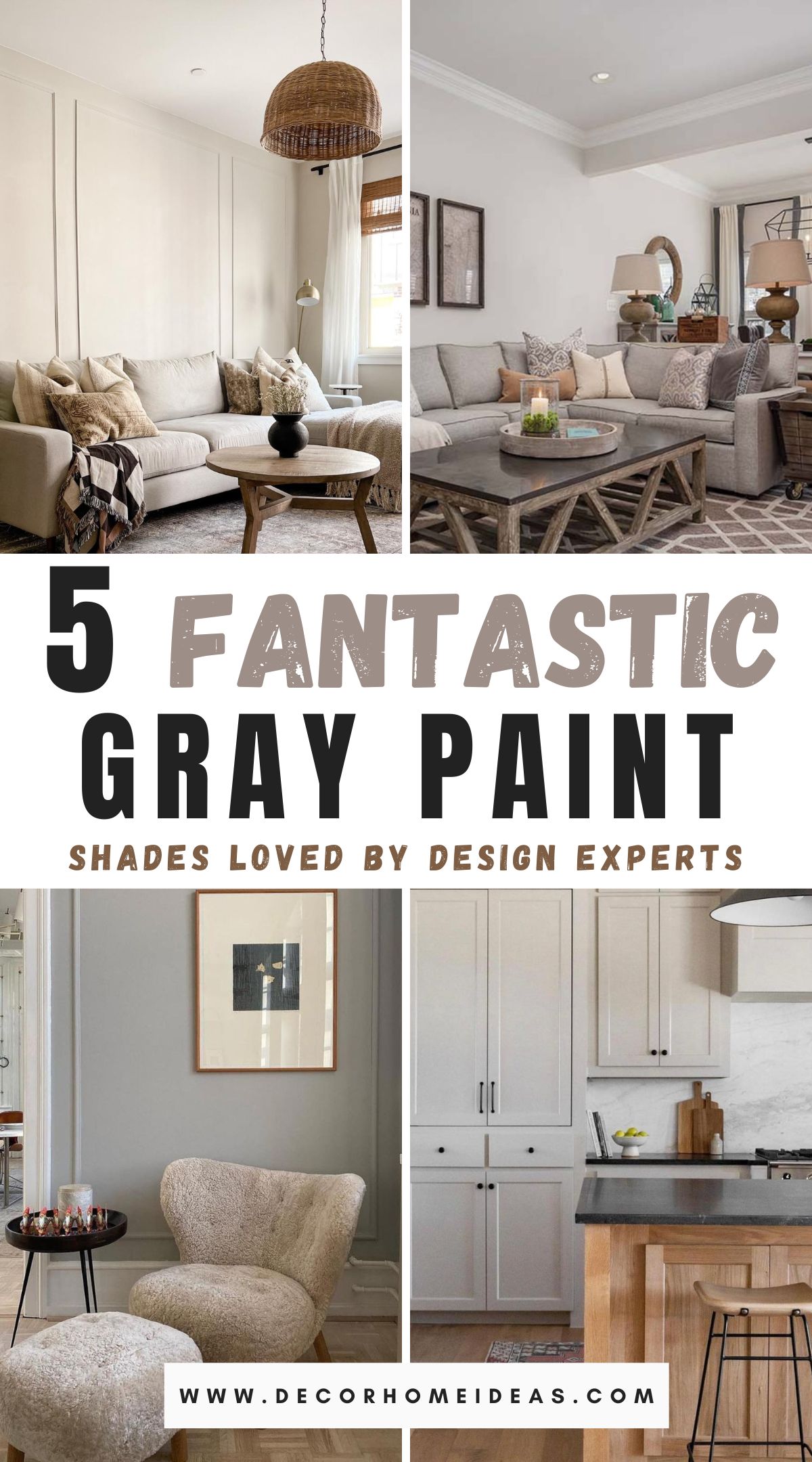
You can use numerous gray tone variations, and we’ve compiled 5 of the best gray paint colors interior designers swear by to create a pared-back, intricate scheme.
Take a look!
Agreeable Gray by Sherwin Williams
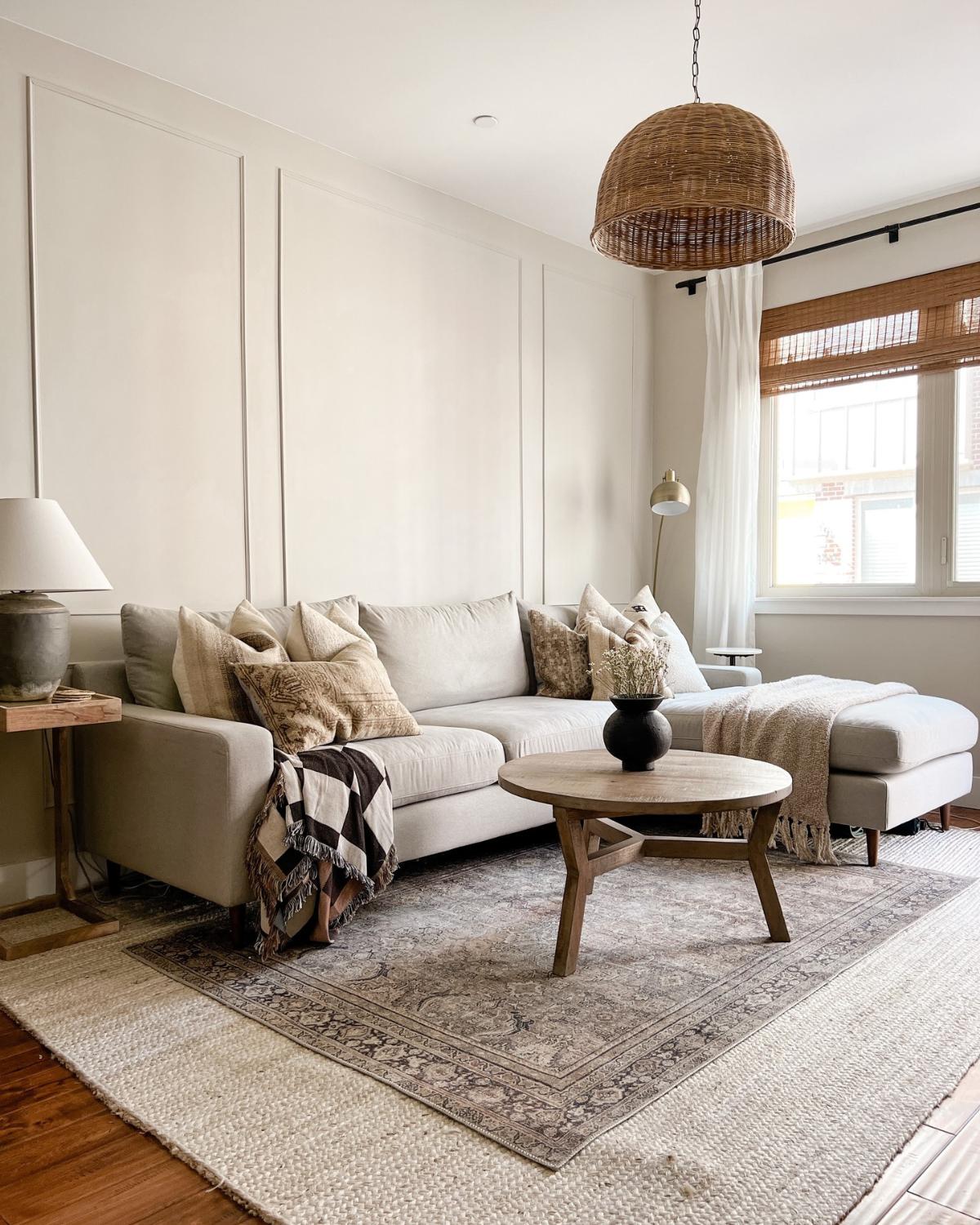
Agreeable Gray has been one of the top-selling paint colors for the past decades and is expected to continue making a significant impact in the world of interior design.
This gray has a green undertone and an LRV (light reflective value) of 63, making it a light color just shy of ultra-light colors, e.g., off-whites, true whites, etc.
Agreeable gray is also a greige color and works with numerous design styles. Its charming, natural, soft hue pairs exceptionally well with wood tones, and you can use it in light or dark rooms.
Revere Pewter by Benjamin Moore
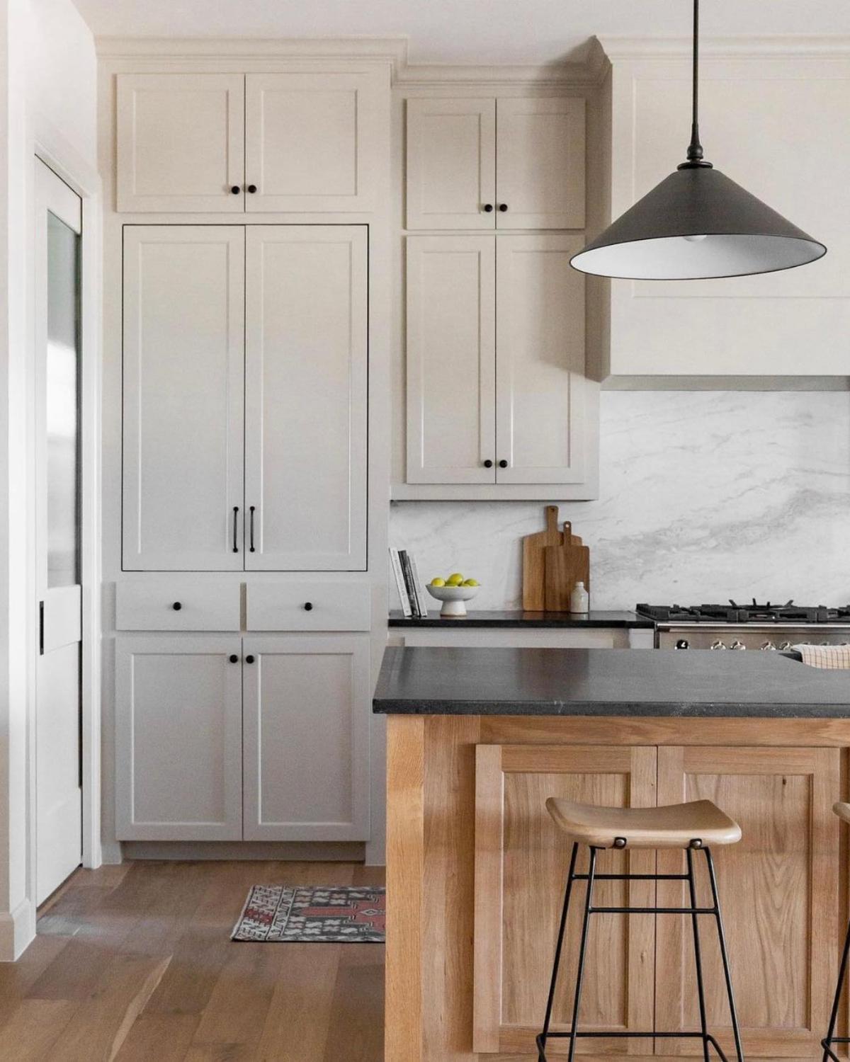
Revere Pewter is another popular gray paint color, and it’s known best for its quality for bringing depth to rooms.
Revere Pewter also has a green undertone but is a bit darker (LRV of 58). Back in the day, people used this paint color for their entire open-concept living space, but with most people preferring lighter hues nowadays, it’s mainly applied to smaller rooms, offices, cabinetry, etc.
Due to its warm tones, this gray also pairs well with fixed dark elements such as dark wood or cherry-type wood.
Repose Gray by Sherwin Williams
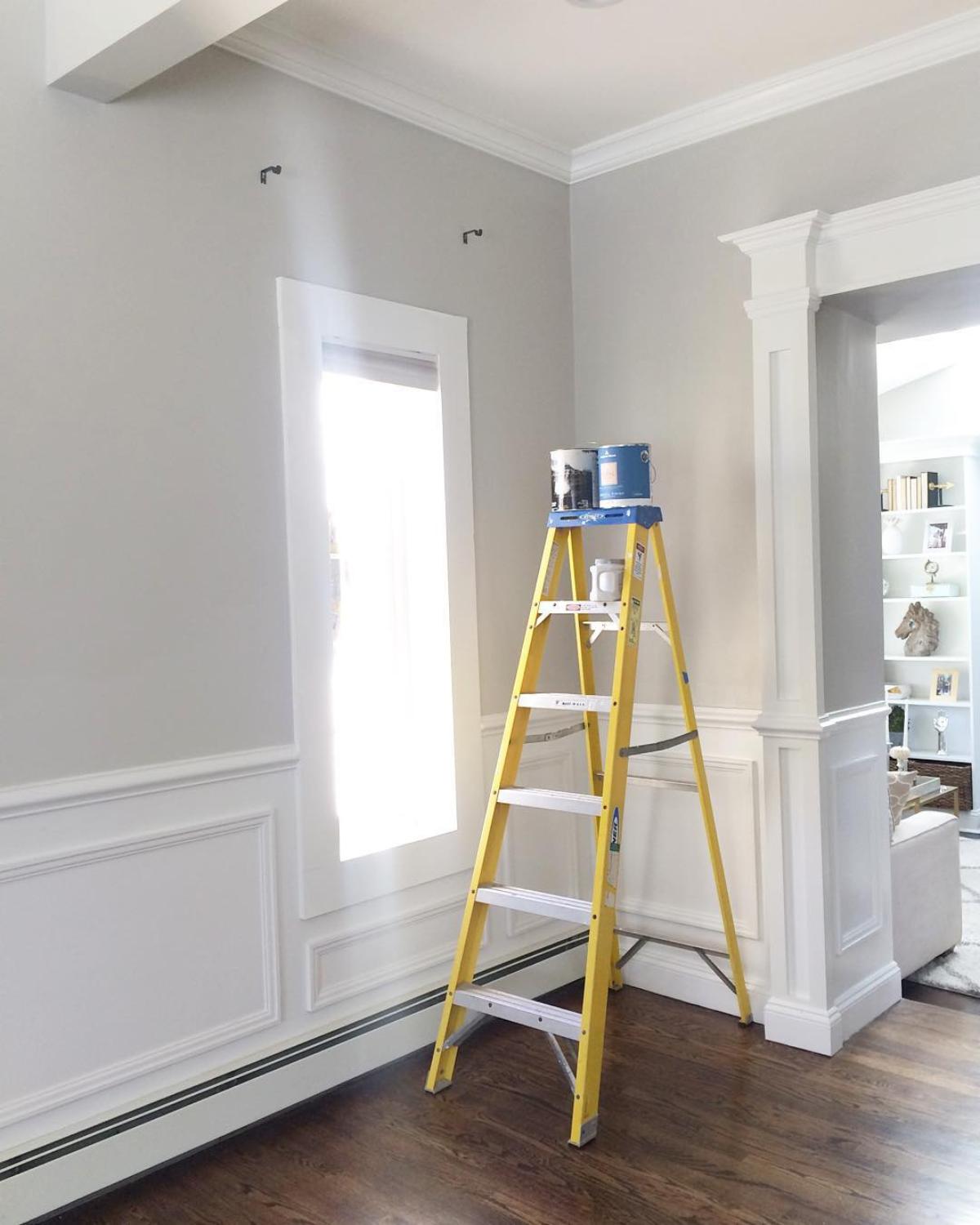
Repose Gray is a much cooler gray paint color and works with almost every decor style you incorporate it into.
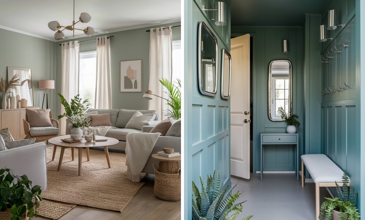
Repose Gray has a blue undertone, but the blue-gray isn’t as intense, notably, compared to other popular blue-grays in the market.
If you’re going for a light, soft feel, Repose Gray works best in south or west-facing rooms, but if you want to evoke that blue undertone, you should use it in a north-facing room.
Pavilion Gray by Farrow & Ball
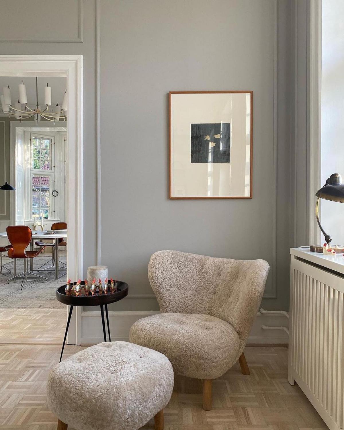
Pavilion Gray by Farrow & Ball is a versatile gray paint color reminiscent of the elegant 18th-century Swedish color that strikes a balance between warm and cool tones.
It adapts well to varying lighting conditions and complements materials like stone, concrete, and wood floors, creating a lovely Gustavian feel.
Classic Gray by Benjamin Moore
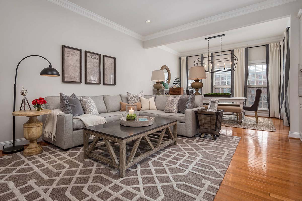
Classic gray is one of my favorite light, warm grays, and it’s a remarkable paint color that gives you an almost-white color, making it perfect for those who don’t want to commit to a strong gray color.
Classic Gray has really soft tones, so if you have a north-facing room or a space without natural light, you might notice a blue-gray undertone.
Your fixed elements will also play a vital role in how this paint color will look in your space, so ensure you compare a sample of the color with your elements and interior decor before applying it to your home.
Final Remarks
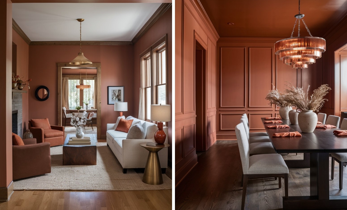
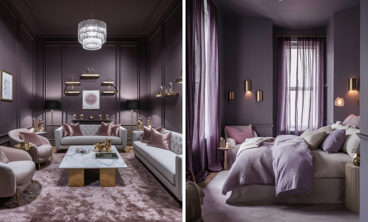
Neutral paint colors are complex to get right, mainly because of undertones. Most gray paint colors have green, blue, and purple undertones, sometimes a combination of two.
It’s extremely hard to notice these undertones and tell the color depth when you look at paint colors in isolation, especially for neutrals, so it’s always prudent to compare a sample of the paint color you want to apply with your existing decor to get the color scheme right.

