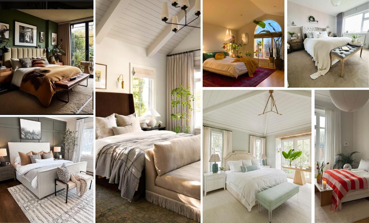
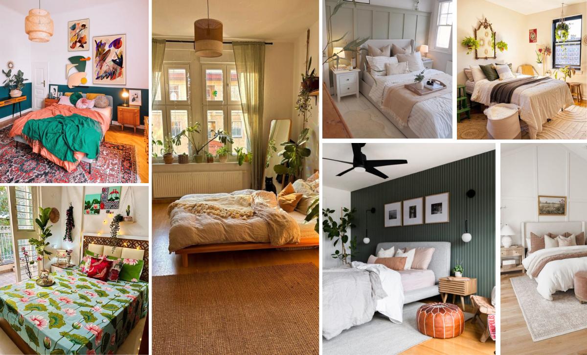
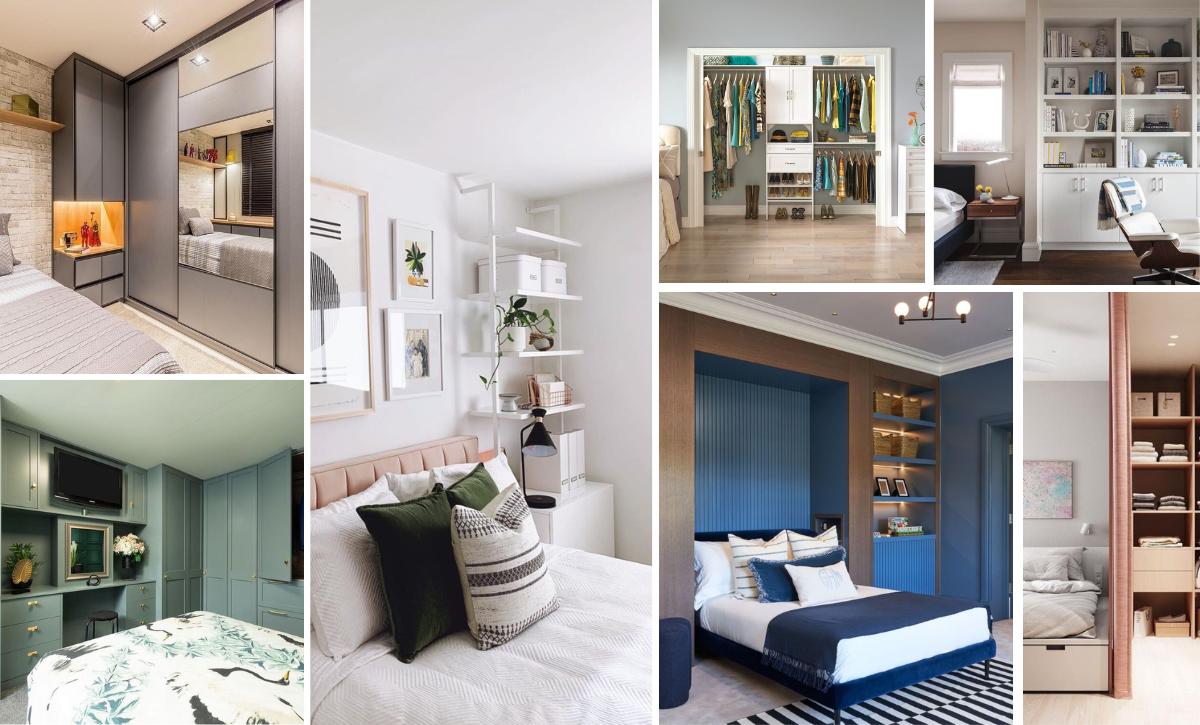
Your guests would spend more of the time visiting you in the living room, but the bedroom is still very important.
It is your home within the fortress that your house or apartment is.
So it must make you feel right where you belong.
It must speak to you in a special way, so to say. And so must the colors.
In this guide, we have included SW paint color names for easier reference.
Be aware, though, that these colors are an author interpretation and couldn’t be used as a sample or exact match to the real paint color, as most of the paints have numerous shades and nuances.

Tip: Check for FREE how much it will cost you to paint a room in your area HERE
Here are 20 beautiful color schemes for your bedroom.null
1. Yellow, Gray and Navy Blue
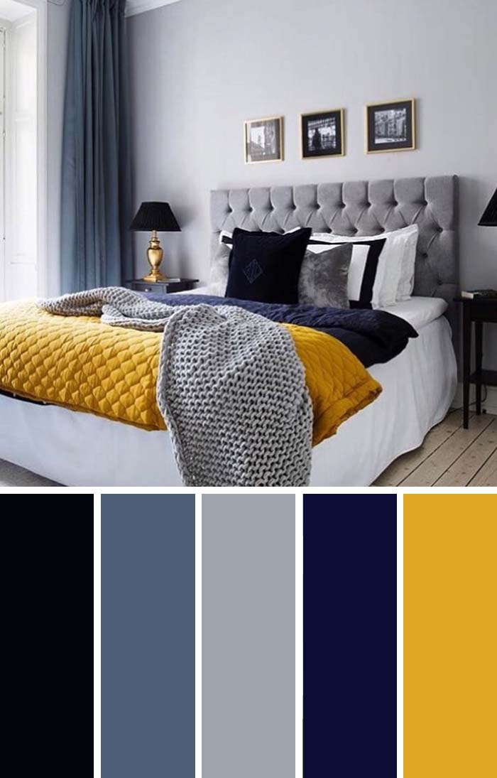
The dark and stylish palette speaks of boldness and character.
Those colors suit the queen-sized bed well.
The golden-yellow blanket makes all the difference between conservative style and splendor, turning the almost monochrome bedroom into a vivid statement of class.
SW Color chart
- SW 6258 Tricorn Black
- SW 6537 Luxe Blue
- SW 7073 Network Gray
- SW 6818 Valiant Violet
- SW 6691 Glitzy Gold
2. Pastel Colored Bedroom
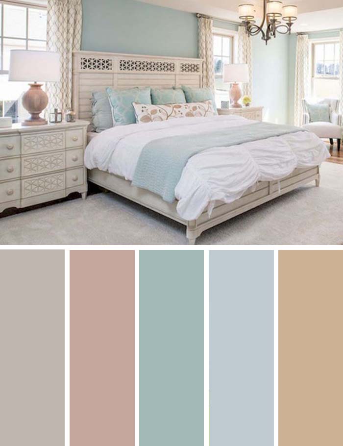
Bedrooms are not usually the place where you bring guests, so it is in a way the most personal spot in your home.
That also makes it the one you should design with just one thing in life, and that is what makes you feel good.
If you want a quiet and calm place for relaxation, then those pastel tones will really ease your eyes and make you happy and comfortable.
This bedroom is all about calming paint colors.
SW Color chart
- SW 7030 Anew Gray
- SW 9096 Beige Intenso
- SW 6226 Languid Blue
- SW 6225 Sleepy Blue
- SW 7713 Tawny Tan
3. Beige and Black
via kbwinteriors.com
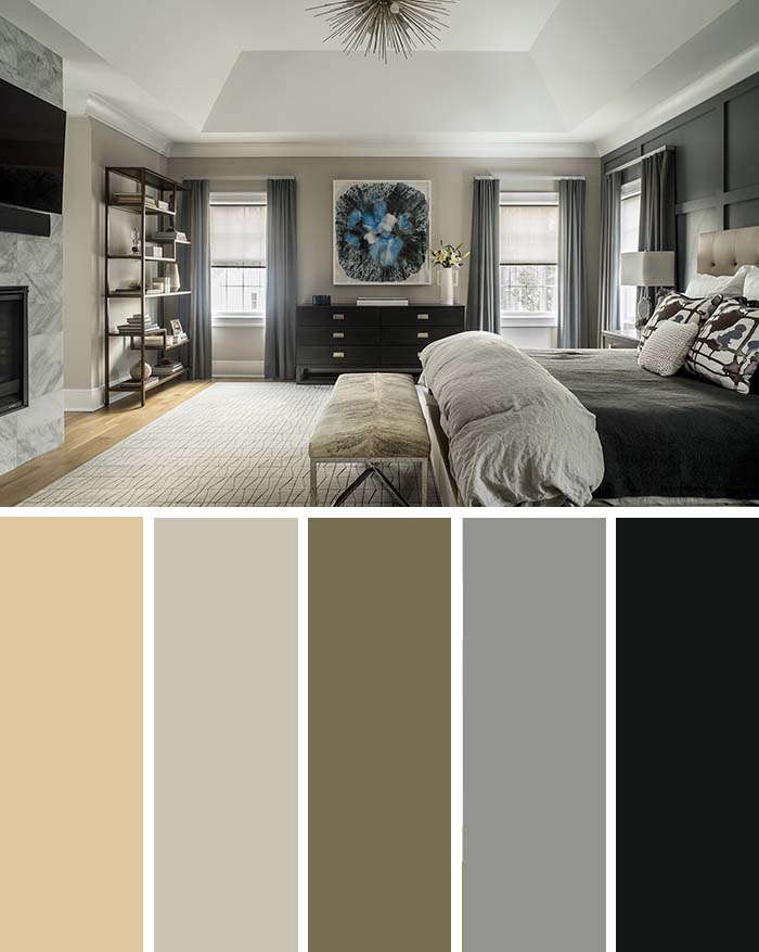
You already know black is one of the best solutions for a slick furniture set.
What some people overlook, though, is the fact that beige is one of the best colors: it matches well with so many other colors, fits well to grayscale without ruining the impression, and brings in warmth.
SW Color chart
- SW 7698 Straw Harvest
- SW 9562 Fortitude
- SW 9529 Twig Basket
- SW 9163 Tin Lizzie
- SW 9680 Night Watch
4. Plum, Silver, Lavender
via janelockhart.com
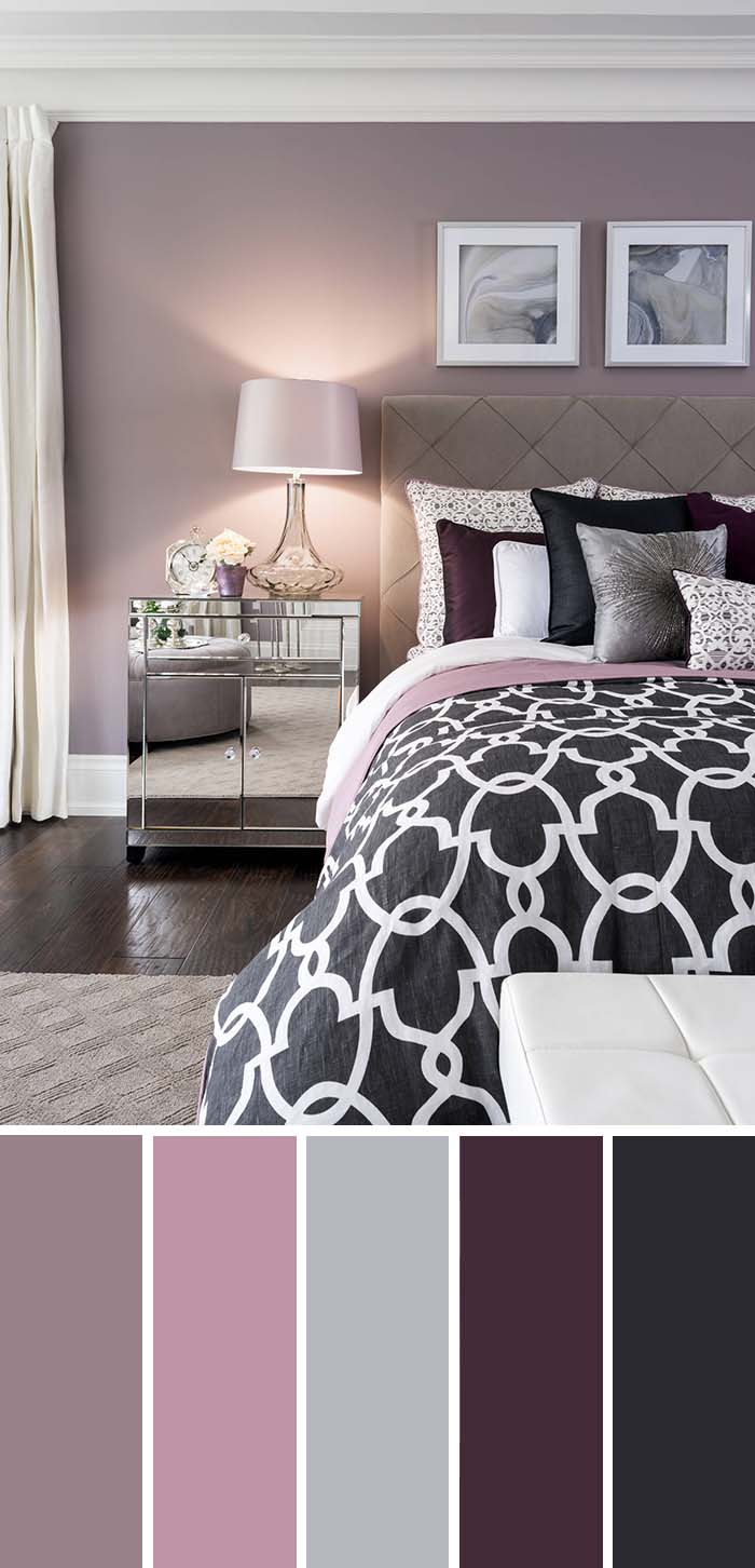
Purple is a bold and demanding color.
But in its many shades, it is also one of the colors of life, spring and nature.
So, it is well worth it to try it out. In this room the lavender is understated, but there are hints of purple in almost any part of the interior.
SW Color chart
- SW 9076 Ruby Violet
- SW 6290 Rosé
- SW 2832 Colonial Revival Gray
- SW 7577 Blackberry
- SW 6989 Domino
5. Turquoise and White

The turquoise palette in this room makes it at the same time seem clinically clean, and have its own unique style.
The color goes all the way from the bed sheets and freely scattered pillows, to the walls and the painting.
There are a few different shades, but the richest nuance serves as an accent color.
SW Color chart
- SW 6494 Lakeshore
- SW 6219 Rain
- SW 6233 Samovar Silver
- SW 6481 Green Bay
- SW 6264 Midnight
6. Navy Blue, Gold & Black
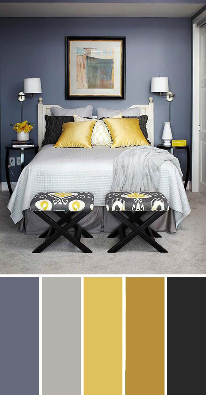
Yellow and navy blue go well together, and black is rarely out of place.
This room utilizes rich saturated colors, such as the navy in the walls, and adds splashes of white and gold for a welcoming contrast.
SW Color chart
- SW 6257 Gibraltar
- SW 9553 Allegory
- SW 6703 Frolic
- SW 6396 Different Gold
- SW 6258 Tricorn Black
7. Navy Blue Accent
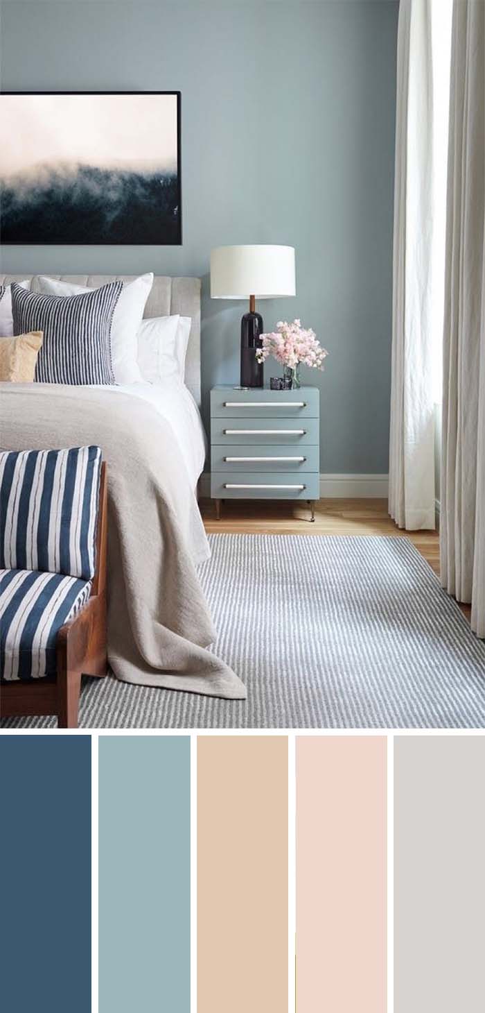
Even though navy blue is a great background color, that is not its sole use in beautiful modern bedrooms.
For those who prefer brighter and better-lit rooms, which reflect and don’t soak up sunshine, there is still a great way to include navy blue.
The way it contrasts to the soft blue walls makes it stand out as an accent.
SW Color chart
- SW 7602 Indigo Batik
- SW 9146 Faded Flaxflower
- SW 7712 Townhouse Tan
- SW 6589 Alyssum
- SW 7647 Crushed Ice
8. Cream Bedroom
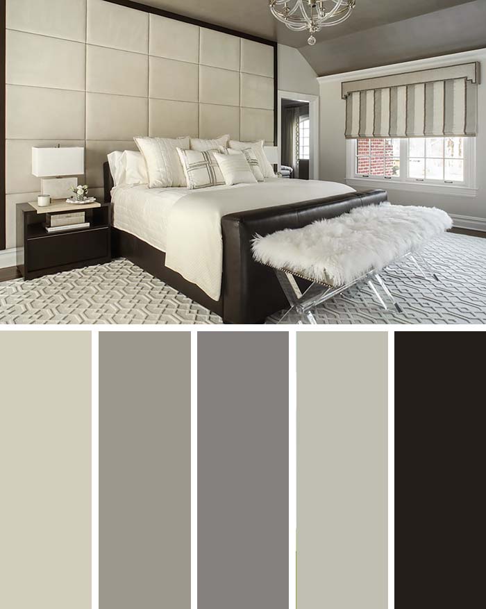
You don’t need much color to have a nice atmosphere indoors and this bedroom proves it.
Grayscale can really suffice as long as your designer has proper understanding of how different levels of saturation make you feel.
This huge king’s bed is surrounded by rich grays and cream, which create neutral, but atmospheric surroundings.
SW Color chart
- SW 9516 Accolade
- SW 7673 Pewter Cast
- SW 9554 Going Grey
- SW 6184 Austere Gray
- SW 6006 Black Bean
9. Purple and Lilac
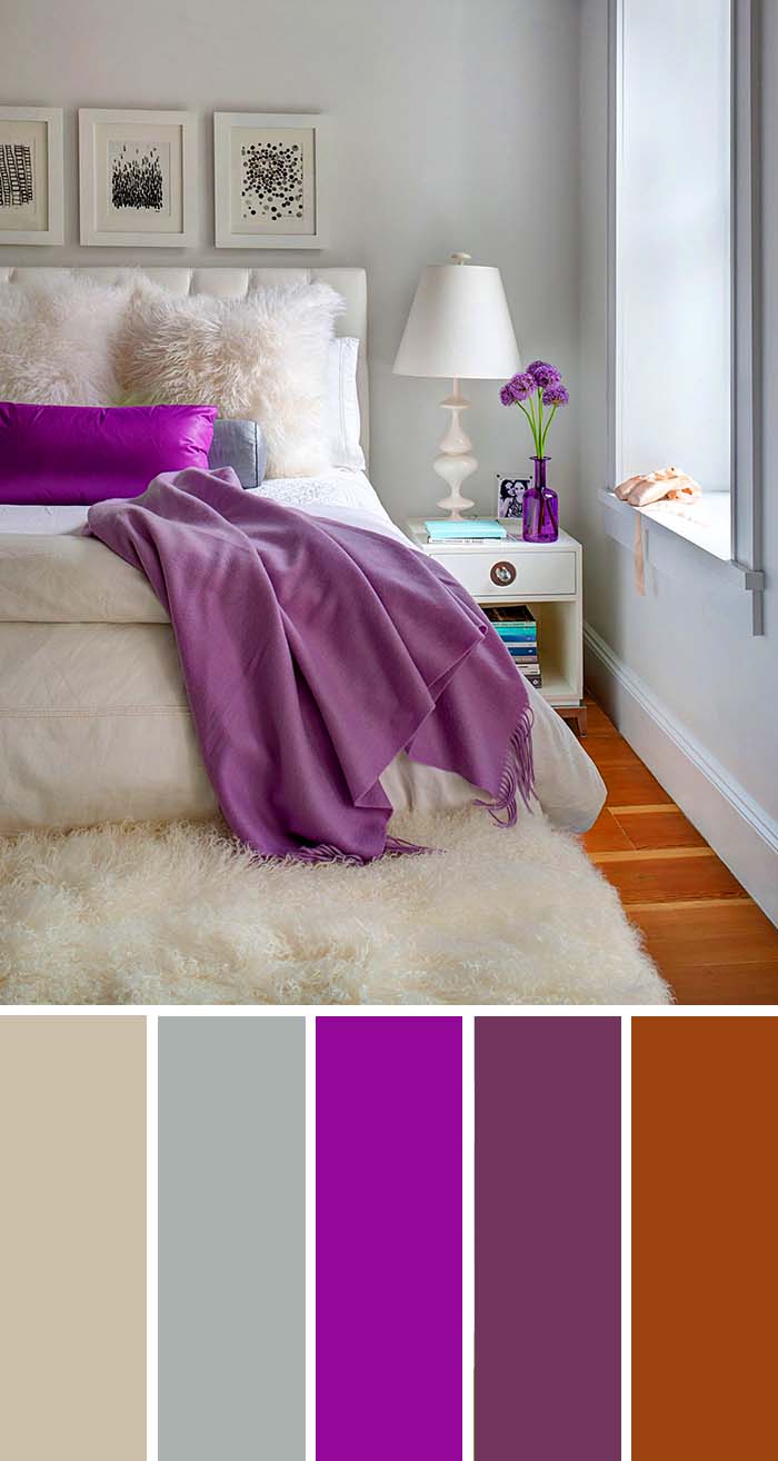
As we said earlier, nuances of purple are great accent colors.
The bed cover and pillow in purple and lilac add life to this room, which is otherwise comfortingly, but boringly plain white.
Additional nice splashes of color are the beautiful floor and the subtle walls.
SW Color chart
- SW 7542 Naturel
- SW 7652 Mineral Deposit
- SW 6842 Forward Fuchsia
- SW 6293 Fabulous Grape
- SW 6622 Hearty Orange
10. Earthly Tones
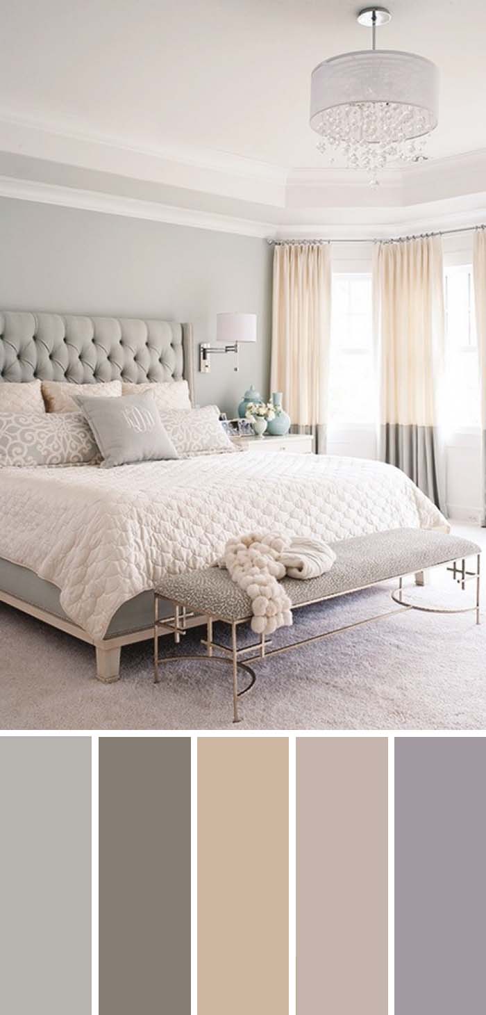
Another way to complement an understated color scheme is to rely on earthly tones, such as brown, soft orange and beige.
This is just what they did here, if only to subtly energize the white and grays we see in the headboard and floor.
SW Color chart
- SW 6198 Sensible Hue
- SW 7053 Adaptive Shade
- SW 6142 Macadamia
- SW 9086 Cool Beige
- SW 6549 Ash Violet
11. Dark Teal And Dusty Rose
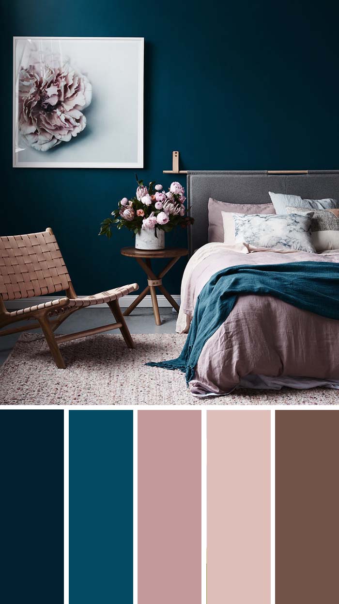
Contrasting colors may be kitsch if not done properly, because they are opposites and ‘clash’. but professionals can easily make these work:
the beautifully rich wall goes well hand-in-hand with the dusty rose of the chair, rug and bed, because it is a softer shade and gives a relaxation counterpoint to the intensity of the teal.
SW Color chart
- SW 6966 Blueblood
- SW 6510 Loyal Blue
- SW 6563 Rosebay
- SW 6583 In the Pink
- SW 6054 Canyon Clay
12. Gray and Orange
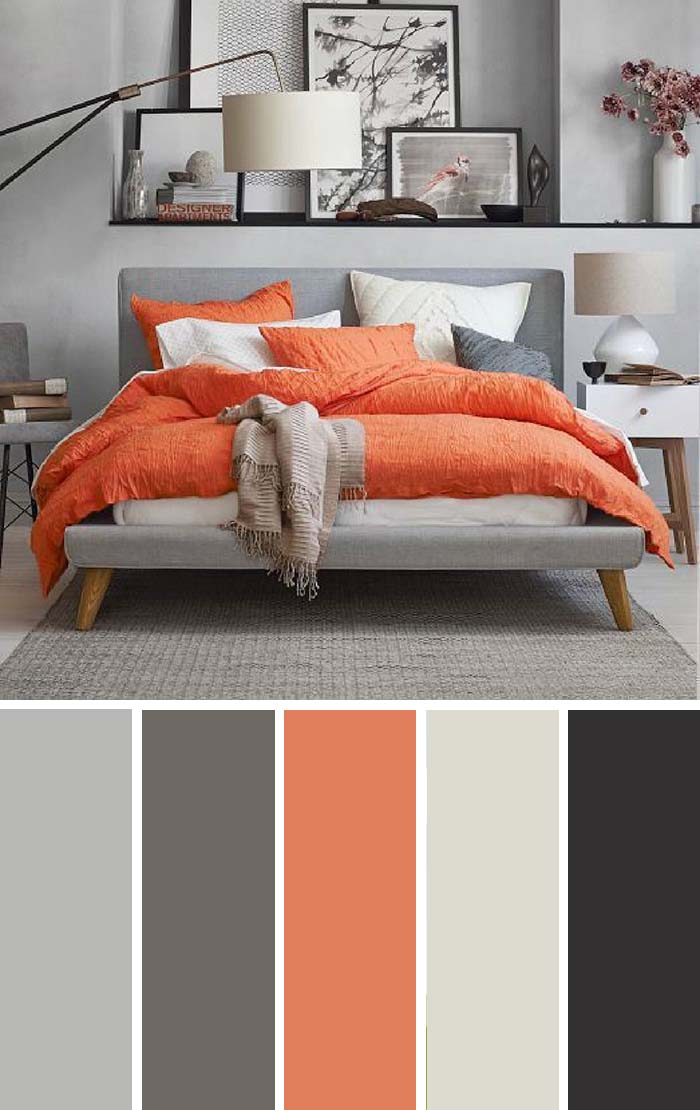
Any combination of neutral gray and bright colors is bound to grab attention and so does this bed.
A clear center point of the room, it instantly makes the feel of this bedroom dynamic.
All the additional color around comes in small splashes just to make sure the bed doesn’t look completely out of context.
SW Color chart
- SW 7668 March Wind
- SW 9555 Storm Warning
- SW 6620 Rejuvenate
- SW 7631 City Loft
- SW 9175 Deep Forest Brown
13. Coastal Blue
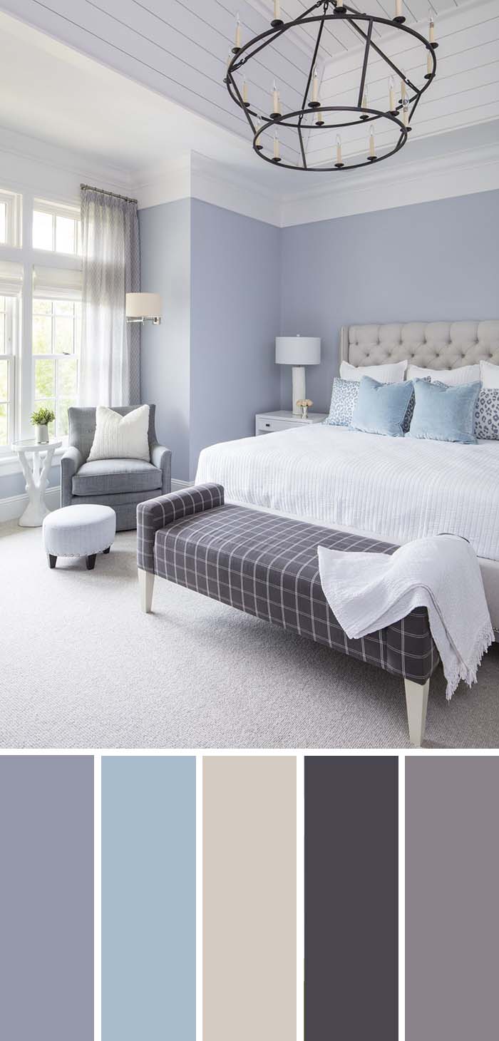
The feel of sunshine and seashore relaxation is not easy to bring inside closed doors.
Some shades of blue and yellow certainly help, such as this beautiful blue color, but they also need to be helped by some huge windows to let in light, and much space to allow owners to feel unrestricted.
SW Color chart
- SW 9161 Dustblu
- SW 6240 Windy Blue
- SW 9601 Symmetry
- SW 6265 Quixotic Plum
- SW 0077 Classic French Gray
14. Feminine Bedroom
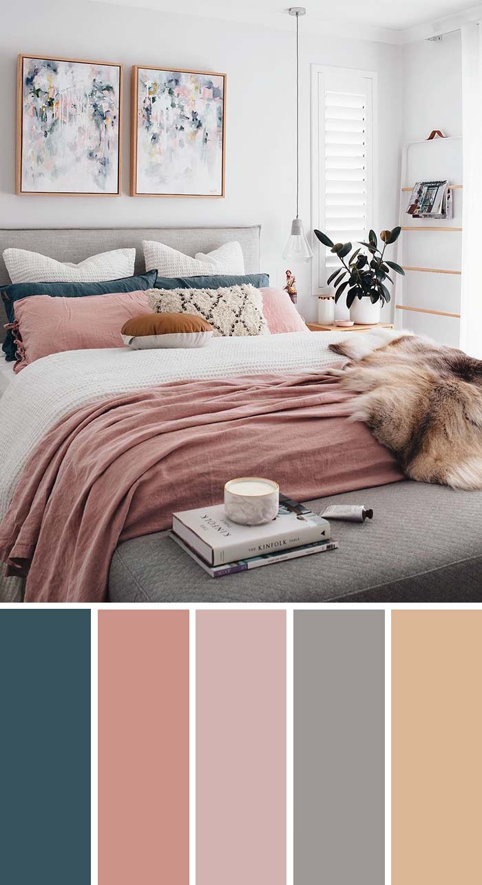
via instagram.com
Pink is a very girly color, but for a more mature feminine look, something more is needed.
Gray to add structure, white to help emphasize the rest of the colors, and why not some blue as an accent.
Now this room is a true classy feminine retreat to proudly live in.
SW Color chart:
- SW 7620 Seaworthy
- SW 6332 Coral Island
- SW 6051 Sashay Sand
- SW 7070 Site White
- SW 9153 Moonlit Orchid
15. Aqua & Lime
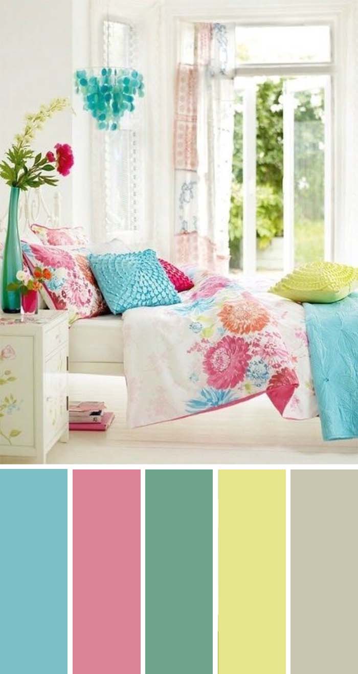
Some people need more than relaxation in their bedroom – just plain fun and great mood come in bright colors.
A rainbow of colors mix in this room to create a positive vibe and to ensure the room reflects its owner’s creative spark.
SW Color chart
- SW 6773 Rapture Blue
- SW 6311 Memorable Rose
- SW 6739 Eco Green
- SW 6900 Optimistic Yellow
- SW 7738 Cargo Pants
16. Navy Blue Color Scheme
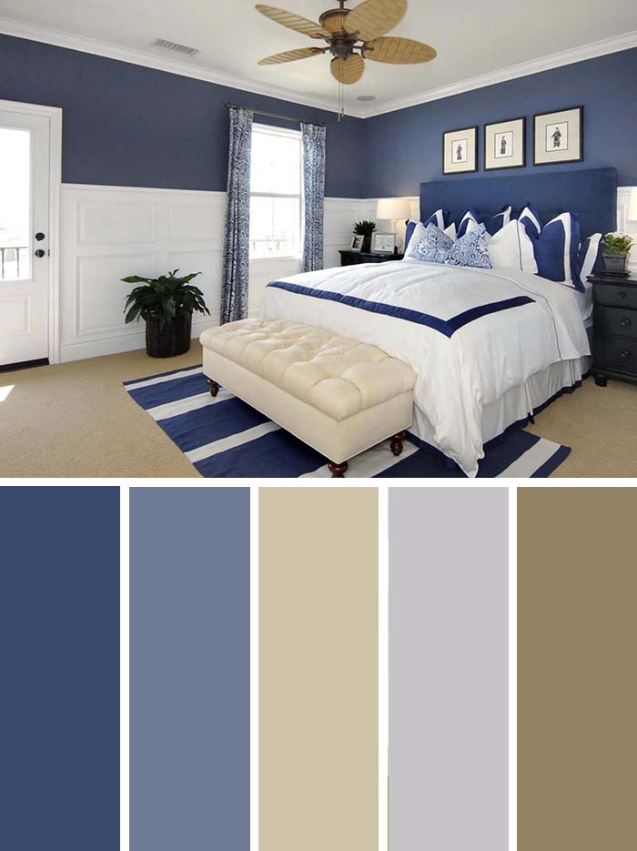
via jwinteriors.com
Forget white and black, this is too pretentious for a bedroom.
You will need some color to feel well.
And, even though many colors claim to be ‘the new black’, here is our piece of mind: navy blue always was its natural successor.
The beige floor and the white wainscoting, bed cover and ceiling help the blue stand out and it does so greatly.
SW Color chart
- SW 6538 Dignified
- SW 6543 Soulful Blue
- SW 9512 Threaded Loom
- SW 9562 Fortitude
- SW 9528 Vintage
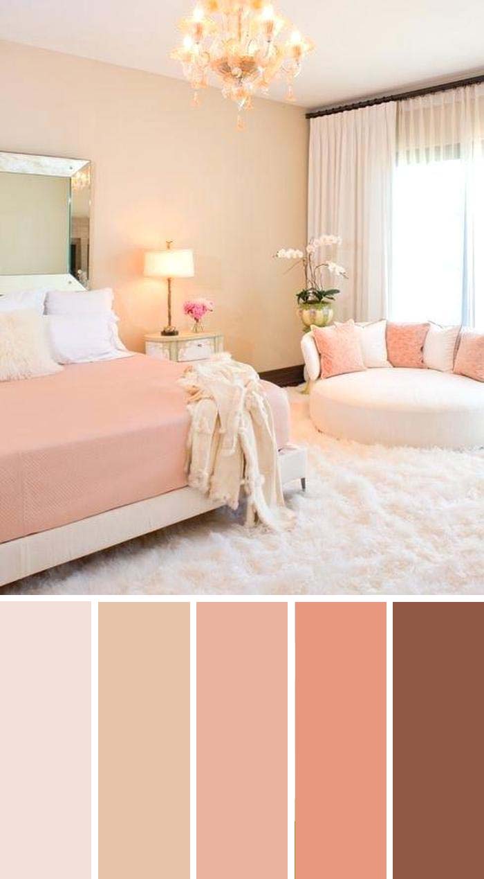
17. Coral Painted Bedroom
You like earthly tones but are afraid they can be too bland.
You need that special splash of color.
Here is a solution for you and it comes straight out of the sea: this coral painted room feels like a living organism, because it is just so lovely.
But the soft subtleness of the pink also makes it great for relaxation.
SW Color chart
- SW 9692 Cotton Candy
- SW 7723 Colony Buff
- SW 6604 Youthful Coral
- SW 6619 Sockeye
- SW 2803 Rookwood Terra Cotta
18. Light Green
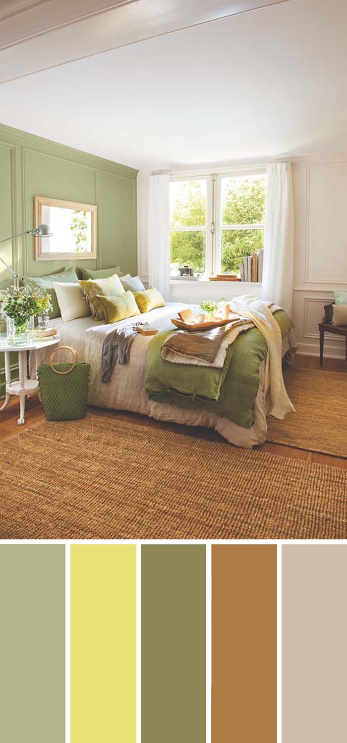
Green is a color of nature, life and vitality.
Many people feel extremely relaxed outdoors, surrounded by plant life.
And so will you in this beautiful bedroom, the interiors of which made us fall in love with this made us plan a trip to the woods.
Right after we take a nap.
SW Color chart
- SW 7727 Koi Pond
- SW 6901 Daffodil
- SW 6418 Rural Green
- SW 6397 Nankeen
- SW 9110 Malabar
19. Gray, Yellow and Black
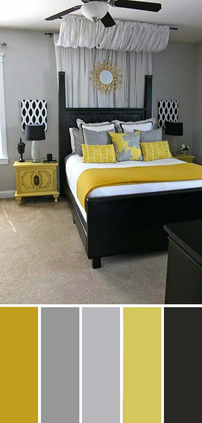
This classic combination would feel just a bit too dark if not for the bright accent yellow.
Now it looks classy and elegant, partly because the yellow is a brave choice, which demonstrates confidence.
At the same time, it is refreshing and exciting.
SW Color Chart
- SW 6699 Crispy Gold
- SW 9162 African Gray
- SW 2832 Colonial Revival Gray
- SW 6703 Frolic
- SW 6258 Tricorn Black
20. Taupe and Pale Pink
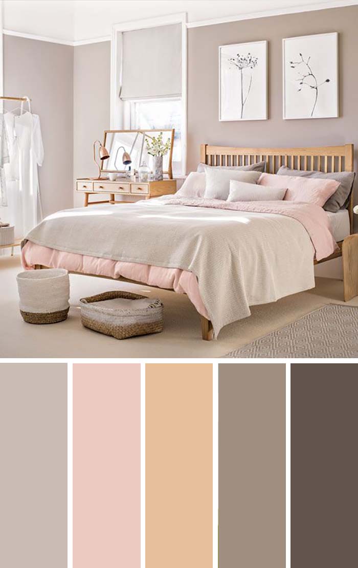
Taupe is a shade of gray, which contains just a tiny hint of brown for some extra sophistication.
Pale pink is a subtle version of pink, which looks stunning, without being overwhelming.
The two combine in this classy and gorgeous palette.
Choosing the right colors for your bedroom always sounds like a risk.
But once you get inspired by these beautiful combinations it sounds more like a playground for your fantasy, as there are so many variations you can try and there is no limit to imagination.
SW Color chart
- SW 9173 Shiitake
- SW 6323 Romance
- SW 6359 Sociable
- SW 9084 Cocoa Whip
- SW 9604 Tea Leaf
21. Earth Tone Green Bedroom
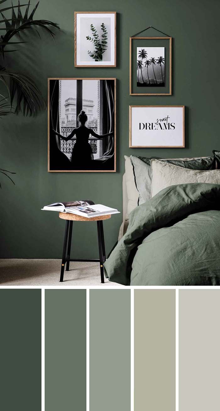
This color palette is very pleasant to the eye and gives any bedroom rich and ambient color at the same time.
From dark green to neutral grey or beige you can feel the energy and transition to calming your senses.
SW Color chart
- SW 7750 Olympic Range
- SW 6194 Basil
- SW 9132 Acacia Haze
- SW 0049 Silver Gray
- SW 9552 Antimony
Important: These color chart references are for aesthetic purposes only and couldn’t be used as an example for real colors as each color has different shades and couldn’t be represented on the device screen.

