I was thinking I saw everything on home decor and especially kitchen design, but when I saw this project I was literally out of words. First thought was – it’s ridiculous, but when I started thinking about the design and purpose I had to admit, that If this is already done, then someone must have liked it.
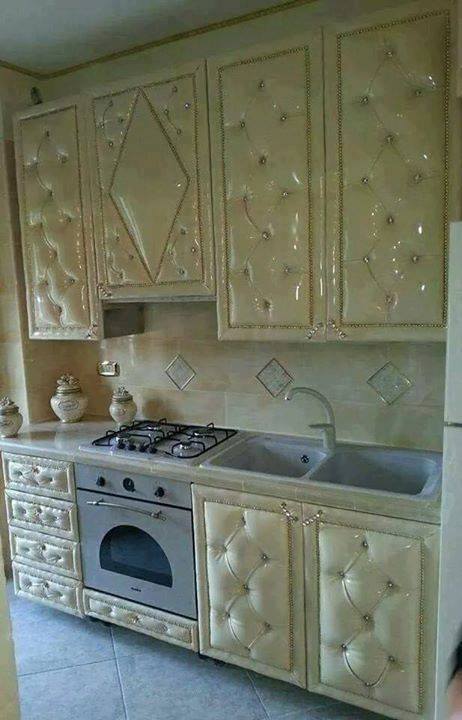
It looks like the furniture is tufted and in cream glossy leather. I’m not sure , but these must be crystals all over it and I can bet they are Swarovski. Backsplash is also in the line of everything else – glossy and shiny.
The stove though is not good enough for this design, I’m sure they could get a better one – at least in the same color. What about the floor tiles – again, boring and cheap.
My honest opinion is – this design is made for someone which is not wealthy enough, but wanted to look like one. In the end – it looks cheap and grotesque.
What do we have here? I don’t know what this looks like..it’s a mess, a total mess. I suppose the original idea was to have some nice thin black lines on the cupboards, but then something got mixed up.
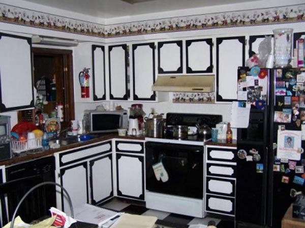
Photo: Credit
I have to admit, the stove and fridge are nicely blended in to this design. They are very well hidden, so no one can get any food.
Floor tiles – another spot on, perfect color choice, I’m really surprised they didn’t choose pink.
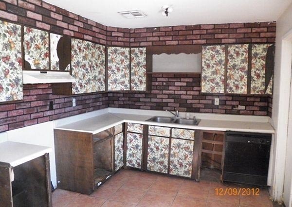
Do you like flowers? Me too. But when you want to design your kitchen with some floral elements, please don’t do it this way. If you want nobody to come into your kitchen, then that’s the way to do it. I would never get my foot in this one.
Photo: Credit
Artificial bricks are only making things worse. If you don’t know how to make a kitchen cozy and inviting, then just browse internet, there are tons of great kitchens even on a budget.
I hope the owners will soon redecorate it and create something better.
If you don’t know what color to paint the cupboards and furniture, then leave them not painted. Just scrubbed with some sandpaper. This is what it looks like here. Or maybe it’s just too fashionable or fancy for my taste.
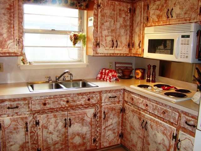
Photo: Credit
Farmhouse and rustic kitchen design have some similar ideas, but this is far from any good idea. Brave enough to get a medal, but nothing that you would withstand in the long run.
I recommend you to choose another option when it comes to furniture paint.
What to say about these cabinets? They all look the same, like some old window frames and with the worst color possible.
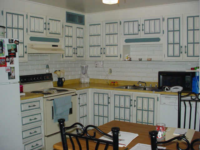
Photo: Credit
Counter top has nothing to do with the rest of the design. Table and chairs are the same total mess.
Big No to this type of design and I feel really sorry for those guys who paid to have these in their home.
Always think twice before hiring someone to make your kitchen.
Curvy they said! OK, here are all the curves you can imagine. Unfortunately, the only thing that this design can achieve is causing me a serious vertigo.
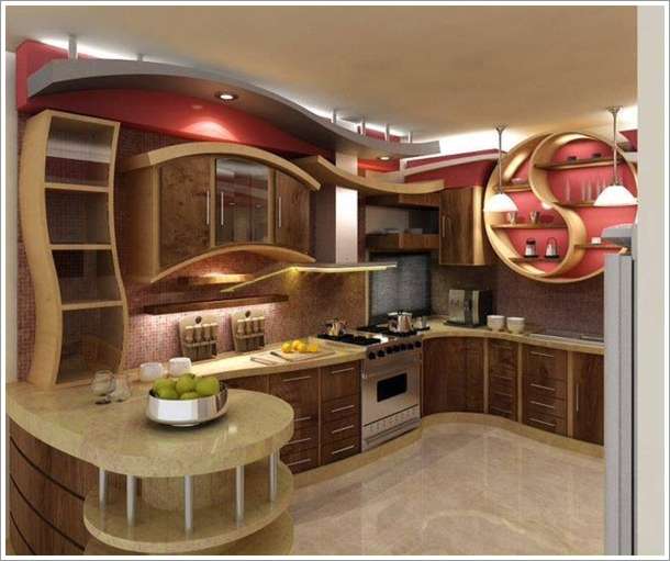
Photo: Credit
I’m not sure what’s inside the cupboards, but I bet it’s stuffed in one corner only. Who can create such cabinets, apart from being not useful at all, they are ugly.
You should be really obsessed with curves to create such design.
It gets better and better, huh? What is this? Anyone with suggestions here? These cabinets are representing some city buildings, but unless you are the founder of that city, please don’t copy this design.
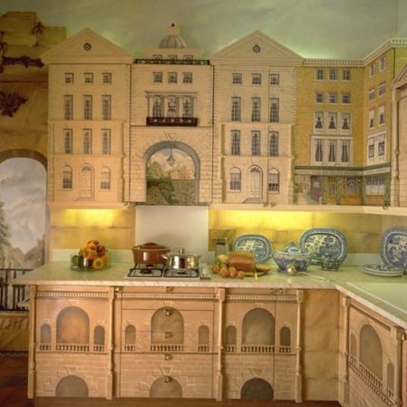
Photo: Credit
I don’t even see where are the handles of these cupboards, it’s so busy and overwhelming.
You can put your neighbors photos in the small windows and pretend theyt are smiling at you.
Big No, No to this one! Even if you are an architect or history teacher.
Well, this could have been trendy in 70s, but today, don’t think so. Furniture is not bad at all, but the wallpaper and ceiling could make you feel dizzy. Red is aggressive color and could get your level of excitement too high.
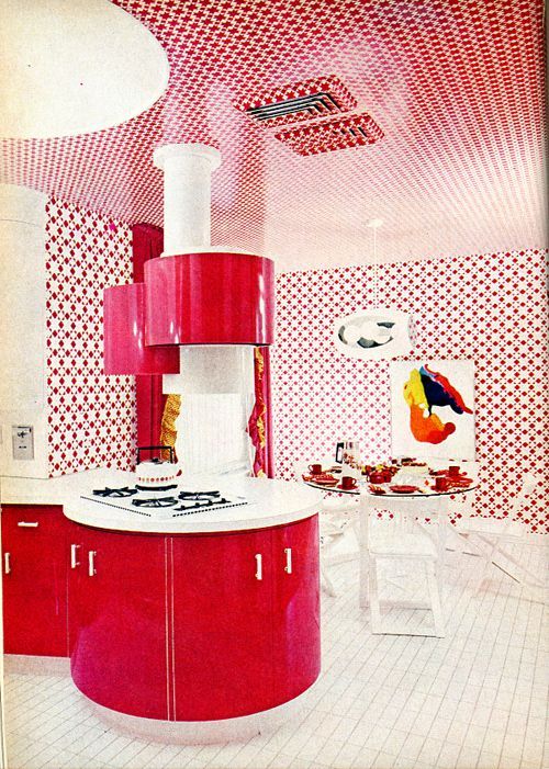
Photo: Credit
I see that even the dishes are red, dark red. I suppose the food will be only tomatoes and peppers.
Floor tiles are similar to those in bathrooms and toilets, so I can pass them too.
Do you like it? Don’t disappoint me.
Someone loves chinaware and blue color here. This one is not so bad ( comparing to the previous kitchens )
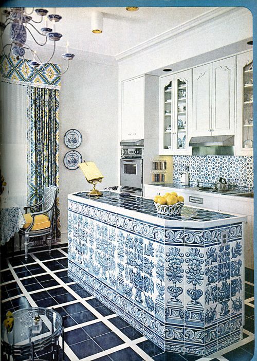
Photo: Credit
If you like this retro style, you can start buying tiles, furniture and decoration to build your own similar kitchen.
I have to warn you, that you won’t impress your guests with this design.
Pink Glitter
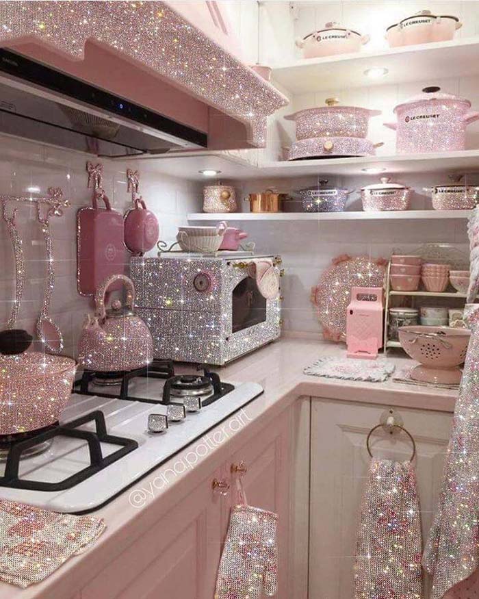
You must be a hard core fan of pink and glitter to convert your kitchen into this. Not sure how it’s possible to cook in this kitchen, but it’s a very creative idea.
Actually, it’s not a real kitchen, but an art made by Yana Potter which has a lot more glitter effect photos. You can follow her on Instagram here.
After you saw all these ridiculous kitchen designs ( I can’t believe you reached the last one ) you need some break, right?

