Butter yellow paint colors could enhance a home space with the optimism and cheerfulness of yellow while keeping it elegant and soft with the tinted butter undertones. These twelve paint colors will bring a gentle and inviting ambiance to your home space through their endearing shading.
By incorporating them into your home space, you can achieve an elevated sense of style, especially with the furniture and design recommendations you will find for each of them. Let your creativity and inspiration wander without losing numerous hours on choosing the perfect paint color – it is right here.
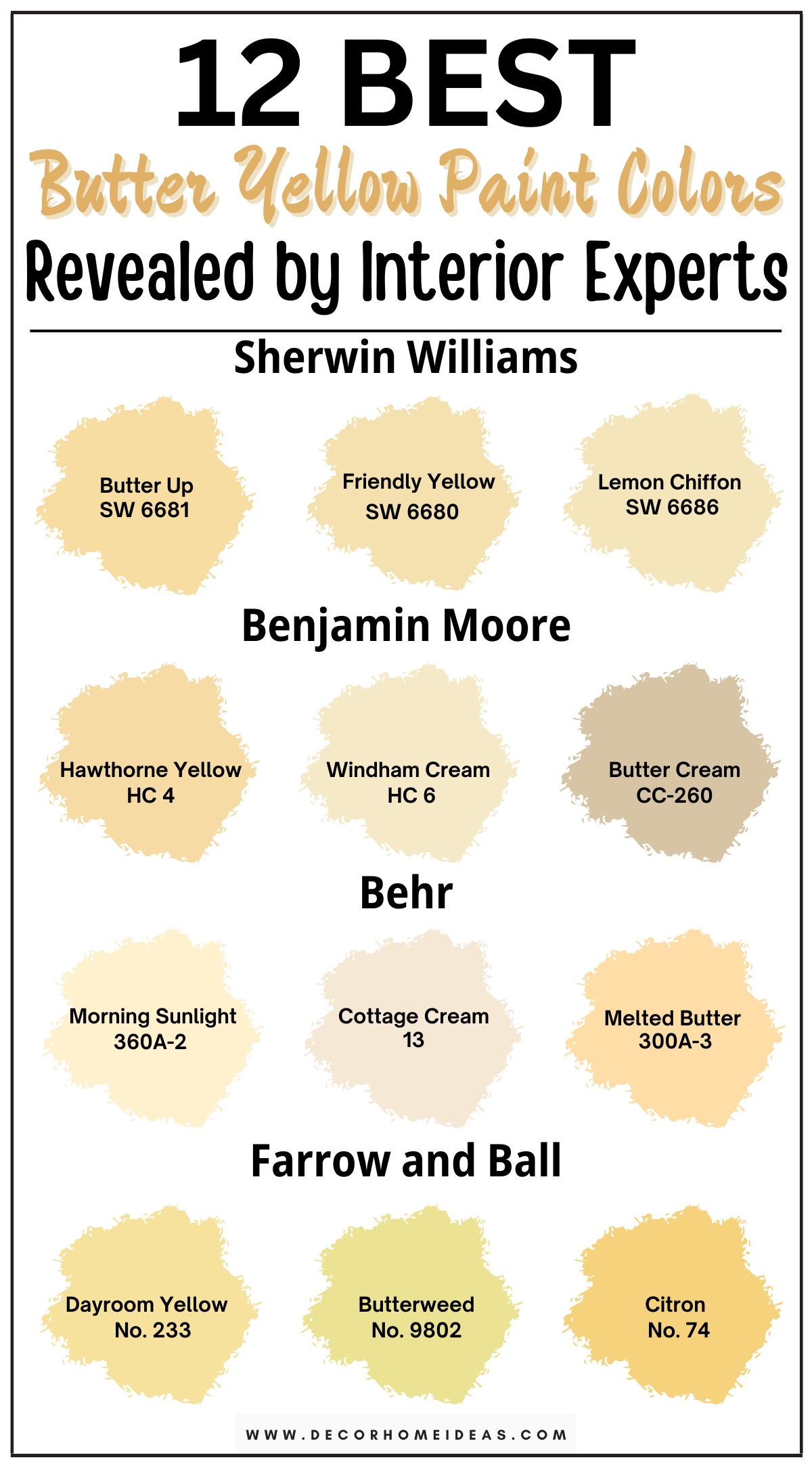
1. Sherwin Williams
Sherwin Williams Butter Up
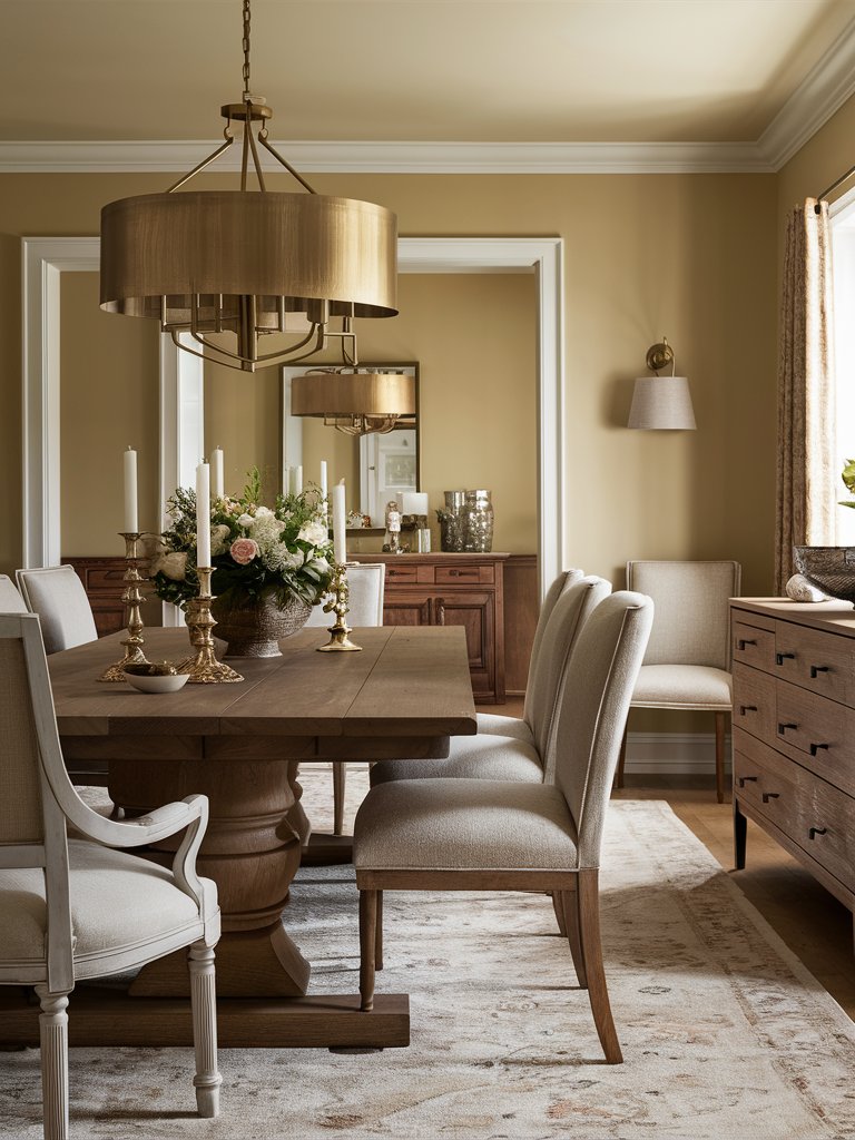
Sherwin Williams’ Butter Up is a creamy butter yellow paint color that could bring a sense of warmth to any room with its pure and gentle design. It could enhance your home with a cozy feeling and a sense of comfort. Therefore, you can integrate it into your dining room where you spend quality time with your family.
Opt for beige chairs combined with a dark wood dining table and drawers for an elegant design choice. Get various gilded elements like sconces, candle holders, and a big gilded chandelier for an elevated style. Try to always keep a fresh bouquet around to enhance the warmth of the room.
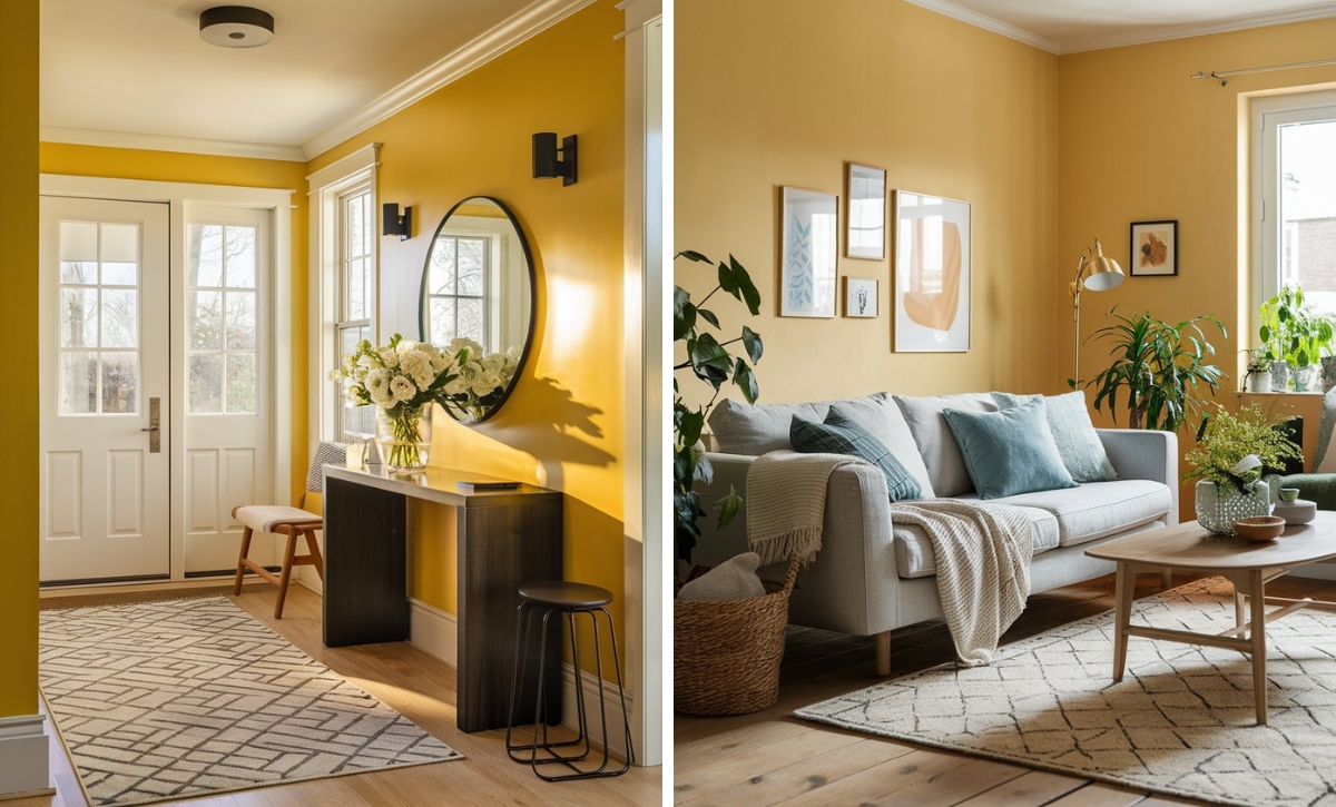
Sherwin Williams Friendly Yellow
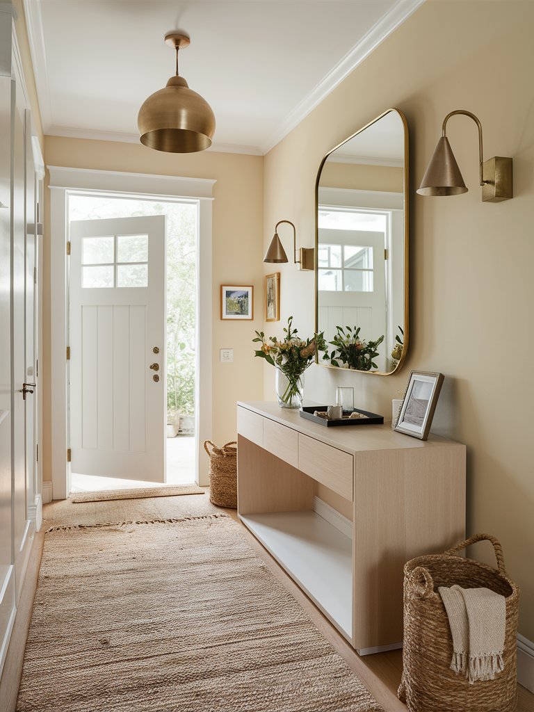
Sherwin Williams’ Friendly Yellow is a light butter yellow paint color that is great for brightening your space without overwhelming it with intense color. Therefore, it could be the perfect choice for a hallway where you have limited space but still want it to look welcoming for your guests.
Choose a palewood hallway console table and a neutral-colored carpet to enhance the bright design you aim to achieve. Opt for gilded elements like a gilded framed mirror, different sconces, and picture frames to create a soft ambiance and complement the butter yellow paint color.
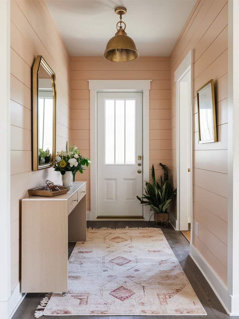
Sherwin Williams Lemon Chiffon
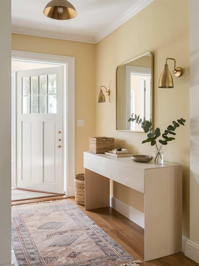
Sherwin Williams’ Lemon Chiffon is a pale butter yellow paint color with light brown undertones that could enhance any home space with a sense of warmth and an inviting feel. Therefore, it could be best to integrate it in a hallway where you need a welcoming atmosphere and comfort.
Follow the lightness of the paint color by choosing a pale wood hallway console and neutral-colored decorations like a brown tray and woven storage boxes. Opt for gilded elements to complement the soft paint color and a glass vase to follow its beauty in simplicity.
2. Benjamin Moore
Benjamin Moore Hawthorne Yellow
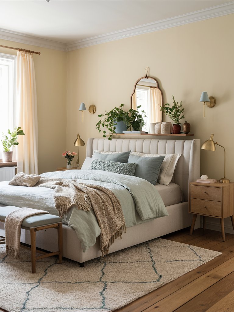
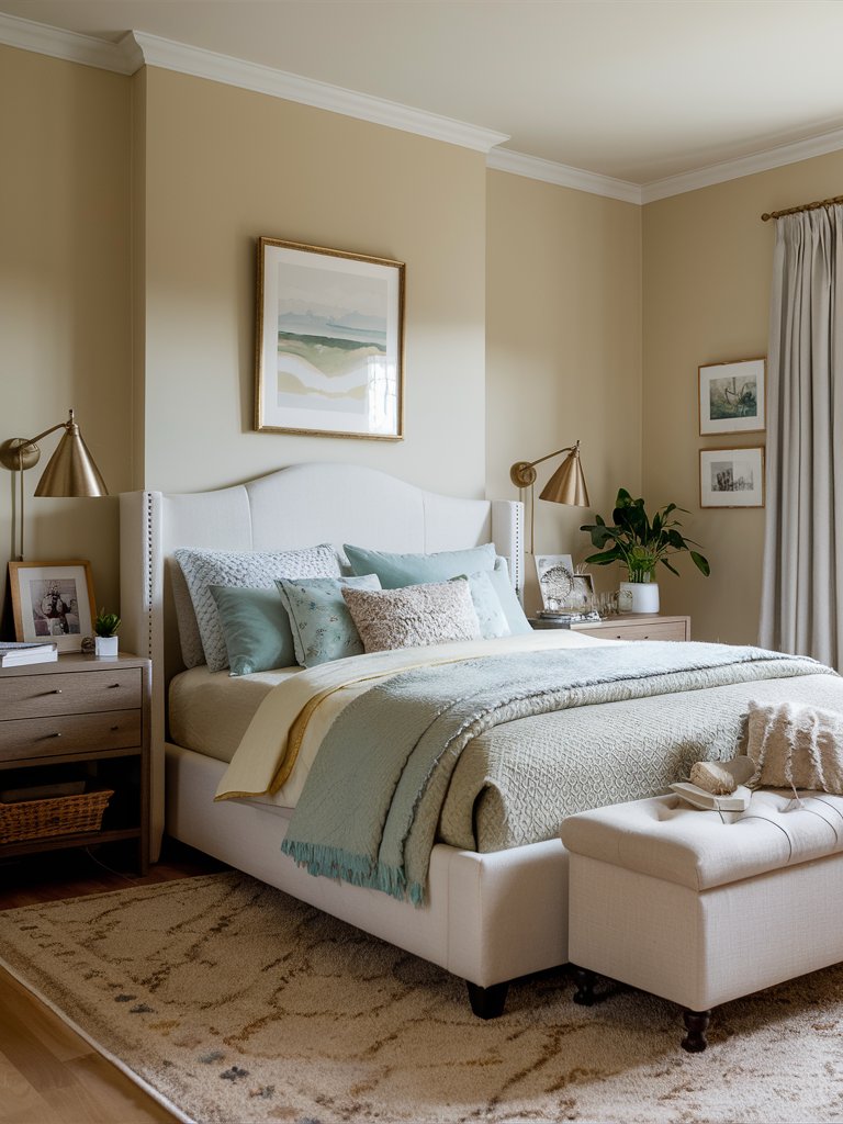
Benjamin Moore’s Hawthorne Yellow is a balanced butter yellow paint color that is one of the company’s best-selling colors because of its softness and the warmth it brings to a room. It could be the perfect choice for a bedroom, where it can evoke a sense of coziness and utter relaxation.
Opt for neutral-colored bedding like beige, white, or gray to enhance the softness of the design. You can also install a wall shelf with some greenery, books, and souvenirs on it with a mirror above to create a homely design. Make sure to also add gilded elements to complement the paint color.
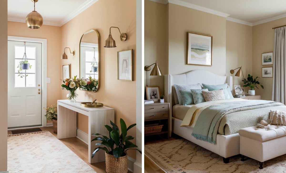
Benjamin Moore Windham Cream
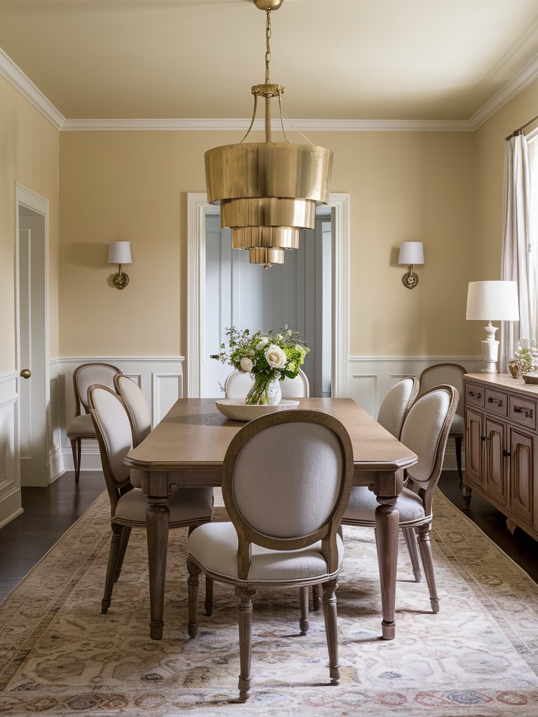
Benjamin Moore’s Windham Cream is a luscious butter yellow paint color with a whisper of peach. It could enhance any space with softness and a warm sunlit feel. Therefore, it could be the perfect choice for a gathering room such as a dining room where it can evoke some optimistic emotions.
Opt for detailed chairs with beige upholstery and light wood together with a similar dining table and drawers. Choose pure white decorative elements like trays, vases, and night lamps to capture the pureness of the paint color and enhance the room’s elegance by adding a gilded chandelier with similar sconces.
Benjamin Moore Butter Cream
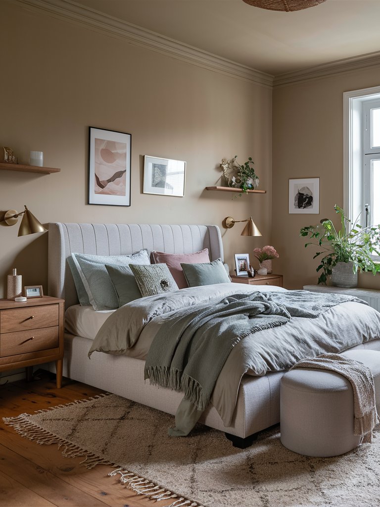
Benjamin Moore’s Butter Cream is a creamy butter yellow paint color with touches of brown and strong beige undertones. It could bring depth to any room and enhance it with a feeling of warmth and coziness. Therefore, it could fit perfectly into the relaxing ambiance of a bedroom.
Opt for bedding in pastel colors like tinted pink and green to complement the softness of the paint color and choose walnut wood nightstands and drawers to continue with the creamy and gentle theme. Hang different creative art pieces on the wall above the bed and add gilded sconces as a finishing touch.
3. Behr
Behr Morning Sunlight
Behr’s Morning Sunlight is a light butter yellow paint color with orange tinges that could create a welcoming atmosphere in every room, especially the hallway where guests first encounter your home space. It is a paint color of softness and timeless charm due to its creamy qualities.
Follow the softness with an ash wood hallway console and a white door for a sense of purity of design. Opt for gilded elements like a gilded mirror and picture frames, sconces, and a decorative tray to evoke further elegance. You can also get eco-friendly woven pots for greenery to enhance the hallway’s charm.
Behr Cottage White
Behr’s Cottage White is a soft butter yellow paint color with unmistakable honey gold notes that elaborates best with abundant natural light to showcase all its gentle qualities. It creates a soft atmosphere of coziness and predisposed relaxation, making it the perfect bedroom choice.
Opt for beige bedding and add a similar neutral-colored bed bench to enhance the creamy softness of the paint color. Choose slightly darker wood nightstands for a contrasting point with the light walls and add gilded elements like sconces and picture frames to evoke further elegance and charm into the room.
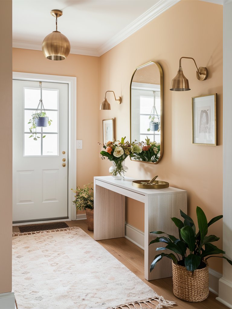
Behr Melted Butter
Behr’s Melted Butter is a charming butter yellow paint color with peachy undertones that could create a welcoming atmosphere in your home space through its bright, yet soft qualities. Integrating it into your hallway will make a nice entrance into your home space ensuring a warm feeling among your guests.
Choose pale wood furniture to soften the hallway area and a peachy rug to complement the paint color. Add gilded elements like a pendant light, sconces, and gilded picture or mirror frames for enhanced elegance. You can also add some greenery and a fresh bouquet to create an even more inviting space.
4. Farrow and Ball
Farrow and Ball Dayroom Yellow
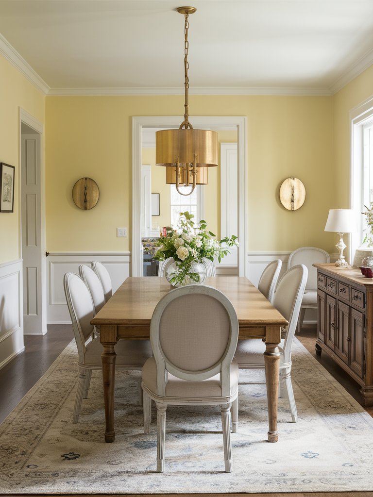
Farrow and Ball’s Dayroom Yellow is a refreshing pale yellow paint color that is simple but charming nonetheless. Its name suggests the best exposure of its qualities in a room with abundant natural light. Therefore, it could be the perfect choice for a dining room where you spend quality time with your family.
Opt for a big pine wood table with soft beige or white chairs surrounding it for a soft and charming appeal. Focus on gilded elements like an elegant pendant light and sconces. Make sure to always have a bouquet of fresh flowers on the table to create an inviting and charming home space.
Farrow and Ball Butterweed
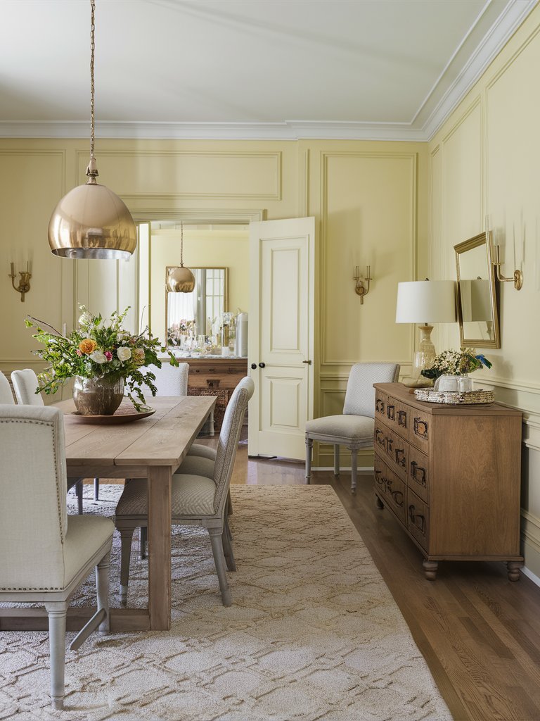
Farrow and Ball’s Butterweed is a lively creamy yellow paint color with green tinges that could invite an earthy feel into your home space ensuring its charm. It is a perfect choice for a gathering room in your home space like a dining room to enhance its welcoming feel and visual appeal.
Choose lighter wood furniture like a big dining table and drawers to enhance the softness of the paint color. You can also focus on gilded elements that can guide your home design to a charming effect of elegance and grace. Enjoy this fresh earthy design by adding a fresh bouquet as a finishing touch.
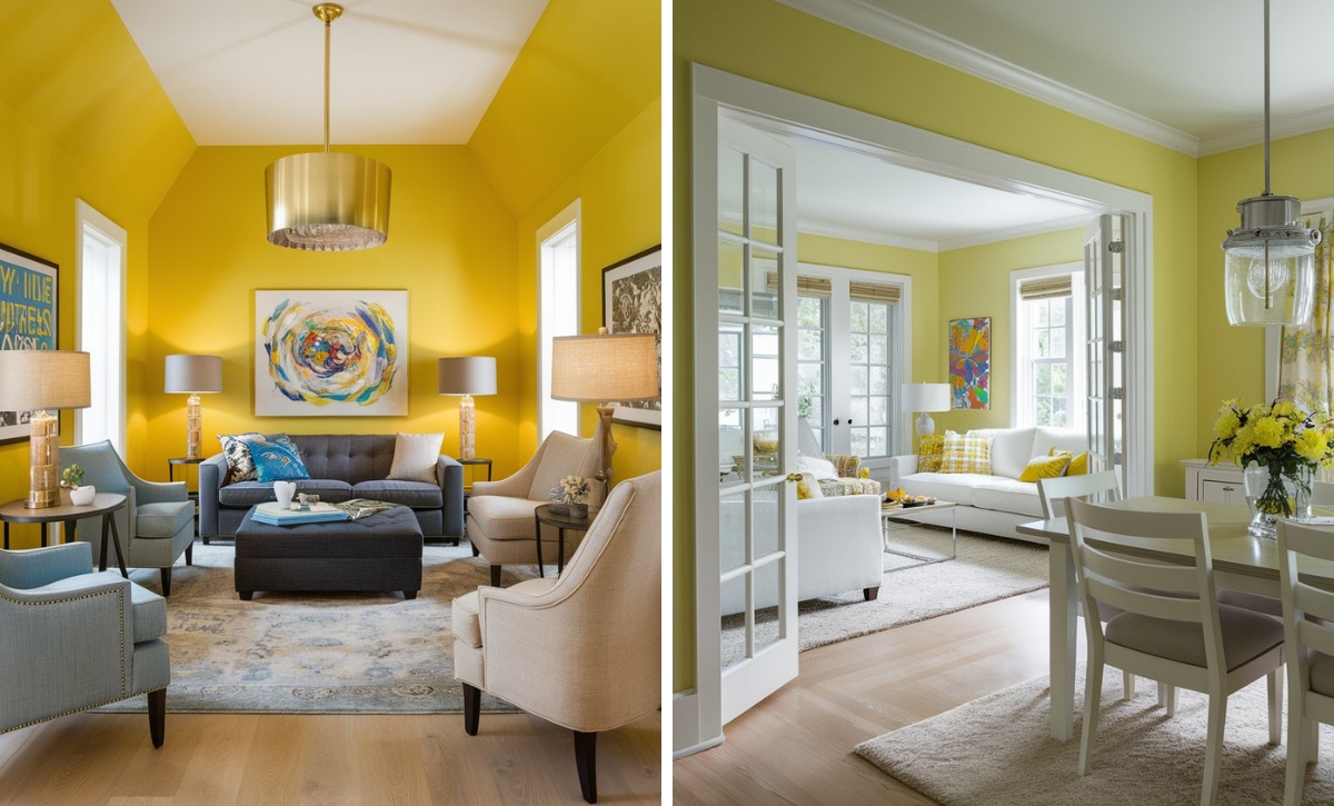
Farrow and Ball Citron
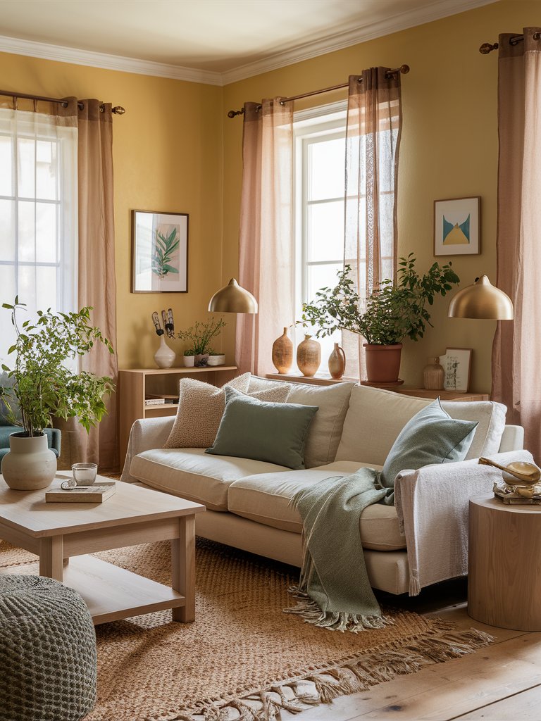
Farrow and Ball’s Citron is a warm lemon yellow paint color that has a bright intensity due to its creamy and tinted qualities. It could enhance any space with warmth and inviting energy and create a homely atmosphere. Therefore, it is the perfect choice for a living room due to its social quality.
Opt for a white or beige sofa with distinctive creamy decorative pillows in different colors to stand against the warm paint color. Choose pale wood furniture for the coffee table and drawers for a charming feel and add greenery and different decorative elements around the room to give it a lively feel.
What Color Compliments Butter Yellow Paint Colors?
- Lavender
- Slate Gray
- Mint Green
- Pale Blue
- Warm White
Lavender
Lavender is a soft, cool tone that creates a gentle contrast with the warm and creamy hue of butter yellow. This pairing brings a light and airy feel to the space, creating a calming and harmonious atmosphere.
Use lavender in accent pieces like throw pillows, curtains, or artwork to introduce a subtle pop of color that complements the warmth of butter yellow.
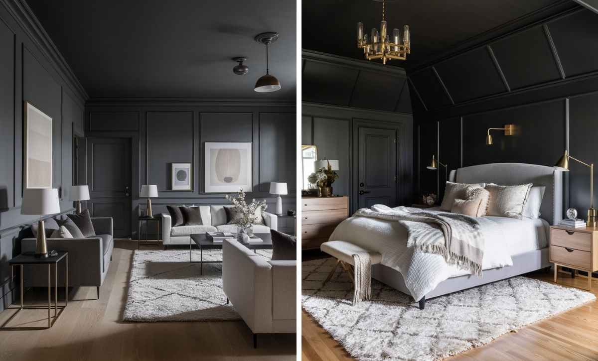
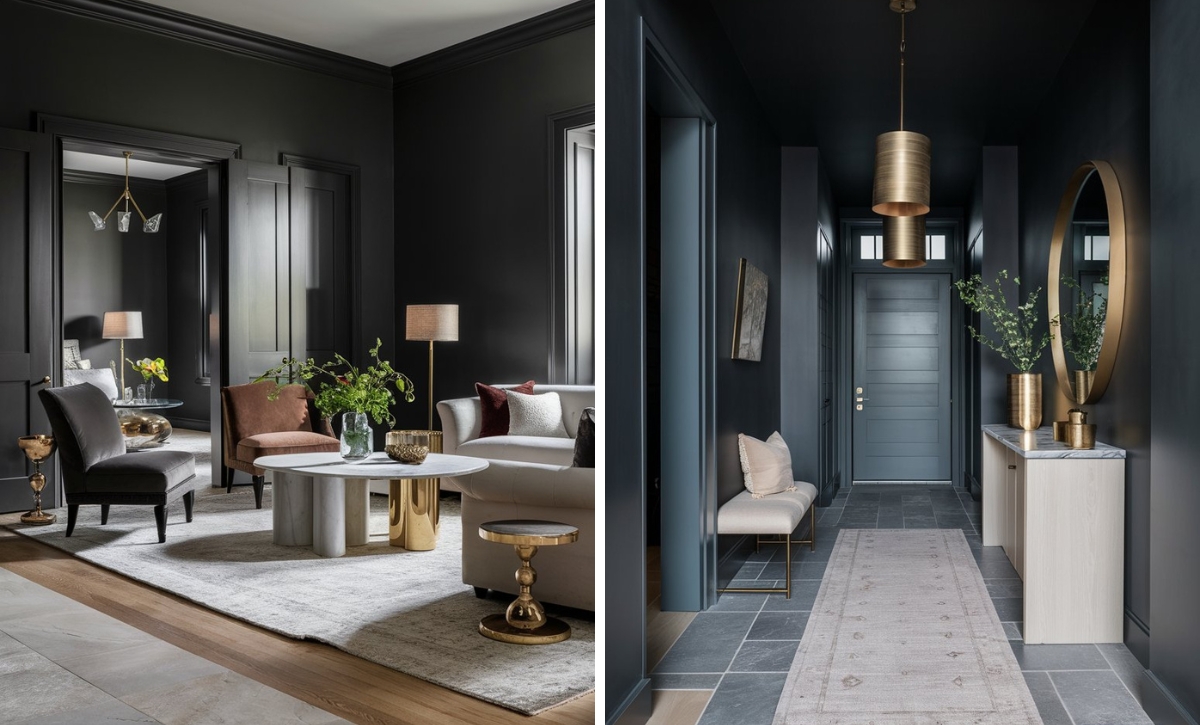
Slate Gray
Slate gray is a rich, neutral color that pairs beautifully with butter yellow, creating a sophisticated and balanced look. The cool undertones of slate gray add depth and modernity to the soft brightness of butter yellow.
Incorporate slate gray in furniture, rugs, or larger elements like accent walls to create a sleek and refined space that enhances the gentle glow of butter yellow.
Mint Green
Mint green provides a refreshing, cool contrast to butter yellow, creating a lively and invigorating look. This combination evokes a sense of nature and springtime, bringing freshness and brightness to the room.
Use mint green in textiles, plants, or decorative accessories to introduce a soothing and organic element that complements the warmth of butter yellow.
Pale Blue
Pale blue is a delicate and calming color that pairs effortlessly with butter yellow, creating a serene and peaceful atmosphere. This pairing evokes a sense of openness and light, making the space feel bright and welcoming.
Incorporate pale blue in bedding, wall art, or accent pieces to create a soft and tranquil environment that complements the warmth of butter yellow.
Warm White
Warm white is a neutral shade that blends seamlessly with butter yellow, creating a clean and cohesive look. This combination enhances the brightness of butter yellow, adding lightness and a subtle warmth to the space.
Use warm white in trim, furniture, or larger surfaces like walls or ceilings to create a fresh and inviting environment that highlights the soft, sunny quality of butter yellow.
Color Disclaimer
Please note that all paint colors displayed on this page are for illustrative purposes only. Due to variations in screen settings, lighting, and other factors, the colors you see on your screen may differ from the actual paint colors. We recommend viewing a physical color sample or swatch for the most accurate representation.