Few colors can rival the allure of burgundy when it comes to creating a sophisticated and mood-laden ambiance in your home. This rich, wine-inspired hue exudes elegance, warmth, and depth, making it a favorite among interior designers and homeowners alike.
Whether you’re looking to create an accent wall or bathe an entire space in this regal hue, the right shade of burgundy can make all the difference.
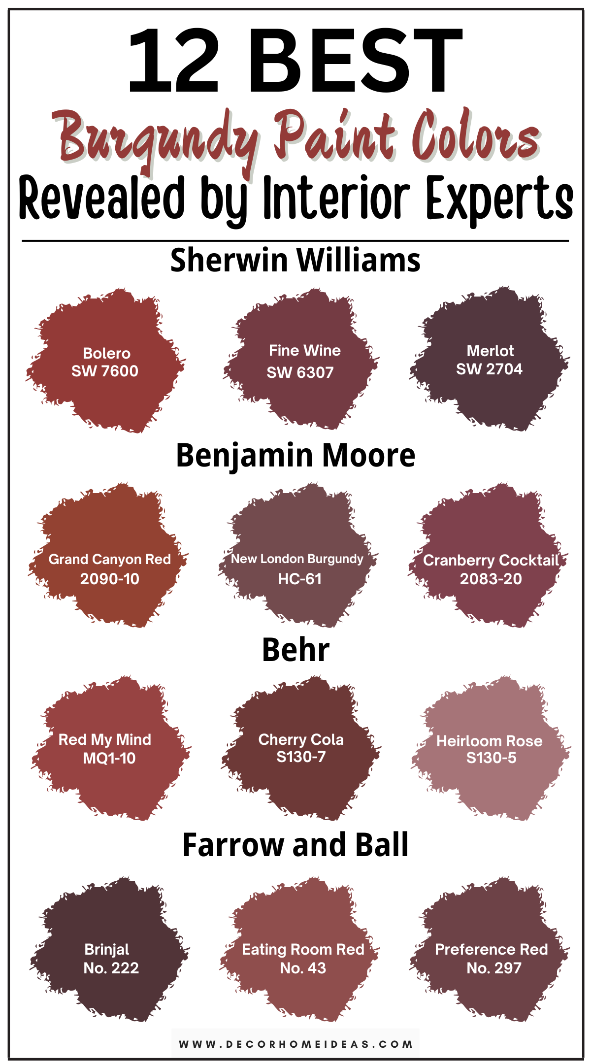
Today, we’ll explore 12 designer-recommended burgundy shades that add depth and character to your home.
But first, let’s discuss the concept of Light Reflectance Value (LRV) in paint colors. LRV measures how dark or light a paint color is on a scale of 0 to 100, with zero being absolute pure black and 100 being absolute pure white; so, keep that in mind!
1. Sherwin Williams
Sherwin Williams Bolero
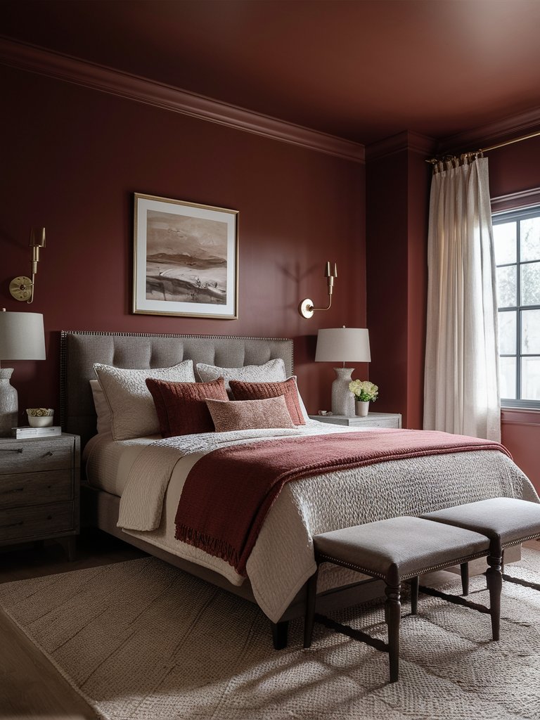
Sherwin Williams Bolero (SW 7600) is a stunning shade with vibrant red undertones that bring energy and passion into any room.
Bolero has an LRV of 9, making it ideal for spaces with abundant natural light. The rich hue is perfect for creating a bold statement on an accent wall or throughout an entire space.
Its red undertones make it ideal for rooms where you want to encourage conversation and connection, such as dining rooms or living areas.
The bold color allows for more creative flexibility, making it a favorite among designers looking to create a dynamic atmosphere.
In this bedroom design, Bolero creates a warm, cozy space perfect for relaxing after a long day. The furniture’s cool gray shades balance out the color’s warmer tones. Bedding with matching undertones creates a harmonious, while the golden metallic accents improve the space’s visual interest.
Sherwin Williams Fine Wine
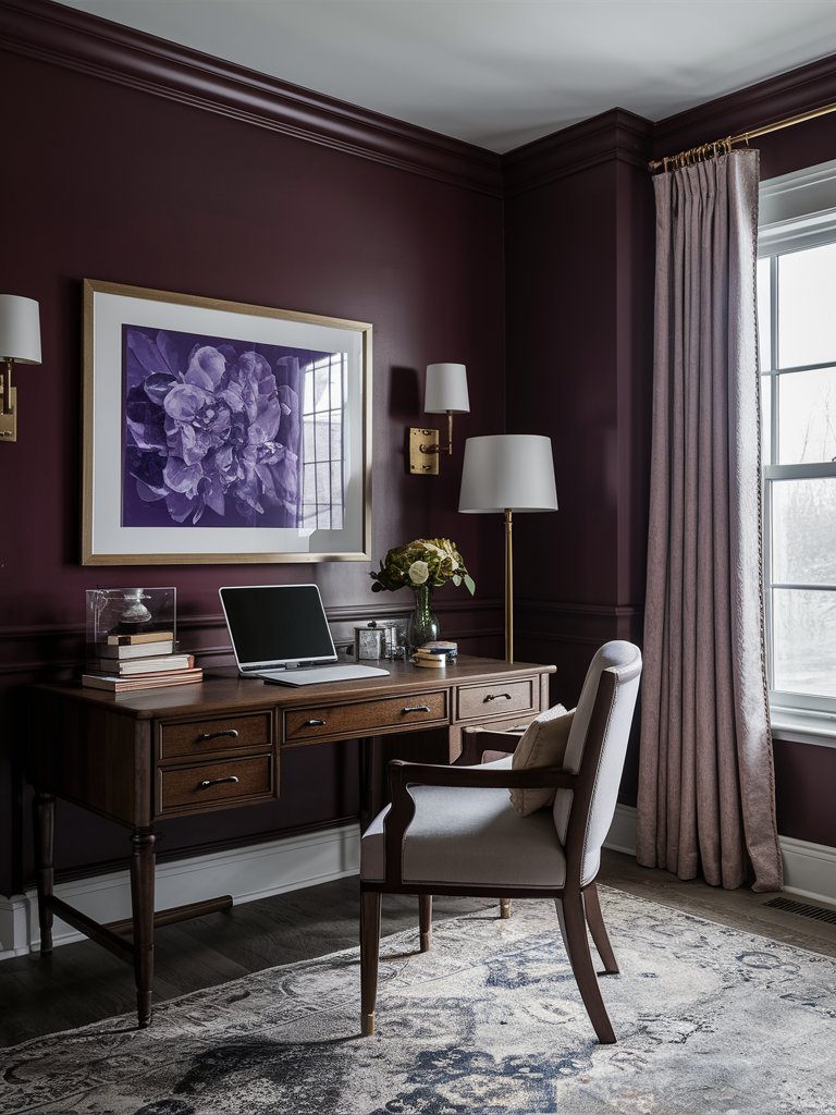
For those who appreciate the finer things in life, Sherwin Williams Fine Wine (SW 6307) offers a sophisticated take on burgundy with its subtle purple undertones. This color evokes the richness of a perfectly aged wine bottle, adding depth and elegance to any room.
Despite its low LRV of 7, Fine Wine pairs beautifully with both cool and warm tones, allowing you to create a balanced and harmonious environment.
Its purple undertones lend an air of mystery and intrigue, making it a fantastic choice for spaces where you want to inspire contemplation and relaxation.
Consider pairing Fine Wine with soft grays or creamy whites for a classic look.
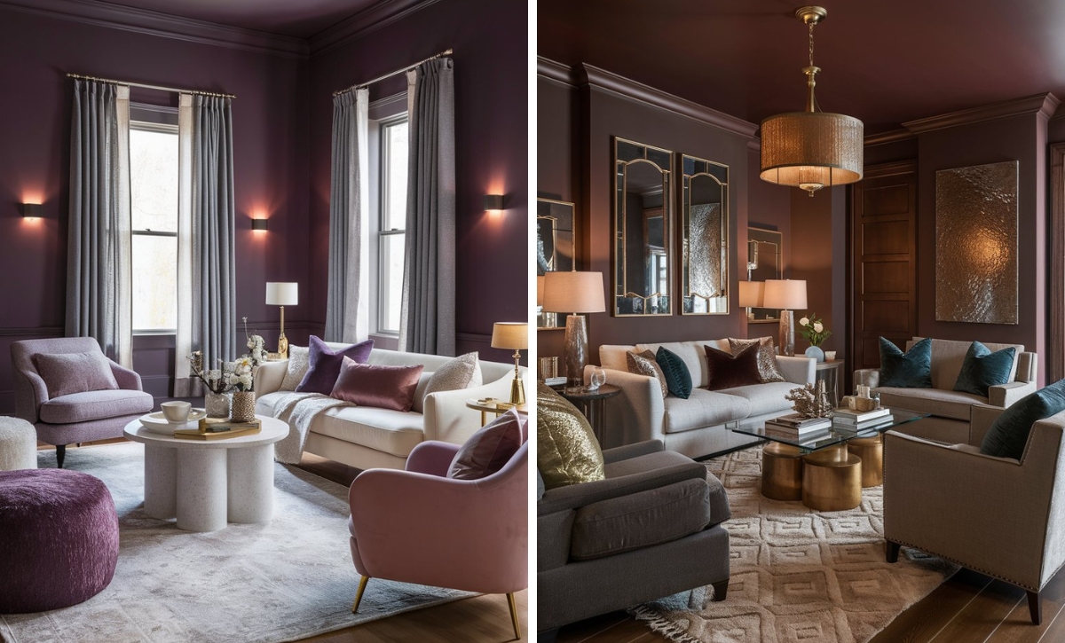
In this studying nook, Fine Wine creates a calming mode that is perfect for focusing. The color’s darker tone creates the perfect canvas and provides the much-needed contrast for the wall art. Light-toned accents balance out the space without looking too stark.
Notice how the metal and wood accents combine to give the space a grounded look.
Sherwin Williams Merlot
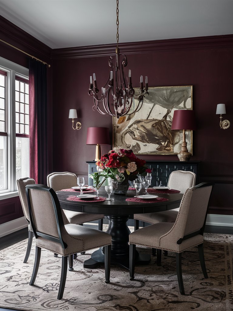
Sherwin Williams Merlot (SW 2704) brings the lush, velvety quality of its wine namesake to your walls, offering a deep burgundy hue with brown undertones.
Merlot has an LRV of 4, so it’s essential to consider the lighting in the area.
Merlot’s earthy undertones provide a sense of grounding and stability, making it an excellent choice for creating inviting and comfortable spaces. It’s also a versatile option for various rooms in your home.
Pair Merlot with crisp whites and light grays to emphasize its richness without overpowering the room—these contrasting shades offer a clean, modern look that balances the warmth of the burgundy shade. Consider incorporating textures like velvet or silk in complementary shades for a touch of opulence.
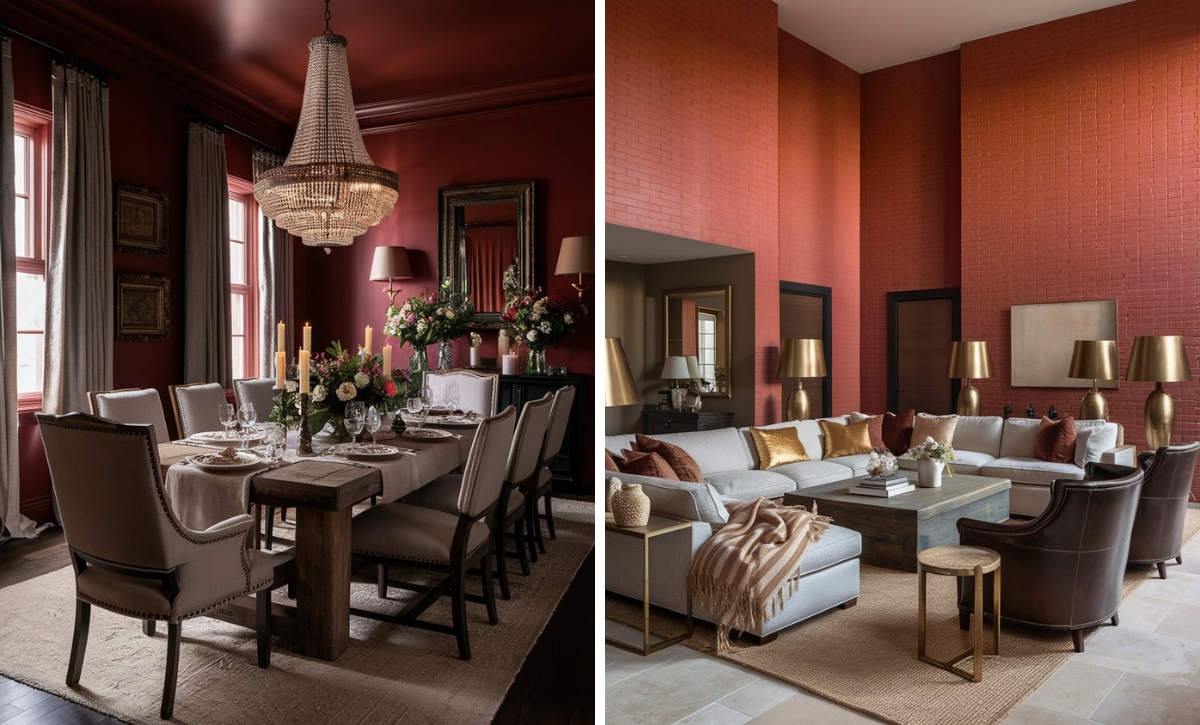
Merlot combines with light and dark tones in this dining room design to create a balanced look. Notice how it pairs with black furniture and metal accents to create a clean, classic look. Golden metallic accents and the colorful floral centerpiece add extra visual interest.
2. Benjamin Moore
Benjamin Moore Grand Canyon Red
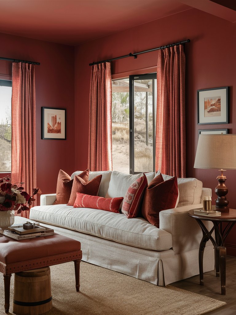
Inspired by the breathtaking beauty of one of the world’s wonders, Benjamin Moore Grand Canyon Red (2090-10) offers a warm, earthy take on burgundy with orange undertones that evoke the colors of a sunset over the canyon.
With an LRV of 11.48, Grand Canyon Red is just a tiny bit reflective, making it perfect for creating plain backdrops.
The paint color brings a welcoming, cozy vibe into your home, making it perfect for spaces where you want to encourage gathering, such as living rooms.
Grand Canyon Red can serve as a rich accent on cabinets or backsplashes. Combined with cream or ivory tones, it achieves a balanced, elegant aesthetic that feels both fresh and welcoming. Its grounding qualities make it an excellent choice for open-plan spaces.
As one of the warmest burgundy tones, Grand Canyon Red can effortlessly create a cozy vibe, as seen in this living room space. Plenty of natural light brings out the orange undertones. With a light-toned couch and a natural fiber rug, the space has the right balance of dark and light-toned colors. Wooden accents help complement and advance the cozy vibe.
Benjamin Moore New London Burgundy
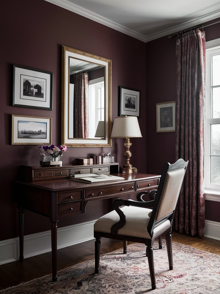
Benjamin Moore New London Burgundy (HC-61) is a versatile burgundy paint color that perfectly balances red and purple tones.
New London Burgundy has a low LRV of 9.82, which allows it to absorb light without making a room too dim or stark. Its rich tones create a sense of warmth and depth.
Its sophisticated hue makes it an excellent choice for creating an elegant dining room or formal sitting area. New London Burgundy pairs beautifully with classic whites and creams, creating a timeless and refined aesthetic.
This paint color is ideal for those looking to create a classic and timeless look.
New London Burgundy works exceptionally well with golden accents and reflective surfaces, as seen in this home office design. The color pairs with dark wood furniture that complements it, bringing an earthy aesthetic. Golden accents give the space a timeless look, while a large mirror helps maximize natural light.
Benjamin Moore Cranberry Cocktail
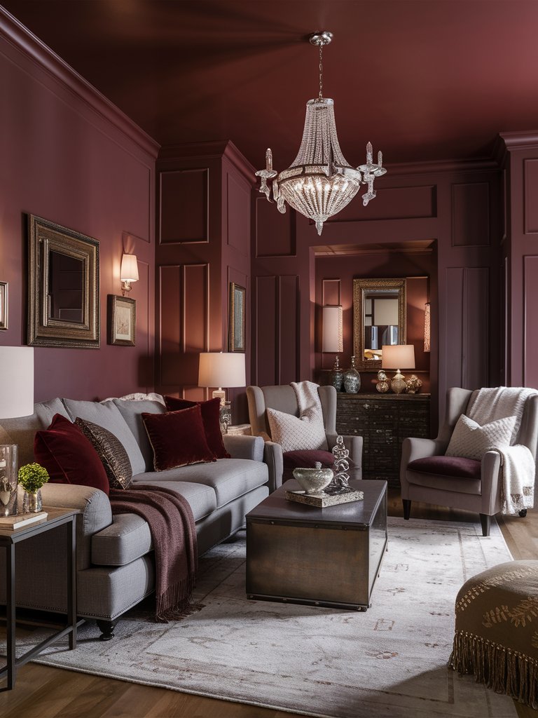
Benjamin Moore Cranberry Cocktail (2083-20) is a lively burgundy shade with pink undertones that add a touch of festive charm to your home.
Cranberry Cocktail has an LRV of 9.84, so incorporate plenty of natural light to keep the room fresh. Consider using plants to add texture and softness.
Pair this lively shade with bold patterns and contrasting colors for a modern and eclectic look. Black and white accents can help ground the space, while metallic finishes add a touch of glamor.
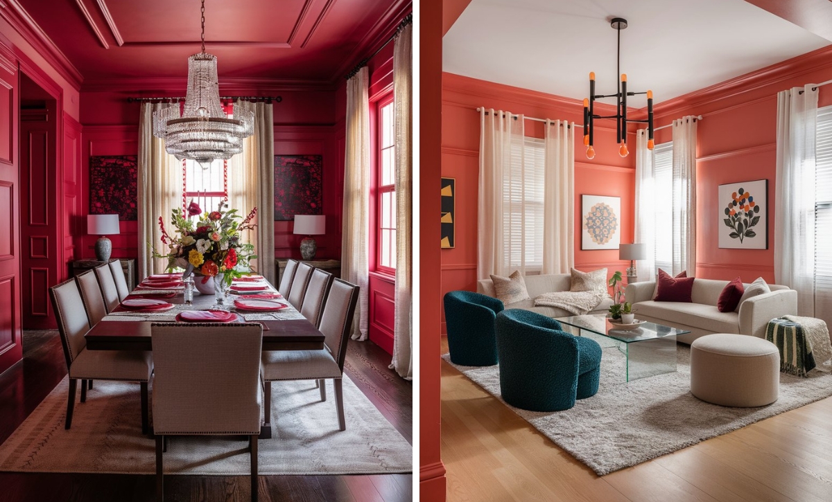
Cranberry Cocktail creates a modern, clean look in this living room space. Since the paint doesn’t reflect a lot of light, it creates a warm, cozy ambiance despite plenty of natural light. Notice how several mirrors are used to maximize the light. The burgundy velvet throw pillows give the space a sense of royalty.
3. Behr
Behr Red My Mind
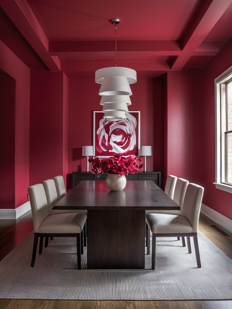
Behr Red My Mind (MQ1-10) is a striking, bold burgundy that commands attention and sets a dramatic tone.
With an LRV of 11, Red My Mind will look best in areas with plenty of natural light.
It’s ideal for accent walls or feature areas and can transform any room into a statement space. Red My Mind is particularly stunning in dining areas, where it enhances the dining experience with its deep, luxurious tone.
The paint color’s red undertones add warmth and depth, creating a cozy and inviting atmosphere.
Pair this color with stark whites or charcoal grays for a crisp and contemporary look. To add warmth, incorporate natural textures like wooden furniture or woven textiles. The contrast between these elements will soften the color’s boldness and create a balanced and inviting space.
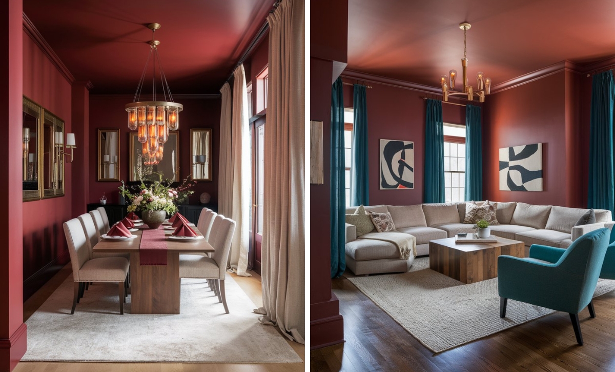
Red My Mind pairs with lighter white trims that integrate well with other elements in this space, such as the light-colored furniture, rug, and décor accents like lamps. The color provides the perfect backdrop for light and dark-toned colors; hence, it’s compatible with the light-colored seats and the dark wooden table and console table.
Behr Cherry Cola
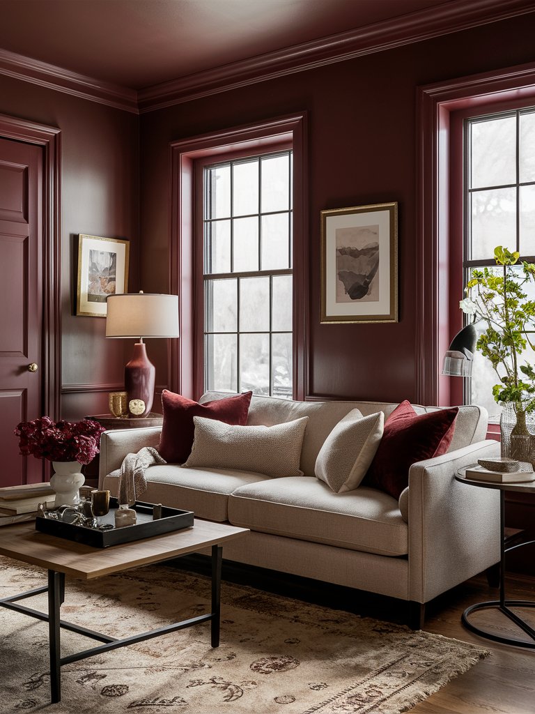
Behr Cherry Cola (S130-7) is a deep burgundy shade with purple undertones that capture the essence of a refreshing sip of its namesake drink.
Cherry Cola has a low LRV of 8, making it one of the least reflective burgundy tones; hence, it’s ideal for creating a dramatic space.
Cherry Cola’s indulgent appeal and versatile undertones make it a favorite among designers looking to create luxurious and inviting spaces. Its rich hue can be easily incorporated into various color palettes, ensuring your space remains stylish and timeless for years to come.
If you want to create a dramatic effect, Red My Mind can be used as the dominant color in a room, complemented by lighter accent pieces. Its luxurious hue can turn any space into a serene and inviting retreat.
Notice how Cherry Cola infuses this living room with character. The color’s warm undertones make it ideal for combining earthy tones, natural fibers, and materials, as noted from the rug. Since the color isn’t reflective, plenty of natural light makes the area look open and airy, while some greenery livens the space.
Behr Heirloom Rose
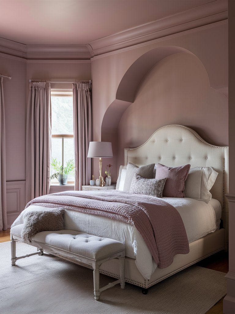
With its subtle pink undertones, Behr Heirloom Rose (S130-5) offers a unique twist on traditional burgundy. This romantic shade is perfect for creating soft, inviting spaces that exude warmth and charm.
With an LRV of 22, Heirloom Rose is one of the best burgundy tones to use if you want a lighter-toned modern take on burgundy shades.
The pink undertones in the paint color add warmth and softness, creating a welcoming and comforting atmosphere.
Pair Heirloom Rose with soft pastels like blush or lavender for a delicate and feminine aesthetic. For added sophistication, incorporate metallic accents like rose gold or brushed nickel.
Consider using Heirloom Rose in bedrooms, living areas, or dining rooms to create a romantic and timeless space.
Heirloom Rose creates a tranquil, relaxed space in this bedroom. The light flowing to the room helps bring out the color’s pink undertones while matching bedding helps create an element of cohesion. With a lighter-toned bed and subtle metallic accents, the room has an air of sophistication and chic aesthetic.
4. Farrow and Ball
Farrow and Ball Brinjal
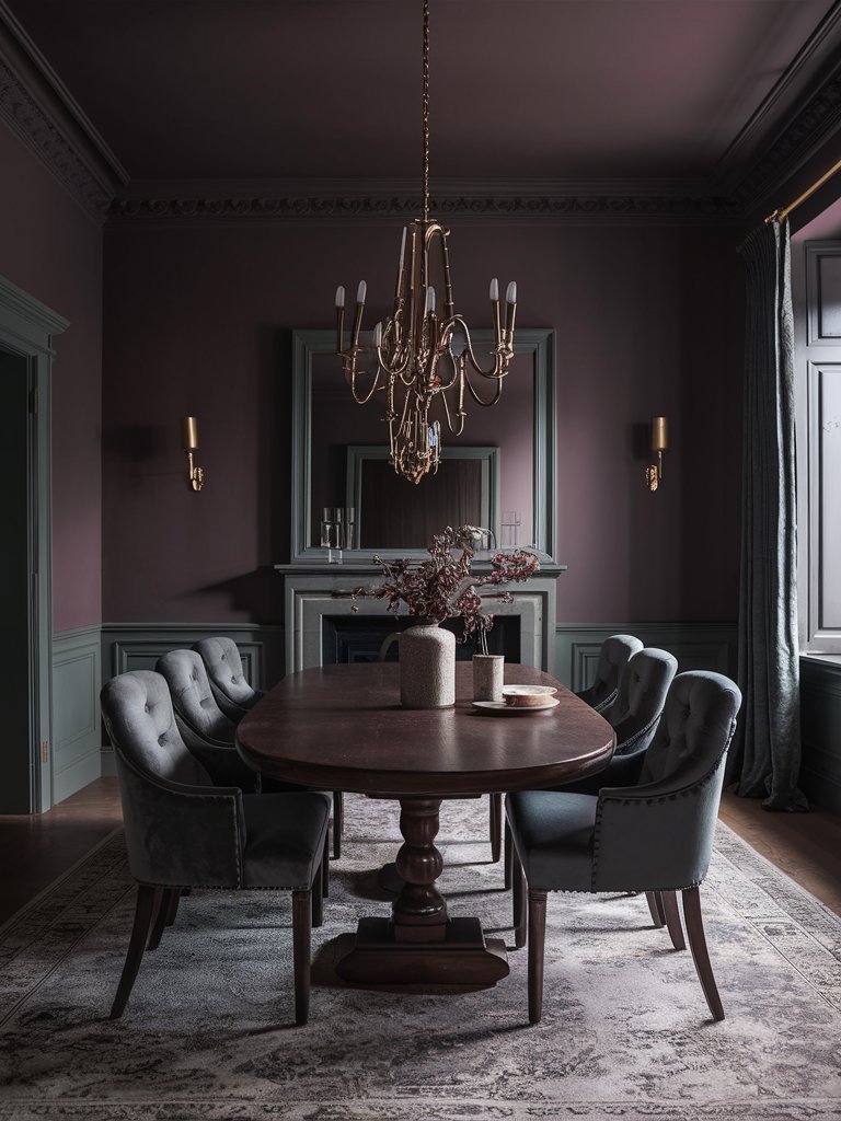
Farrow and Ball Brinjal (No. 222) is a deep, eggplant-like burgundy that brings an air of sophistication to a space.
Brinjal is a rich hue that creates a dramatic and moody atmosphere in dining rooms or libraries.
Pair Brinjal with deep greens or navy blues for a bold and cohesive palette. To add warmth, incorporate golden accents or rich, textured fabrics—these elements will enhance the color’s depth and complexity, resulting in a lavish and inviting space.
In terms of decor, its regal character pairs well with traditional furnishings and opulent textiles. Think velvet curtains and plush rugs that enhance the room’s luxurious feel.
With the right accessories, Brinjal can create a space that feels both timeless and indulgent. Notice how the paint color makes a rustic, calming space in this dining room area. It combines with other neutral tones like gray and brown to give the space a timeless look.
Farrow and Ball Eating Room Red
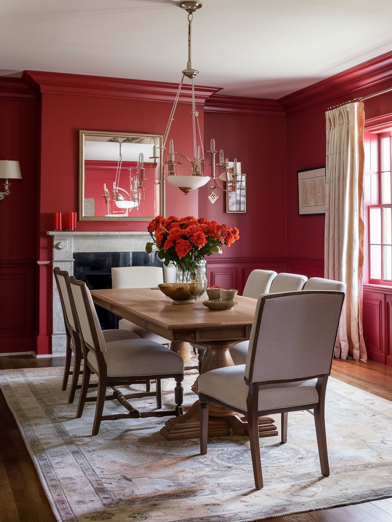
Farrow and Ball Eating Room Red (No. 43) is a classic burgundy with warm red-brown undertones. It’s an ideal paint color for those looking to create a classic and sophisticated look.
Eating Room Red’s warm undertones make it perfect for dining rooms or formal spaces where you want to foster a sense of intimacy and connection. Its timeless nature makes it a versatile choice for various styles, while its LRV of about 11 makes it ideal for areas you want to infuse with color.
Pair the paint color with traditional elements like crown molding and wainscoting to enhance its classic appeal. Use rich fabrics like velvet or brocade for a touch of luxury, and complement its warm tones with dark wood furniture.
Eating Room Red is ideally used in this dining room to create a welcoming mood. A combination of dark brown accents on the furniture and light tones on the chairs, ceiling, and trims creates a balanced look. Metallic accents add a touch of luxury, while the floral centerpiece makes the space feel homey.
Farrow and Ball Preference Red
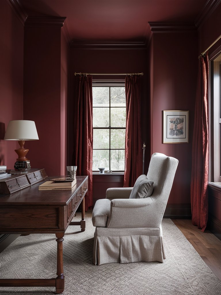
Farrow and Ball’s Preference Red (No. 297) is a bold, statement-making burgundy shade that makes your walls and surfaces scream confidence and individuality. It’s the perfect paint color for those looking to make a bold statement with their design choices.
Preference Red’s deep tones and low LRV of about 7 make it ideal for accent walls or feature areas, adding drama and depth to any room. This shade’s daring nature makes it a favorite for contemporary spaces or adding a modern twist to traditional designs.
In home offices, Preference Red promotes focus and productivity. Paired with dark wood furniture and elegant decor, it creates a professional, inspiring environment that encourages creative thinking.
As noted from this space, the paint color works incredibly well in areas with plenty of natural light to create a calm space. The color’s refined tone is also suitable for libraries or study nooks.
What Color Compliments Burgundy Paint Colors?
- Gold
- Navy Blue
- Soft Gray
- Creamy White
Gold
Gold is a warm, luxurious color that pairs beautifully with burgundy. This combination creates an opulent and regal atmosphere, adding a touch of glamour and sophistication.
Incorporate gold through decorative accessories, mirrors, or lighting fixtures to elevate the richness of burgundy and create a stunning, elegant space.
Navy Blue
Navy blue is a deep, cool shade that offers a striking contrast to burgundy. This pairing creates a bold and refined look, adding depth and a sense of classic elegance to the space.
Use navy blue in textiles, such as curtains, rugs, or throw pillows, to create a harmonious and balanced environment that complements the richness of burgundy.
Soft Gray
Soft gray provides a neutral, calming contrast to the intensity of burgundy. This combination creates a balanced and modern look, softening the boldness of burgundy while maintaining a sophisticated atmosphere.
Incorporate soft gray in larger elements like furniture, walls, or rugs to create a serene and elegant environment that enhances the warmth of burgundy.
Creamy White
Creamy white is a warm, neutral color that pairs effortlessly with burgundy. This combination creates a light, airy, and cohesive look, adding brightness while preserving the rich tones of burgundy.
Use creamy white in trim, ceilings, or larger furniture pieces to create a fresh and inviting environment that complements the depth of burgundy.
Color Disclaimer
Please note that all paint colors displayed on this page are for illustrative purposes only. Due to variations in screen settings, lighting, and other factors, the colors you see on your screen may differ from the actual paint colors. We recommend viewing a physical color sample or swatch for the most accurate representation. Some images might be generated by AI to represent paint colors in different interiors

