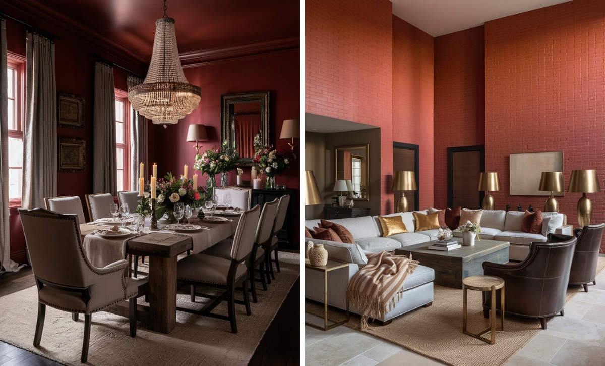
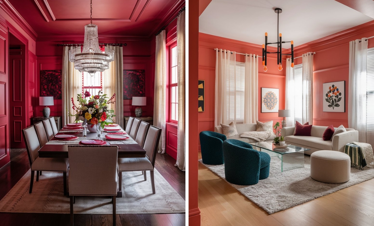
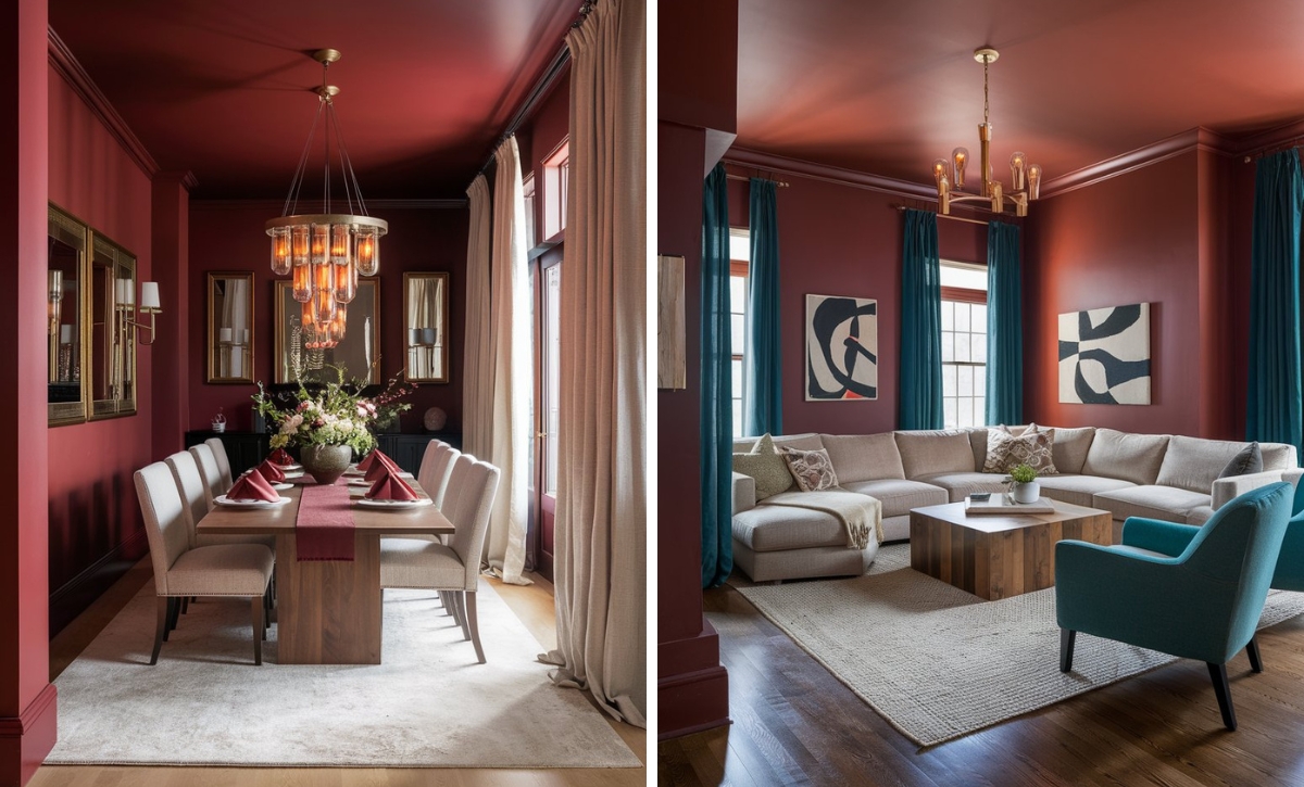
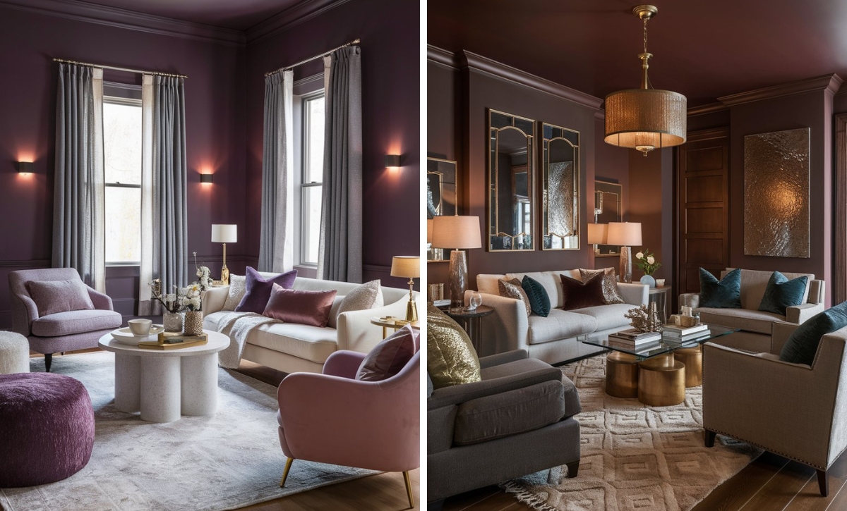
Given its high saturation and intensity, red can be a challenging paint color to add to your space. However, it can make a stylish statement and transform a space entirely when used right, and there are numerous red shades to choose from.
Among the range of shades available, crimson stands out with its striking allure and bold intensity. Depending on your room’s orientation and lighting, it can bring a deep and moody feel or a bright and energetic one.
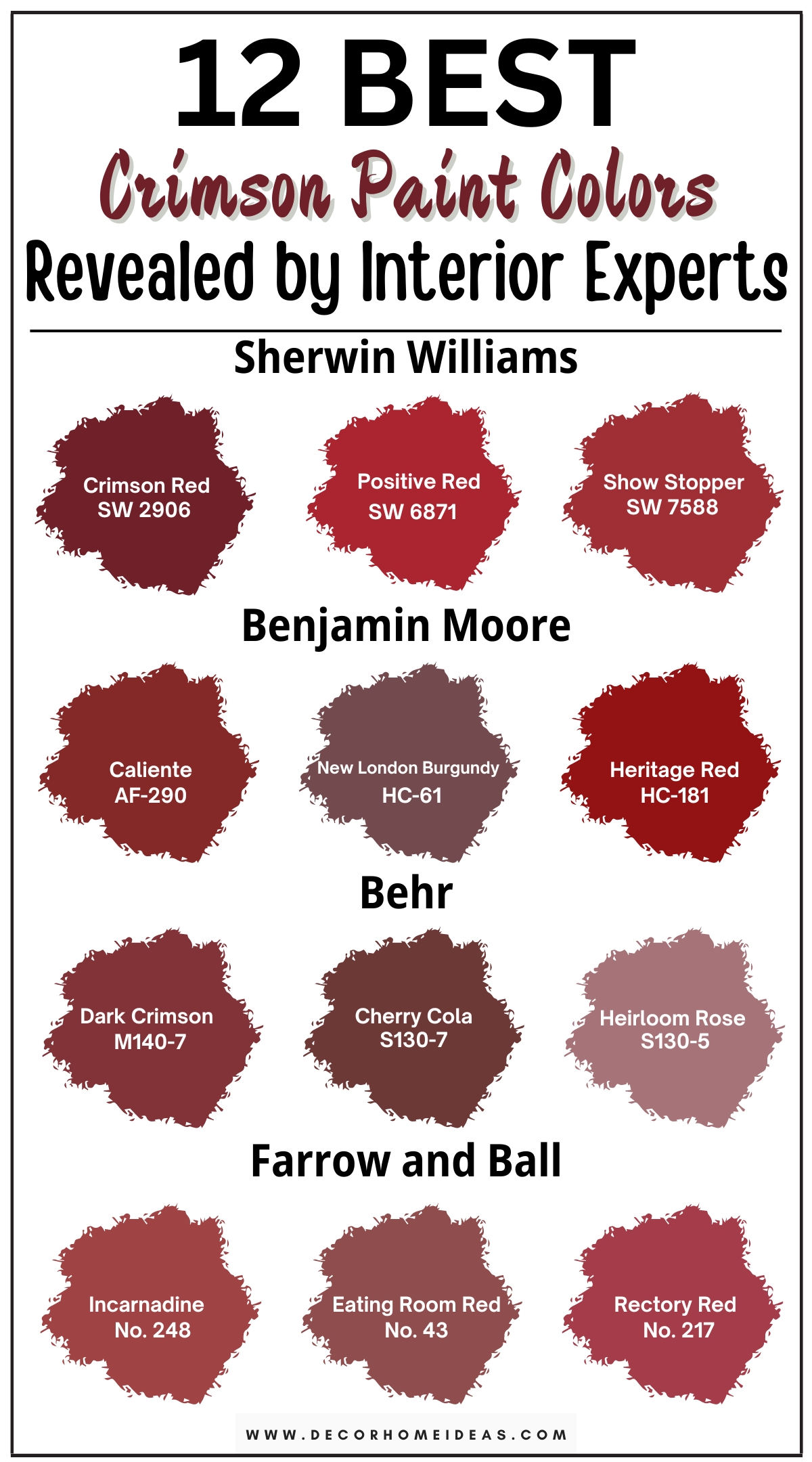
Today, we will explore 12 vibrant crimson paint colors that promise a dramatic transformation for any space.
Take a look!
1. Sherwin Williams
Sherwin Williams Crimson Red
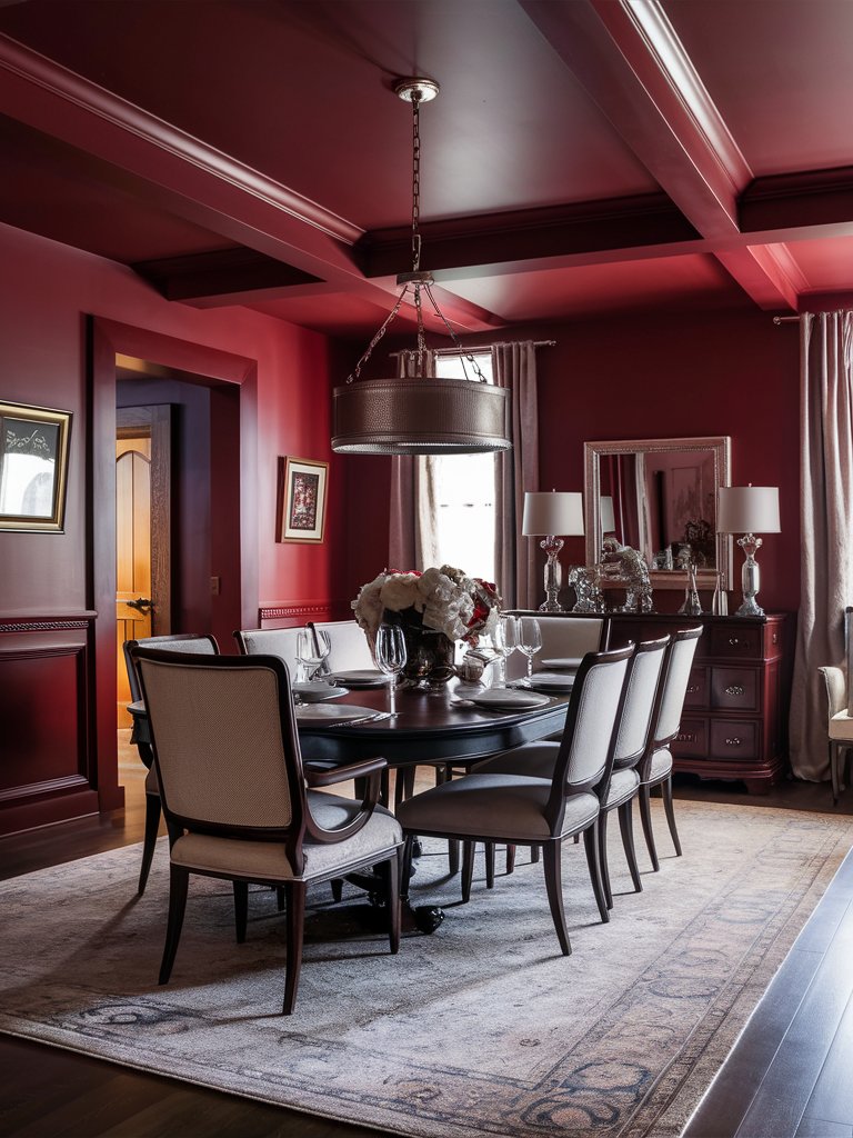
Sherwin Williams Crimson Red (2906) is a classic choice for a rich, full-bodied red. This color brings warmth and depth, perfect for creating cozy yet sophisticated spaces.
With an LRV of 4.62, Crimson Red doesn’t fade into the background but instead commands the space, regardless of the setting.
Crimson Red has blue undertones that make it veer away from the traditional fire-engine red, offering a more subdued and elegant presence.
Crimson Red can create a bold and energetic atmosphere in a bright, sunlit room. It pairs wonderfully with golds and creams for a stately look or contrasting greens for a modern twist.
Combine Crimson Red with dark wood furnishings and metallic accents for a more dramatic effect. This will add depth and sophistication to your space, making it perfect for formal dining rooms or home libraries.
In this dining room design, Crimson Red has been used as the primary color, combining seamlessly with the furniture’s cream tones and other light-toned colors, such as the curtains. Notice how reflective elements like glass, mirrors and metallic accents maximize natural light and improve the room’s illumination.
Sherwin Williams Positive Red
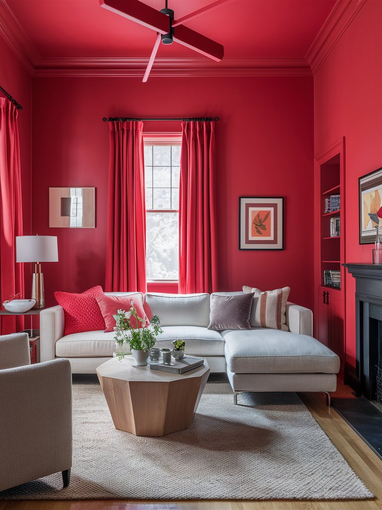
Sherwin Williams Positive Red (6871) is an energetic and uplifting hue that can breathe life into any space.
With an LRV of 11, Positive Red is still considerably vibrant.
The vibrant shade features bright red undertones with a hint of orange, giving it a lively and cheerful vibe. It’s an excellent choice for areas where you want to encourage conversation and creativity, such as kitchens or playrooms.
Positive Red bursts forth with vibrancy in south-facing rooms with plenty of natural light, infusing them with a lively spirit. The warm undertones become more apparent in such spaces, creating a welcoming and stimulating environment.
This shade can appear slightly muted in north-facing rooms with limited natural light, offering a subtle and sophisticated charm.
Consider pairing it with crisp whites or soft creams to make the most of Positive Red. These colors will highlight its vibrancy while maintaining a balanced and harmonious look.
Positive Red exudes a charming, vibrant vibe in this living room design due to plenty of natural light flowing into the space. The paint color has been combined with light-toned colors such as cream and beige, while similar toned accents on the sofa help tie the space together.
Sherwin Williams Show Stopper
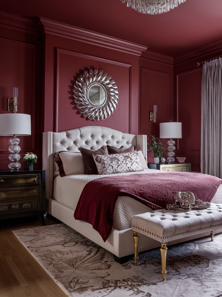
True to its name, Sherwin Williams Show Stopper (7588) is a bold, attention-grabbing hue that commands the spotlight. It’s ideal for making a statement in entryways, dining rooms, or feature walls.
With an LRV of 10, Show Stopper isn’t that reflective, and its muted feel allows light tones in space to become prominent.
It has deep red undertones and hints of magenta that help create a sense of drama and sophistication in any space.
Show Stopper is ideal for adding a touch of luxury to bedrooms or living rooms where you want to create a serene and intimate setting. Pair it with metallic accents or deep blues for a truly opulent feel.
In this bedroom, Show Stopper has been used to bring a calm, tranquil feel to the space. The color’s warm tone allows it to easily combine with earthy accents such as brown used on the beddings. Reflective accents such as mirrors and shiny metals have complemented the color and added visual interest.
2. Benjamin Moore
Benjamin Moore Caliente
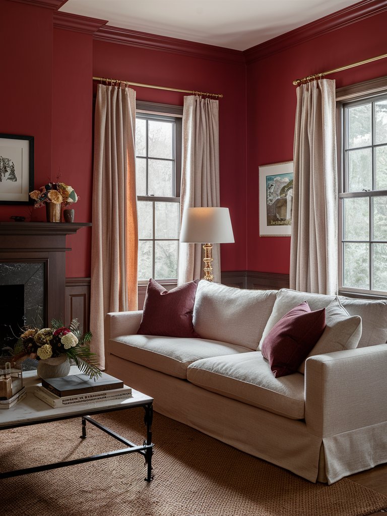
Benjamin Moore Caliente (AF-290) is a vibrant crimson with a touch of orange undertone. This color radiates energy and passion, making it ideal for spaces where creativity and enthusiasm are desired.
Caliente has an LRV of 6.7.
Caliente’s warmth makes it an excellent companion for earthy tones and natural materials. It complements wooden textures beautifully, enhancing their natural beauty while appearing as a feature color.
In north-facing lighting, this shade transforms into a deeper, more sophisticated hue, ideal for creating cozy and intimate settings. In south-facing rooms, Caliente reveals its full richness, with the warm undertones creating an inviting and enveloping atmosphere.
Notice how Caliente seamlessly combines earthy tones to create a well-rounded space. A touch of bright tones, such as the paint color, light tones of the furniture, and earthy tones, such as the rug and the baseboards, balance out the space.
Plenty of natural light brings out the color’s warm tones, making the room more cozy.
Benjamin Moore New London Burgundy
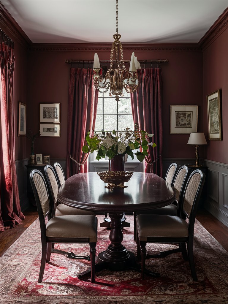
Benjamin Moore New London Burgundy (HC-61) offers a more restrained approach to crimson for those who prefer a sophisticated and timeless look.
This deep, muted red with purple undertones exudes elegance and refinement, perfect for traditional or formal settings.
New London Burgundy is a natural fit for traditional and vintage-inspired interiors. It pairs nicely with antique furnishings, classical moldings, and rich fabrics like velvet and brocade.
New London Burgundy develops a cozy, enveloping quality in low-light environments, making it a superb choice for libraries or home offices.
Even though it has an LRV of about 9.82, this paint can feel much darker.
Being one of the dark-toned crimsons, this color thrives in plenty of natural light, like in this dining room space, where the color creates a traditional themed dining area.
Notice how the color absorbs most of the light falling into the space, creating a calm, relaxed atmosphere. The wooden accents and furniture combine seamlessly with the space, while the crimson-colored carpet complements the space’s primary color.
In south-facing rooms or rooms with eastern morning light, New London Burgundy reveals its rich, luxurious tones, with the purple undertones adding a touch of elegance.
In north-facing rooms or rooms with western afternoon sunshine, the color takes on a darker, more intimate feel, perfect for a cozy and inviting space.
Benjamin Moore Heritage Red
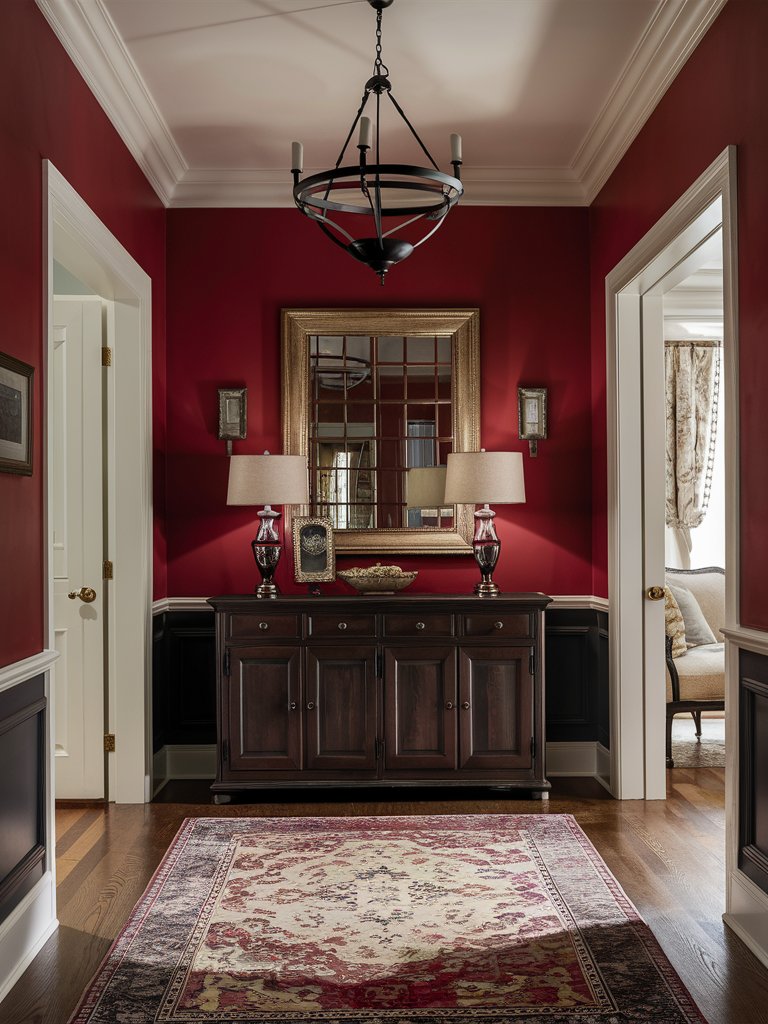
A classic crimson with a timeless appeal, Benjamin Moore Heritage Red (HC-181) boasts warm, earthy undertones.
With an LRV of 10.26, Heritage Red is one of the more saturated crimsons. This makes it ideal for creating a dramatic focal point.
Heritage Red looks stunning on front doors or as exterior accents, where its boldness can make a memorable impression. Inside, it pairs beautifully with vintage decor and antique furniture, enhancing a space with its historic charm.
In the evening light, the richness of Heritage Red is accentuated, offering a cozy and inviting atmosphere.
Combine Heritage Red with warm wood tones and neutral accents to create a balanced and harmonious look. This combination makes the color shine while maintaining a cohesive and inviting aesthetic. Whether used in bold strokes or subtle accents, Heritage Red brings a touch of warmth and charm to any space.
Here, Heritage Red creates a clean, luxurious space that adds a vibrant edge. Notice how the color combines with vintage accents like the console table, lamps and chandelier, bringing out their beauty and enhancing the space’s look. The lighter-toned trims and ceiling color balance out the space, while the large mirror on the wall helps maximize the light.
3. Behr
Behr Dark Crimson
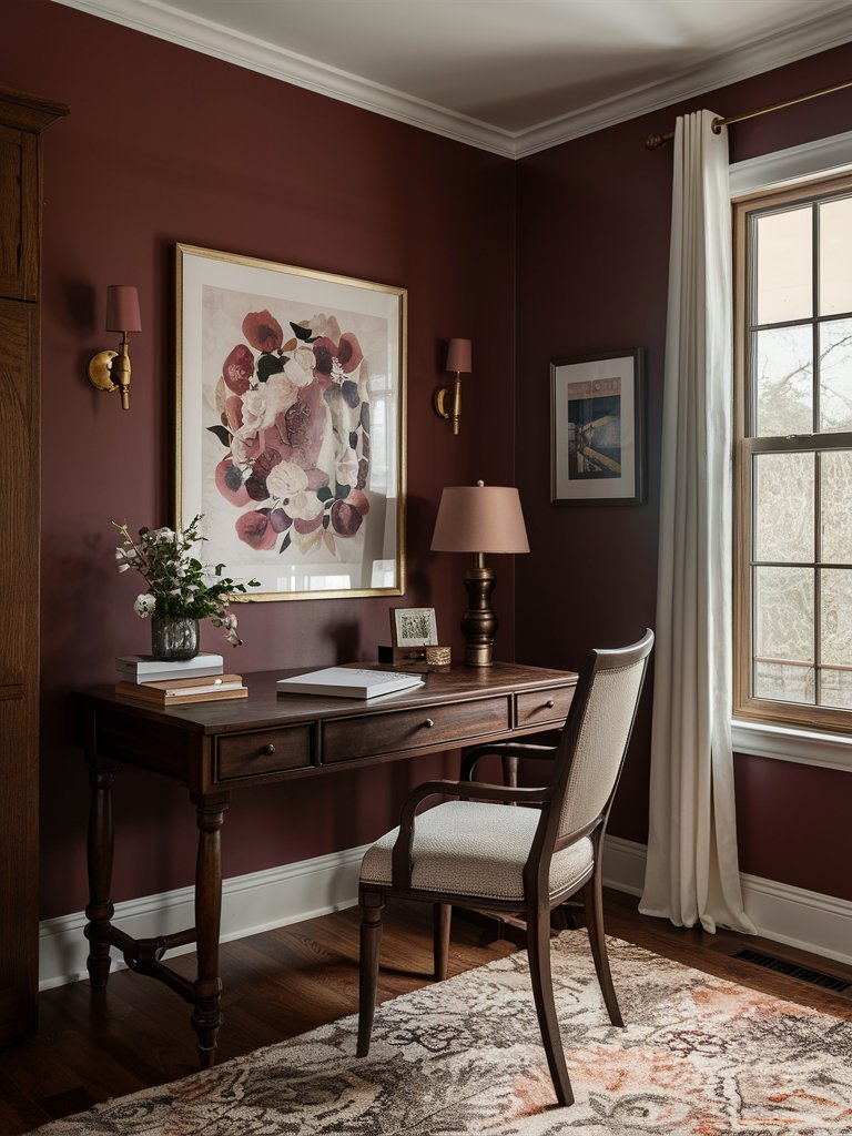
Behr Dark Crimson (M140-7) is a sultry and enigmatic shade that brings a touch of drama to any space.
With its deep, moody undertones and an LRV of 9, Dark Crimson is all about making bold design choices.
In well-lit rooms, Dark Crimson showcases its depth and complexity, making it a stunning backdrop for artwork or statement furniture. It’s a captivating choice for feature walls or accent areas where drama is desired.
In moderately lit rooms, the paint color takes on a sultry and luxurious feel, perfect for intimate settings.
Pair Dark Crimson with warm neutrals and textured fabrics to enhance the room’s comfort and sophistication. This allows the color to shine while maintaining a balanced and cohesive look. Deep blacks and charcoals can enhance its depth, adding a layer of sophistication to your decor.
In this study space, Dark Crimson creates a captivating backdrop that acts like a blank canvas for the light accents, such as the wall art to dominate the space. It combines well with the room’s wooden furniture and metallic accents. With plenty of natural light, the paint creates a calm mood enveloping the whole space.
Behr Cherry Cola
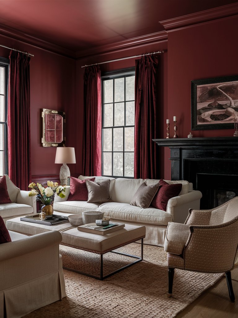
If you’re seeking a playful yet rich shade of crimson, Behr Cherry Cola (S130-7) will provide you with a delightful balance of warmth and vibrancy. It’s a deep-toned crimson, almost leaning toward maroon.
Cherry Cola has an LRV of 8, and its brown undertones evoke the inviting charm of its namesake.
Cherry Cola works particularly well in dining rooms or kitchens, where its cheerful undertones add a sense of joy and vitality.
In bright lighting, Cherry Cola reveals its playful side, while in shaded areas, it exudes a cozy warmth, inviting conversation and connection.
In this space, Cherry Cola combines well with golden and black accents to create a living room with a luxurious feel. Since the color is light absorbent, it absorbs most of the natural light, eliminating any stark feeling. Light-toned furniture lightens up the space, creating a balanced, harmonious look.
Behr Heirloom Rose
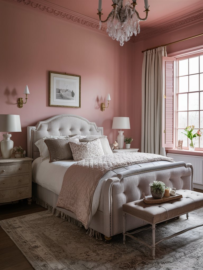
Behr Heirloom Rose (S130-5) presents a softer approach to crimson, with pinkish undertones that lend a touch of romance and femininity.
This shade is perfect for creating gentle, welcoming spaces that feel light and airy.
Heirloom Rose has an LRV of 22, making it one of the most reflective crimson paint colors on this list. It can be used for nurseries or bathrooms, where its gentle hue can create a calming and serene atmosphere.
It appears almost pastel in bright sunlight, while in lower light, it takes on a more muted and versatile tone. This makes it an excellent backdrop for soft furnishings and floral patterns.
In this bedroom, Heirloom Rose creates a delicate, calm look for the space. Due to its reasonably high LRV, the paint color reflects a generous amount of light, creating an airy feel. The space creates a clean, welcoming atmosphere with lighter-toned beds, beddings and furniture, making it the ideal place to lay down and wind down after a hard day.
4. Farrow and Ball
Farrow and Ball Incarnadine
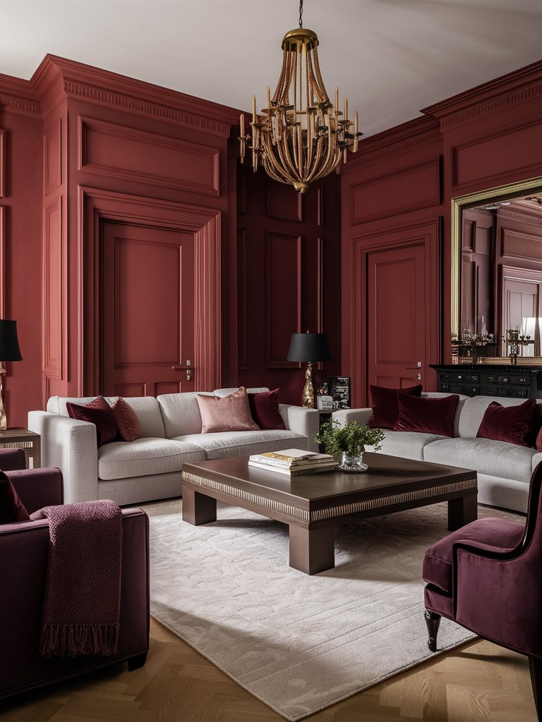
Farrow and Ball Incarnadine (No. 248) offers a rich and dramatic crimson hue with a touch of historical charm.
With its deep red undertones and subtle hints of brown, this shade evokes a sense of luxury and elegance.
Incarnadine’s rich undertones come to life in natural light, creating a sense of depth and dimension.
Consider pairing it with classic elements like dark wood furniture or brass accents to make the most of Incarnadine. This approach enhances the color’s timeless appeal, creating a cohesive, elegant design that stands the test of time.
The paint color will look best in areas with plenty of natural light.
Incarnadine brings a stylish, luxurious feel to this living room design, combining dark and light tones to create a balanced, well-thought-out space. The color’s matte look allows other elements, such as the light-toned furniture, to dominate. Maroon and crimson accents, such as throw pillows, create a well-rounded look, while the dark-toned accents help add some drama.
Farrow and Ball Eating Room Red
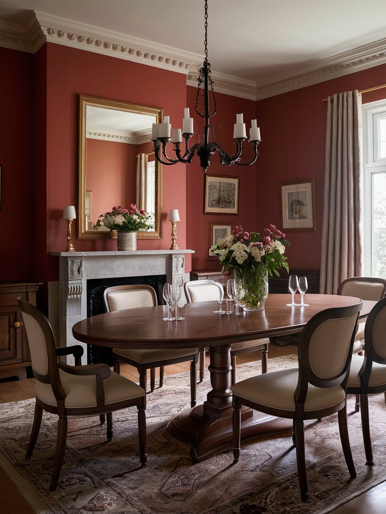
As the name suggests, Farrow and Ball Eating Room Red (No. 43) is a color designed to enhance dining spaces. This warm and inviting crimson with earthy undertones creates a cozy and welcoming atmosphere perfect for shared meals and gatherings.
Eating Room Red creates a sense of warmth and hospitality, and this is what makes it perfect for dining rooms or kitchens. Pair it with soft neutrals or natural wood finishes for a harmonious and cozy look.
This paint color has been applied to this dining room to create an inviting space that’s airy enough but still maintains some coziness. The wooden furniture and accents help enhance this coziness, while lighter tones provide some contrast and help create balance. A mirror maximizes light flowing in the space.
Farrow and Ball Rectory Red
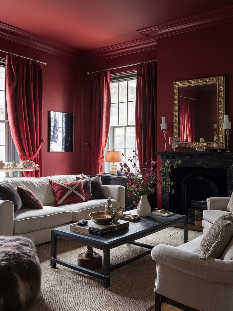
Farrow and Ball Rectory Red (No. 217) is a vibrant, dynamic shade that exudes energy and passion.
With its bright red hue and subtle orange undertones, Rectory Red creates a lively and inviting atmosphere.
Rectory Red is perfect for spaces where you want to create a sense of playfulness and creativity, such as playrooms or home offices. It’s also excellent for creating striking feature walls or accenting architectural details.
It pairs well with modern and traditional decor, offering versatility across design styles. Consider pairing it with light tones and natural materials for a warm and inviting feel.
Rectory Red has been used to create a vibrant traditional living room design. It combines with other darker-toned accents, such as black and brown, and light-toned elements, such as the furniture and rug, to make the space more inviting. Several mirrors bounce off light around the space to make the room feel more expansive.
What Color Compliments Crimson Paint Colors?
- Charcoal Gray
- Soft Pink
- Gold
- Deep Navy
Charcoal Gray
Charcoal gray is a deep, neutral shade that offers a sophisticated contrast to the boldness of crimson. This pairing creates a modern and elegant atmosphere, adding depth and balance to the space.
Use charcoal gray in larger elements like furniture, accent walls, or rugs to create a sleek and harmonious environment that complements the richness of crimson.
Soft Pink
Soft pink provides a gentle, romantic contrast to the intensity of crimson. This combination adds warmth and softness, creating a balanced and inviting look.
Incorporate soft pink through textiles, such as throw pillows, curtains, or bedding, to introduce a delicate and soothing element that enhances the boldness of crimson.
Gold
Gold is a warm, metallic color that adds a touch of luxury and glamour to crimson. This combination creates a rich and opulent atmosphere, perfect for making a bold statement.
Add gold accents through lighting fixtures, decorative accessories, or mirrors to elevate the richness of crimson and create a luxurious, sophisticated look.
Deep Navy
Deep navy is a rich, cool color that contrasts beautifully with crimson. This pairing creates a dynamic and elegant look, adding depth and a touch of classic sophistication to the space.
Use deep navy in textiles, artwork, or furniture to create a striking visual impact that complements the intensity of crimson.
Color Disclaimer
Please note that all paint colors displayed on this page are for illustrative purposes only. Due to variations in screen settings, lighting, and other factors, the colors you see on your screen may differ from the actual paint colors. We recommend viewing a physical color sample or swatch for the most accurate representation. Some images might be generated by AI to represent paint colors in different interiors

