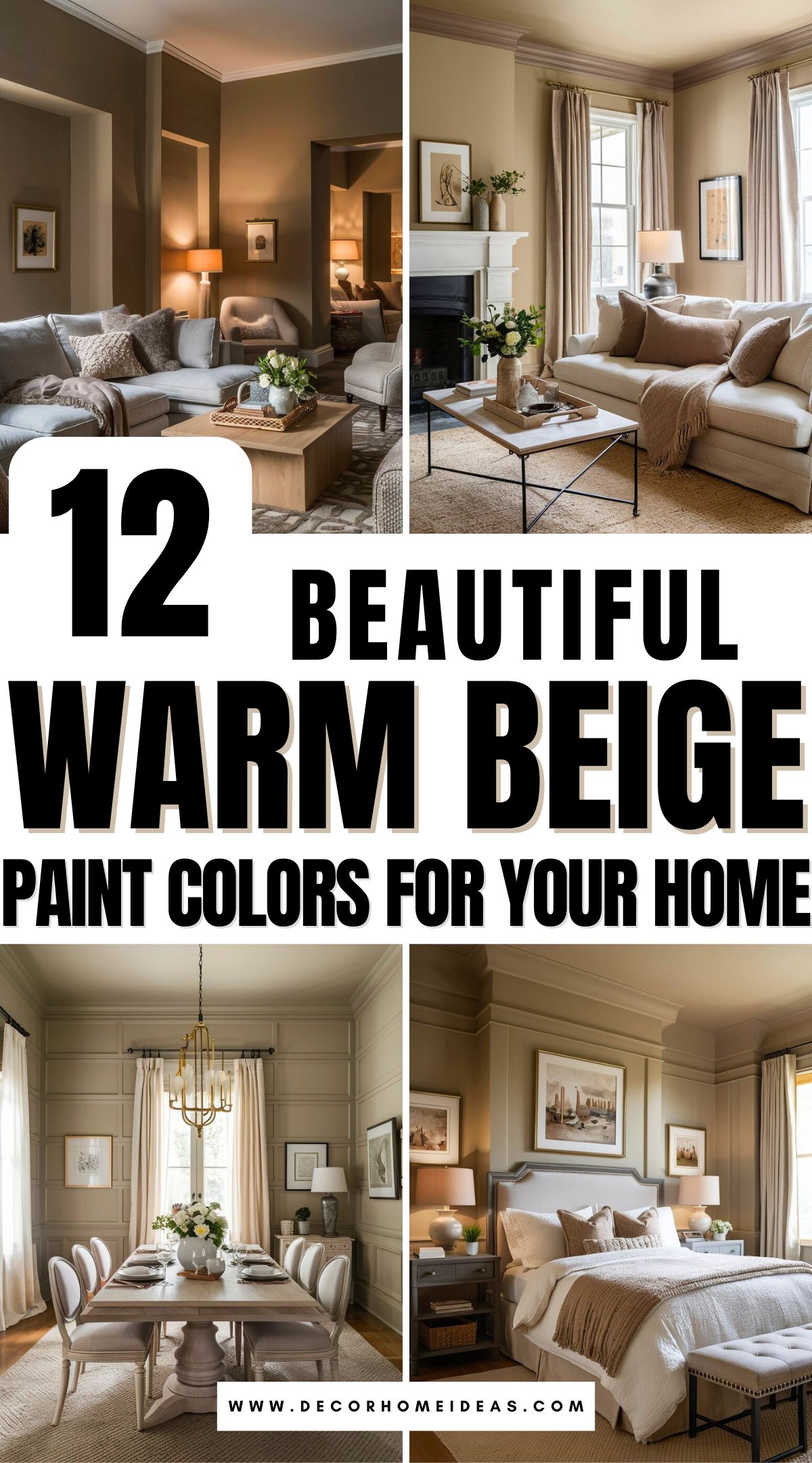
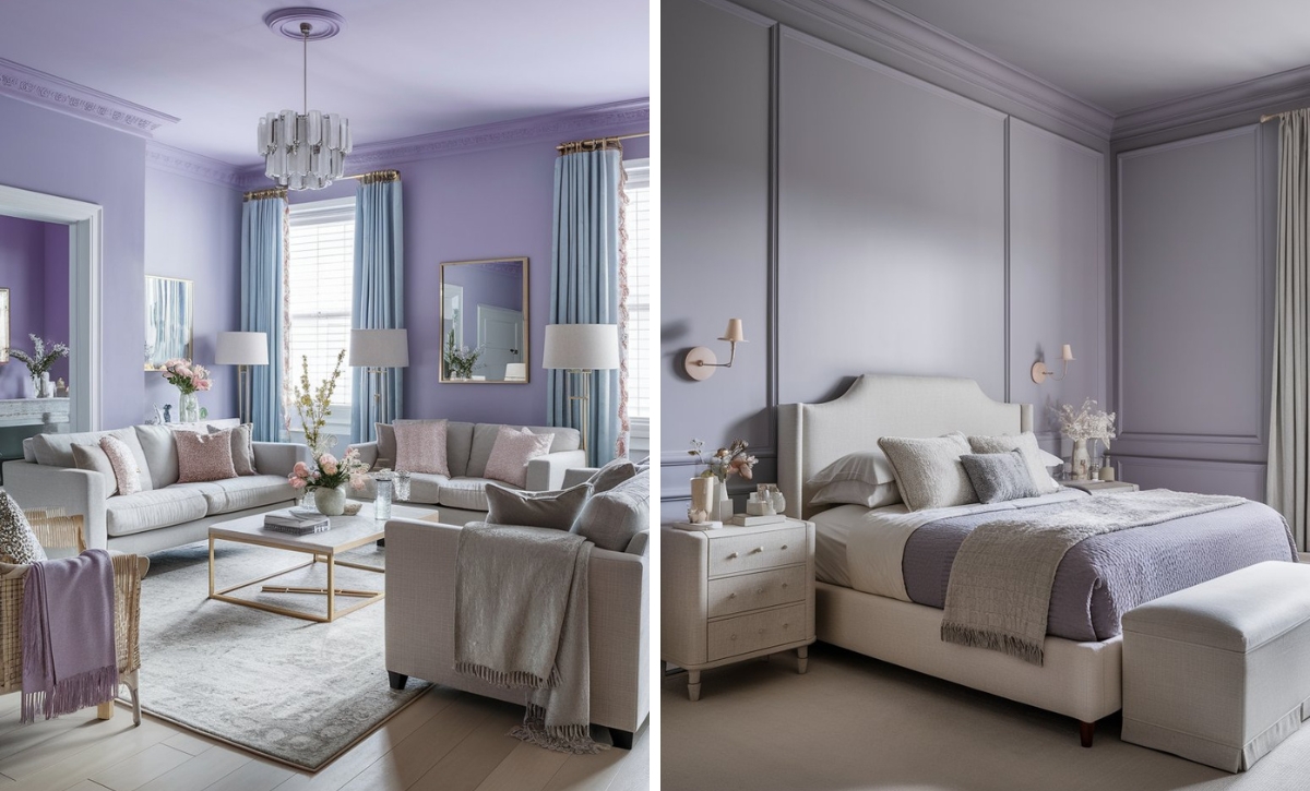
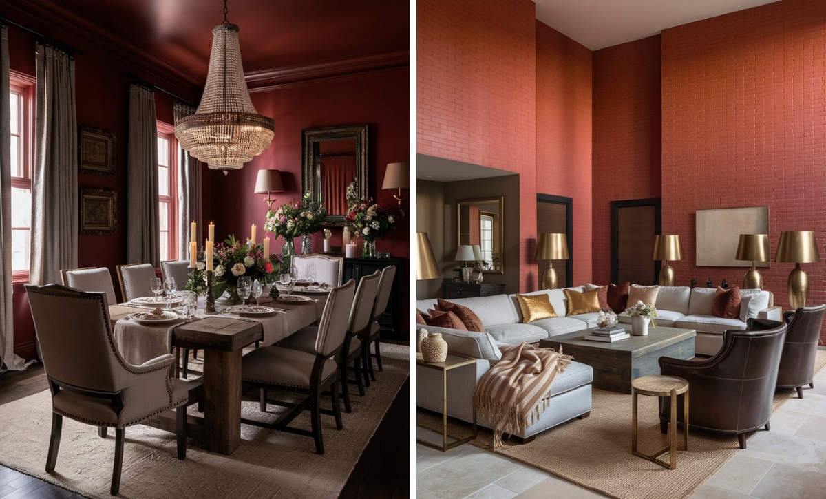
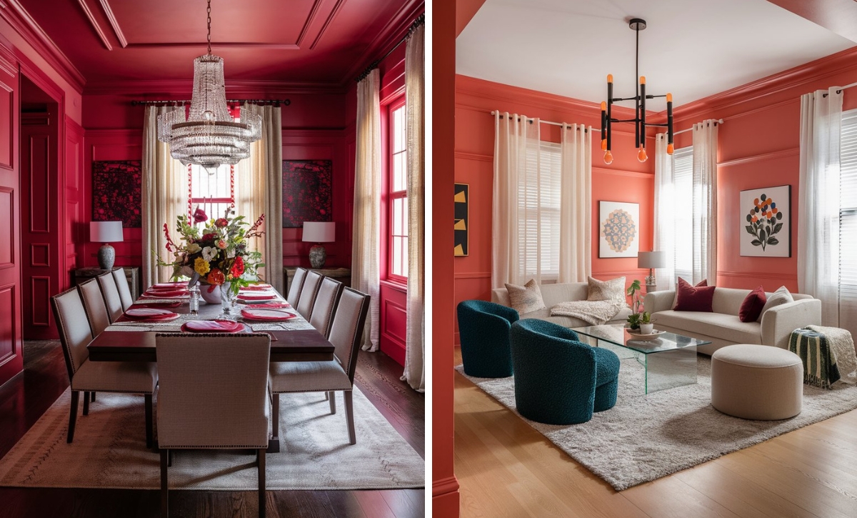
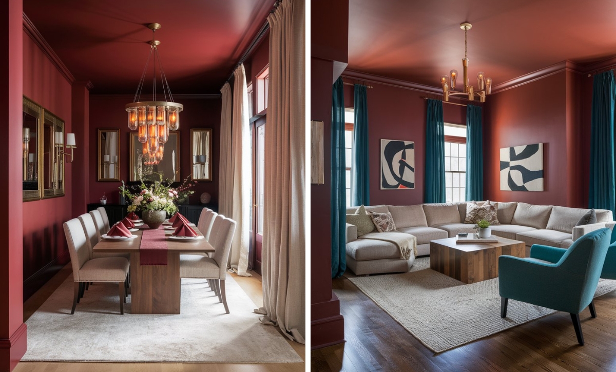
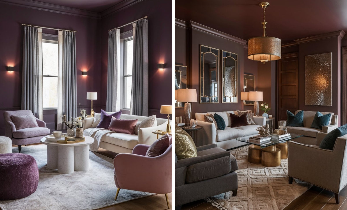
Beige has had quite a difficult time in interior design, with its reputation being tarnished by developers and builders who can’t seem to choose the right beige shade when giving paint color recommendations to homeowners.
As such, you’ll often hear words such as flat, dull, and unattractive being associated with beige. But this doesn’t have to be the case. In fact, beige has proven to be a very versatile shade that stands the test of time.
The only trick for achieving glamorous beige walls is understanding the paint color’s undertones. This isn’t a small feat either, but that’s where we come in!
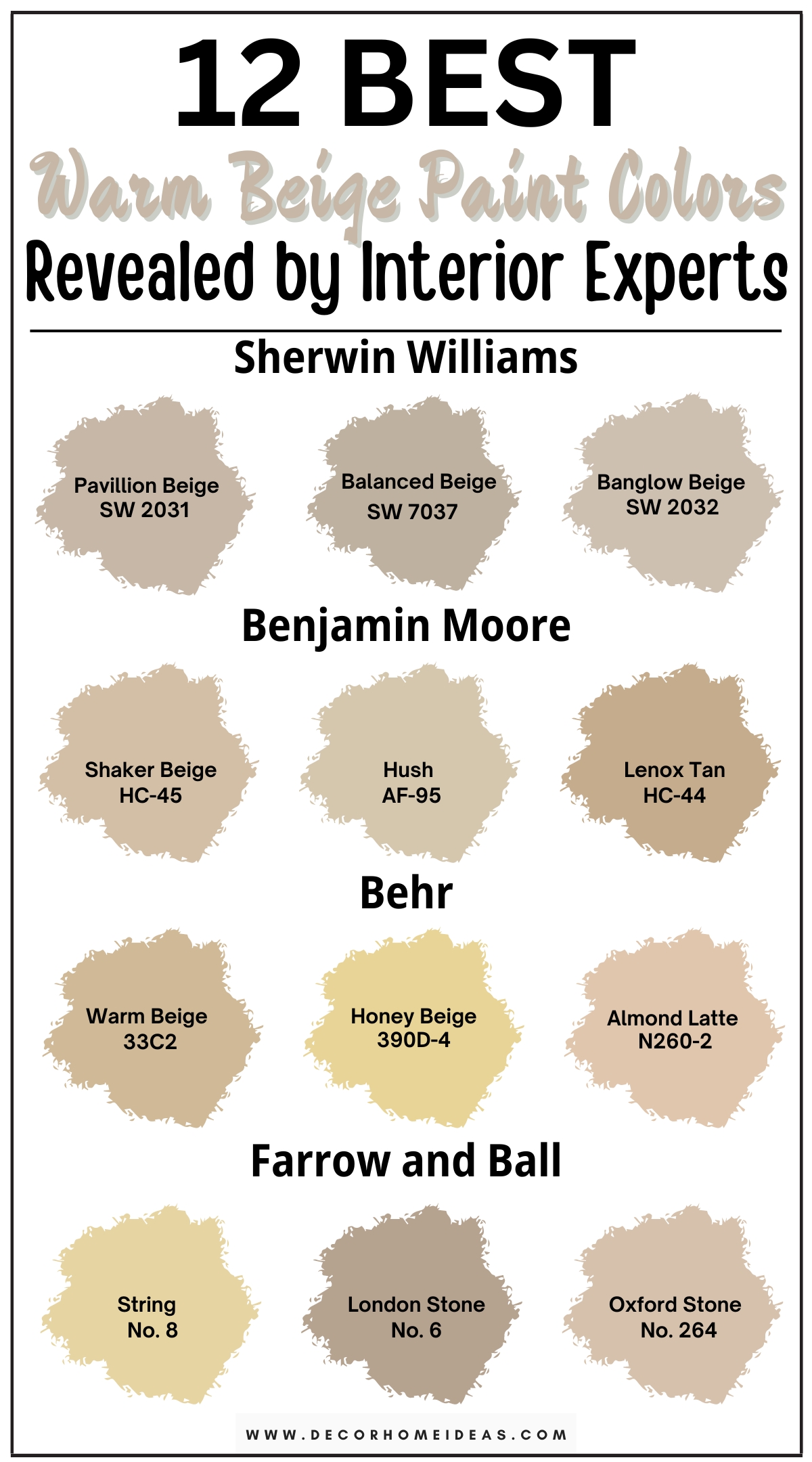
We’ve compiled some of the best warm beige paint colors recommended by interior designers to bring an airy yet warm backdrop.
Take a look!
1. Sherwin Williams
Sherwin Williams Pavilion Beige
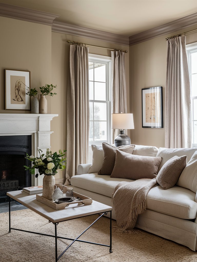
If you want a beige with a bit more commitment that suits your home’s finishes, Sherwin Williams Pavilion Beige (7512) is your paint color.
This beige-gray shade embodies a sense of refinement and class. Its stony aspect rounds out what could be your average gray and makes it feel sharp, warm, and grounded.
Pavilion Beige has an LRV of 48, but it’s still considered a light-medium, depth paint color. Since it’s a warm neutral in the light-medium spectrum, the paint color may appear a bit drab or flat if your room doesn’t have sufficient natural or artificial light.
Luckily, you don’t have to worry about it being washed out in well-lit areas.
Pavilion Beige doesn’t lean more toward its orange-pink undertones like most of today’s beiges. It caters to a very subtle yellow undertone—it’s actually barely noticeable!
The paint color suits various interior finishes and looks lovely on kitchen cabinets—its added depth makes it flexible with numerous coordinating wall paint colors, unlike off-white or light warm neutrals that don’t leave much room to maneuver.
In north-facing or flatter east-facing light, Pavilion Beige is an excellent choice to add passive warmth to your rooms. However, ensure your rooms have ample lighting, or your walls will look drab and flat.
In south-facing light or western afternoon sunshine, the paint color leans more into its warmth and might even exhibit a touch of yellow.
Here, Pavilion Gray on the walls and ceiling blends harmoniously with browns, beiges, and creams on the area rug, furniture, curtains, fireplace, and décor accents for a cohesive look. Using a more darker beige on the crown molding is an excellent way to create contrast while maintaining a seamless transition between the walls and ceiling.
Sherwin Williams Balanced Beige
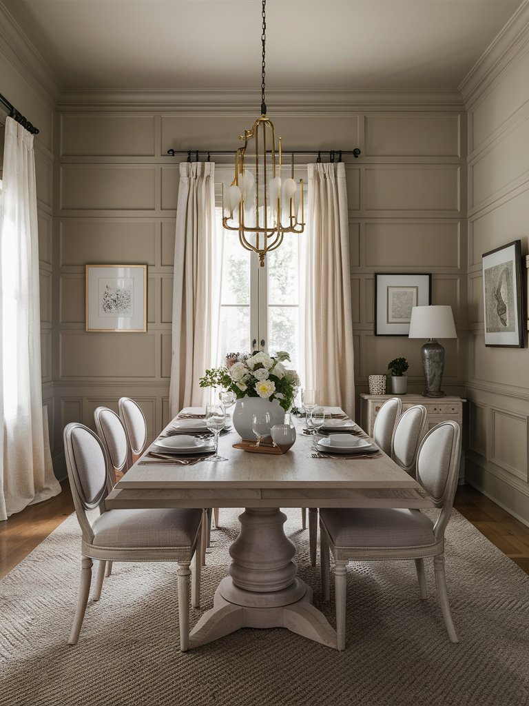
Sherwin Williams Balanced Beige (7037) shares the same color profile with SW Accessible Beige, but it’s only a shade darker. It’s a mid-tone warm beige paint color with a cool warmth and subtleness.
With an LRV of 46, Balanced Beige sits on the medium darker end of the scale. If you plan on using Balanced Beige on all the walls in your room, ensure ample natural light to make the color look light and airy instead of dingy and flat.
Balanced Beige is a warm, true beige color with gray undertones. It has very few orange and yellow undertones, and the gray undertone can make the color look relatively muted or subdued, as well as blissful at all times.
This gray undertone also qualifies Balanced Beige as a modern beige color. Notice how the gray chairs and area rug in the above dining room bring out that gray undertone of Balanced Beige. Using the paint color on walls, the ceiling, and trim brings a neutral, airy feel.
The paint color is best for medium or larger-sized spaces, unlike Accessible Beige, which can work even in smaller or medium-sized spaces. If you have traditional beige finishes, ensure Balanced Beige is warm enough.
It’s also excellent for kitchen cabinets, and its depth coordinates nicely with other paint colors compared to lighter shades.
Sherwin Williams Bungalow Beige
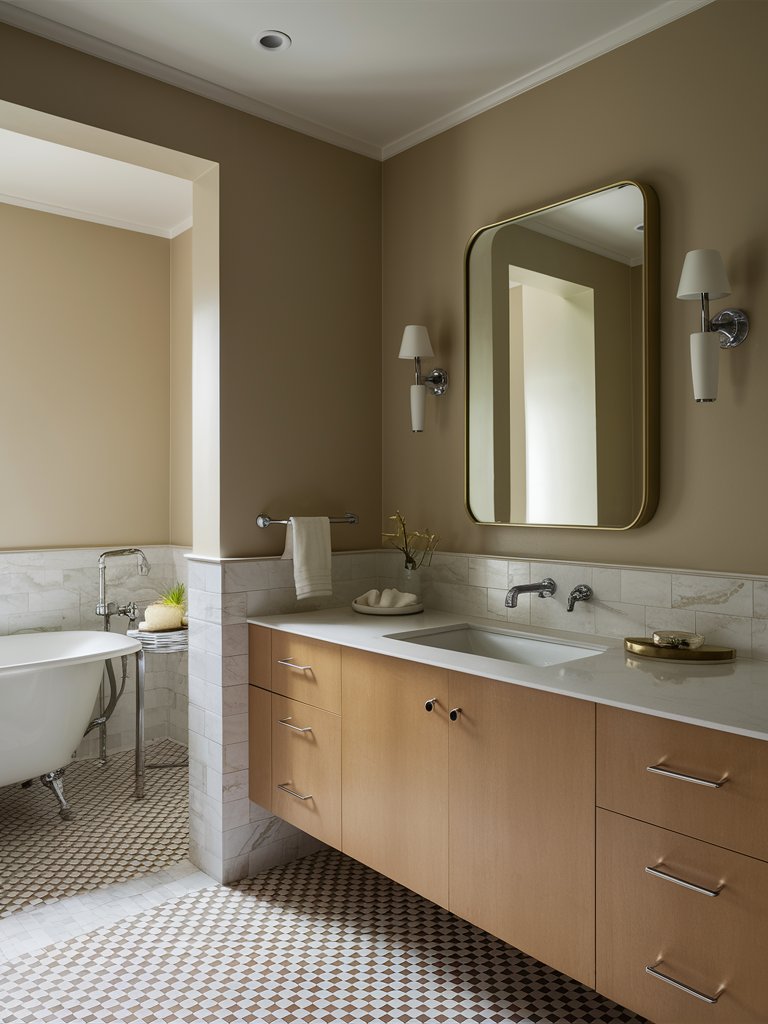
Sherwin Williams Bungalow Beige (7511) is a soft, creamy, warm, and soothing beige paint color with considerable brown-red undertones.
With an LRV of 53, Bungalow Beige falls on the medium end of the scale. If you want to add considerable depth to your walls, the deep red undertones in this paint color make it ideal for the job.
Here, Bungalow Beige leans warm in one room and cool in another due to the disparity of natural light, creating a likable contrast. The wood vanity is the perfect complement to the wall color.
The paint color suits most traditional and French country backdrops and interior design styles. So, if your home has ample warm and wood textures, SW Bungalow Beige will look excellent on the walls. It often works best with red oak or honey oak kitchen cabinets.
2. Benjamin Moore
Benjamin Moore Shaker Beige
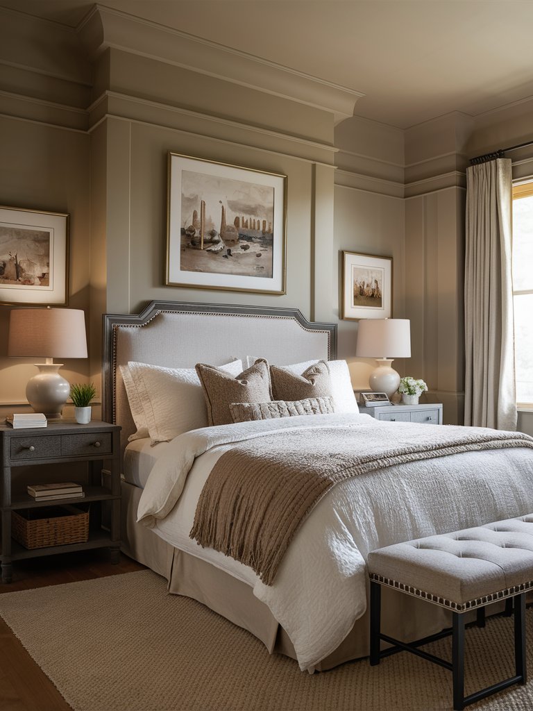
Benjamin Moore Shaker Beige (HC-45) is a warm beige paint color that is a bit more warm than most of today’s famous tan and beige colors.
Shaker Beige has an LRV of 54.61, so it’s a light-medium-depth paint color. This added depth makes it suitable for super bright rooms since it doesn’t wash out like other colors with higher LRVs. The paint color leans more toward its orange undertone but still politely nods to the pink side.
It can be used in living spaces, bedrooms, kitchens, and exteriors and caters to various interior design styles, including traditional, bohemian, farmhouse, contemporary, and transitional. The above bedroom looks super relaxing and inviting with Shaker Beige on the ceiling, walls, and trim!
Shaker Beige works well with earthy tones of the same LRV/depth or darker, such as gray greens, dark charcoals with a green undertone, muted earthy greens, and gray-blues with a bit more depth and body.
It’s integral to compare Shaker Beige with other paint colors in your space since it can take on a darker or lighter look. Similarly, compare it with all the furnishings in your space to avoid clashing colors.
Shaker Beige can sometimes be quite overwhelming in south-facing rooms, so we recommend using it in north-facing or east-facing rooms. However, you have to sample the paint color to see how it’ll look during different times of the day.
Benjamin Moore Hush
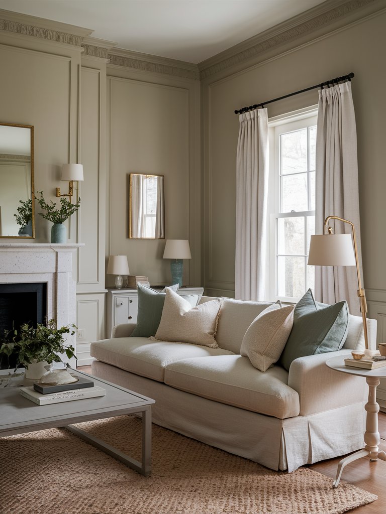
Benjamin Moore Hush (AF-95) is a soft beige that reads neutral without going overly brown or gray. It has subtle yellow undertones, but they are really subdued compared to other, more traditional beiges.
With an LRV of 57, Hush sits on the upper side of light mid-tone paint colors. It won’t necessarily help brighten a dark room, but incandescent light will make some of the warm yellow undertones more prominent.
Nonetheless, the paint color remains a lovely backdrop for living spaces and bedrooms—the above living room is a testament. The white ceiling and drapery provide a subtle contrast, while gray and light cream tones complement the walls.
Hush works best in a room with plenty of natural light.
Benjamin Moore Lenox Tan
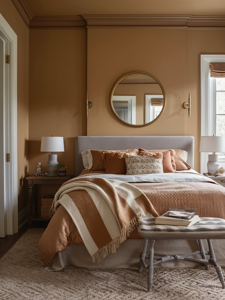
Benjamin Moore Lenox Tan (HC-44) is part of the brand’s Historical Collection and is a tried-and-true warm neutral. If you’re bored with traditional warm beiges, you can try this hue for a change.
Lenox Tan feels like a deepened tone of beige. It’s sort of a pale brown with some gray added in. This gray gives it a slight khaki green undertone, making it more conservative than other hues that feel a little more vibrant or orange-leaning.
Still, it can feel like a true tan against cooler colors and sometimes a bit more muted against warmer colors—you can manipulate it to suit your needs.
Lenox Tan has an LRV of 43.14; since it’s in the low 40s, it’s a mid-tone paint color. Mid-tones are excellent versatile colors that suit interior walls and exterior surfaces since they have a noticeable depth, unlike more subtle off-whites.
Lenox Tan looks excellent as a home’s primary exterior color but also works well on things like garage doors, where you want something that ties into your main body color but is a bit lighter or darker.
The good news is that since it’s a mid-tone, it’s right in the middle—whether your house is darker or lighter, you’re guaranteed a nice contrast.
Here, the gray headboard pops against Lenox Tan on the walls without clashing. Warmer brown and deep orange hues on the bedding match perfectly with the paint color, making it appear lighter and airier.
3. Behr
Behr Warm Beige
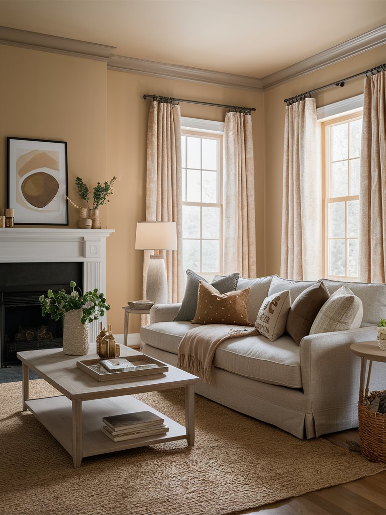
Behr Warm Beige (33C-2) is a timeless choice for anyone seeking a versatile and cozy ambiance.
With an LRV of 50, Warm Beige reflects moderate light, striking a perfect balance between light and dark. This makes it ideal for rooms where you want to maintain a sense of warmth and openness.
Its subtle yellow undertones add warmth, while brown ones keep it grounded. Warm beige brings a soothing, welcoming feel to any room and offers a neutral backdrop that’s easy to pair with various accent colors.
This makes it an excellent choice for open-plan spaces where lighting varies throughout the day. Notice how different neutral shades in this living room complement Warm Beige while still having their own presence felt.
Warm Beige pairs nicely with earthy tones and natural textures and suits various spaces, including living rooms, bedrooms, and even kitchens.
In south-facing rooms or eastern light, Warm Beige tends to lean more to its yellow side, making the room feel inviting and comfortable while enhancing its warmth. However, north-facing or western afternoon light can appear slightly darker with a more intimate atmosphere.
Behr Honey Beige
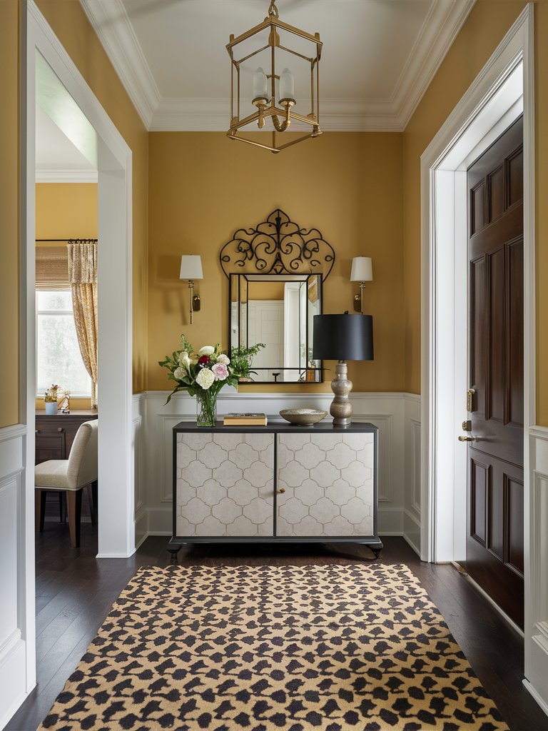
Behr Honey Beige (390D-4) is a warm beige paint color with a noticeable yellow undertone that adds instant cheer and a sense of comfort. It has the tendencies of a primary paint color and the essence of a modern neutral.
Honey Beige has an LRV of 66, making it the lightest color on this list. It’s strong enough to stand alone but still looks beautiful as a supporting color.
The paint color pairs well with classic neutrals like gray and white to keep things grounded. It creates a vivid background that offers a subdued and sophisticated way to incorporate energy and positivity into a room.
Honey Beige also has a sophisticated warmth that reads neutral when used on walls. It works well in nurseries, bedrooms, bathrooms, offices, kitchens, living and dining rooms, infusing a touch of optimism.
It also caters to numerous interior design styles, from coastal and cottage to mid-century and contemporary.
The crisp white trim, wainscoting, and ceiling in this entrance hall offset the Honey Beige on the walls to create a sophisticated look that feels clean and modern while allowing the colors and accents to pop. The dark wood floor further invigorates the color.
If you have furnishings or décor that are too traditional, Honey Beige might look a bit dated. Therefore, balancing your décor and lighting is essential to achieve that transitional and modern vibe.
Behr Almond Latte
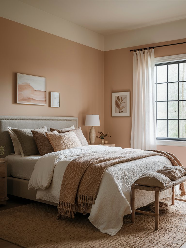
Behr Almond Latte (N260-2) is a warm beige paint color with a blend of undertones that distinguish it from other tan paint colors. It’s warmer and more intense than other popular beige colors.
Almond Latter has an LRV of 59, so it’s in the lighter range but has a bit more depth and body than some typical light beige paint colors.
It has orange-pink undertones, which become even more prominent when you place it alongside blues, greens, or neutrals with these cool undertones, as evident in the above bedroom.
The paint color pairs perfectly with carpets, countertops, and tiles from the late 90s and 2000s since most of these elements possess similar undertones, particularly travertine tiles.
Almond Latte can appear a bit toasty in south-facing or afternoon western light, but this will highly depend on personal preferences—if you want a subtle warmth in your space, then you should have no worries!
4. Farrow and Ball
Farrow and Ball String
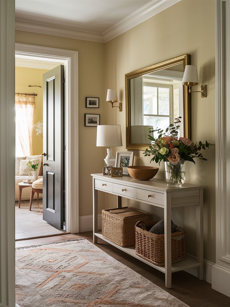
Farrow & Ball String (No. 8) is a light, soft, warm, neutral tan paint color with a passive warmth rather than a definitive one, thanks to a dusting of gray that calms it down.
String has an LRV of about 63, so you shouldn’t expect it to necessarily brighten or lighten a dark space. However, it won’t weigh a room down too much if there’s sufficient interior lighting. The paint color will wash out in overly bright walls or rooms, but only when the sun hits it directly.
Generally, it’s a tan that leans slightly into yellow with a considerable gray backdrop, but there’s also a smidge of green undertone that’s barely visible.
String offers a soft warmth in south-facing or west-facing rooms without overheating on very sunny days. However, when used in a dark north-facing room, it might appear slightly grayed out and fall flat.
The gilded mirror frame in this entrance hall brings a classy, timeless allure further enhanced by String on the walls. The gray console table blends perfectly with the walls, while natural elements like a wooden bowl, woven baskets, and wood floor cater to the paint color’s warmth.
Farrow and Ball London Stone
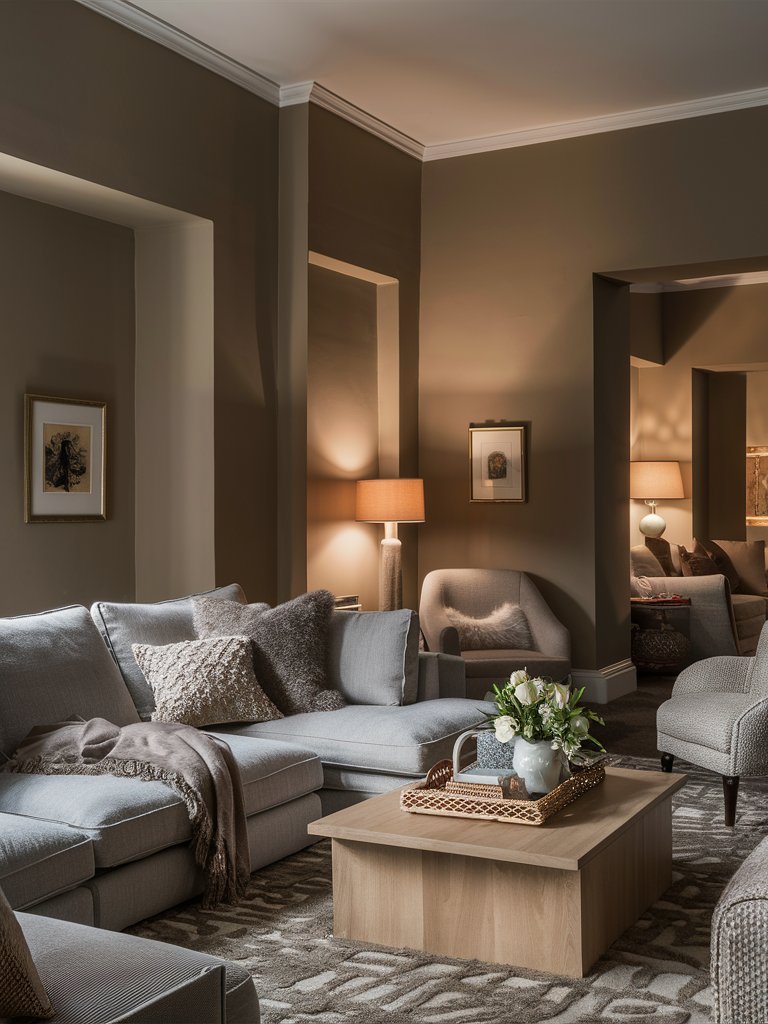
Farrow & Ball London Stone (No.6) is a warm beige paint color that’s a cross between tan and gray with subtle green undertones—the green undertones are virtually unnoticeable.
With an LRV of about 36, London Stone sits on the lighter (softer) medium-range spectrum.
Unless you want a dark, moody feel, this paint color might look heavy in a room without enough natural light because of its depth. You can see how dark the paint color is on corners that don’t receive natural light in the above living space, even with ambient lighting.
This depth also prevents the paint color from becoming easily washed out, making it an excellent option for exterior surfaces. However, it’ll be warmer than in the interiors, especially if your home receives south-facing or afternoon western sunshine.
London Stone also looks great on kitchen cabinets, with its depth giving them a mushroom/beigey look.
Its brown undertone brings a warm, earthy, calm ambiance that feels timeless and grounding. The paint color pairs well with soft, warm whites and is a beautiful choice for wood trim, creating a more subtle contrast.
London Stone may appear muted in north-facing rooms or eastern light but retains its lovely, passive warmth. It can be a bit warmer in south-facing rooms or western afternoon sunshine. However, since it’s a more muted shade of dark beige, it won’t look overly golden or overwhelming.
Farrow and Ball Oxford Stone
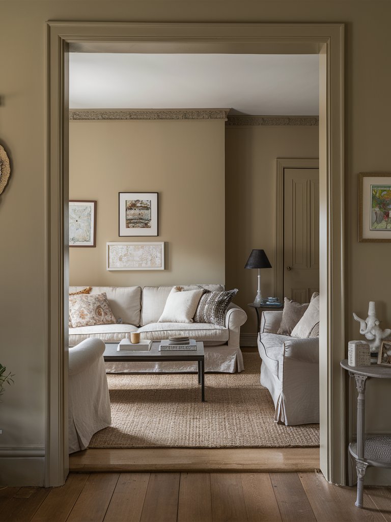
Farrow & Ball Oxford Stone (No. 264) is one of the brand’s best-selling neutrals. It’s a warm, medium, muted beige paint color that takes inspiration from the charming cottages in the Cotswolds.
Oxford Stone is on the opposite end of taupe, where some colors start with a base of gray and a touch of brown mixed in. However, the brown aspect of this paint color is muted slightly with a bit of gray.
The result is a warmer color and a mid-tone that you can use in areas with a lot of light while adding more deliberate coloration to your walls.
It has a lot of noticeable warmth, bringing a gentle and subtle feel to rooms where a white may be deemed too clinical or chilly.
Oxford Stone’s earthy richness and depth pair nicely with neutral palettes. It offers more contrast with white trim than other famous tan and beige paint colors.
In north-facing or east-facing rooms with little natural light, Oxford Stone may look a bit dingy and lose some of its lovely, passive warmth.
What Color Compliments Warm Beige Paint Colors?
- Deep Burgundy
- Soft Gray
- Teal
- Creamy White
Deep Burgundy
Deep burgundy is a rich, warm color that creates a luxurious contrast with warm beige. This pairing brings a sense of sophistication and warmth, making spaces feel cozy and elegant.
Use deep burgundy in accent walls, furniture, or decorative pieces to add depth and a touch of opulence to a warm beige room.
Soft Gray
Soft gray is a neutral, cool tone that balances the warmth of beige. This combination creates a calm and harmonious environment, adding a modern touch while keeping the space inviting.
Incorporate soft gray in larger elements like rugs, furniture, or textiles to create a balanced and serene atmosphere that complements warm beige.
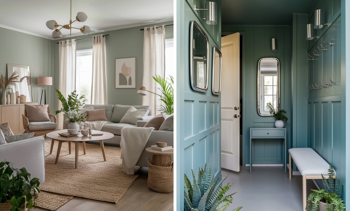
Teal
Teal is a vibrant, cool shade that adds a refreshing contrast to warm beige. This combination introduces a pop of color and energy, creating a dynamic and lively space.
Add teal through decorative items like cushions, artwork, or vases to bring a touch of vibrancy and sophistication to a warm beige room.
Creamy White
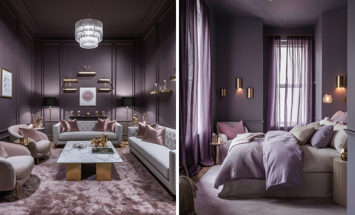
Creamy white is a soft, off-white color that blends seamlessly with warm beige. This combination creates a light, airy, and cohesive look, adding brightness without losing the warmth of the beige.
Use creamy white in trim, ceilings, or furniture to create a seamless and elegant environment that enhances the warm beige.
Color Disclaimer
Please note that all paint colors displayed on this page are for illustrative purposes only. Due to variations in screen settings, lighting, and other factors, the colors you see on your screen may differ from the actual paint colors. We recommend viewing a physical color sample or swatch for the most accurate representation. Some images might be generated by AI to represent paint colors in different interiors

