Gray is one of the timeless and trendiest interior design colors you can try in your space. Not only is it highly versatile, but you can also easily style it alongside other paint colors to suit the style of your home.
Like other lighter tones, such as white, gray is a neutral tone that will balance your space. Whether you’re decorating your living room, bedroom, or even a bathroom, gray allows you to create an exciting new look.
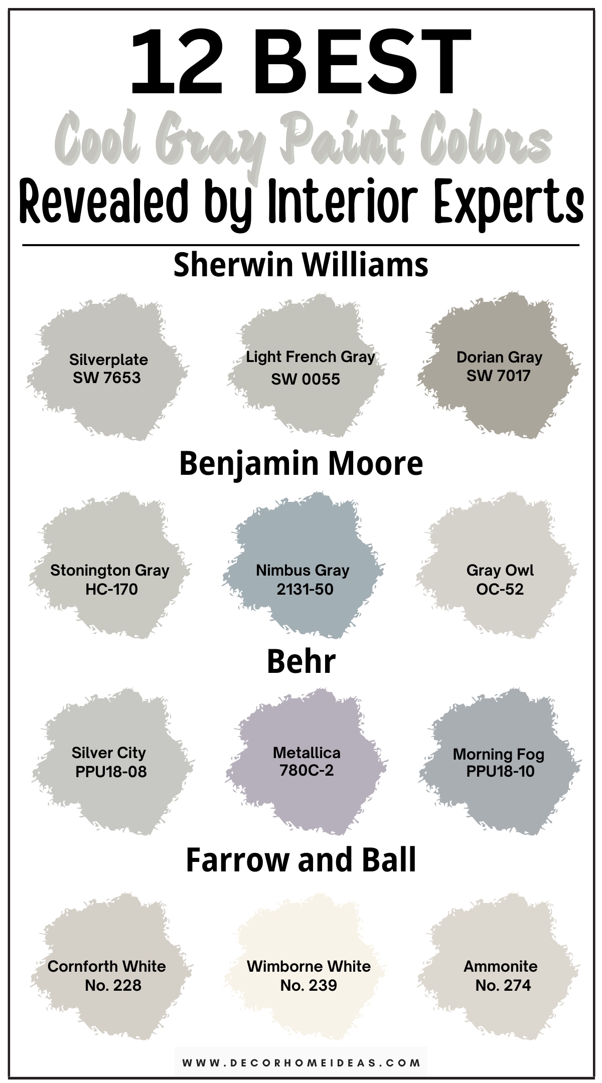
Since gray is a timeless and trendy paint color, we’ve put together some interesting cool gray paint colors for you to try.
Take a look!
1. Sherwin Williams
Sherwin Williams Silverplate
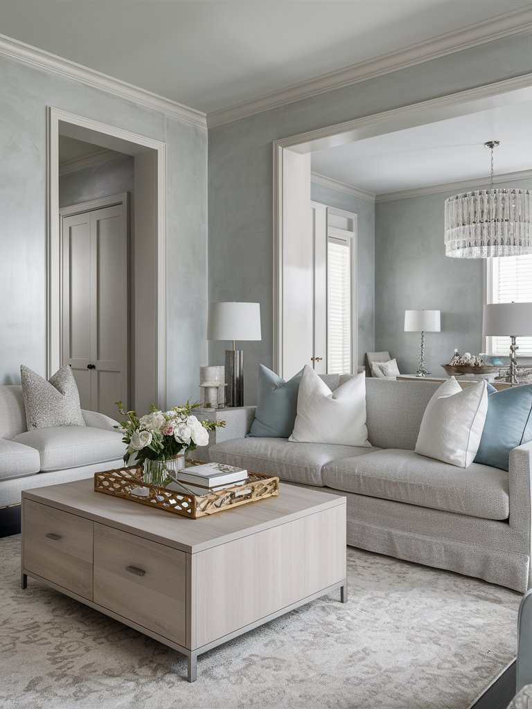
If you’re looking for medium gray paint, Sherwin Williams Silverplate (7649) is probably the best option. It is bright enough to reflect some light into your room but also adds a specific depth that allows you to grab the attention of your guests.
While it appears like a true gray, Silverplate has a unique element that differentiates it from other grays. It looks good in both cool and warm settings, evoking different moods. With an LRV of 53, Silverplate falls just on the lighter end of the scale.
When used on the walls of your home, it feels refined, balanced, and crisp. Its silverish undertone allows it to reflect light without being overly stark.
Its versatile nature makes it easy to use in traditional and contemporary spaces. However, the paint will appear different in north, east, west, and south-facing rooms due to the amount of light and how it’s reflected.
Here, SW Silverplate has been used to create a bright yet calm space. The color’s subtle nature allows it to effortlessly pair with other neutral tones, such as white and gray. The combination of light, neutral tones in the space helps create a modern, minimalistic style.
Sherwin Williams Light French Gray
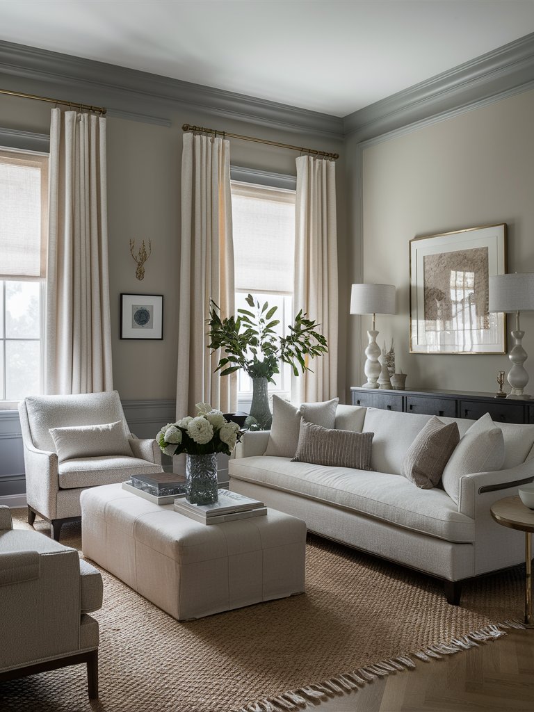
True gray is one of the paint tones that can transform any space, especially if the gray color has cool undertones—Sherwin Williams French Gray (0055) perfectly fits that description. While not entirely a true gray, it’s one of the most versatile gray tones you can use to add some depth to your space.
Its LRV is about 53, which makes it an ideal color for reflecting light without overwhelming your space. It works well when matched with darker accents but can also complement light, warmer tones like tans and taupes.
SW French Gray has purple undertones, which give it the unique quality of looking either warm or cool, depending on the lighting conditions. This color will show cool undertones in north-facing rooms, while in south-facing rooms, the warm undertones will be more prominent.
Here, French Gray promotes a modernistic touch to the space. It matches the darker gray on the trims and complements the lighter-toned furniture. The muted tones in the space give the room a clean look and allow the plants to add unique visual interest.
Sherwin Williams Dorian Gray
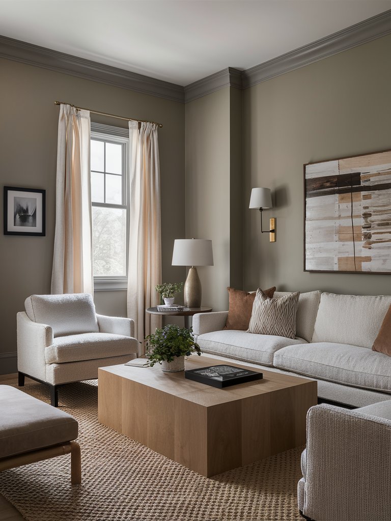
A warm gray that can be used for both interior and exterior paint projects, Sherwin Williams Dorian Gray (7017) is a medium-toned paint whose color comes off as soft rather than heavy.
It has traces of purple and green undertones, though, in some rooms, it may read a bit brown. In some lighting, Dorian Gray may even be considered a greige.
With an LRV of 39, SW Dorian Gray is very reflective, making it advisable to use it in medium—and well-lit rooms. The color works best in traditional or transitional designs, but you can also use it in modern and contemporary designs.
It can be used with various exterior materials, including stucco, shake siding, and even vinyl siding. On the interior, Dorian Gray is a great color to match warm off-whites, complex neutrals, and earthy tones.
In this living room design, Dorian Gray gives the space an inviting, calming ambiance. The abundance of natural light in the space brings out the color’s green undertones, making it easier to match with other earthy tones, such as light brown. The natural fiber rug and woody accents help create a relaxed, airy space.
2. Benjamin Moore
Benjamin Moore Stonington Gray
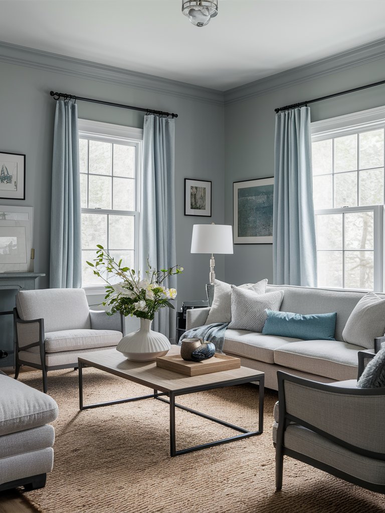
A versatile gray with a silvery look, Benjamin Moore Stonington Gray (HC-170) can be used in just about any space throughout your home. Benjamin Moore describes this paint as an “all-purpose silvery gray,” which is a testament to its versatile nature.
With an LRV of 59, Stonington Gray is a reflective color with a generous amount of pigmentation. It’s muted, yet the gray shades are clearly evident, so you won’t risk your wall looking white when you paint it, even in a room with plenty of light.
This color has blue undertones; in fact, some people may refer to it as a blue-gray color.
Under cool lighting, Stonginton’s blue undertones will be very prominent. Thus, it can be used as a muted blue color in spaces where you want a calm blue tone that won’t glow on the walls.
Here, BM Stonington Gray has created an intimate, airy space. Notice how the color combines with other blue undertones to create a well-rounded space. Even with plenty of natural light, the color creates a calm, inviting atmosphere.
Benjamin Moore Nimbus Gray
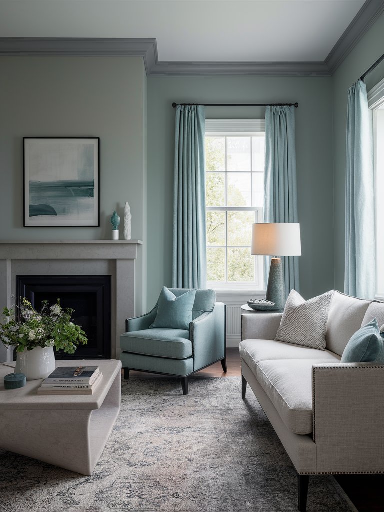
Sandwiched between warm and cool grays, Benjamin Moore Nimbus Gray (2131-50) is one of the cool gray tones that’s really been slept on! This is the color to choose if you want to maintain a refined, understated look. It pairs well with neutral and lighter tones.
With an LRV of 42, Nimbus is a light gray that won’t wash out easily even under intense light. However, it isn’t so heavy that it weighs a room down. With minimal light, the color may look a bit flat.
In terms of undertones, Nimbus has hints of violet and blue. Even though they’re hardly noticeable, they become more evident under the right lighting conditions. You can use this color to create a tranquil space or combine it with warm and earthy tones to create a cozy space.
Like many other interior colors, lighting will determine how this color reads. In a north-facing room, this paint color will read like a cool shade of gray, while in south-facing and western rooms, it will lean on the warm side.
This living room design clearly shows the two-toned nature of this paint. Around the window area, where there is plenty of natural light, the color’s blue undertones are more prominent, while around the fireplace, the color has a warm gray tone. The matching curtains and armchair help complement the wall color, while the lighter furniture and accents dominate the room under the slightly darker background.
Benjamin Moore Gray Owl
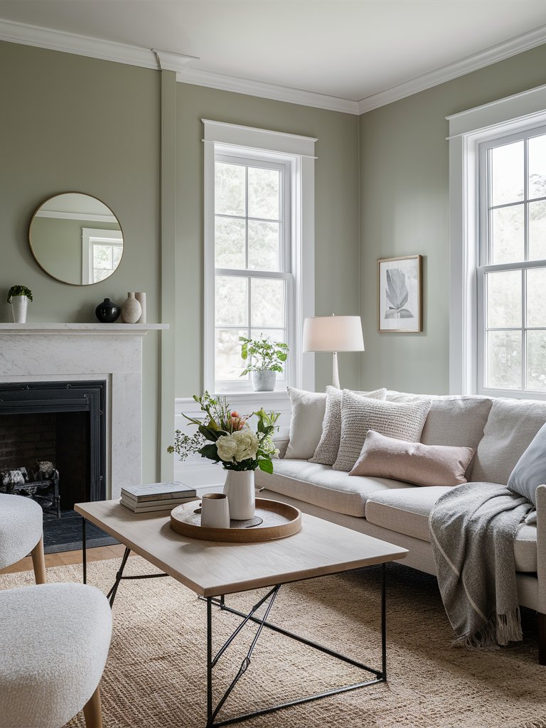
If you’re looking for a gray with balanced warm and cool undertones, Benjamin Moore Gray Owl (2137-60) may do the trick for you. It has green undertones, although it may show some blue undertones in places flooded with natural light.
With an LRV of 64, Gray Owl will reflect a generous amount of light, so you don’t have to worry about your space being too dull. Its lightness also allows it to adapt beautifully to natural and artificial lighting.
In west-facing sunshine, the green undertones will become more prominent. Whether the color displays green or blue undertones will depend on what you pair it with.
BM Gray Owl is an excellent choice for rooms that need a fresh, modern feel without veering into stark, clinical territory.
Here, the neutral look of Gray Owl highlights the space’s lighter tones. The natural light in the space brings out the color’s green undertones. The paint color brings an earthy feel to the space and combines well with other natural-looking elements, such as the natural fiber rug and the wood coffee table.
3. Behr
Behr Silver City
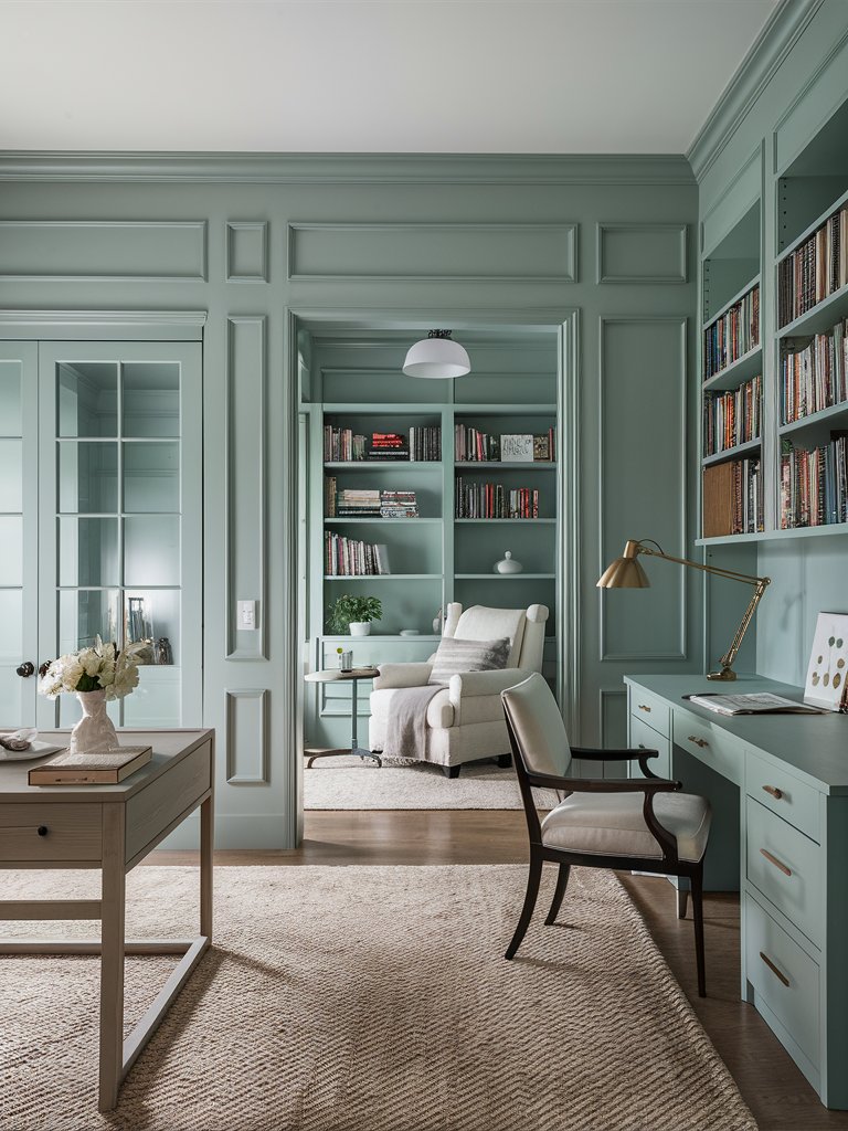
Behr Silver City (MQ2-59) is a refined and elegant medium gray with cool undertones, perfect for creating a calming and sophisticated atmosphere.
Silver City’s LRV of 57 makes it a balanced shade, neither too dark nor too light. Its cool undertones make it a versatile shade capable of easily enhancing both modern and traditional interiors.
Silver City exudes a crisp, silvery tone in bright, natural light, offering a clean and polished look. It can create a strikingly contemporary aesthetic when paired with cool blues, whites, or even black accents.
In softer or artificial lighting, Silver City deepens slightly, taking on a richer and more serene gray look. This color is ideal for creating intimate or cozy spaces in bedrooms or living rooms.
Here, Silver City has created a serene atmosphere that makes the study room the perfect space to wind down with a good book. The neutral look of the silver-gray background allows the book collection on the shelves to add visual interest to the space. The color’s reflectance ability makes the space appear well-lit.
Behr Metallica
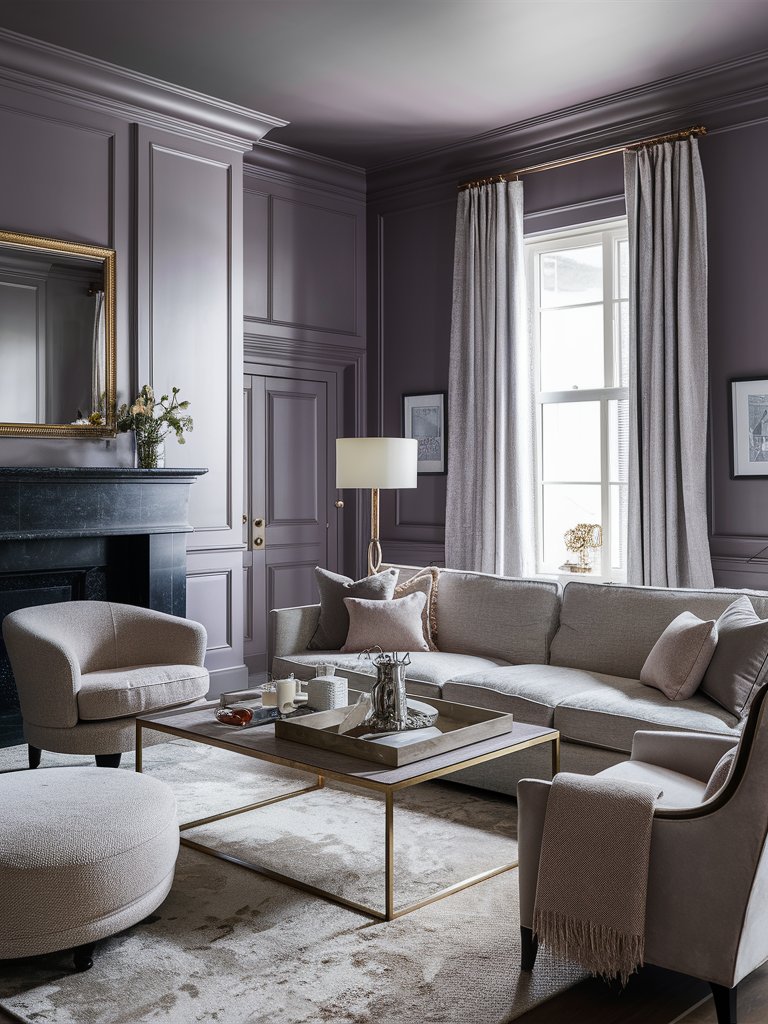
Behr Metallica is a bold, eye-catching shade, part of Behr’s metallic-inspired colors. It’s a medium, cool-toned gray with a subtle sheen that evokes the sleek sophistication of industrial metals.
The paint’s soft bronze-like metallic shimmer adds dimension and visual interest, making it perfect for creating statement walls or adding a touch of drama to any space.
With an LRV of 30, Metallica leans toward the darker side, absorbing more light than it reflects. This gives it depth and a rich, moody quality that can create a sense of coziness in a room, mainly when used in lower-light settings or with warmer lighting.
Metallica creates a cozy space in this living room while providing the perfect backdrop and contrast for the lighter furniture. This color combines well with metallic accents like the golden mirror frame, the lamp, and the table. The natural light makes the lighter tan tones in the room more prominent.
Behr Foggy Morn
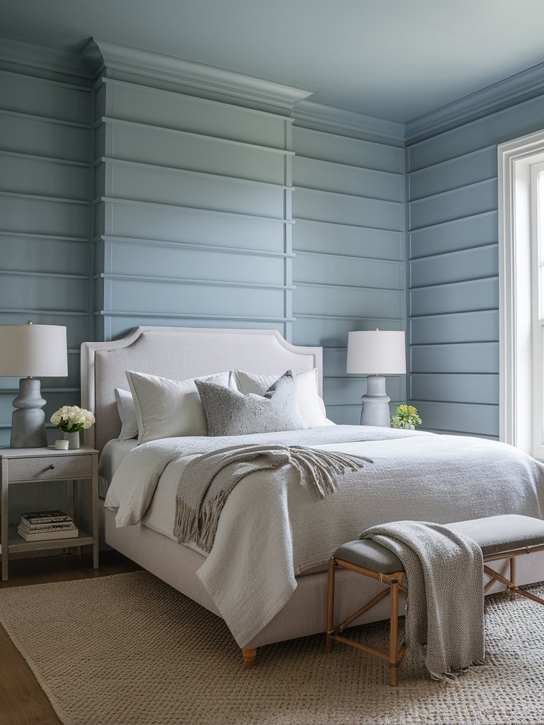
Behr Foggy Morn (PPF-17) is a soft and calming gray that evokes an early morning’s serene, misty atmosphere. With a delicate blend of blue undertones, this shade offers a sense of tranquility and quiet sophistication, making it ideal for spaces where you want to promote a relaxed feel.
With an LRV of 63, Foggy Morn is a medium-light gray that reflects a good amount of light. It can be used either as a primary color or an accent.
Foggy Morn is perfect for living rooms, bedrooms, and bathrooms, where its soothing tones can create a peaceful retreat. It pairs beautifully with crisp whites, soft pastels, or deeper grays for contrast.
In this bedroom, the paint color has been used to create an inviting, calm, and airy bedroom. Combining natural fibers and other natural materials like wood helps create a boho-style bedroom. The cool gray tone of Foggy Morn reflects enough light in the room without being too bright and provides a good contrast for the warm and cool accents in the space.
4. Farrow and Ball
Farrow and Ball Cornforth White
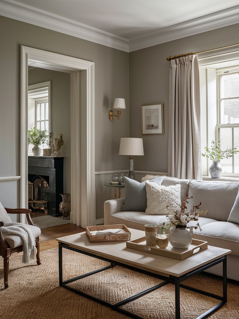
Farrow & Ball Cornforth White (No.228) is one of the lightest gray colors. While its “white” name may be confusing, Cornforth White is actually a gray tone. It has a mid-tone gray look with slight violet undertones, even though it may look purple under different lighting.
Like many other grays, how warm or cool this color looks will depend on the elements you pair it with, the trim color, and the lighting of the space. These conditions will also cause different undertones to become more prominent. Pair it with natural fabrics and light-toned colors to create a clean, airy finish.
Cornforth White is paired with natural brown wood, light, airy finishes, and metallic accents to create a semi-modernistic space in this living room design. The natural light in the space brings out the paint’s subtle green undertones, helping ground the room. The colors and accents in the room help create a calm, well-rounded space without creating stark contrasts.
Farrow and Ball Wimborne White
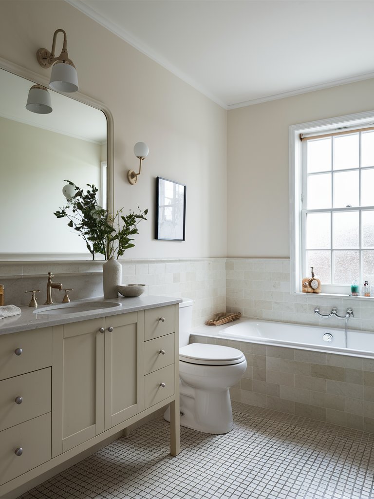
If you prefer a very light gray color for your space, you cannot afford to miss out on Farrow & Ball Wimborne White (No. 239). Referred to as “just off-white” by Farrow & Ball, Wimborne White is one of the most versatile neutral tones you can add to your space. It has a slight warmth that takes it away from pure white.
Wimborne White is one of the best gray tones for making your space feel larger. With an LRV of 89, it’s one of the most reflective grays.
It has subtle yellow undertones that make it feel warmer in south-facing rooms. These warm tones make this color feel cozy and inviting no matter the space it’s used in.
Notice how Wimborne White has been used in this bathroom to create an open, clean look. The color’s bright tone makes it ideal for such a small enclosed room, making the space feel expansive. The abundance of natural light and the large mirror in the bathroom make the space feel even more prominent.
Farrow and Ball Ammonite
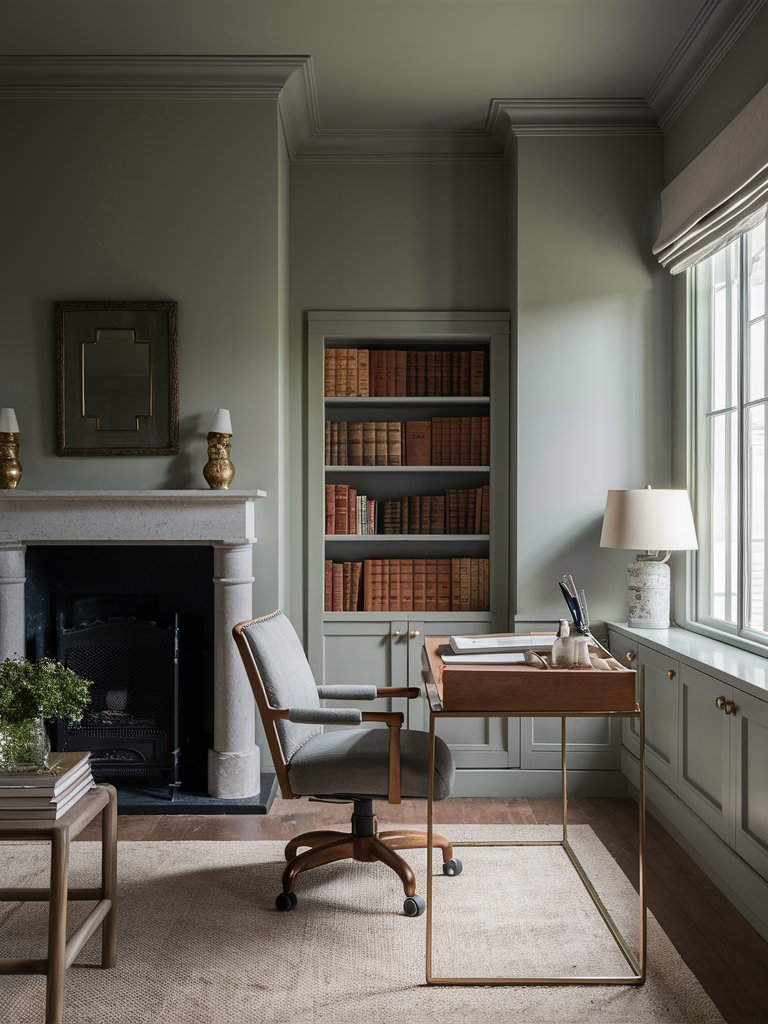
Farrow & Ball Ammonite (No. 274) is a light gray tone with a deep complexion that isn’t common in other neutral tones. Its unique light gray tone adds depth, personality, and texture to any space.
Ammonite has an LRV of 68, making it a slightly reflective color. Despite its generous level of reflection, Ammonite manages to retain its saturation throughout the day, unlike other paint colors that look different at different times of the day.
The color has a matte-like finish that makes it calming no matter the amount of light reflected off it. What makes this color really interesting is its chameleon quality. Under bright natural light, it will read light gray. However, in dimly lit rooms, it may read dark gray with greenish undertones.
In this small office space, Ammonite creates a tranquil, cozy, and inviting space. Notice the chameleon nature of the paint. The color reads a bit warm and darker on the upper side of the room, where natural light doesn’t illuminate as much, while on the lower side of the space, where there’s more illumination, it reads light gray.
What Color Compliments Cool Gray Paint Colors?
- Navy Blue
- Soft Pink
- Emerald Green
- Warm Beige
Navy Blue
Navy blue is a deep, rich color that pairs beautifully with the crispness of cool gray. This combination creates a sophisticated and timeless look, adding depth and elegance to any space.
Use navy blue in furniture, accent walls, or decorative items to enhance the cool gray and create a striking and luxurious environment.
Soft Pink
Soft pink is a delicate, muted shade that adds a touch of warmth to the cool tones of gray. This pairing creates a balanced and calming atmosphere, perfect for bedrooms or living areas.
Incorporate soft pink through textiles, such as throw pillows, rugs, or curtains, to introduce a touch of romance and softness to a cool gray space.
Emerald Green
Emerald green is a vibrant, rich color that provides a refreshing contrast to cool gray. This combination creates a sophisticated and lively look, adding a touch of nature and elegance to your space.
Add emerald green through plants, accent walls, or decorative accessories to bring a pop of color and a sense of tranquility to a cool gray room.
Warm Beige
Warm beige is a neutral, earthy color that complements the coolness of gray. This pairing creates a cozy and inviting environment, perfect for creating a comfortable and welcoming space.
Use warm beige in larger elements like furniture, rugs, or accent walls to enhance the cool gray and create a harmonious and balanced look.

Color Disclaimer
Please note that all paint colors displayed on this page are for illustrative purposes only. Due to variations in screen settings, lighting, and other factors, the colors you see on your screen may differ from the actual paint colors. We recommend viewing a physical color sample or swatch for the most accurate representation. Some images might be generated by AI to represent paint colors in different interiors

