Most people shy away from decorating with dark colors because they’re skeptical that they may make their spaces look dull, but the truth is that they can be a great way to add a timeless, sophisticated look to your space.
The main trick to effectively decorating with dark colors is ensuring there’s a balance between dark and light tones in the space.
Unlike the traditional neutral tones preferred in most interior spaces, dark colors bring an element of excitement to a space. With the limitless options of vibrant home decor and accessories, decorating with darker tones has become a great way to create a striking and cozy space.
For many homes, dark colors are a breath of fresh air since they break away from the norm and can match with just about any color. One of the darker-toned colors that has been adopted in many spaces is charcoal gray.
This color has a unique element in that it has a dark tone but can still reflect some light, giving your space an uplifting look.
Let’s take a look at some of the charcoal gray paint colors you can try in your next home makeover.
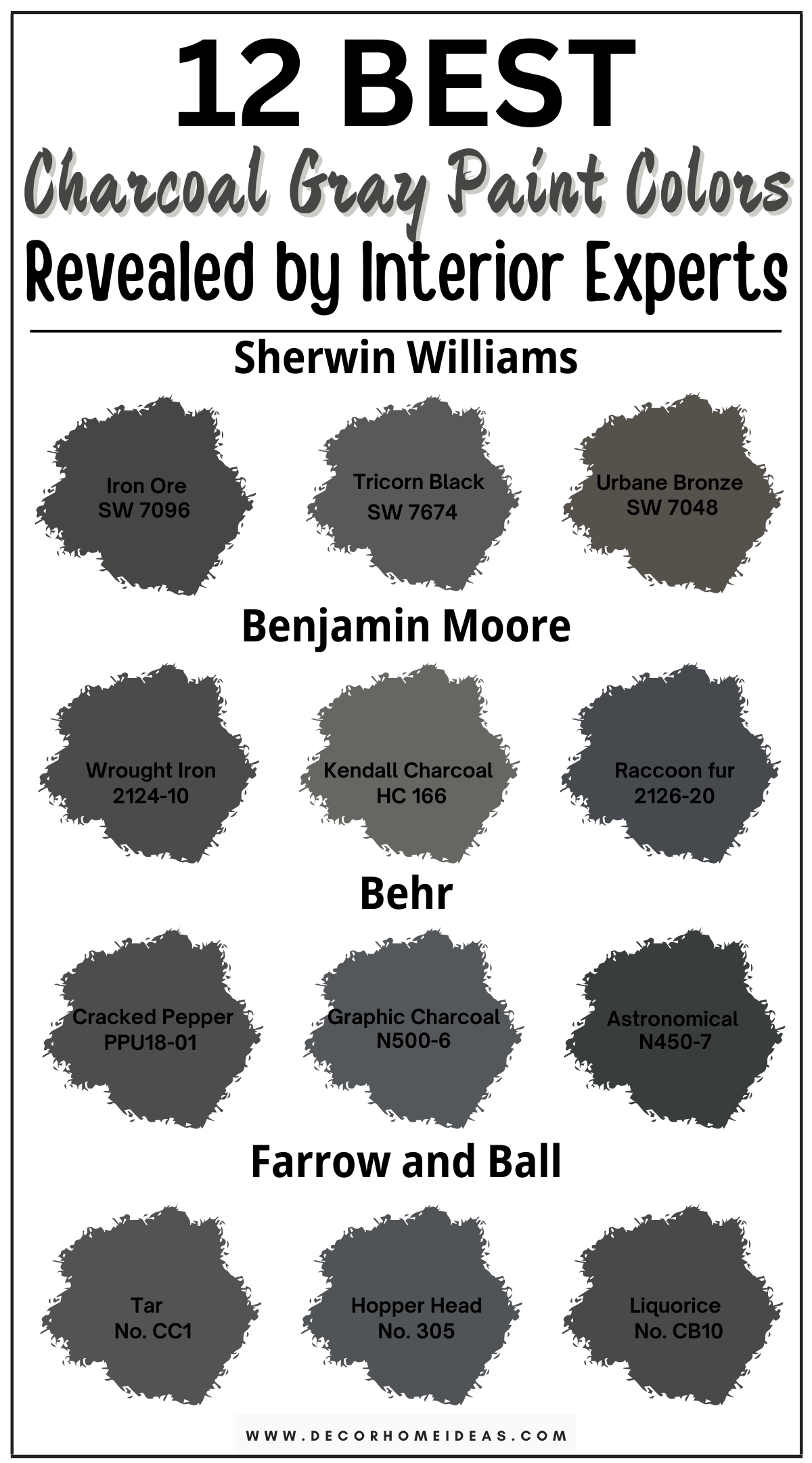
1. Sherwin Williams
Sherwin Williams Iron Ore
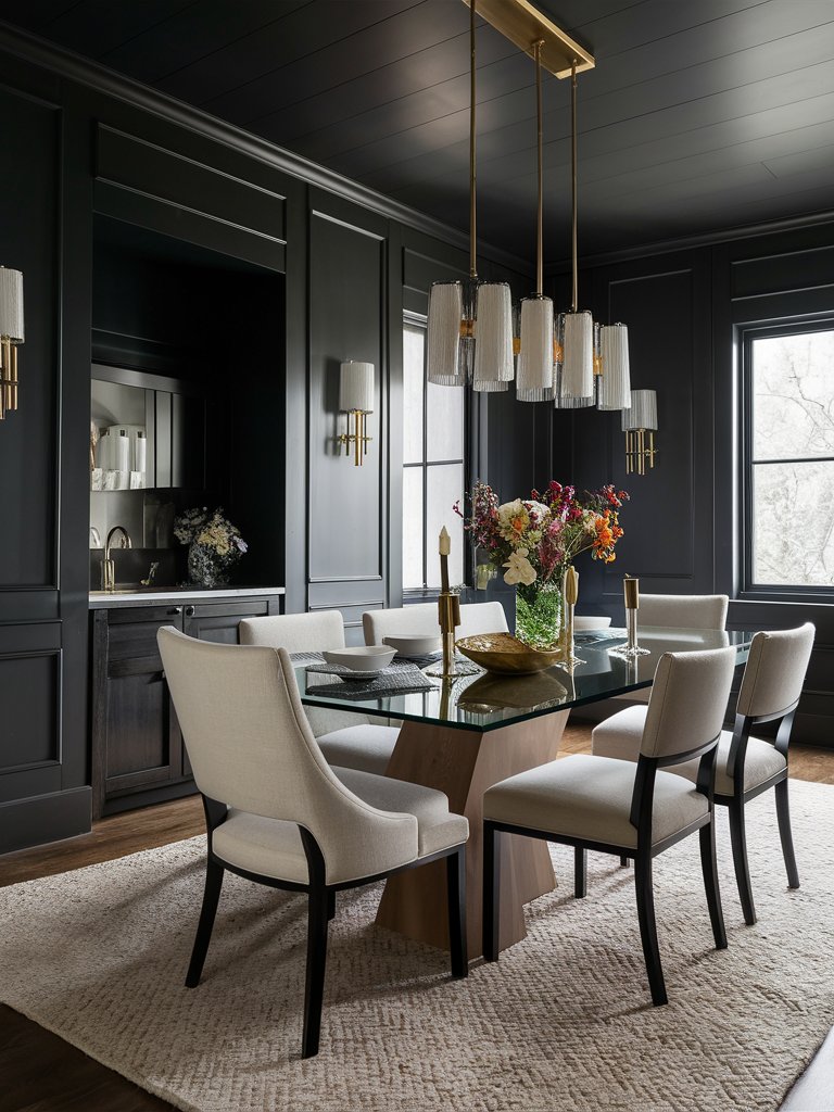
Sherwin Williams Iron Ore (7069) is a dark gray that leans toward the black color family. Its LRV (Light Reflectance Value) is 6, so it’s definitely lighter than other pitch-black hues.
Depending on your space’s lighting conditions, this color will read anywhere between milky black and dark, warm charcoal, or a deep navy blue. Under very bright light, it will appear grayish with some blue undertones.
The primary undertones of Iron Ore are blue and navy blue. In north-facing or east-facing rooms, the blue undertones will become more prevalent. However, the undertones that the color displays will depend on the time of day and the amount of light that the room is receiving.
Under the subdued morning and evening light, the color will read as a soft black.
SW Iron Ore can be used in various spaces. It can be used as an accent wall paint or for the entire room. It creates a calm, cozy space, ideal for winding down after a long day, so you can easily use it in your bedroom. You can also use it to create a modern, classy, high-end feel for your dining room or office.
In this idea, Iron Ore has been used to create a modern minimalist office. The color creates the perfect backdrop to display the book collection and other subtle accents in the room. The light-colored furniture in the space brings an element of balance to the office. With plenty of natural light, the dark shade of iron ore makes the office feel airy and inviting.
Sherwin Williams Tricorn Black
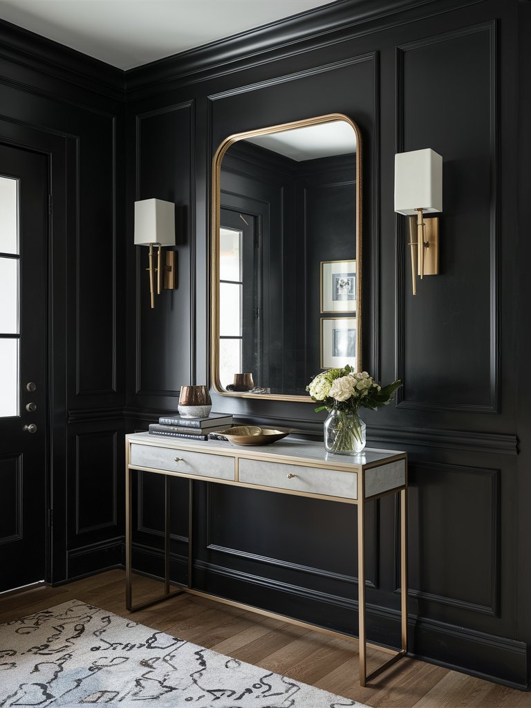
If you’re looking for a versatile, balanced color that’ll work with almost any palette, then Sherwin Williams Tricorn Black (6258) is the color for you. It pairs well with almost any design and won’t look dated even years down the road, which is what makes it unquestionably popular.
With an LRV of 3, Tricorn Black is one of the darkest colors on the market. The marketing director at Sherwin-Williams describes it as “one of the blackest blacks that’s really rich and perfect as a dark shade.”
While the perception of color largely depends on the level of lighting and the surrounding environment, Tricorn Black absorbs most of the light that lands on it.
For the best result, it’s advisable to use it in well-lit rooms or opt for high-intensity light. You can also use reflective surfaces such as mirrors to help bounce off the light in the room.
One unique element of this color is that it’ll make a statement whether used in small doses or floor-to-ceiling applications. It can be used indoors, though many people use it for doors, smaller fixtures, and accents like handles and hinges. With the proper styling, you can use it for your entire space.
Here, SW Tricorn Black covers this space from top to bottom, including the trims. The color creates the perfect contrast with the lighter accents in the room, such as the wall lamps and the light-colored console table. Notice the use of mirrors in the space, which help reflect color despite the low LRV of the color.
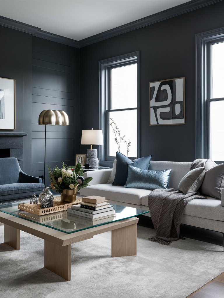
Sherwin Williams Urbane Bronze
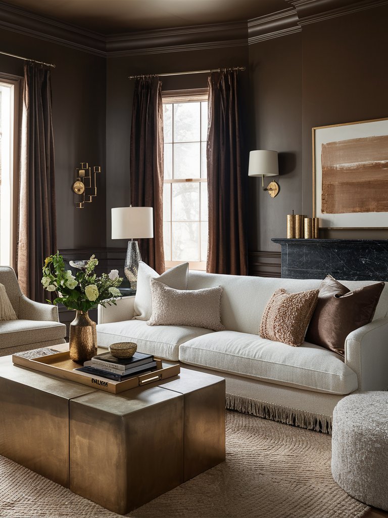
Sherwin Williams Urbane Bronze (7048) is one of the light tones in this category and probably one of the most unique ones you can add to your space. Named by Sherwin Williams as their 2021 Color Of The Year, it’s a dark, warm, greige paint with a gorgeous depth and a very wide range.
Urbane Bronze has an LRV of 8, and while this is low, it can hardly be considered black. Since it isn’t a completely dark color, it’ll work well with lighter elements as well as darker accents.
However, the “bronzy” nature of the paint makes it uniquely suited to pair with metallic accents, where it will perfectly complement them. It’ll also fit nicely in an earthy tone palette.
In this living room design, Urbane Bronze is the primary wall color; the lighter furniture it pairs with creates the perfect balance. Notice the variety of metallic accents added to the room, such as the bronze wall lamps, wall art, flower vases, and the silver table lamp. The coffee table also has a metallic touch. The color and accents in the space combine well to create an ultra-modern look.
As with many other colors, the way that it appears will greatly depend on the lighting conditions. In north-facing light, SW Urbane Bronze will appear gray with a cooler muted tone.
In south—or west-facing rooms, the color will read warmer and richer. Its green undertones become more prominent when used in a space with plenty of natural light or outdoors.
2. Benjamin Moore
Benjamin Moore Wrought Iron
As a relatively soft shade of black, Benjamin Moore Wrought Iron (2124-10) has a relatively malleable character.
It’s often described as chalkboard black since it usually shows a dark graphite color similar to a clean school chalkboard. It isn’t completely dark, so it has some depth, but it doesn’t feel cold or imposing.
Wrought Iron has an LRV of 8.16 and navy blue undertones. Due to its neutral undertones, It can easily pair with a variety of paint colors, from White Ice to wedgewood gray.
While it works perfectly in sunny environments and exteriors, this color can also create a lovely, dramatic interior. Its chalky appearance contributes to its softness and makes it easy to use in small spaces since it has a reflective sheen.
Wrought Iron looks amazing in various interior design settings and complements various building materials such as stone, brick, and wood. Although it’s often applied as an accent color on design elements such as shutters and trims, it can also work as the main paint color in a room.
Here, BM Wrought Iron is the main color in this dining space. It covers the entirety of the room, including the ceiling, creating the perfect backdrop for other design elements to shine.
The room has plenty of natural light and is accented with a variety of reflective materials, including mirrors and a glass table. The light-colored furniture and accents appear more prominent against the darker background.
Depending on the lighting conditions and the place where it’s used, Wrought Iron can look like a dark charcoal gray. In north-facing rooms where natural light is minimal, this color will often look black.
If you’re worried about how the color will appear in different spaces, ensure you get a paint sample before adding it to your space.
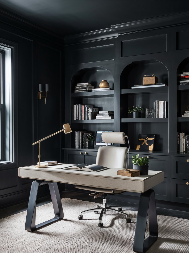
Benjamin Moore Kendall Charcoal
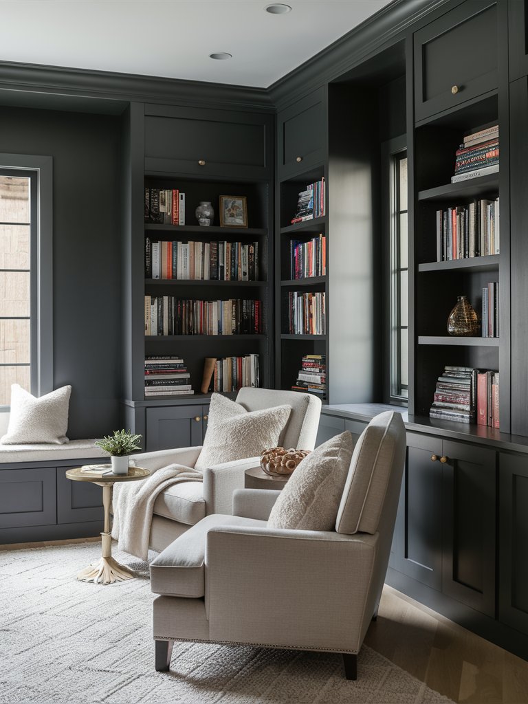
Benjamin Moore Kendall Charcoal (HC-166) is an interesting dark gray paint with a deep, rich, and complex gray-black hue that adds a warm, moody touch to any space. It’s one of the few colors that bodes well for modern spaces since it can work with many natural tones and materials.
This color has an LRV of 12.9, making it lighter than most dark-toned grays. Its green and brown undertones add beauty and visual interest to your space. In a well-lit space, the green undertones will be more prominent. However, in a dimly lit room, the color may read a deeper charcoal.
Kendall Charcoal complements a wide range of colors, from tan and sage to glam gold and dusty pink. Despite being dark, it brings a warm, inviting feeling to any space, making it a favorite for many designers.
Depending on the look you’re looking to achieve, you can pair Kendall Charcoal with a variety of warm and cool tones. Consider the undertones of other items in your space before using this paint. It works especially well with warm undertones and may seem distorted if combined with bright, stark, or cold tones.
In this office space, Kendall Charcoal has been used to create a soft, tranquil space perfect for enjoying a good read. The lighter-toned furniture balances out the darker hues in the space, while the books on the shelves add visual interest since they’re perfectly contrasted by the darker Kendall Charcoal background.
Benjamin Moore Raccoon fur
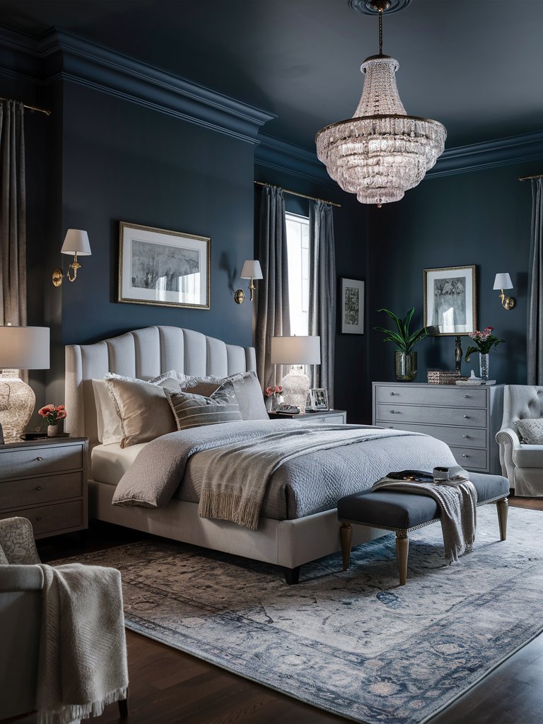
A slightly lighter black with a mysterious hue and tons of character, Benjamin Moore Racoon Fur (2126-20) is one of the dark grays you can use to achieve a moody and traditional aesthetic. It can also create a calm, airy space with the right combinations.
With an LRV of 8.28, Racoon Fur falls on the dark side of paint colors. However, depending on the light and the materials it’s used with, this color may appear light or dark.
In shaded or densely wooded environments, this color will read as a dark gray. However, in bright and sunny locations, it can read as a hazy deep slate.
One of the reasons that Raccoon Fur is preferred in most interior spaces is that it’s versatile. It shifts from day to night or sun to shade. Its blue undertones make it ideal for use with stone or copper accents.
Not only can it be used for columns, porch ceilings, front doors, and trims, but it’s also a great paint color for bedrooms and living rooms.
In this bedroom, Racoon Fur creates a soft, welcoming mood. Plenty of natural light in the room brings out the color’s blue undertones, complemented by bluish accents on the rug and gray accents on the bed bench. Notice how the color seamlessly complements the glass and metallic accents in the space.
3. Behr
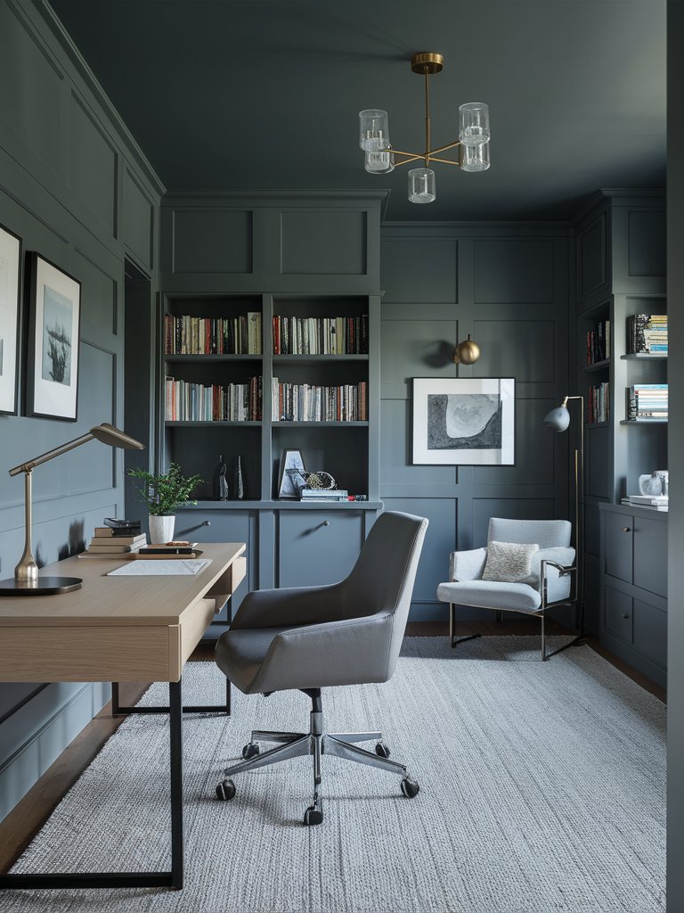
Behr Cracked Pepper
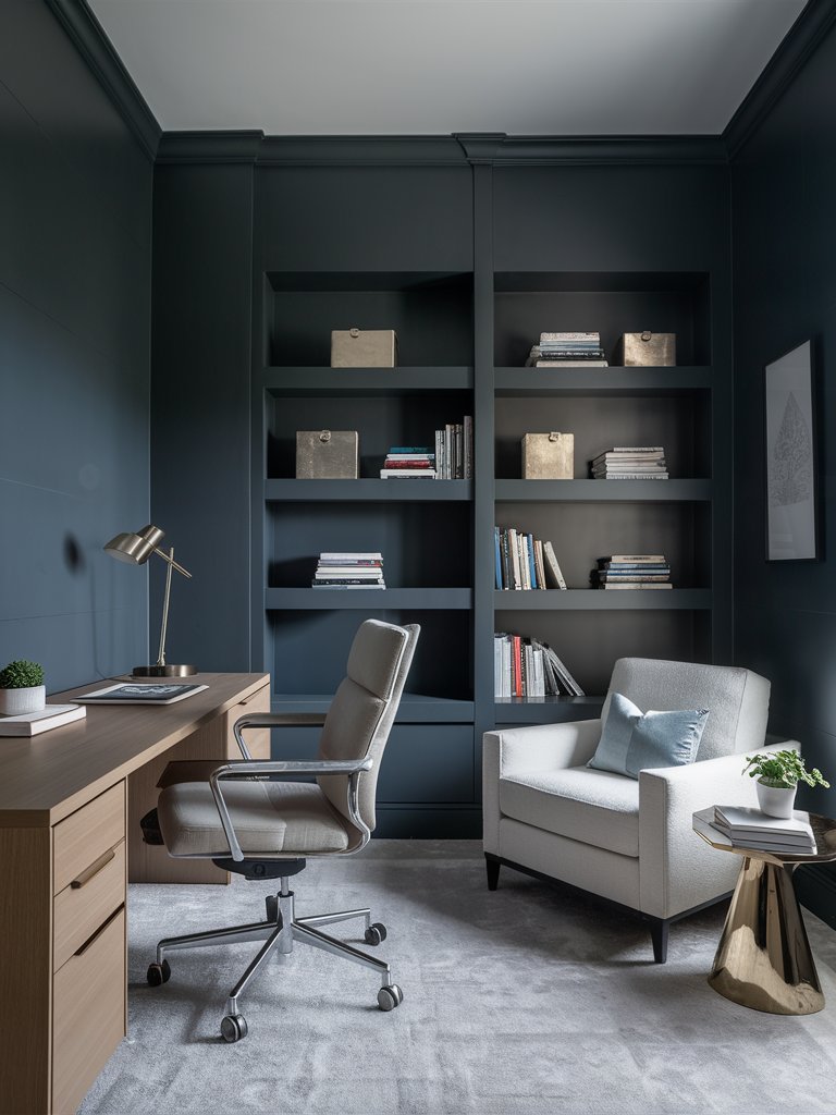
Behr Cracked Pepper (PPU18-1) is a deep, sophisticated charcoal shade with subtle undertones of black and gray. It’s a bold yet versatile color that works well as a backdrop for contemporary spaces or as an accent wall to add dramatic flair.
With an LRV of 8, this paint is decidedly dark, meaning it reflects very little light. Because of its low LRV, Cracked Pepper absorbs more light, making it ideal for more extensive, well-lit spaces where you want to create a sense of groundedness or coziness.
Despite its dark tone, this shade complements various colors, from crisp whites to warm, soft neutrals like beige or taupe. Its appearance will also largely depend on how light bounces off it.
Cracked Pepper creates a striking contrast when paired with lighter hues like crisp whites or soft neutrals, making details and textures pop. Despite its dark nature, it can bring warmth and elegance to a space, especially when complemented with natural wood elements.
In this office, Cracked Pepper has been used to create a calming space with minimal distractions, perfect for studying or focusing on office work. Notice how the cracked pepper color is impacted by the lighting. On one side of the painted shelf, it appears darker with a navy blueish hue; on the other, it reads gray.
Behr Graphic Charcoal
If you’re looking for a deep, heavy, yet sophisticated charcoal gray paint color, then Behr Graphic Charcoal (N500-6) is the color for you. It adds richness and bold qualities to any space.
With an LRV of 11, Graphic Charcoal can be considered a light-toned dark color. Its cool gray tone will work with a variety of paint colors.
When using this color in your space, it’s important to note that other items in the room will significantly impact the color’s undertones. Sampling the paint is the only way to ensure you know exactly how the color will look in your space.
Even though it’s a deep gray color, it has cool blue undertones that may vary depending on the colors it’s paired with and the time of day.
Due to its unique shade, Graphic Charcoal works well in large rooms with open floor plans or as an accent color. Its unique velvet finish makes it compatible with modern decor from industrial, minimalist, Scandinavian, and farmhouse-style homes.
In this living room, Graphic Charcoal has been used to elevate the room’s modern aesthetic. The color allows the light-colored furniture and accents to take center stage. Since this color absorbs most of the light in the space, it creates a calm, cozy space. Notice the absence of curtains, which allows light to fully illuminate and bring out the beauty of the space.
Behr Astronomical
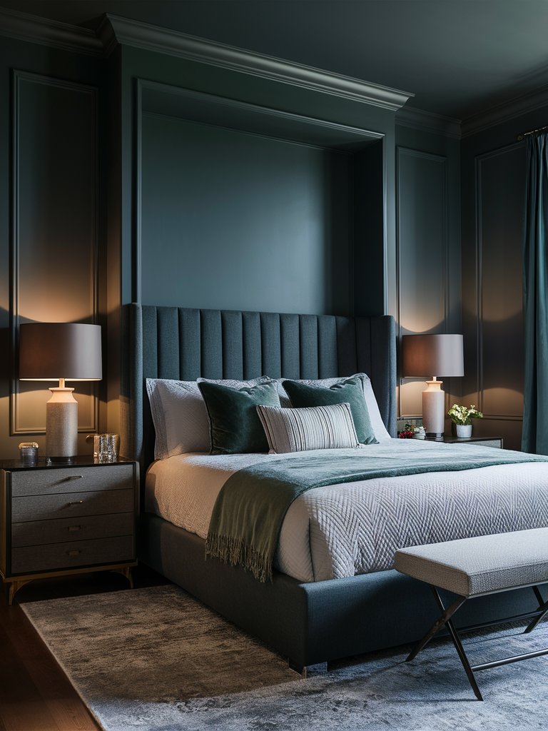
Behr Astronomical (N450-7) is a deep, moody shade of blue-black that captures the essence of a night sky just before complete darkness sets in.
With an LRV of 4, it reflects very little light, making it one of the darkest colors available in Behr’s catalog. This profound, inky hue has a strong, commanding presence that adds a layer of sophistication, class, and drama to any space.
Astronomical works well as a statement color on accent walls, cabinets, and any wooden elements, bringing depth and contrast to interiors. Its cool undertones also make it ideal for modern, minimalistic settings, enhancing sleek lines and contemporary decor.
When balanced with adequate lighting and complementary lighter accents, Astronomical can create a cozy, cocoon-like atmosphere. It’s also a perfect shade for those looking to add an edge of mystery and elegance to a room without using pure black.
This paint color has been used to create the above modern, stylish bedroom that exudes rich, timeless appeal. The balance of dark and light tones in the space helps create a clean, elegant look. The dark color’s beauty has really been brought out by the lighting added to the space, which makes Astronomical look lighter.
4. Farrow and Ball
Farrow and Ball Tar
With a unique off-black shade reminiscent of the sun-baked desert, Farrow & Ball Tar (No. CC1) has a deep yet restrained tone that’s soft enough to envelop any space.
Unlike some cooler blacks, Tar has undertones that lean toward the brown spectrum, making it feel more grounded and versatile for various spaces.
With an LRV of 6, Tar is one of the most absorbent shades in their range. This nearly black hue has a distinctive softness brought about by its subtle brown undertones, which gives it a natural warmth that many other deep colors lack.
Its depth makes it perfect for adding contrast or highlighting architectural features, and it pairs particularly well with lighter neutrals, creating a balanced and sophisticated look.
Its ability to absorb light gives rooms a relaxed, intimate feel, but adequate lighting can also make a striking backdrop for vibrant artwork or statement furniture.
In this living room design, Tar creates the perfect backdrop for other design elements to dominate the space, such as furniture. It also helps to advance the modern minimalistic look of the space by allowing the design to be cozy and inviting despite the minimal accents used.
Farrow and Ball Hopper Head
Farrow & Ball Hopper Head (No. 305) is a deep, sophisticated charcoal gray with an almost industrial feel. Its name is inspired by the decorative rainwater hoppers often found on Victorian buildings, and this paint brings a sense of architectural refinement to any space.
FB Hopper Head is an ideal charcoal gray color for creating inviting spaces. It works with different shades and can be used exclusively on woodwork, walls, and the ceiling to create a dramatic space.
Its versatility makes it easy to use in both interior and exterior spaces. It can be especially used to create depth in interior spaces when paired with earthy tones and lighter neutrals.
Under a space with natural light, Hopper Head reads a softer tone with a more approachable character. However, in north-facing rooms, it can appear more intense and moody.
Hopper Head’s muted quality makes it an excellent choice for those seeking a darker neutral that doesn’t feel too overpowering. It also works well on woodwork such as cabinets and exterior components like windows and doors.
Here, Hopper Head has been used to create an airy, inviting space for this office. The colors pair well with the earthy tones in the space, like light brown and beige. The natural light illuminating the space gives the color a two-toned feel, with a light gray tone on the lower side and a warm gray with green undertones on the upper side.
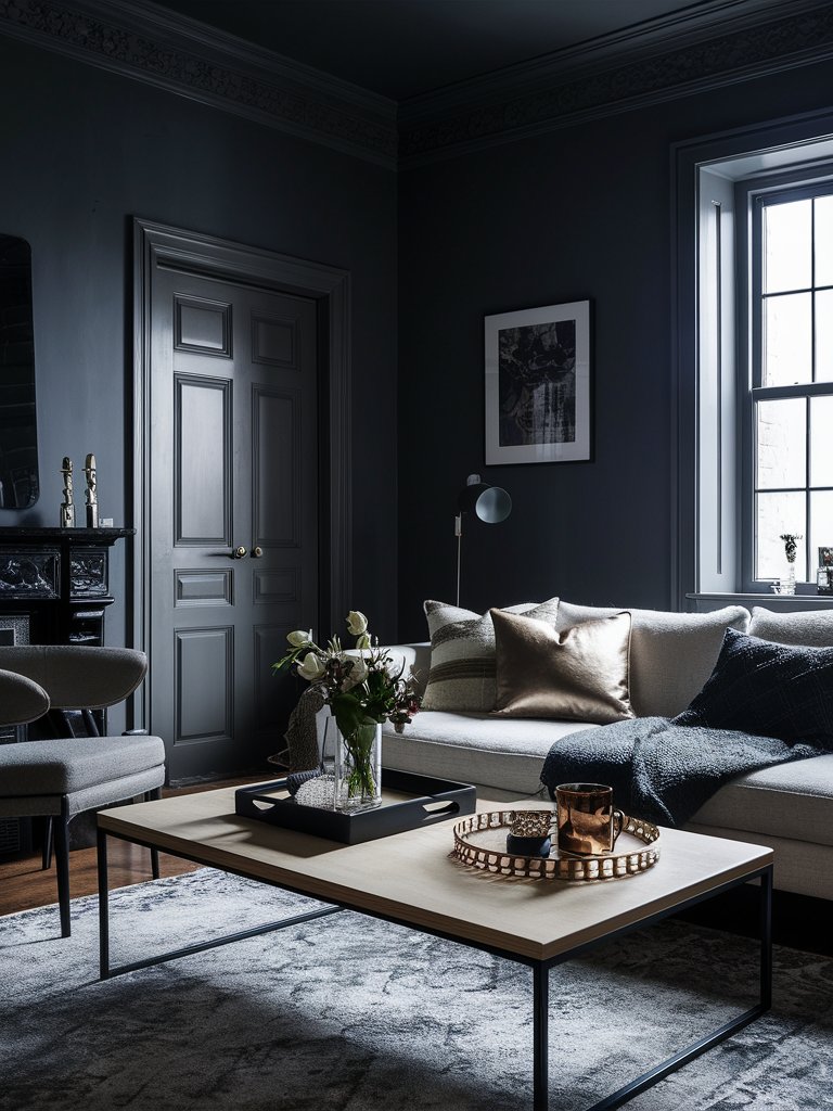
Farrow and Ball Liquorice
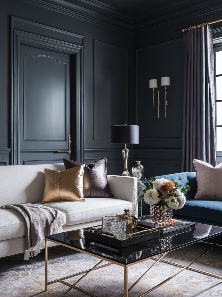
Farrow & Ball’s Liquorice (No. CB10) is a deep, velvety black that exudes an air of quiet sophistication.
With an LRV of just 2, it’s one of the darkest shades in the Farrow & Ball catalog, absorbing almost all light. Its near-total light absorption makes it a commanding presence in any space, perfect for those looking to introduce a bold, dramatic effect that can match any style.
Unlike many flat, cold blacks, Liquorice has subtle, warm undertones that lend a welcoming softness. These warmer hues prevent the color from feeling too stark or severe, allowing it to create an enveloping atmosphere in both contemporary and traditional interiors. In fact, it can sometimes feel like a matte type of paint.
This color works particularly well with off-whites or lighter neutrals, providing a striking contrast. You can also use this tone to create a cozy, intimate setting perfect for small living rooms or add a dramatic effect to dining rooms.
Liquorice has been used in this living room seating as a light drencher, absorbing most of the light falling on the space and creating a soothing, tranquil space. Notice how the color seamlessly matches the bright metallic accents in the room, like the bronze and golden throw pillows. It also pairs well with the glass accents in the room, which also helps reflect light in the space.
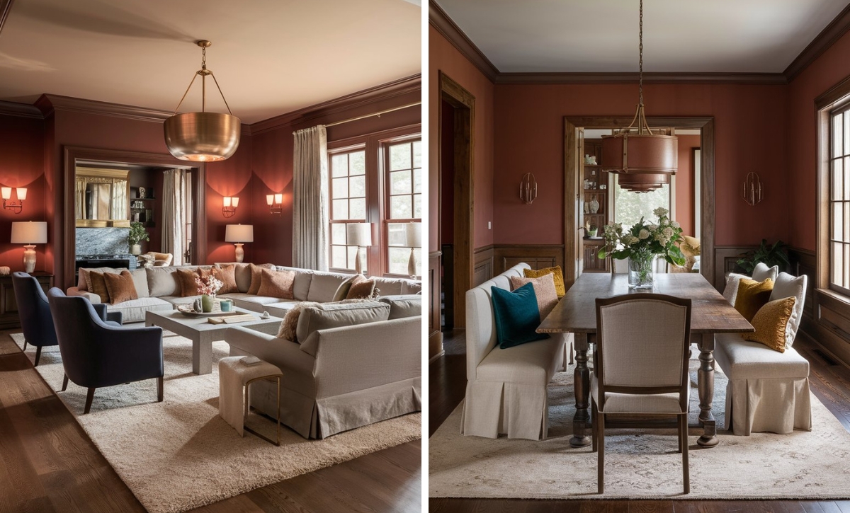
What Color Compliments Charcoal Gray Paint Colors?
- Bright White
- Blush Pink
- Mustard Yellow
- Teal
Bright White
Bright white provides a crisp and clean contrast to the deep, rich tones of charcoal gray. This combination creates a modern and sophisticated look, making spaces feel open and airy.
Use bright white in trim, ceilings, or furniture to highlight the charcoal gray and add a touch of elegance and brightness to a room.
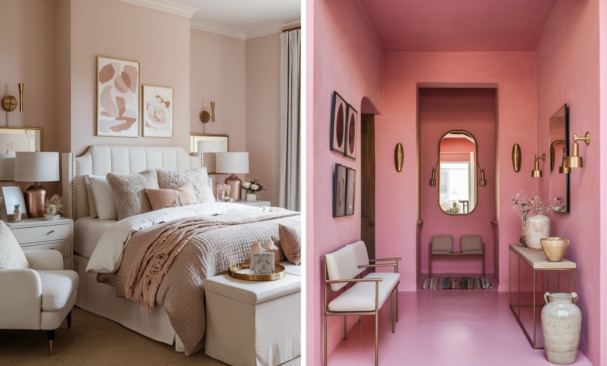
Blush Pink
Blush pink is a soft, muted shade that adds a gentle warmth to the cool, dark tones of charcoal gray. This pairing creates a balanced and calming atmosphere, perfect for bedrooms or living areas.
Incorporate blush pink through textiles, such as throw pillows, rugs, or curtains, to introduce a touch of romance and softness to a charcoal gray space.
Mustard Yellow
Mustard yellow is a warm, vibrant color that provides a lively and energetic contrast to charcoal gray. This combination creates a dynamic and inviting look that feels both modern and cozy.
Consider using mustard yellow in accessories like cushions, artwork, or vases to bring a pop of color and warmth to a charcoal gray room.
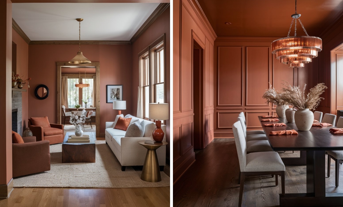
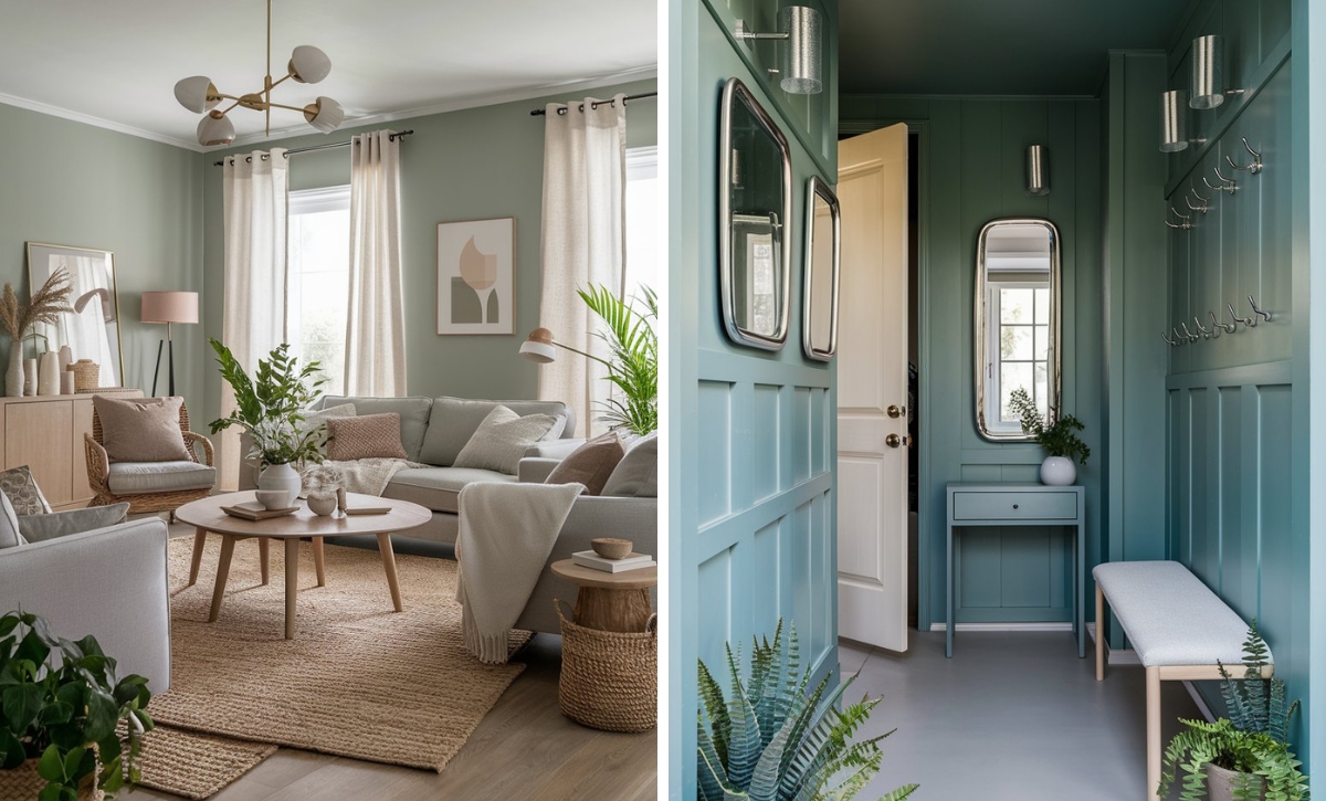
Teal
Teal is a rich, deep shade of blue-green that pairs beautifully with charcoal gray. This combination creates a fresh and serene atmosphere, adding a touch of sophistication and tranquility to your space.
Add teal through accent walls, textiles, or decorative items to introduce a refreshing and balanced element to a charcoal gray room.
Color Disclaimer
Please note that all paint colors displayed on this page are for illustrative purposes only. Due to variations in screen settings, lighting, and other factors, the colors you see on your screen may differ from the actual paint colors. We recommend viewing a physical color sample or swatch for the most accurate representation. Some images might be generated by AI to represent paint colors in different interiors