Many people think of white when adding neutral hues to a space. While white is a great neutral color, there are many other exciting hues you can try, such as gray.
We need to discuss a paint’s LRV (Light Reflectance Value) before we go any further. LRV represents the percentage of light being reflected by a paint color on a scale of 0 to 100. Bright, light colors are close to 100, while darker ones will be found close to zero.
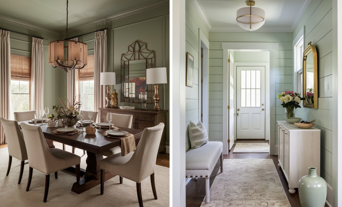
Light gray is primarily considered a perfect neutral. It adds depth to any room and, depending on how it’s used, may be a cool or warm color. Grays are also ideal for creating a light, airy space. As such, you can use them to create sophisticated chic spaces that are versatile enough for any decor style.
We’ve picked some of the best light gray paint colors that will give your home a timeless look that won’t go out of style any time soon.
Take a look!
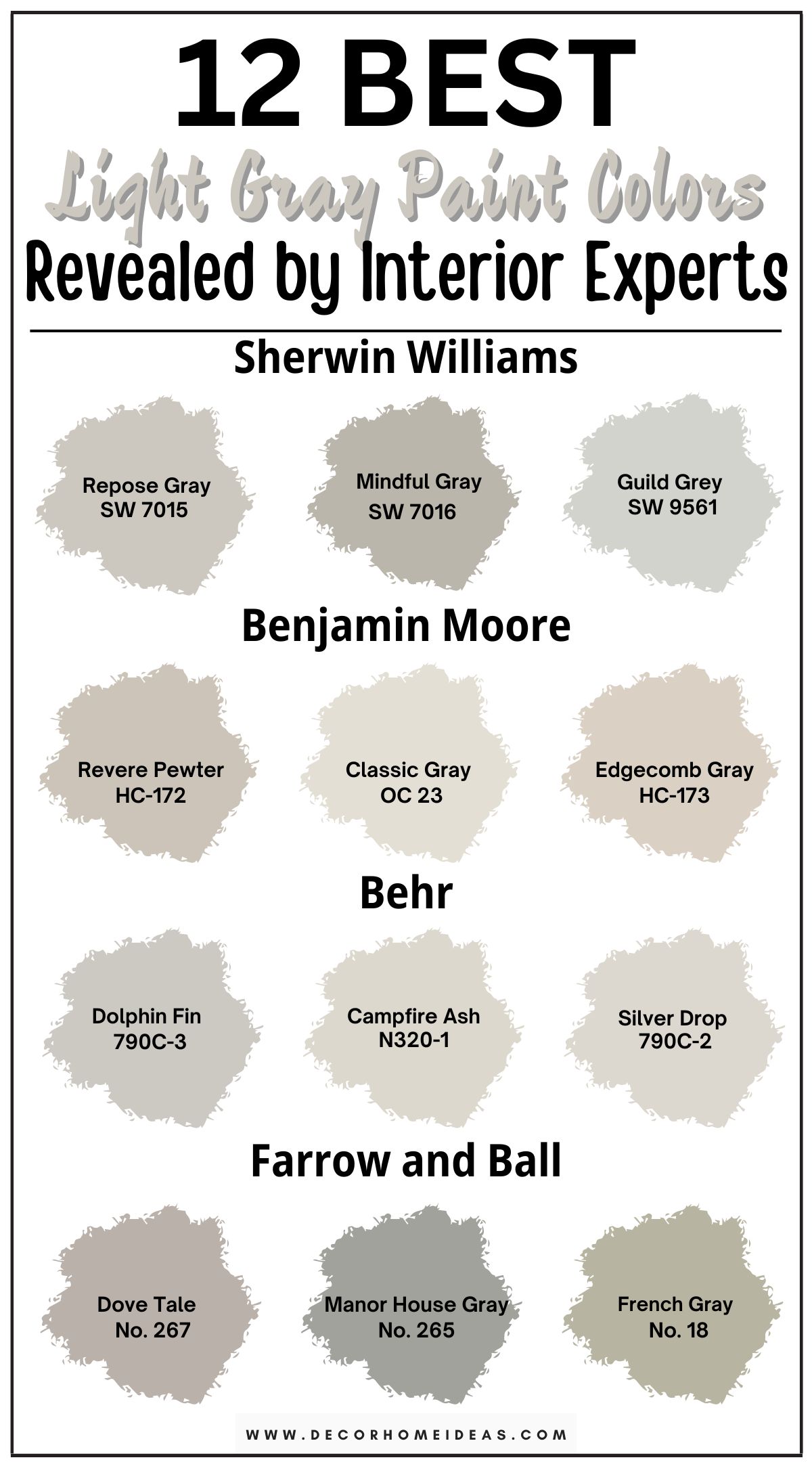
1. Sherwin Williams
Sherwin Williams Repose Gray
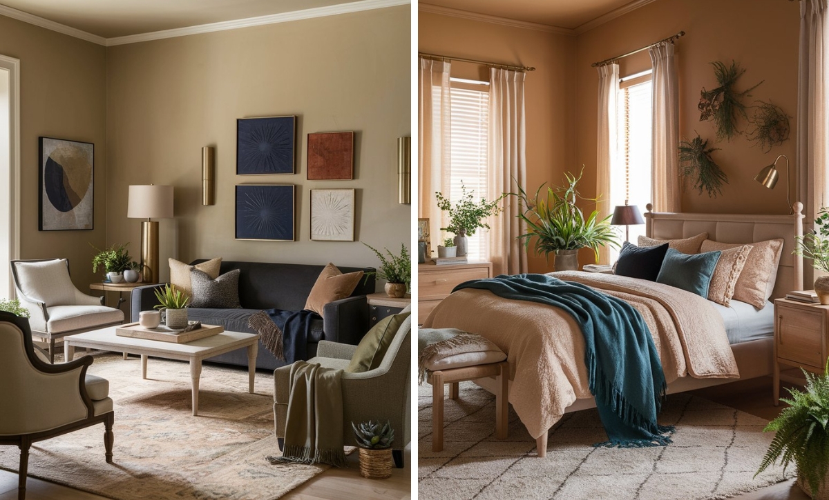
Sherwin Williams Repose Gray (7015) is a neutral gray with green and violet undertones. Its LRV is 58, which makes it slightly darker than most grays available on the market today. This hue is ideal for areas with lots of light because it doesn’t reflect much light.
Since Repose Gray is a versatile color and is more profound than most grays, it can be used in a variety of spaces, including bedrooms, where it creates a calming, soothing effect.
Use this color in spaces with warm wood finishes or if you have crisp white countertops and matching stone or quartz countertops. Finishes with similar undertones will pair well with this color.
In this kitchen, Repose Gray is the primary paint color, matching well with the granite countertops. The wood accents help create a modern, clean finish.
Depending on the time of the day, the level of light exposure, and the side that your room is facing, SW Repose Gray may either appear warm or slightly cooler. We recommend you sample or test the paint to know its full effect.
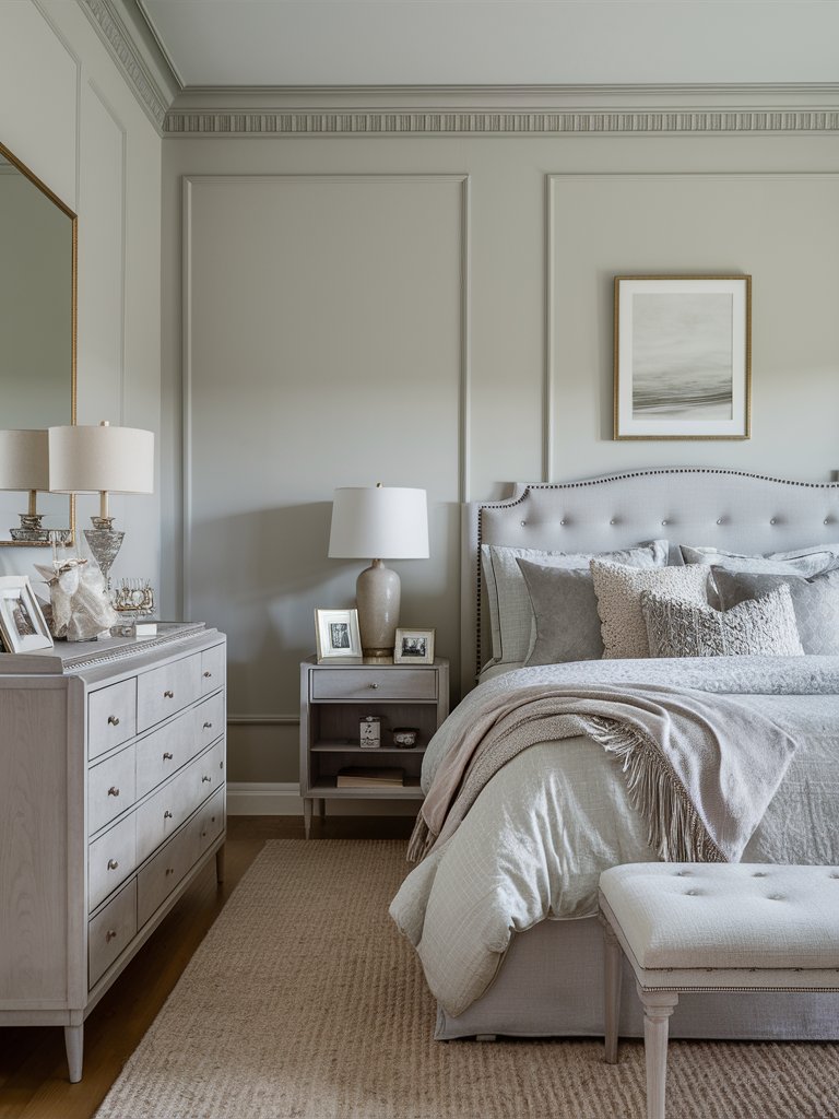
Sherwin Williams Mindful Gray
One of the most popular neutral colors for many homeowners, Sherwin Williams Mindful Gray (7016) adds a timeless touch to any space, from kitchens to bedrooms and even bathrooms.
The paint color’s warm yet neutral undertones help create a cozy, inviting atmosphere. The green-blue undertones help the color maintain its gray color without emanating brown hues.
With an LRV of 48, SW Mindful Gray reflects a generous amount of light, making spaces appear more expansive in its own unique way. However, it’ll need a space with plenty of natural light.
Here, this color has been used to create a peaceful, tranquil bedroom that appears larger and brighter without seeming too cold. Notice the creative use of light that adds more warmth and ambiance to the space.
The paint’s blue and green undertones will become more prominent in north-facing rooms, while in south-facing rooms, the color will be cooler. Use it in modern, traditional, or farmhouse-style interiors.
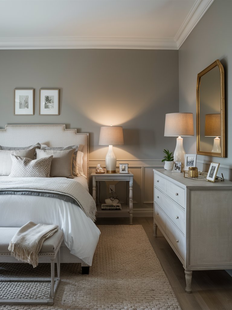
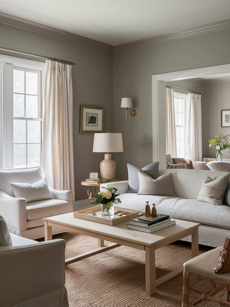
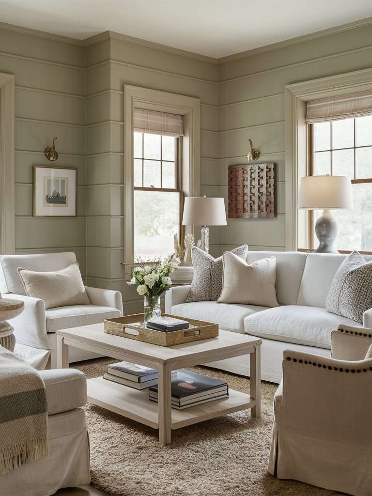
Sherwin Williams Guild Grey
Sherwin-Williams Guild Gray (9561) is a sophisticated, muted gray with an LRV of 63, meaning it strikes a perfect balance between light and dark. It can brighten up small spaces without seeming too overpowering, making it ideal for creating a calm, serene atmosphere.
When using guild gray, pair it with light colors such as SW Pure White on the trims or ceilings to create a refined look.
In this space, Guild Gray is used as the primary wall color pairing, creating a relaxing atmosphere for this bedroom. Notice how it pairs seamlessly with the bright white color on the ceiling and trims. Since it creates a refined backdrop, Guild Gray allows other accents in the room to be more prominent, like the brass accents in this bedroom.
2. Benjamin Moore
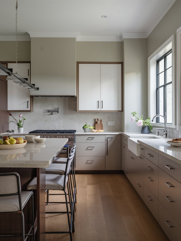
Benjamin Moore Revere Pewter
Benjamin Moore Revere Pewter (HC-172) is a gray color with a warm, greige tone that makes it feel distinctively neutral. Most designers prefer it due to its pigmentation, which has a yellow-green undertone. This balances the hue in bright rooms while still retaining its brightness in darker rooms.
It has an LRV of 55, making it a medium gray even though it’s still considered reflective. Its balanced, reflective nature makes it ideal for just about any room in your house. Since it’s a warm color, Revere Pewter works best in rooms with plenty of natural light and will pair well with clean white or off-white trims.
In this design, Revere Pewter is used as the primary wall color and matched with white tones on the rims to create a clean, traditional look. The darker tone of the color makes other accents in the room stand out, like the light-colored furniture and wooden accents.
Other than natural light and lighter colors, BM Revere Pewter will also work well with warm stone and natural wood floors. One of the most unique elements of this color is that it looks warm and inviting, whether the room is well-lit or even with low light.
Benjamin Moore Classic Gray
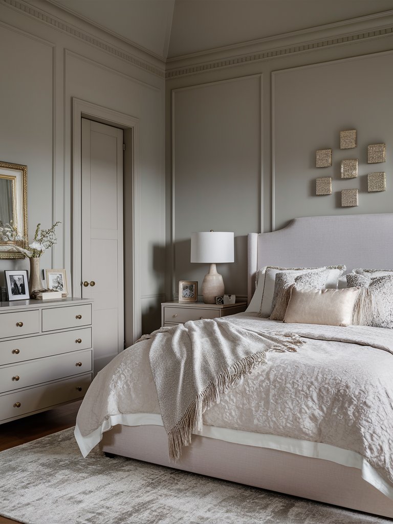
If you’re looking for a light gray with a soft tone almost bearing on white for your interior space, then Benjamin Moore Classic Gray (OC-23) is the color for you. It’s a soft gray with light, warm undertones that you can use in spaces where white paint may leave the room looking too stark or cold.
With an LRV of 73.67, Classic Gray can be classified as a very light greige or a darker off-white hue. Its warm green undertones are nearly invisible, making it perfect for matching with both warm and cool paint colors.
Since it’s so light, this color may sometimes look white, especially in the presence of plenty of natural light.
On top of the subtle green undertones, BM Classic Gray has flashes of purple that become prominent in cooler light. Depending on the position of a room and the refraction of light, it sometimes displays a warm tone that’s almost beige or a light, warm gray tone.
Here, classic gray has been used to add a little more pigment to the wall while providing a bright alternative that doesn’t appear too stark, making the bedroom peaceful and inviting.
This color is an excellent option for southern-facing rooms, where white paint can sometimes look too stark. The subtlety of the paint makes other elements appear more prominent by contrasting them.
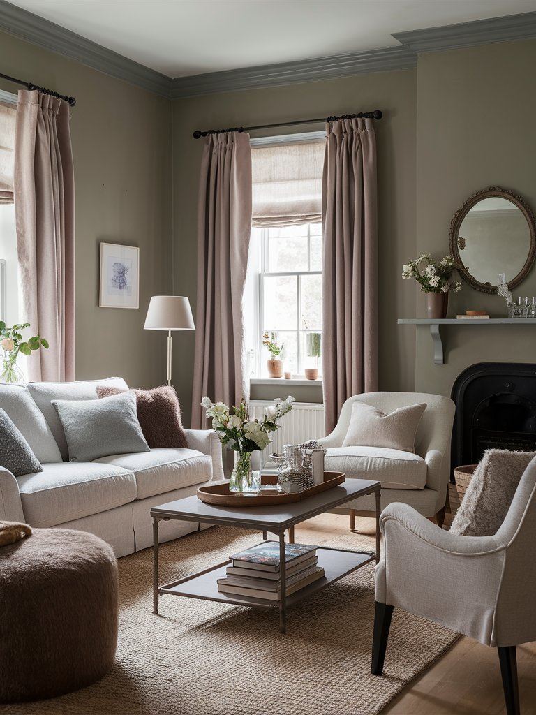
Benjamin Moore Edgecomb Gray
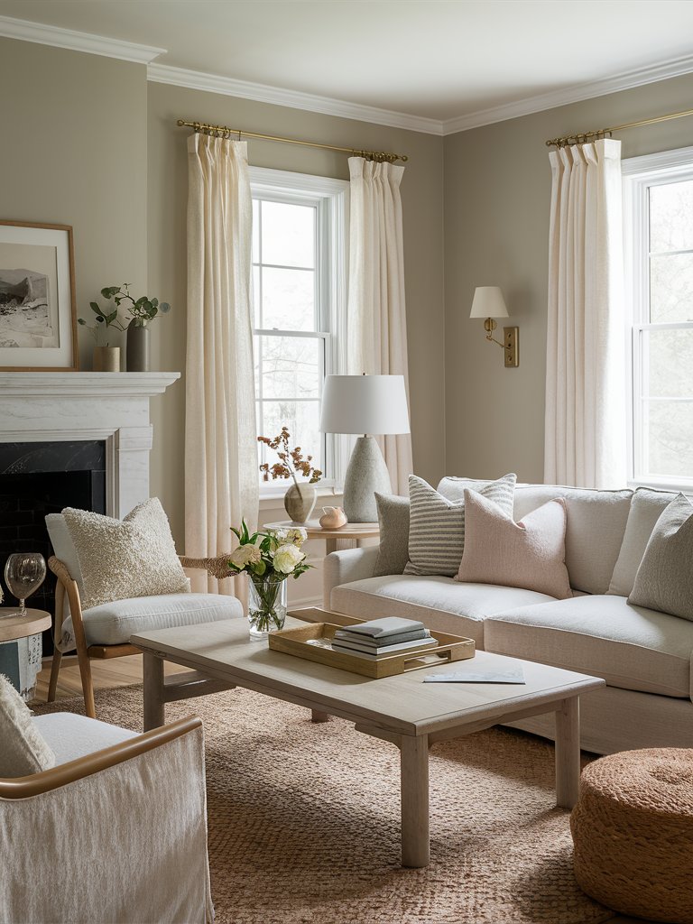
Benjamin Moore Edgecomb Gray (HC-173) is a soft, warm gray that often reads as greige. Its warm tone gives a light taupe-beige look that can be interpreted as a warm gray.
With an LRV of 63, light will bounce off Edgecomb Gray easily without creating too much starkness. This paint color is light enough to keep your space airy and has enough depth to set the mood of a space and not just feel like plain off-white neutral.
Described as a “soft, earthy organic neutral,” BM Edgecomb Gray is a timeless paint that can work in almost any space. Its versatility allows it to be paired with a variety of accents, both warm and cooler tones.
In this living room design, Edgecomb Gray is paired with light trim paint to help it create a calming, airy space. Paired with natural wood and fibers, the paint helps advance a boho-style themed bedroom. Notice how other elements and accents in the room appear prominent with the muted Edgecomb Gray background. The availability of plenty of natural light makes the spaces seem even more expansive.
3. Behr
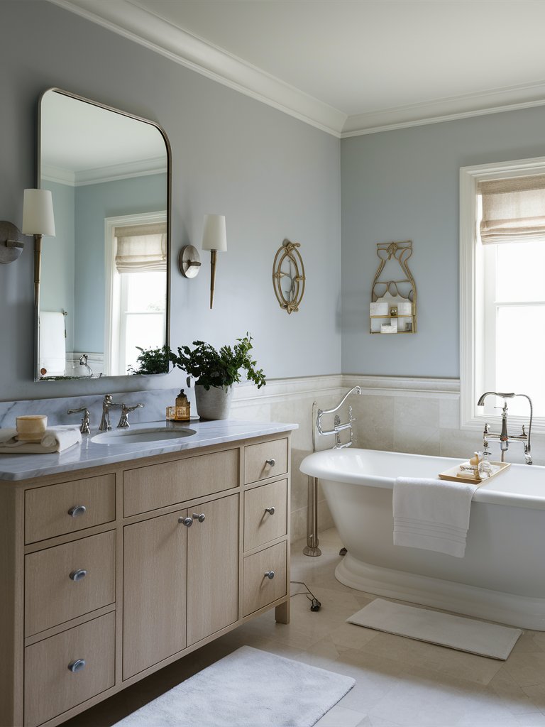
Behr Dolphin Fin
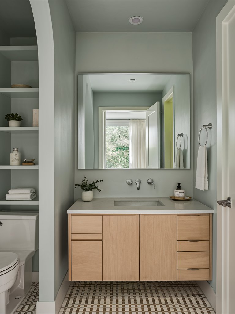
If you want to try a neutral, calm, composed finish, try Behr Dolphin Fin (790C-3). It’s a resounding warm gray paint that gives a subtle, soothing mood.
Dolphin Fin has an LRV of 59, meaning that it falls on the light side of the spectrum and can reflect a generous amount of light that falls on it.
It has green-blue undertones, and due to its depth, it’ll maintain its true character and charm no matter the space it’s used in. It has a unique quality of reflecting light without appearing too stark, making it a great paint color for small apartments and spaces with tight horizontal spaces.
Depending on what you pair it with and how light bounces off your space, this color may display warm or cool undertones. In north-facing rooms, it’ll have a cool grayish tone, while in south or west-facing rooms, it’ll feel considerably warm with beige undertones.
Here, Dolphin Fin has been used for this small bathroom to create a calm, muted, yet seemingly expansive space. The natural light in the space, which the addition of a mirror has maximized, brings an open, airy feel to the space despite its size.
What really makes Dolphin Fin stand out from other colors is that it’s easy to use. Not only can you use it in any space, but you can also pair it with a variety of different neutral tones, including blues, sage greens, deeper taupes, and beige. Moreover, it goes well with lighter trim colors.
Behr Campfire Ash
Behr Campfire Ash (N320-1) is a versatile, muted gray with a cozy warmth that lives up to its name. This subtle, smoky shade evokes the comforting ambiance of a fireside gathering on a cool evening, blending softness with sophistication.
Campfire Ash has an LRV of 69, and its hue offers a perfect balance between warmth and neutrality, making it an excellent choice for various room settings such as living rooms, kitchens, and even exterior paint.
While gray is often associated with cool, industrial tones, Campfire Ash breaks away from this stereotype. Its warm undertones make it feel more inviting, giving the gray a softer, approachable feel without straying into the overly warm beige family.
The hint of warmth in Campfire Ash makes it ideal for creating a welcoming atmosphere in spaces like living rooms or bedrooms, where comfort is key.
In the space, this color has been used to add a grounding neutral tone that compliments and contrasts other elements in the room, such as the furniture, the rug, and the metal and wooden accents.
Pair Campfire Ash with crisp white trims for a clean, classic look. If paired with soft pastels, it creates a smooth, delicate look. With deeper colors, such as navy and charcoal, it makes a bold, contrasting palette.
Behr Silver Drop
Considered a “chameleon” gray, Behr Silver Drop (790C-2) can play different roles in different spaces depending on how you decide to use it. It reads white in most rooms with bright natural light and will look like a true gray in southern or western-facing rooms.
With an LRV of 70, Silver Drop’s highly reflective nature can create the illusion of a bigger, airy space. Unlike other brighter hues, this color ensures that a space feels expansive but doesn’t feel awkwardly large.
Silver Drop has subtle yellow undertones, which give it a hint of warmth. These undertones help improve its versatility. Under warm lighting conditions, Silver Drop can appear like tans or off-whites.
However, the undertones that this color displays aren’t limited. Depending on the environment, Silver Drop can reveal blue, purple, and green undertones. However, it tends to lean more green most of the times..
In this bedroom, Silver Drop has been used to create an open, inviting space. It has been matched with light furniture and accents to give the room a luxury look.
Behr Silver Drop can also create a state of cohesiveness and balance, making it ideal for unevenly large spaces and smaller spaces. In north-facing rooms, this color will feel cool and bold, whereas in south-facing rooms, it will feel more creamy.
4. Farrow and Ball
Farrow and Ball Dove Tale
An excellent warm paint color that Farrow & Ball describes as “a darker version of Elephant’s Breath” on their website, Farrow & Ball Dove Tale (No. 267) is a perfect color for those hoping for a warm gray finish.
With an LRV of around 44, Dove Tale lives somewhere between an earthy taupe and a soft, muted beige, perfectly blending into both cozy and contemporary spaces. It softly bounces light around the room, creating warm, sun-filled spaces while offering a cozy depth in dimmer areas.
FB Dove Tale has gentle lilac undertones that create a soft, inviting feel. While it makes an ideal choice for bedrooms, it can also be used for living rooms and bathrooms.
Its charm lies in its adaptability—offering just enough warmth to be inviting yet neutral enough to fade into the background when needed. This color creates a neutral background that can be matched with either lighter or darker materials.
Here, Dove Tale has been used to create the ultimate neutral background that provides a great contrast with the dark and light tones in the space. It allows brighter colors to dominate the space while providing enough contrast for darker hues to also be visible.
FB Dove Tale is a color that effortlessly walks the line between cozy and chic, making it a dream choice for homeowners who crave a neutral tone with character.
Whether you’re designing a minimalist modern living room, a peaceful bedroom, or a serene bathroom, this shade of greige is versatile enough to adapt and distinctive enough to leave a lasting impression.
Farrow and Ball Manor House Gray
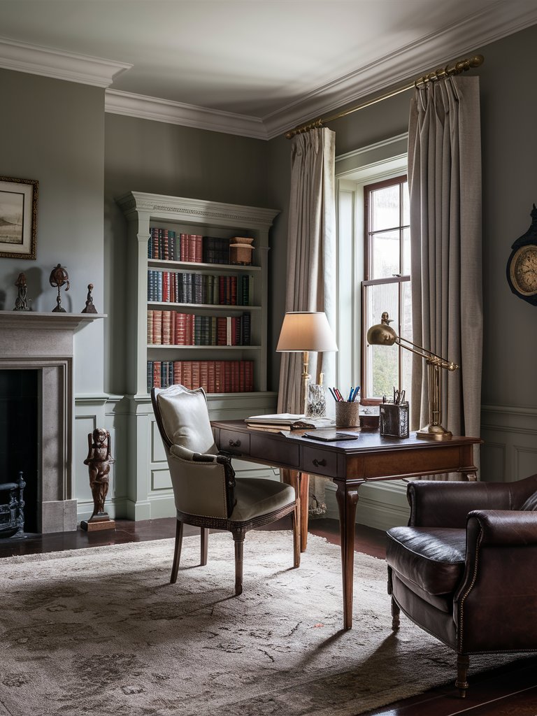
Farrow & Ball Manor House Gray (No.265) is one of the few colors that can be said to have a “historical” context. It’s named after the color of the houses traditionally inhabited by local lords of the UK—Farrow & Ball is a UK-based company.
It’s a definite gray that retains its color in all lights and becomes especially prominent when contrasted with velvet.
Manor House Gray has an LRV of about 32, and its cool blue undertones give it a crispness, making it an excellent alternative to warmer grays if you’re aiming for a modern aesthetic.
Its subtle blend of blue and black undertones creates a balanced, cooler gray that can change dramatically with lighting, providing a refined, slightly moody ambiance to any space.
Unlike many grays that can lean too heavily on either side of the color spectrum, Manor House Gray strikes a perfect middle ground, making it a versatile option for both classic and contemporary interiors.
This gray also has a cooler and cleaner feel than other gray tones, such as FB Charleston Gray. It’s prevalent in contemporary homes with minimal living styles and works well when used alongside more dramatic railings.
In this space, FB Manor House Gray has been used to create a soothing, relaxed mood for this home office. Its muted tone highlights the brown furniture and accents in the space. The light tone of the color allows enough light to bounce off the space without being too bright due to the natural light flowing into the space.
Farrow and Ball French Gray
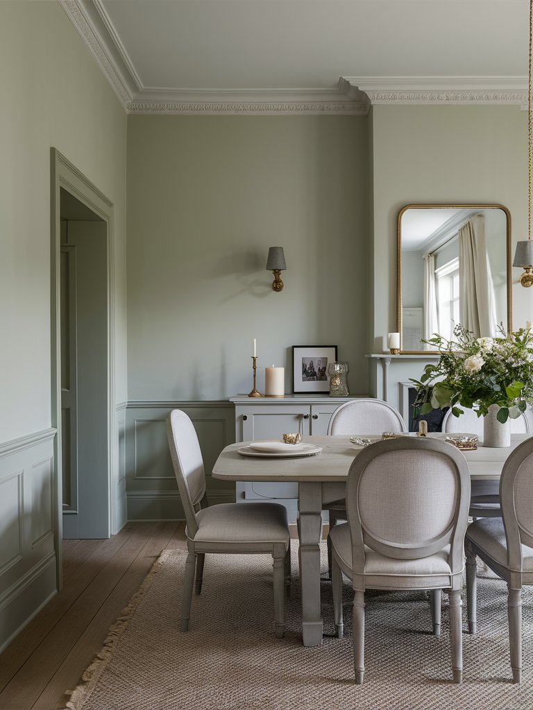
Farrow & Ball French Gray (No.18) gets its name from popular colors used in French Decoration in the 19th century. It creates a relaxed feel, and its green undertone makes it an excellent choice for woodwork.
With an LRV of about 43, French Gray works exceptionally well in period properties, mainly Georgian or Victorian homes, where its understated elegance can complement historical features like wainscoting or paneled walls.
However, it also has enough subtlety to integrate well into contemporary spaces, especially when combined with sleek materials and modern fixtures.
Since it has a soft, neutral quality, French Gray can be used in open-plan spaces, creating a flawless, seamless space that doesn’t overwhelm the senses. It can also be used on the interior and even on your front door.
This color has been used to create a serene but inviting mood for this dining room. It combines well with light, earthy tones to give the space a minimalist look. The clean look of the room and matching light furniture allow even minimal decor, such as the houseplant, to add visual interest to the space.
Its ability to shift between gray and green depending on lighting makes it a dynamic choice for homeowners seeking a timeless, flexible color palette that adds warmth and serenity to any space. French Gray pairs beautifully with a neutral like FB All White for trims, ceilings, or adjoining walls.
What Color Compliments Light Gray Paint Colors?
- Navy Blue
- Soft Pink
- Mustard Yellow
- Forest Green
Navy Blue
Navy blue is a deep, rich color that provides a striking contrast to light gray. This combination creates a sophisticated and timeless look that exudes elegance and style.
Use navy blue in furniture, accent walls, or decorative items to add depth and a touch of luxury to a light gray room.
Soft Pink
Soft pink is a delicate, muted shade that adds a gentle warmth to the cool tones of light gray. This pairing creates a balanced and calming atmosphere, perfect for bedrooms or living areas.
Incorporate soft pink through textiles, such as throw pillows, rugs, or curtains, to introduce a touch of romance and softness to a light gray space.
Mustard Yellow
Mustard yellow is a warm, vibrant color that adds a lively and energetic touch to light gray. This combination creates a dynamic and inviting look that feels both modern and cozy.
Consider using mustard yellow in accessories like cushions, artwork, or vases to bring a pop of color and warmth to a light gray room.
Forest Green
Forest green is a rich, natural shade that pairs beautifully with light gray. This combination creates a fresh and serene atmosphere, adding a touch of nature and tranquility to your space.
Add forest green through plants, textiles, or accent walls to introduce a refreshing and balanced element to a light gray room.
Color Disclaimer
Please note that all paint colors displayed on this page are for illustrative purposes only. Due to variations in screen settings, lighting, and other factors, the colors you see on your screen may differ from the actual paint colors. We recommend viewing a physical color sample or swatch for the most accurate representation. Some images might be generated by AI to represent paint colors in different interiors