Reds are arousing. According to color theory, they are advancing rather than receding colors. Interior designers explain that advancing colors dominate an interior and, to the viewer, appear to come forward. This would be especially true in small spaces such as red bathrooms.
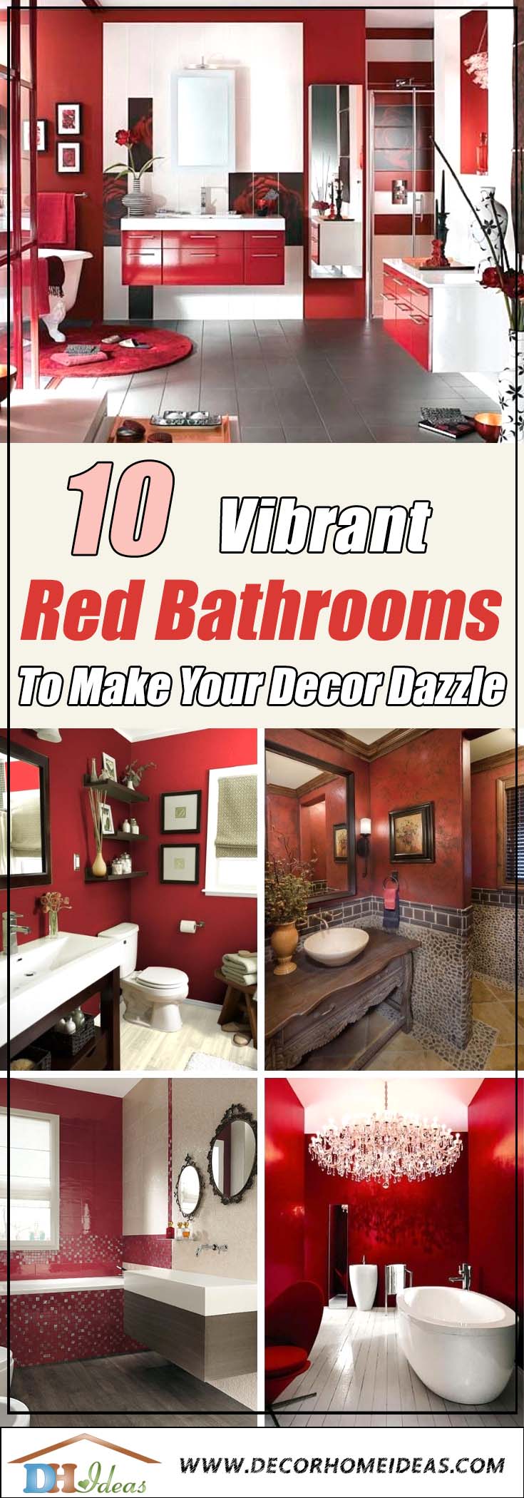
Designers say that reds warm a room and make it feel more cozy and lively. If you want a quiet, more spacious look, receding colors in the blue to green range are the right choice.
But the truth of the matter in designing red bathrooms is that few people opt for in-your-face, entirely red designs. Often they combine neutrals – greys, whites and tans – to tone down the heat.
Plus, reds themselves come in a range from hotter to cooler hues. On the warmer, spicier side are tomato reds that contain varying amounts of yellow. Cooler berry reds tend toward the blue spectrum and look juicy. In the middle is primary red, the kind you might find in a crayon box with only three colors.
As you tour the ten examples of red bathrooms we’ve gathered here, you’re likely to notice that some contain multiple shades of red. For each design, we share color analysis, thoughts about what we love and suggestions for ways in which we might change it.
Along the way, we’ll take short side trips to consider the history of red.
10. PRIMARY RED
Shiny, Modern Crayon Box Red
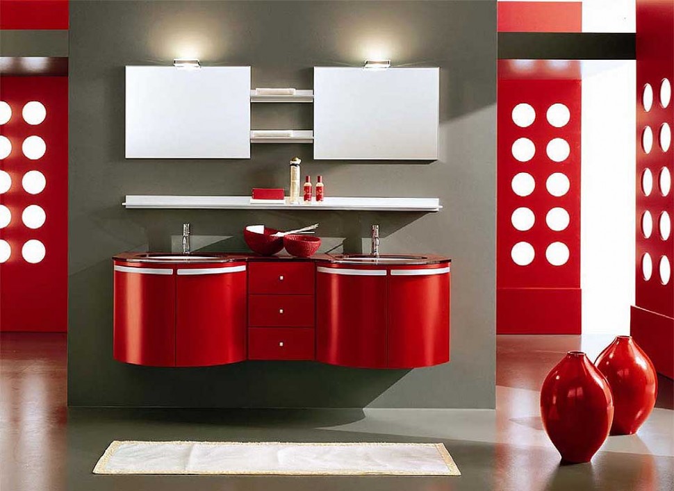
Photo: Credit
Color combo: A soft, grey-green wall quiets the eye-popping red and bright white of the floating vanity. A deep brown counter top and pecan-brown wood flooring reinforce the room’s warmth while keeping the red from being too commanding.
Why we love it: Floating cabinetry gives bathrooms a less cluttered, more open look. This sparely furnished bathroom has a high-tech look despite the Art Deco curviness of its vanity. The white, gumball sized drawer pulls nicely reiterate the polka-dot cutouts of the sleek wall dividers.
Our suggestion: The pottery is pretty, but breakable. Why not replace it with something more useful, such as a small bench.
History Side Trip: Red from Insects and Minerals
To make red dye, ancient Egyptians ground up the tiny plant pests called Kermes scales, which suck on plant foliage and branches. Later, New World explorers discovered Cochineal scales, which are still used today to make non-toxic red pigments. But not all ancient red pigments were safe. In contrast, the Ancient Romans crushed the highly toxic mineral cinnabar to create vermilion.
9. SPICY RED
Natural Pebbles & Spice
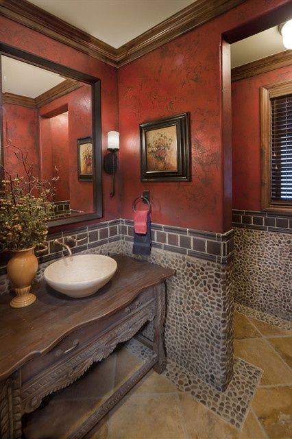
Photo: Credit
Color combo: A cream-colored ceiling adds a feeling of height to the cozy brown woods and mottled red and brown walls of this stately design. Low lighting and gold floor tiles further increase the room’s warmth.
The half-up pebble-and-tile wall finish adds greys, blacks and rusts to the color mix.
Why we love it: We’ve seen many credenzas turned into vanities. But the white porcelain sink in this bathroom pops up like a wash-stand bowl from the days before plumbing. This adds a reassuring, old-fashioned touch.
Our suggestion: Why not complete the old-fashioned vibe by replacing the vase with a wash-stand pitcher filled with flowers?
8. Cooling Touch of Green
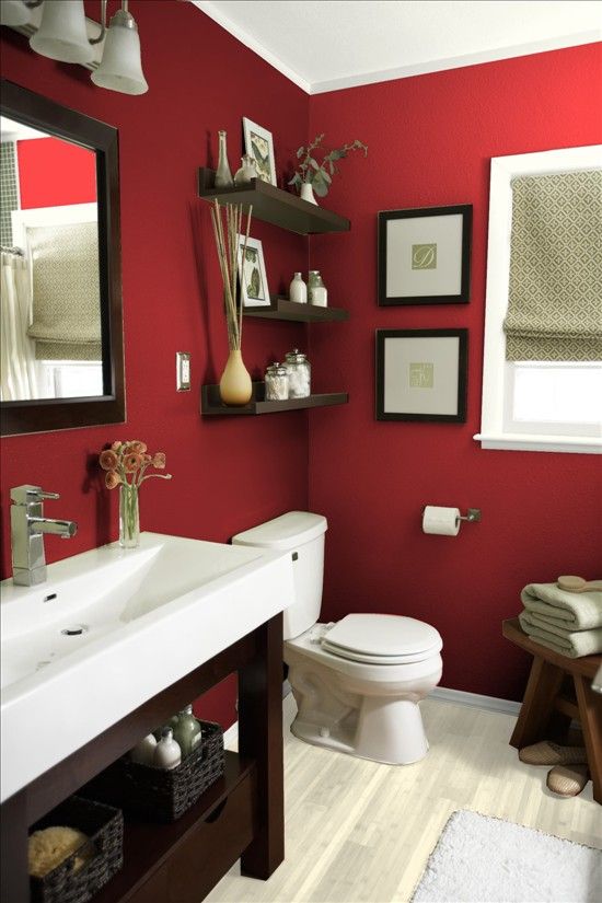
Photo: Credit
Color combo: Sage green shades and towels form a cooling contrast for the hot, cinnamon red of this bathroom’s walls. The floor (possibly wood) also has a green cast. The whites of the ceiling, window frame, lighting sconces and toilet balance the red.
Why we love it: First, you have to love a color scheme that turns a roll of white toilet paper into an eye-catching design element. Second, we love the serious brown and airiness of the room’s not-quite-a-vanity washstand.
Its long, rectangular wash trough and lanky frame adds an appealing angularity of the design.
Our suggestion: The flooring looks like it will become dated before long. We suggest a light oak instead.
7. Warm Wood Floors & Tomato Walls
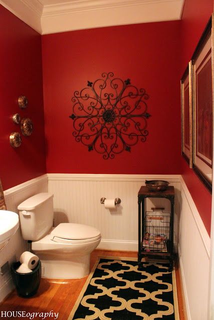
Photo: Credit
Color combo: Cinnabar-red walls add drama to this room. The cream wainscoting is pretty and well-matched to the color of the toilet, but the white sink adds nothing to the color combination.
Why we love it: The Moorish look is reinforced by the wrought iron wall art, which is reflected by the gold and black design of the runner rug.
Our suggestion: What’s with the toilet paper storage? It looks like a trash can. This room needs some cabinetry.
History Side Trip: Royal Red
Red pigment was a rare commodity centuries ago, so only the most powerful wore it in 17th-century France. Louis XIV loved shoes with red heels. His taste became a fad among nobles. Red high heels remain trendy today.
6. BERRY JUICY
These reds may remind you of a slice of berry pie or a cooling drink of red bush tea.
Chic Modern with Chandelier
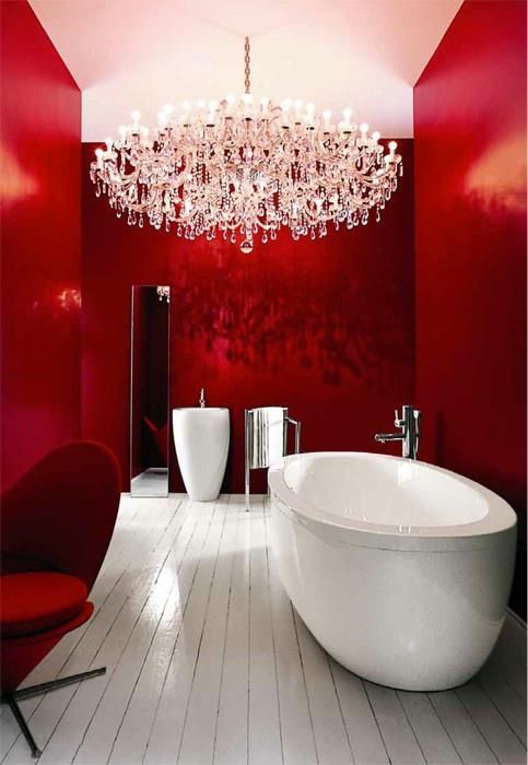
Photo: Credit
Color combo: Lots of white forms a strong contrast with lots of berry, berry cherry red. The white of the glossy painted wood floor (or is that faux wood linoleum?) looks a bit grey in contrast to the bright white of the tub, ceiling, sink and chandelier. This room is roughly an even split of red and white with chrome (fixtures and towel rack) as a 5% accent.
Why we love it: The voluptuous curves of the freestanding tub and sink are sensuous, especially against the luscious red. You might think we would love the chandelier, but read the bad news next.
Our suggestion: There is nothing romantic about electrocution. Get rid of the chandelier, because – based on electrical safety code — the room is neither tall enough or wide enough for it. A damp bather might be tempted to reach up and touch it, then zap! Code varies from one part of the world to another, but in the U.S., the National Electrical Code indicates that chandeliers are hazardous near bathtubs.
If you insist on hanging one near your tub, the bottom of the chandelier must be eight feet up and three feet away horizontally from the top edge of the tub. The best bathroom lighting is damp-proof and – over tubs and in enclosed showers — wet-proof. Here is an explanation from an electrical inspector.
5. Red, Black and White All Over
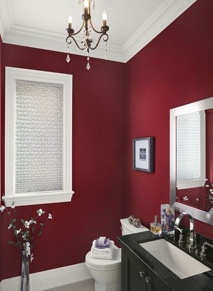
Photo: Credit
Color combo: Rich ruby red partners with crisp white, chrome and glossy black as well as pale grey flooring.
Why we love it: Ruby walls remind us of Dorothy’s magical slippers in The Wizard of Oz. The white window shade adds more magical sparkle.
The rectangular vanity is sleek and useful yet takes up little space. It brings the look back to earth with just the right amount of black.
Our suggestion: The chandelier appears to be in a safe spot, but it is blah. Black metal might be a more eye-catching choice.
4. Red & Silver Mosaic
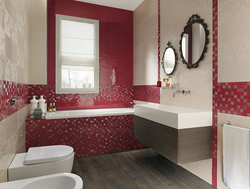
Photo: Credit
Color combo: Bits of bluish silver sparkle amid ruby red tiles on the front of the tub and along the shiny cream-colored tile dominating the walls. The floating sink rests atop the same dusky brown wood as the flooring.
Why we love it: The ruby accent wall and mosaic are dramatic.
Our suggestion: The cream walls need to go. Soft pearl grey would be a better choice and would contrast more crisply with the white fixtures.
History Side Trip: Lucky Red
The ancient Chinese practice of feng shui partly focuses on making beneficial color choices in home decoration. It deems red an auspicious color that will bring prosperity and other benefits to those who decorate with it. But don’t get carried away with red. Feng shui is also about achieving balance.
3. SPICE AND BERRY
Sometimes you can’t choose between hot and cool reds. You want them both.
Cherry Red & Spice Modern
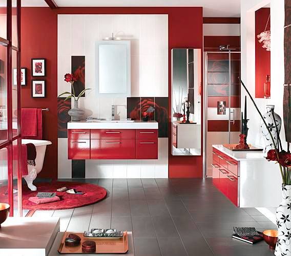
Photo: Credit
Color combo: A spicy cinnabar accent wall plays against the bluer red of this bathroom’s vanity and storage.
A mid-grey tile floor partners with the reds and bright whites.
Why we love it: Grey, cherry, cinnabar and bright white partner successfully here. The floating vanity and storage create a feeling of spaciousness.
Our suggestion: The color combination is complicated enough. Keep the accessories to a minimum or you create a cluttered look as in this picture. But some people like lots of decoration.
2. Rustic Reds & Golds
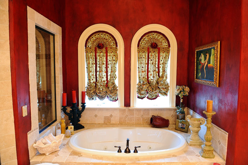
Photo: Credit
Color combo: Mottled tomato- and berry-red walls pair with creams and golds here.
Why we love it: First, who doesn’t love arched windows?
The gold and red balloon shades add a 1970s femininity to the rich color combination.
Our suggestion: Don’t unnecessarily clutter the tub surround, but leave the candles for romantic warmth.
1. Raspberry Sherbet & Spice
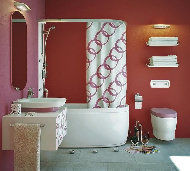
Photo: Credit
Color combo: Raspberry pastel and cinnamon red walls join together like an attraction of opposites. Foam green flooring is the peacemaker in this design.
Why we love it: This is a fun, zany color combination that has a high-tech yet 1970s hipster appeal. Look closely and you will see that the floating toilet is also self-flushing and there are no electrical outlets in the walls. You can plug a blow dryer into the front of the floating, box-like vanity.
Our suggestion: Although we love lack of clutter, this bathroom is a bit too spare. Maybe an open cabinet could replace the motel-style towel racks.
Red Bathrooms Without Redrum
Careful combinations of color, shape and useful fittings make red bathrooms lovely settings for relaxing in a warm bath or shower. They offer luxury rather than the creepy symbolism of the red bathroom in the haunted hotel of Stephen King’s horror film classic The Shining. The movie is based on King’s novel in which he coined the word “redrum,” which is “murder” backwards.
Remodeling may be murder on your budget, but a beautiful red bathroom likely will make you feel like royalty.

